Nev Flynn Bento Grid Portfolio
A modern bento grid personal portfolio featuring sticky navigation, interactive React-based widgets, a Spotify activity display, and a customizable dark mode toggle.
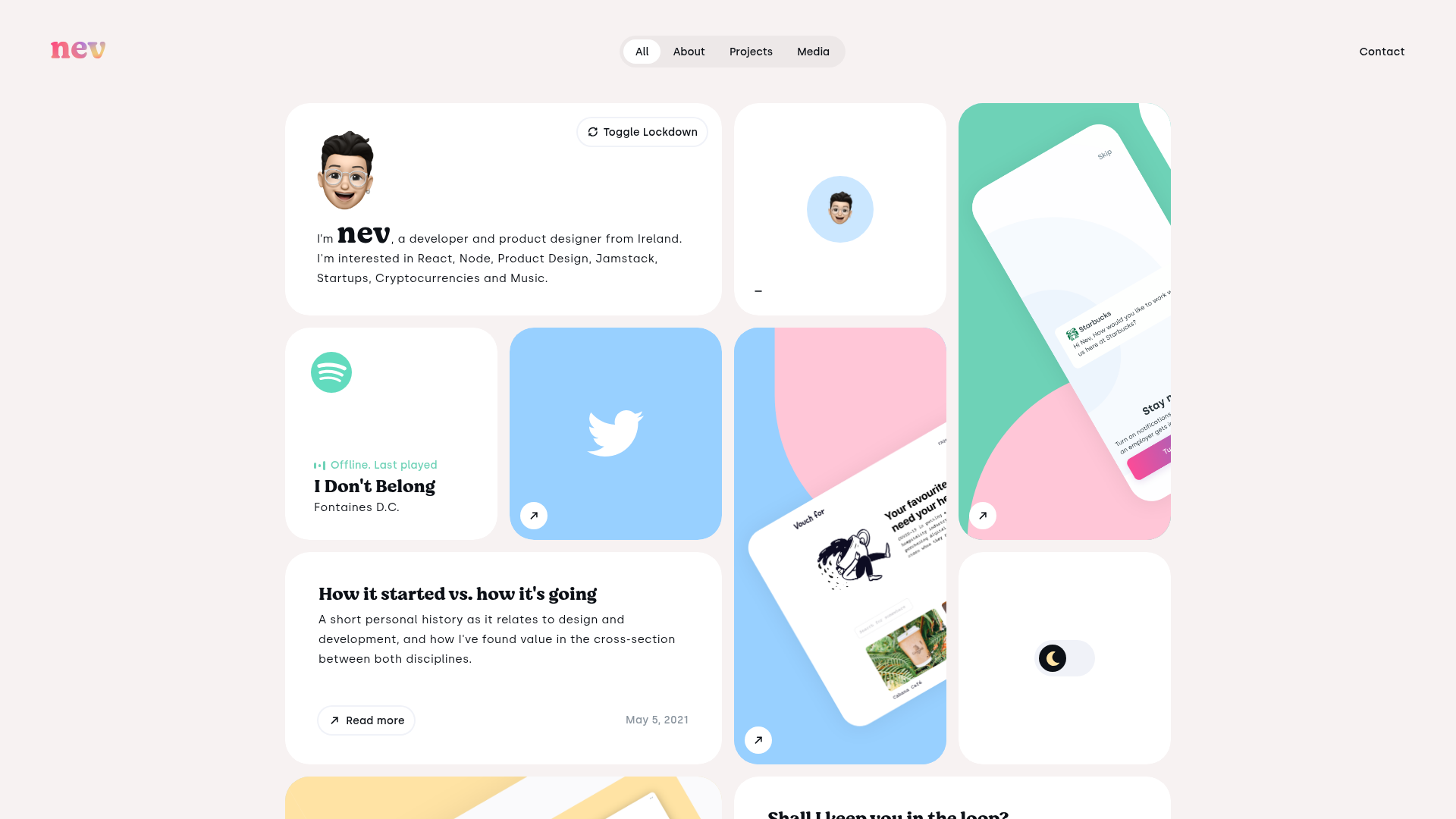
Overview
This portfolio is a premier example of the "Bento Grid" design trend, utilizing a tiled layout to showcase a diverse range of content from personal bios to live API integrations. It is a strong reference for creators who want to consolidate their digital identity (projects, social activity, and blog posts) into a single, high-impact visual dashboard.
Design System
- Color Palette & Visual Hierarchy: The site uses a soft, off-white background (
#f7f2f1) to allow the vibrant tile backgrounds—ranging from Spotify green and Twitter blue to pastel pinks and teals—to pop. Hierarchy is established through tile size (1x1, 2x1, and 1x2 configurations) rather than traditional vertical scrolling. - Typography: The system features a sophisticated mix of the serif font Moranga Bold for branding and emphasis (e.g., the "nev" logo and subscriber counts) and a clean sans-serif for body copy and UI labels. Headings use a prominent "Trafalgar" scale for high readability within constrained grid cells.
- Structure & Components: The layout is built using
react-grid-layout, allowing for a responsive, masonry-style arrangement. Key reusable components include:- Interactive Widgets: The Spotify "Now Playing" card with a CSS-animated frequency bars indicator and the Mapbox-integrated location tile.
- Action Tiles: The "Toggle Lockdown" button and a custom Dark Mode toggle switch.
- Case Study Cards: Large vertical tiles featuring SVG background shapes overlayed with product mockups and "Expanded Corner Links" that reveal titles on hover.
- Input Blocks: A minimal newsletter subscription form integrated directly into a 2x1 grid cell.
- Interactions & Motion: The UI is highly dynamic, featuring
framer-motionstyle transitions for memoji animations, hover-triggered shifts in the corner arrow links, and a functional dark mode toggle that swaps the global theme. - Implementation Clues: The HTML reveals a React-based architecture (
__next) usingstyled-componentsfor CSS-in-JS. The grid items use absolute positioning with transform-based offsets, indicating a highly controlled, JavaScript-driven layout engine.
Use Cases
- Personal Branding: Ideal for developers, designers, and multi-hyphenate creatives who need to display code, design, and social presence simultaneously.
- Product Dashboards: The widget-based grid can be remixed into a SaaS analytics dashboard or a landing page for an app with multiple distinct features.
- Remix Directions: Builders can swap the Memoji for professional photography, replace the Spotify API with a Github contribution graph or a latest-tweet component, and adjust the grid density for more text-heavy professional CVs.
- Clone Scope: A full-page clone is recommended to capture the sophisticated grid logic and dark mode implementation, but the individual
CaseStudyandSpotifywidgets are excellent candidates for targeted section-only reuse.
Related Inspirations
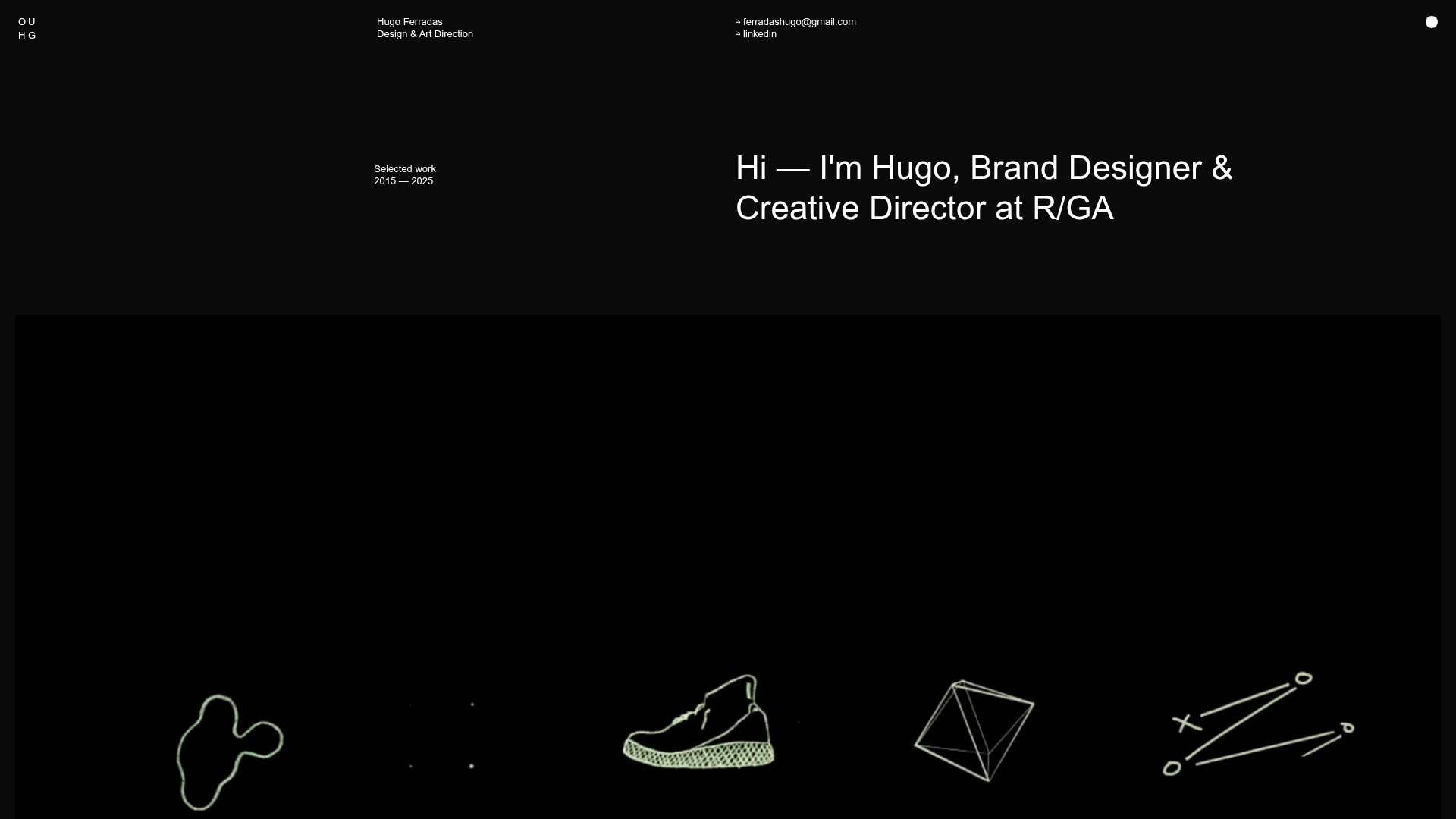
Hugo Ferradás Portfolio Site
A dark-themed portfolio featuring a creative director bio, sticky sidebar navigation, and a dynamic asymmetric grid of case study cards with animated hover reveals.

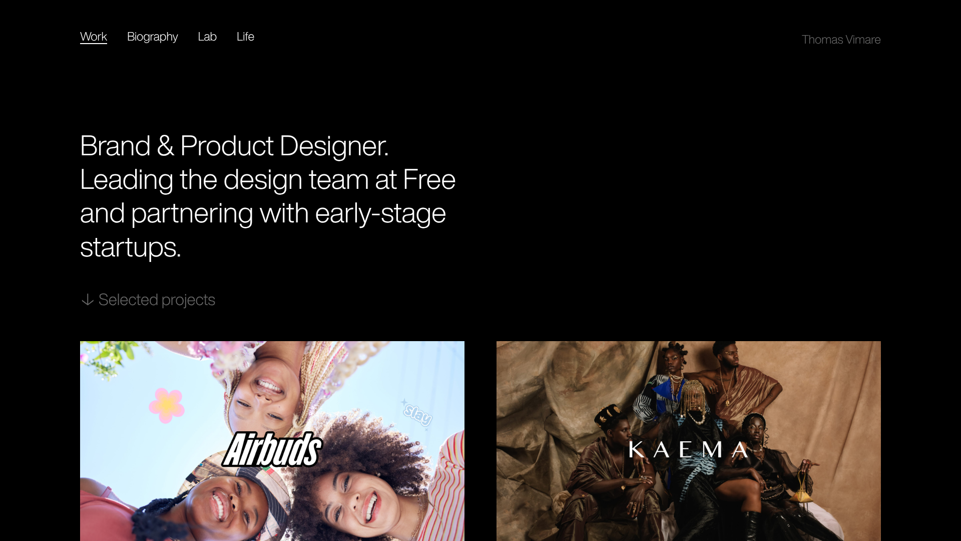
Niklas Rosén Designer Portfolio Index
A minimalist, responsive grid-based portfolio index featuring a clean 16-column layout, typographic list components, and a custom dark mode transition.
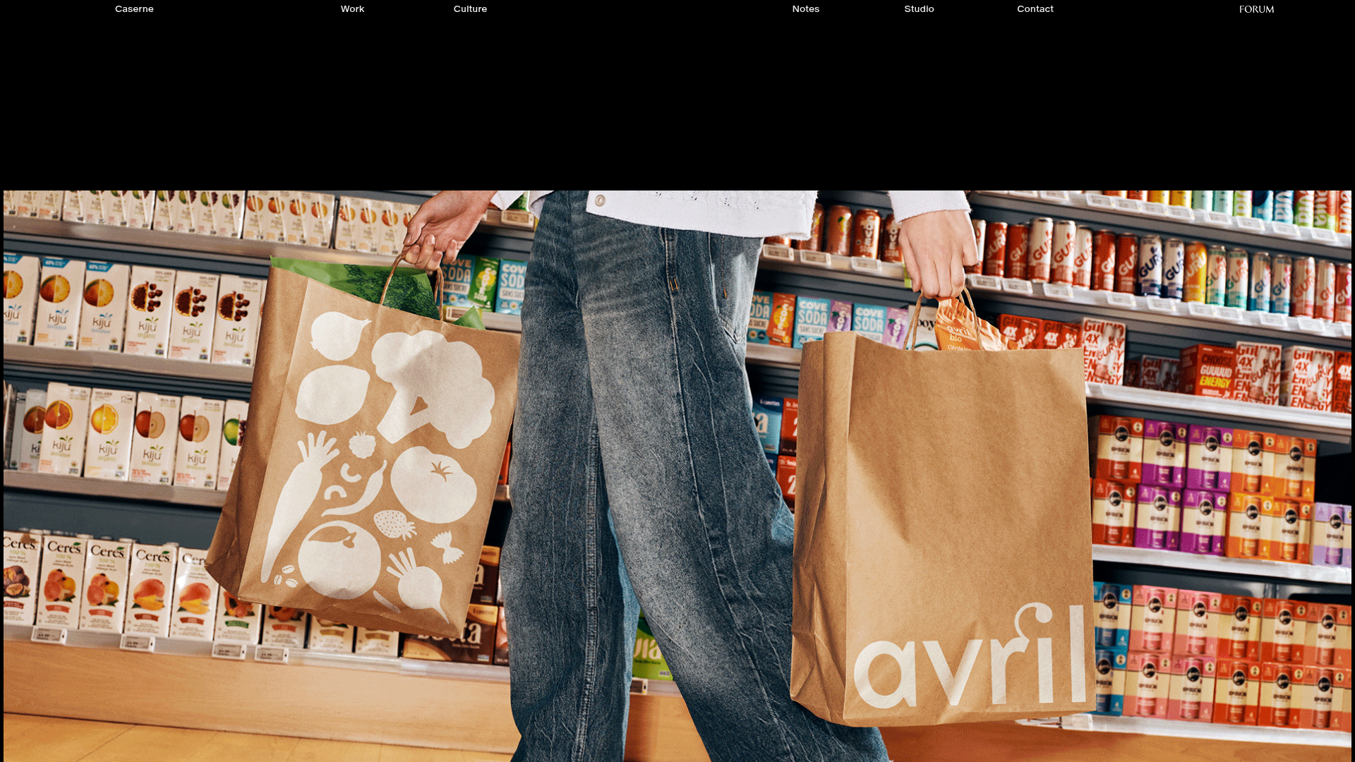
Caserne Design Studio Portfolio
A minimalist, high-impact portfolio featuring a dynamic masonry grid of project thumbnails with overlay text and a clean, oversized typography-driven footer.
Minimalist Dark Designer Portfolio Grid
A clean, dark-themed portfolio featuring a bold typography hero section and a staggered two-column image grid with subtle entrance animations.
Jakub Reis Portfolio Case Study Gallery
A dark-themed designer portfolio featuring a typography-focused loading animation and a staggered masonry grid for project case studies.
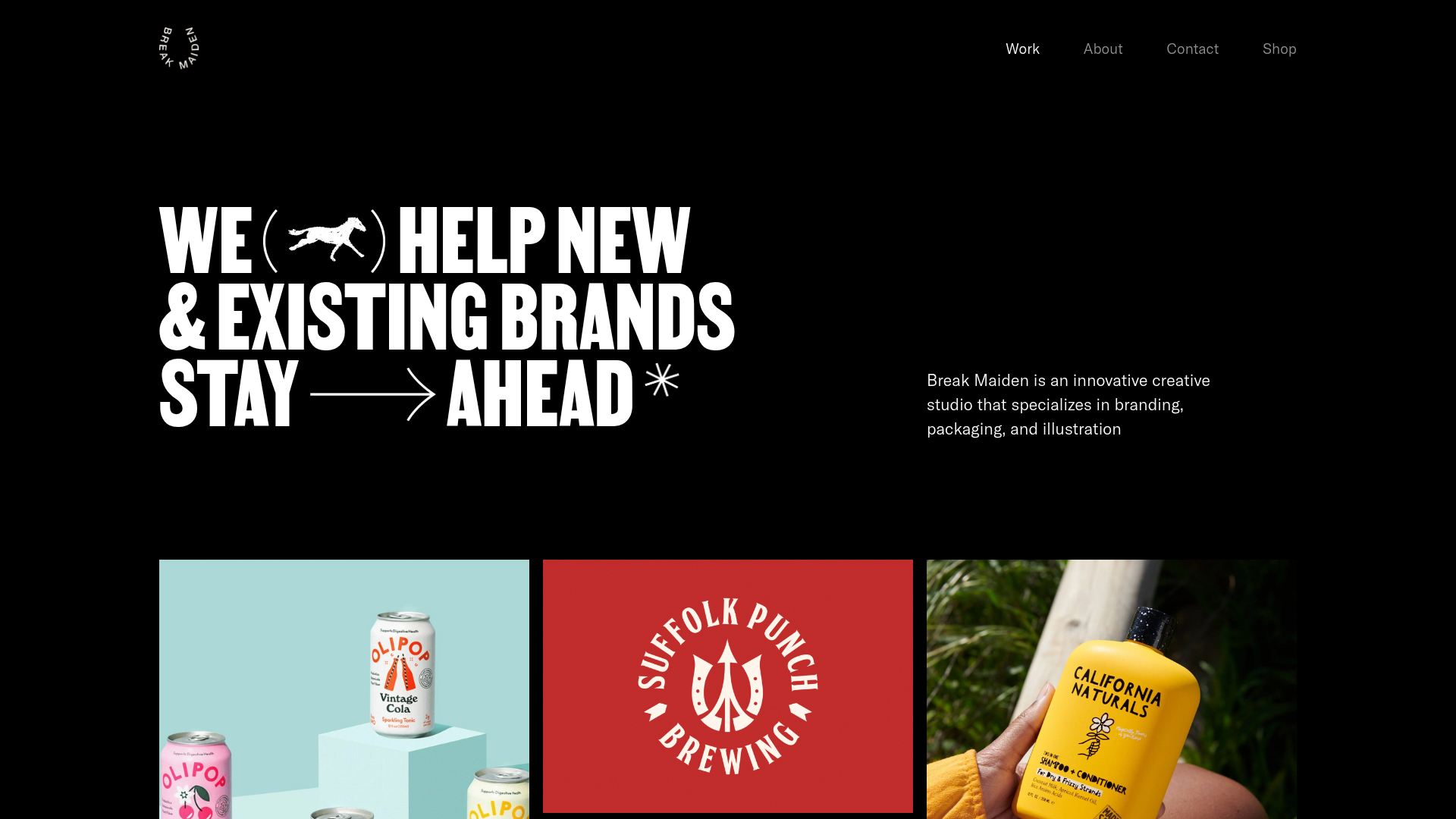
Break Maiden Agency Portfolio Hero
A high-impact dark mode hero section featuring oversized typography with inline GIF icons and a responsive grid for display-heavy case studies.
