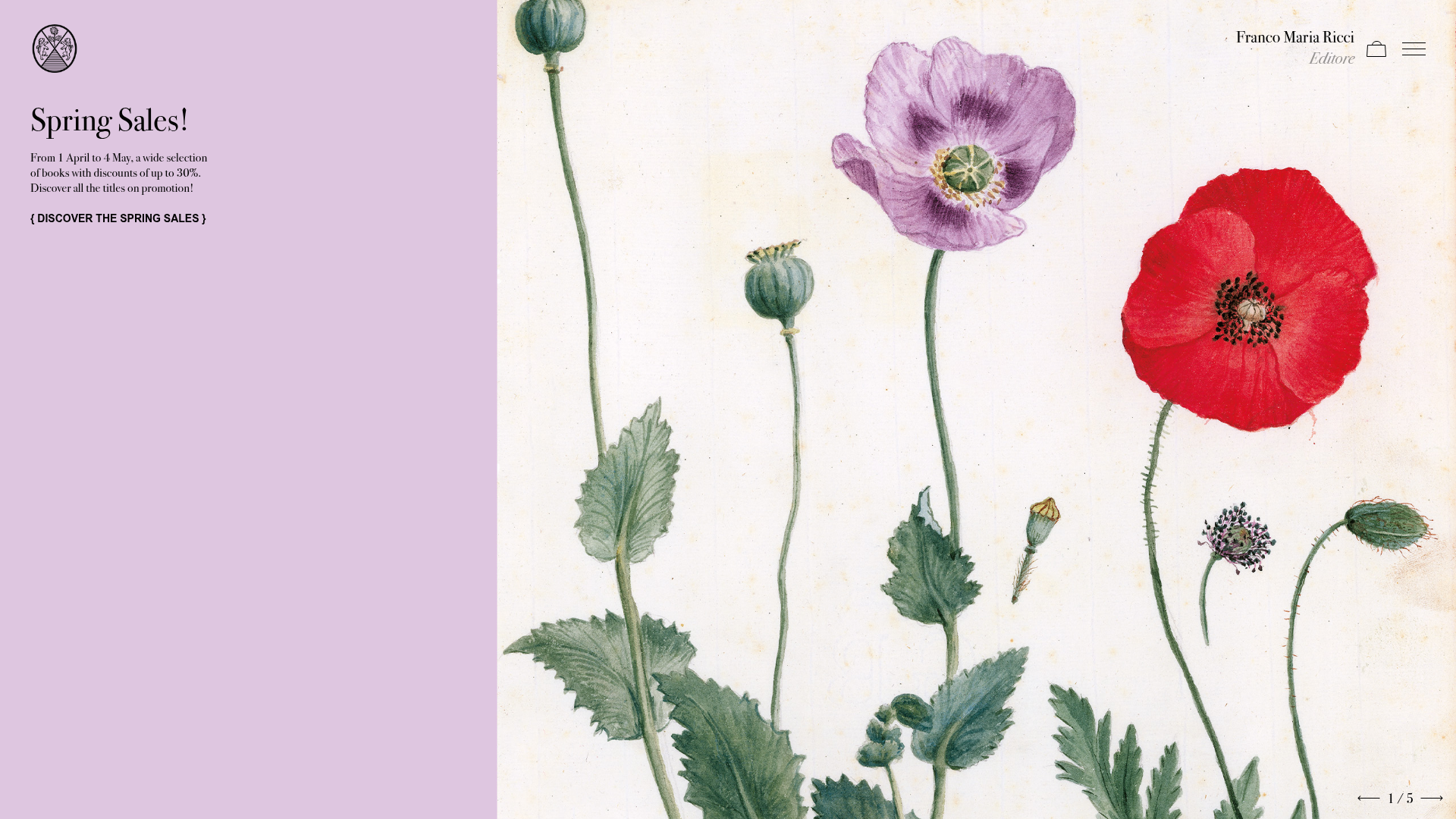
Franco Maria Ricci Editorial Portfolio
An elegant publisher site featuring a split-screen hero layout, hover-activated product cards with rotate-transformed metadata, and alternating two-column alternating content blocks.
Overview
This website for Franco Maria Ricci is a masterclass in editorial digital design, bridging the gap between high-end print publishing and e-commerce. It uses a sophisticated split-screen layout and art-focused visual hierarchy to showcase a portfolio of books, making it an excellent reference for builders who want to create a premium, gallery-like experience for physical products.
Design System
- Color Palette & Visual Hierarchy: The palette is grounded in muted, sophisticated neutrals (off-whites and light lavenders) contrasted against deep blacks and a rich "azul" blue used for hover states. Gold highlights (
text-gold) are reserved for high-level branding and emphasis on luxury collections. - Typography: The system uses a mix of high-contrast serif headings for elegance and clean sans-serif bodies for legibility. Headings follow a generous scale (e.g.,
text-42px), while interactive links use a distinctive bracketed format (e.g.,{ Discover }) for clear call-to-action emphasis. - Page Structure: The site follows a vertical flow of high-impact sections: a fixed-height hero with split content, a category-swiping grid for product discovery, and alternating 50/50 image-and-text blocks for storytelling.
- Reusable Components:
- Product Cards: Square-aspect cards that hide metadata behind a color-overlay hover state.
- Split Content Blocks: A grid pattern (
md:grid-cols-2) where images and text swap sides to maintain rhythm. - Category Swiper: A horizontal slider for high-level collection filtering.
- Interactions & Motion: The site relies on smooth transitions (
duration-500 ease-out). A standout feature is the localized rotate-transform on card metadata—labels are rotated 90 degrees and positioned at the edges of the card during hover for a technical, blueprint-like aesthetic. - Responsive Behavior: The design transitions from split-screen horizontal layouts to stacked vertical blocks on mobile using Tailwind-like utilities (
lg:order-lasttoorder-first). The HTML shows specific mobile-only elements like a centered pagination counter below swipers. - Implementation Clues: Built with Nuxt.js, the site leverages utility-first CSS (likely Tailwind) for layout and standard libraries like Swiper.js for the gallery interactions.
Use Cases
- Who should clone this: Small high-end publishers, boutique e-commerce brands, and digital artists looking for a portfolio that feels more like a coffee-table book than a standard online store.
- Effective Remixes: This pattern works exceptionally well for luxury fashion lookbooks, architecture firm portfolios, or premium furniture catalogs where imagery is the primary selling point.
- Remix Directions: Swap the botanical/classic art for minimal photography to create a modern tech-luxury site. Use the bracketed link style as a signature CTA element across a different domain. The hover-card metadata (rotating 90 degrees) can be adapted to show technical specs or pricing for catalog products.
- Clone Scope: The product card component and the split-screen hero are the most immediate "quick wins" for cloning. The alternating content blocks are highly reusable for any brand story or "About Us" page.
Related Inspirations

Context Gallery High-End Furniture Landing Page
A minimal editorial layout featuring a multi-column product carousel, designer biographies with image-text pairings, and a magazine-style content grid for curated design stories.

Glein Minimalistic Bento Grid eCommerce
A clean, modular layout using a bento-style responsive grid of text teasers and large-scale product imagery for lookbooks and collection browsing.

Basic.Space E-commerce Gallery Clone
A minimalist product marketplace featuring a clean sticky navigation bar, nested flyout menus, and a horizontally scrollable product carousel with hover-state image switching.

Ashley & Co Lifestyle E-commerce
An elegant Shopify-based storefront featuring a split-screen animated hero, horizontal ticker-tape collection carousel, and dynamic mega-menus with scent-specific color switching and image previews.
Mishmash Stationery E-commerce Layout
A clean retail template featuring rounded image grids, a multi-column comparison section with custom iconography, and a responsive products carousel.
Volume Crowdfunding Book Gallery
A minimalist editorial storefront featuring full-width high-resolution image cards, status pills for campaign progress, and a clean typography-focused navigation layout.
