Mishmash Stationery E-commerce Layout
A clean retail template featuring rounded image grids, a multi-column comparison section with custom iconography, and a responsive products carousel.
Overview
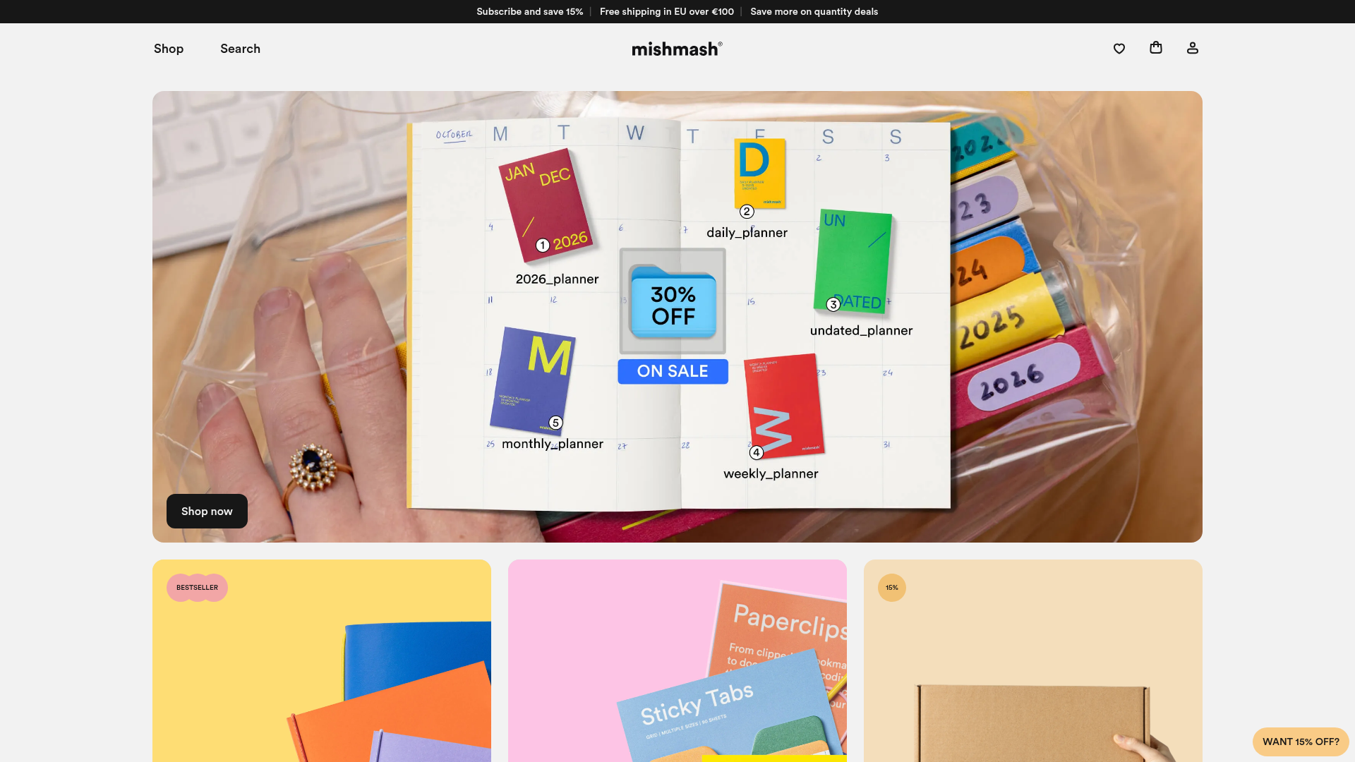
Mishmash is a minimalist stationery e-commerce site that balances high-end editorial photography with a clean, functional UI. It serves as an excellent reference for cloning because it demonstrates how to use large border radii, punchy accent colors, and structured horizontal scrolling to create a modern retail experience.
Design System
- Color Palette & Visual Hierarchy: The design uses a sophisticated neutral base (Whites and Light Greys like
#DFDED6) contrasted with vibrant, solid-color product photography. Accent badges use a "candy-color" palette (Salmon, Sun, Sky, Teal, and Orange) to categorize products and promotions without cluttering the interface. - Typography: The system relies on a clean sans-serif (Inter-like) with strong weight contrasts. Headings use
text-4xltotext-6xlfor impact, while product details utilizetext-xlandtext-lgfont-medium styles to maintain high legibility. - Page Structure: The layout follows a modular flow: a hero grid of variable-width cards (
first:basis-fullfor the top banner), followed by a large-scale brand statement, a multi-item carousel for social proof, and a detailed three-column product comparison section. - Reusable Components:
- Rounded Cards: Images use
rounded-2xl(approx. 16px) creating a soft, friendly aesthetic. - Comparison Cards: These feature custom iconography for specifications (gsm, page count, size) separated by dashed dividers (
border-dashed). - Floating Call-to-Action: A "Want 15% off?" button is fixed to the bottom-right for lead generation.
- Carousel Sliders: Horizontal snap-scroll regions (
snap-x snap-mandatory) with custom dot indicators that expand on hover.
- Rounded Cards: Images use
- Interaction & Motion: The HTML reveals a
group/sliderpattern where navigation dots and arrows appear or enlarge on hover. Buttons usemotion-safe:transition-allwith high-contrast state changes (black background to subtle opacity shifts). - Responsive Behavior: The layout uses Tailwind-style utility classes (
sm:min-w-[19rem],lg:grid-cols-3) to transition from single-column vertical stacks on mobile to horizontal grids on desktop.
Use Cases
- Target Audience: Designers building boutique retail stores, digital product catalogs, or portfolio sites that require a balance between "white space" and high-impact imagery.
- Effective Remixes: This layout is ideal for physical goods with strong visual identities like home decor, independent magazines, or high-end apparel.
- Remix Directions: Replace the dashed specification dividers with solid lines for a more corporate look, or swap the rounded corners to
rounded-noneto shift from "playful" to "brutalist" architecture while keeping the robust grid logic. - Clone Scope: A full-page clone is recommended for those needing a complete Shopify or Headless CMS front-end. Alternatively, the "Which notebook are you?" comparison grid is a perfect individual section clone for adding technical product specs to a landing page.
Related Inspirations

Context Gallery High-End Furniture Landing Page
A minimal editorial layout featuring a multi-column product carousel, designer biographies with image-text pairings, and a magazine-style content grid for curated design stories.

Glein Minimalistic Bento Grid eCommerce
A clean, modular layout using a bento-style responsive grid of text teasers and large-scale product imagery for lookbooks and collection browsing.

Basic.Space E-commerce Gallery Clone
A minimalist product marketplace featuring a clean sticky navigation bar, nested flyout menus, and a horizontally scrollable product carousel with hover-state image switching.

Ashley & Co Lifestyle E-commerce
An elegant Shopify-based storefront featuring a split-screen animated hero, horizontal ticker-tape collection carousel, and dynamic mega-menus with scent-specific color switching and image previews.
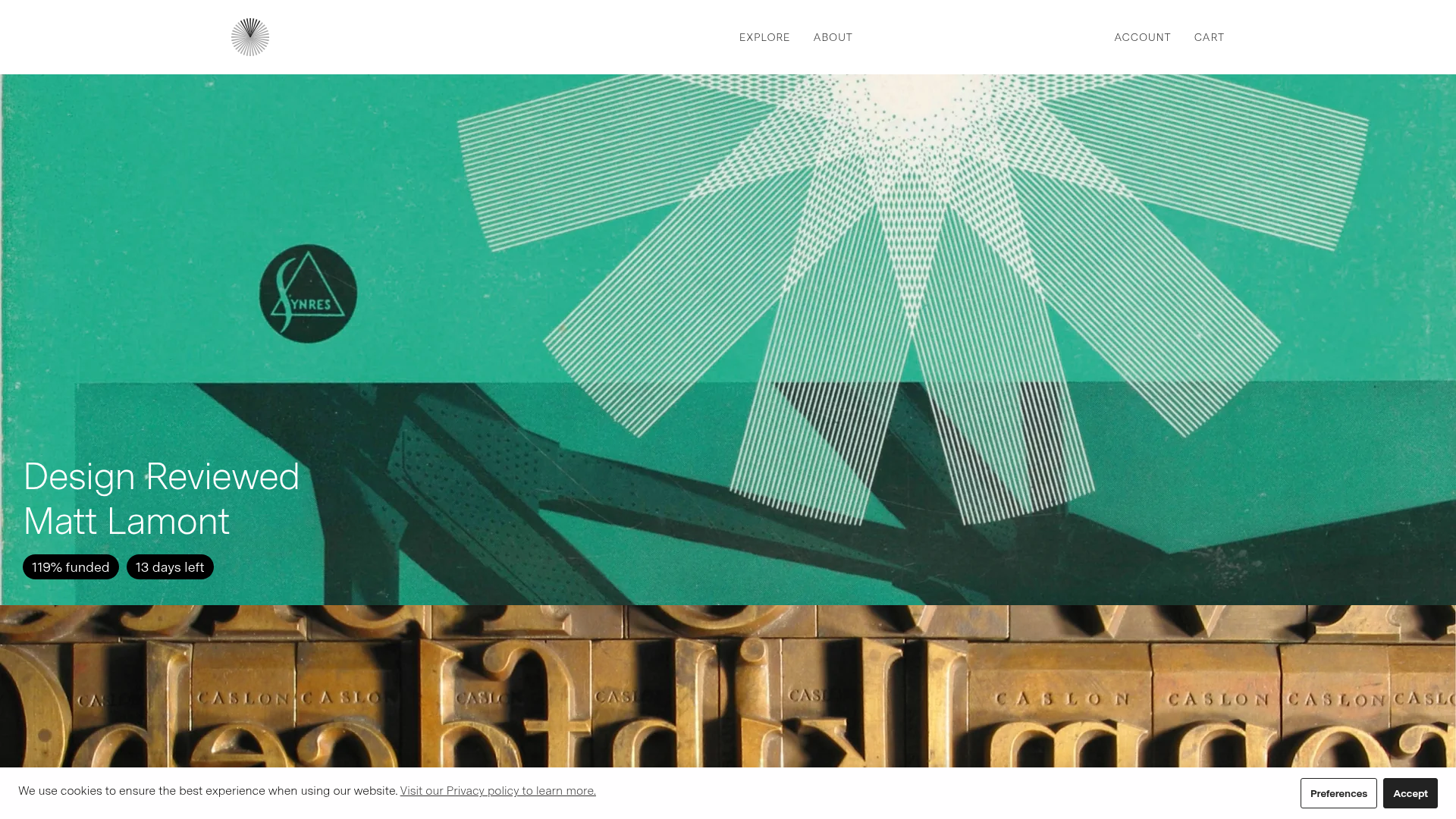
Volume Crowdfunding Book Gallery
A minimalist editorial storefront featuring full-width high-resolution image cards, status pills for campaign progress, and a clean typography-focused navigation layout.
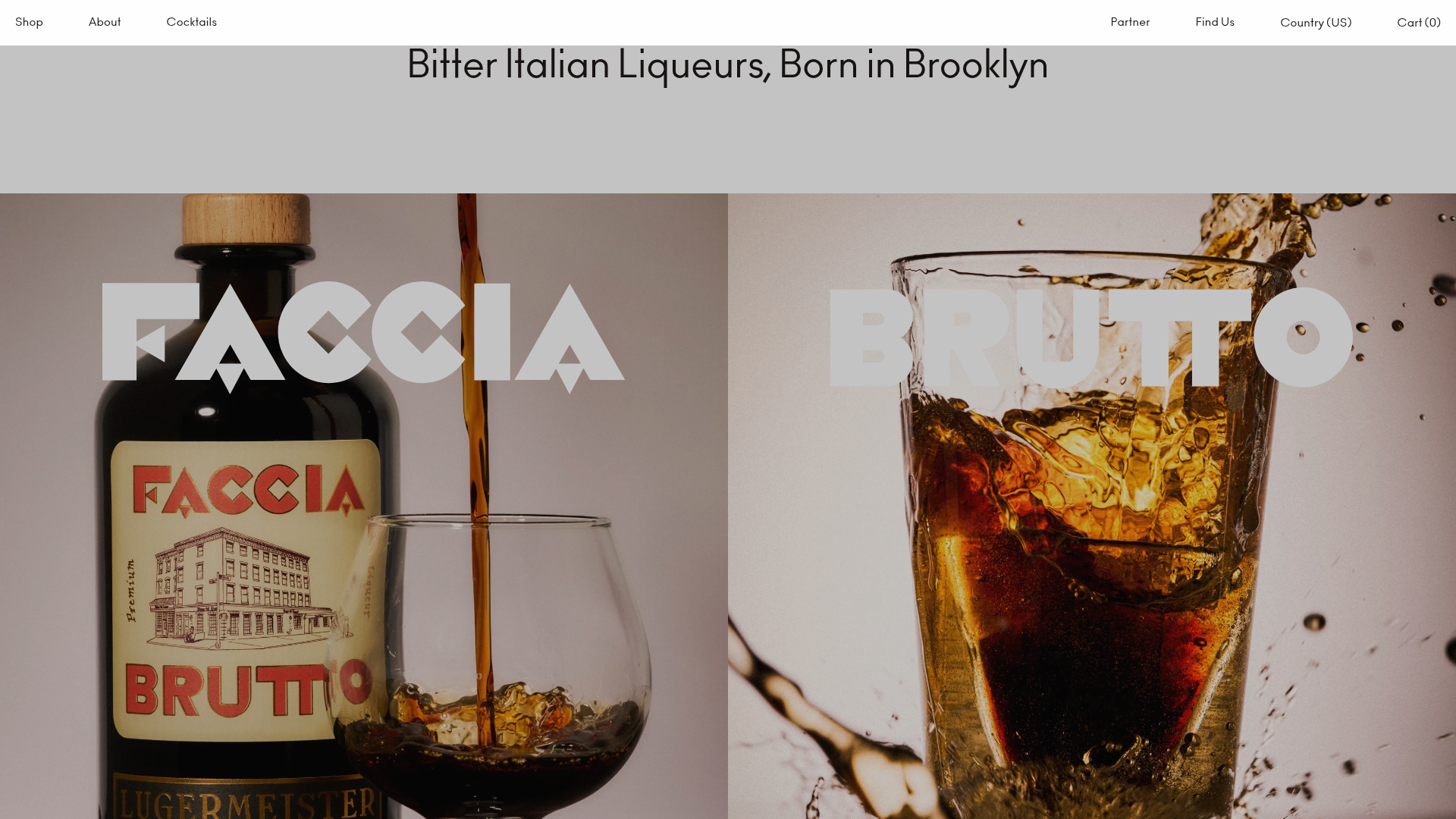
Faccia Brutto Spirits E-commerce Showcase
A refined Shopify layout featuring a split-hero landing, monochromatic bento grid product layouts, and a slide-out cart interaction with a heavy focus on typography-driven design.
