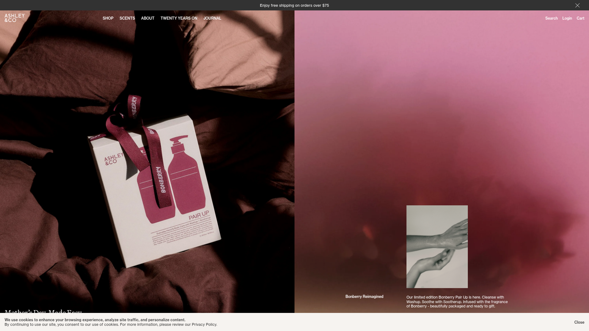
Ashley & Co Lifestyle E-commerce
An elegant Shopify-based storefront featuring a split-screen animated hero, horizontal ticker-tape collection carousel, and dynamic mega-menus with scent-specific color switching and image previews.
Overview
This elegant Shopify storefront for a luxury lifestyle brand demonstrates a sophisticated split-screen layout and data-driven navigation. It is an excellent reference for high-end e-commerce clones due to its seamless blend of atmospheric lifestyle photography with a highly functional, interactive product discovery system.
Design System
- Color Palette & Visual Hierarchy: The palette is deeply rooted in earthy tones (chocolate browns, muted pinks, sage greens) paired with high-contrast monochrome (white and black). The visual hierarchy uses large-scale full-bleed imagery to establish mood, while essential utility elements (Search, Login, Cart) are kept minimal in the top-right corner.
- Typography: The system uses a classic serif font for main headers (e.g., "Mother’s Day, Made Easy") to convey heritage, contrasted with a modern, sans-serif font for body copy, navigational labels, and product details. All-caps styling is used for secondary navigational emphasis.
- Page Structure & Flow: The layout follows a modular flow: a Split-Screen Hero (50/50 image split) leads into a horizontal Ticker-Tape collection carousel, followed by a Featured Product grid ("Welcome in") and a tabbed "Click-to-Reveal" section for Best Sellers and New Releases.
- Reusable Components:
- Scents Mega-Menu: A highly functional component that uses
data-bg-coloranddata-text-colorattributes to change the menu's background dynamically based on the hovered scent. - Ticker-Tape Carousel: A custom
<ticker-tape>element used for browsing categories with variable-width items. - Product Cards: Featuring aspect-ratio-controlled images (
aspect-[46/59]), hover-reveal images (card__hover-img), and quick-add buttons.
- Scents Mega-Menu: A highly functional component that uses
- Interactions & Motion: The site uses hover-based image swapping for product cards and a transition-heavy navigation menu. The mega-menus utilize a backdrop overlay to blur the main content, focusing the user's attention on the menu items and high-resolution preview images.
- Responsive Behavior: The 50/50 split hero collapses to a single-column stack on mobile. Navigation transitions from a horizontal desktop bar to an accordion-style mobile drawer.
- Implementation Clues: The HTML reveals a custom-built Shopify theme using utility-first CSS classes (Tailwind-like prefixes like
tw-row--gridandmd:col-span-12), and custom elements/Web Components like<mega-menu>,<ticker-tape>, and<product-card-hover>.
Use Cases
- Who should clone this: Brands in the beauty, fragrance, interior design, or luxury pet care sectors looking for a boutique, gallery-like shopping experience.
- Ideal Product Remixes: High-ticket items with strong visual narratives, such as artisanal spirits, designer furniture, or high-end skincare.
- Practical Remix Directions:
- Scent-Based UI: Reuse the "Scents" mega-menu logic for product attributes like "Materials" or "Flavor Profiles."
- Information Architecture: Adapt the top-level categories (Shop, Scents, Journal) to separate product-heavy browsing from brand story-telling.
- Hero Adaptation: Use the split-screen hero for "Lookbook" versus "Shop Now" side-by-side calls to action.
- Clone Scope: Start with the Mega-Menu system for improved discovery, then the Ticker-Tape carousel for a modern alternative to traditional grid category lists.
Related Inspirations

Context Gallery High-End Furniture Landing Page
A minimal editorial layout featuring a multi-column product carousel, designer biographies with image-text pairings, and a magazine-style content grid for curated design stories.

Glein Minimalistic Bento Grid eCommerce
A clean, modular layout using a bento-style responsive grid of text teasers and large-scale product imagery for lookbooks and collection browsing.

Basic.Space E-commerce Gallery Clone
A minimalist product marketplace featuring a clean sticky navigation bar, nested flyout menus, and a horizontally scrollable product carousel with hover-state image switching.
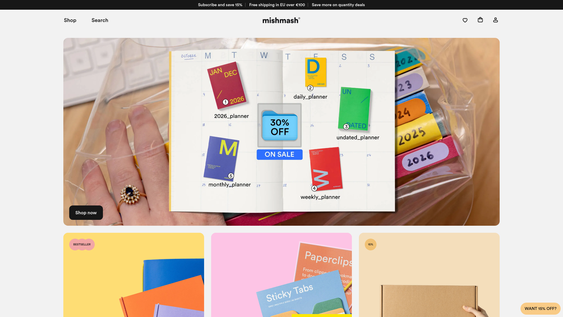
Mishmash Stationery E-commerce Layout
A clean retail template featuring rounded image grids, a multi-column comparison section with custom iconography, and a responsive products carousel.
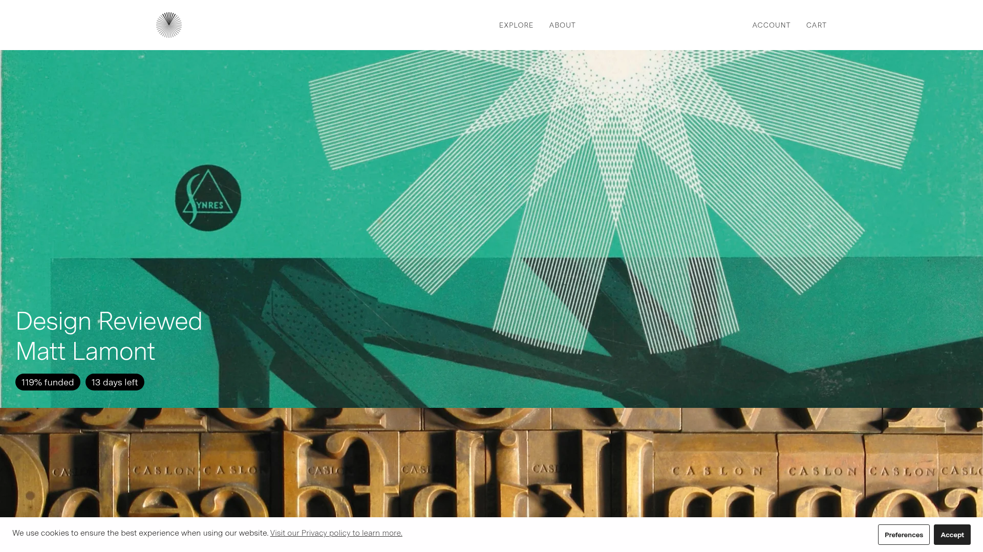
Volume Crowdfunding Book Gallery
A minimalist editorial storefront featuring full-width high-resolution image cards, status pills for campaign progress, and a clean typography-focused navigation layout.
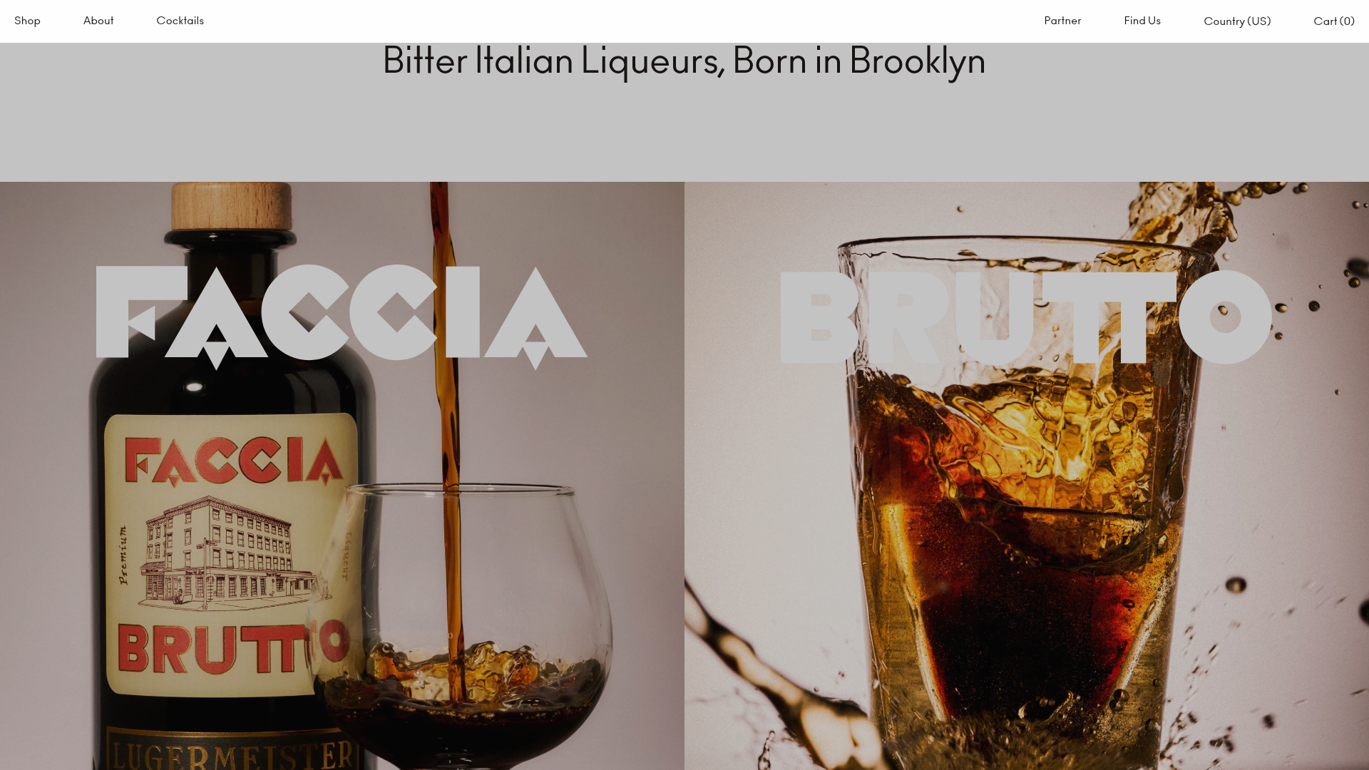
Faccia Brutto Spirits E-commerce Showcase
A refined Shopify layout featuring a split-hero landing, monochromatic bento grid product layouts, and a slide-out cart interaction with a heavy focus on typography-driven design.
