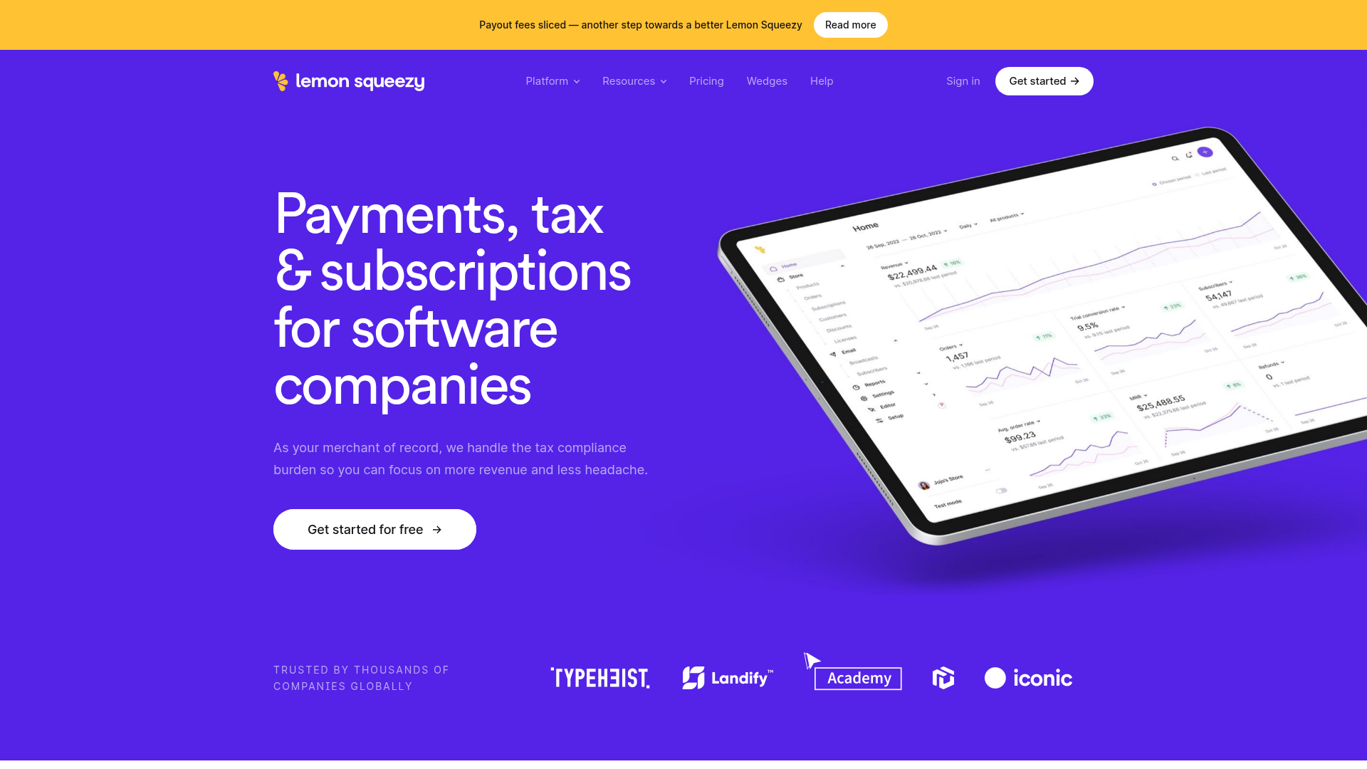
Lemon Squeezy SaaS Platform Landing Page
A high-conversion SaaS layout featuring a vibrant gradient hero, vertical tabbed feature sections, skewed device mockups, and a layered testimonial grid.
Overview
Lemon Squeezy’s landing page is a masterclass in modern SaaS design, utilizing high-contrast gradients and organized sectioning to simplify a complex Merchant of Record product. It is a premier reference for builders due to its seamless integration of product mockups with technical copywriting and its highly scalable vertical-tabbed feature navigation.
Design System
- Color Palette & Visual Hierarchy: The brand identifies with a vibrant "Lemon" yellow and "Blue Violet" (#6366f1) palette. It uses a high-contrast strategy where primary sections sit on saturated violet backgrounds, while secondary explanatory sections transition to neutral "Smoke White" or pure white. Accent colors (Indian Red, Orchid, Sea Green) are used to categorize specific product features (Ecommerce, Marketing, Reporting).
- Typography: The system uses a clean Sans-Serif font (likely Inter or custom geometric sans) with a tiered scale. H2 headings are significantly larger for impactful value propositions, while small caps "text-style-title" labels provide clear categorizations for each scroll section.
- Page Structure:
- Announcement Banner: Urgent top-strip for news.
- Hero: Centered copy with a skewed tablet mockup.
- Logo Cloud: Greyscale icons for social proof.
- Vertical Tabs: A high-functionality section (
info-tab_component) that cycles through six distinct value props paired with mobile device mockups. - Categorized Feature Blocks: Alternating feature grids divided by color (Ecommerce in Red, Marketing in Blue, Reporting in Green).
- Developer/Internal Case Studies: Large-scale image-and-text blocks for technical depth.
- Layered Testimonial Grid: A staggered card layout for reviews.
- Reusable Components:
- Interactive Tabs: Clone the
.info-tab_itemstructure for feature-rich landing pages. - Service Cards: The
.service-cards_itemuses a numeric label (e.g., e/1, m/1) and subtle hover transforms. - Primary Buttons: Rounded buttons with arrow icons and hover color-fill states.
- Interactive Tabs: Clone the
- Motion Patterns: The site heavily utilizes scroll-based entrance animations. HTML classes like
data-w-idsuggest a Webflow-driven interaction system where elements slide upwards (2rem offset) and fade in (opacity 0 to 1) as they enter the viewport. - Responsive Behavior: The
.info-tab_mobile-contentclass indicates that the desktop side-by-side tabs collapse into a vertical stack on mobile, ensuring product images remain visible beneath their respective headers.
Use Cases
- Who should clone this: Fintech startups, developer tool providers, or any SaaS platform offering an "all-in-one" solution that requires explaining multiple distinct feature sets (e.g., payments + marketing + analytics).
- Remix Directions: Developers can reuse the Vertical Tab Section as a standalone module for a product feature tour. The Feature Grid (e/1, e/2) is easily adaptable for a "Services" or "Capabilities" page by swapping the icons and changing the accent border colors.
- Suggested Scope: For a quick win, clone the Hero and Logo Cloud to establish immediate credibility. For a deep project, clone the Vertical Tabs and Feature Layout Sections to handle long-scroll information architecture effectively without overwhelming the user.
Related Inspirations
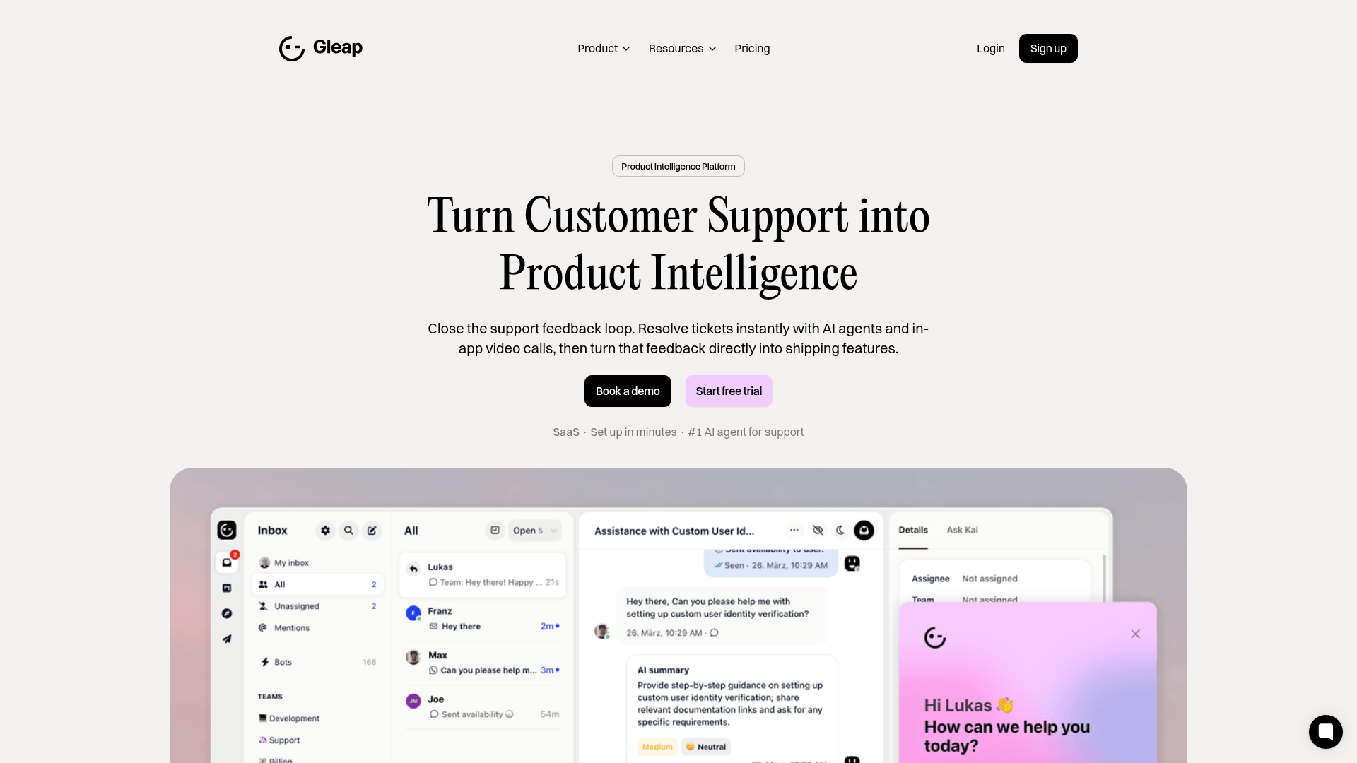
Gleap Product Intelligence Platform Landing
A SaaS template featuring a central video hero, comparison pricing tables, tabbed feature navigation, and a testimonial grid with major brand logos.
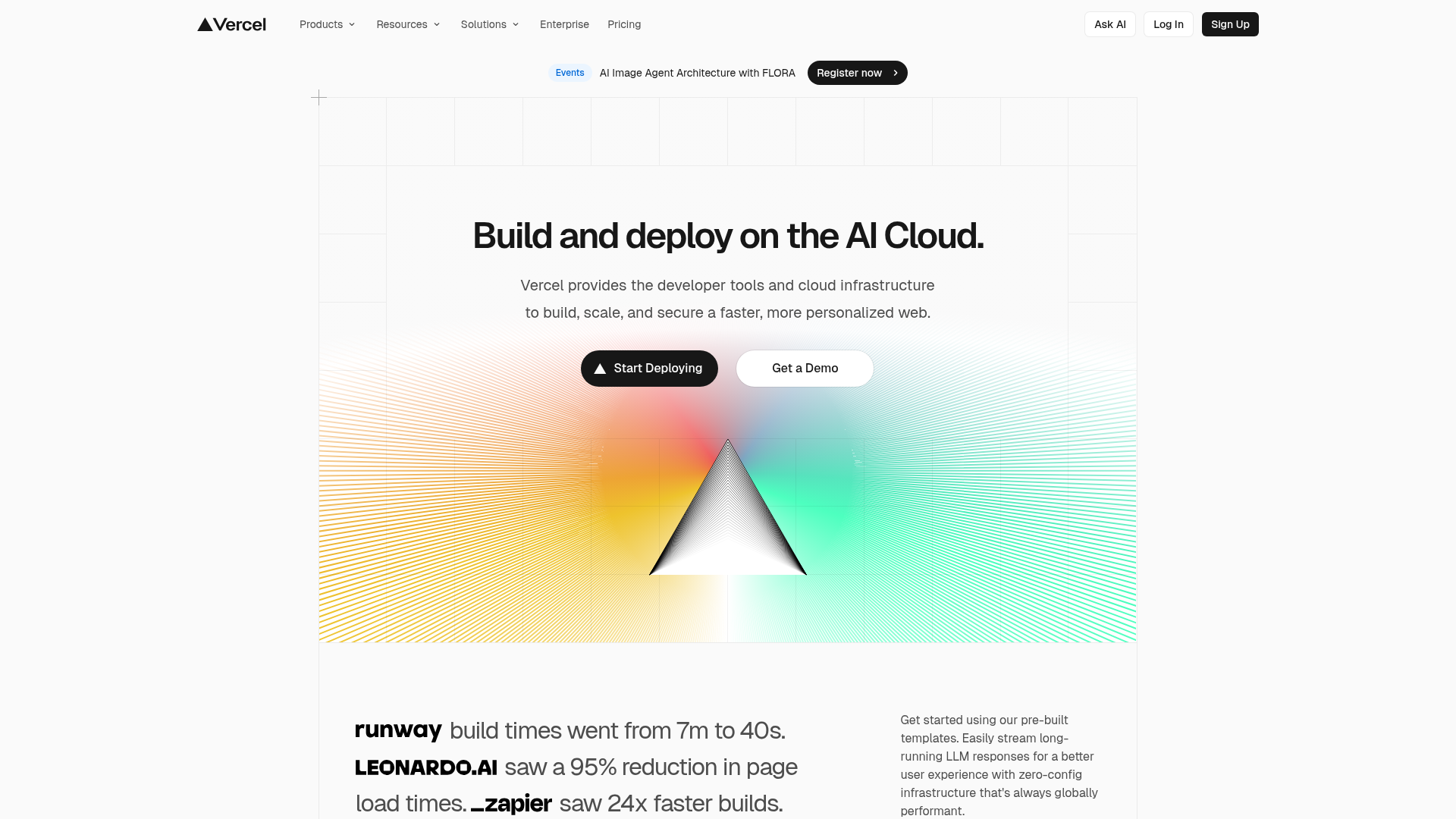
Vercel AI Cloud Landing Page
A modern landing page featuring a minimalist dark-themed navbar, a grid-overlay hero section with radial color gradients, and high-contrast typography for customer success stories.
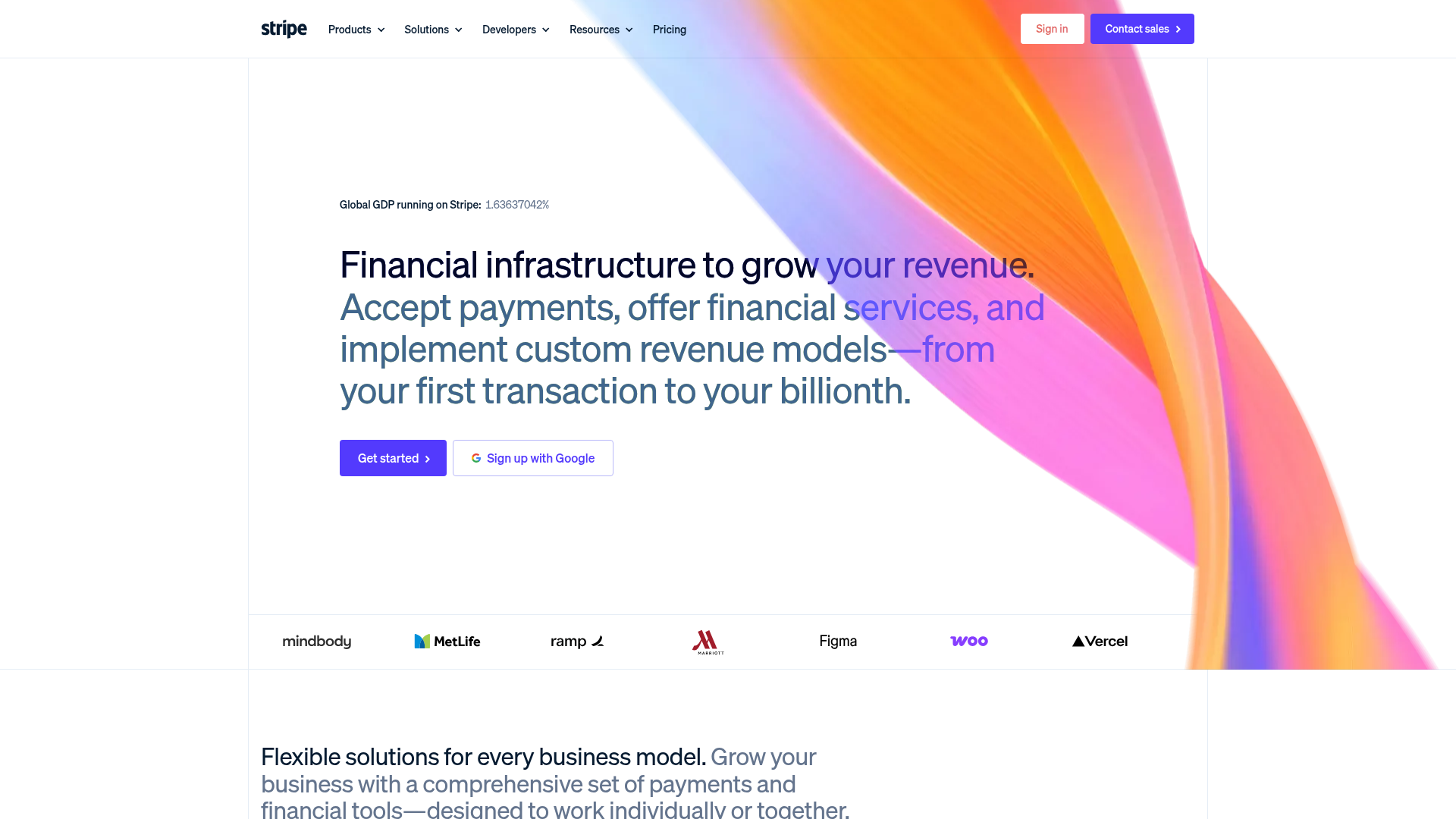
Stripe Modern SaaS Landing Page
A high-conversion landing page featuring a complex mesh-gradient hero, sticky navigation, and a horizontal logo wall for brand social proof.
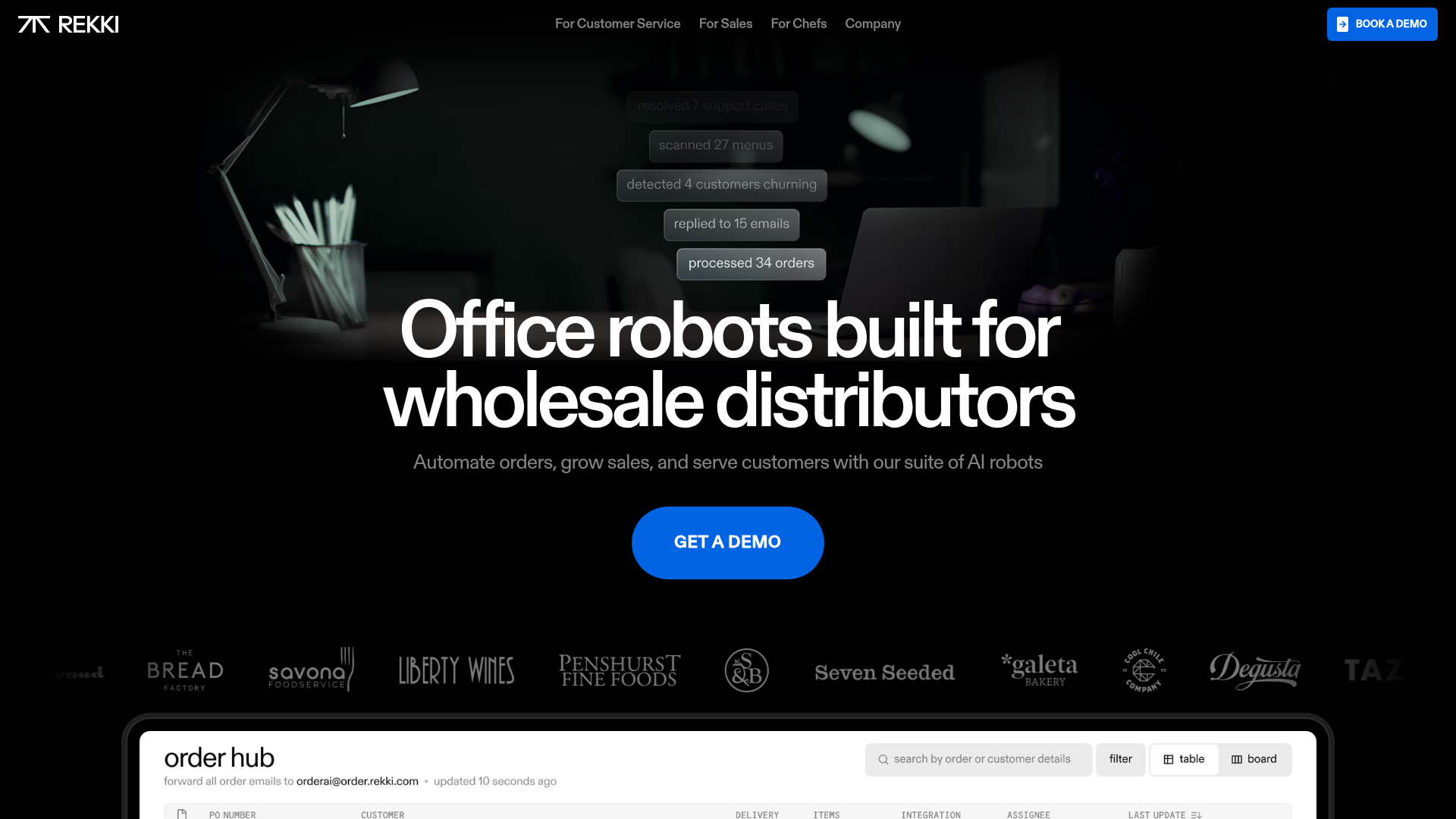
REKKI AI Automation SaaS Landing Page
A high-impact dark-mode landing page featuring a floating label hero section, marquee brand logos, an interactive dashboard UI preview, and card-based testimonial grids.
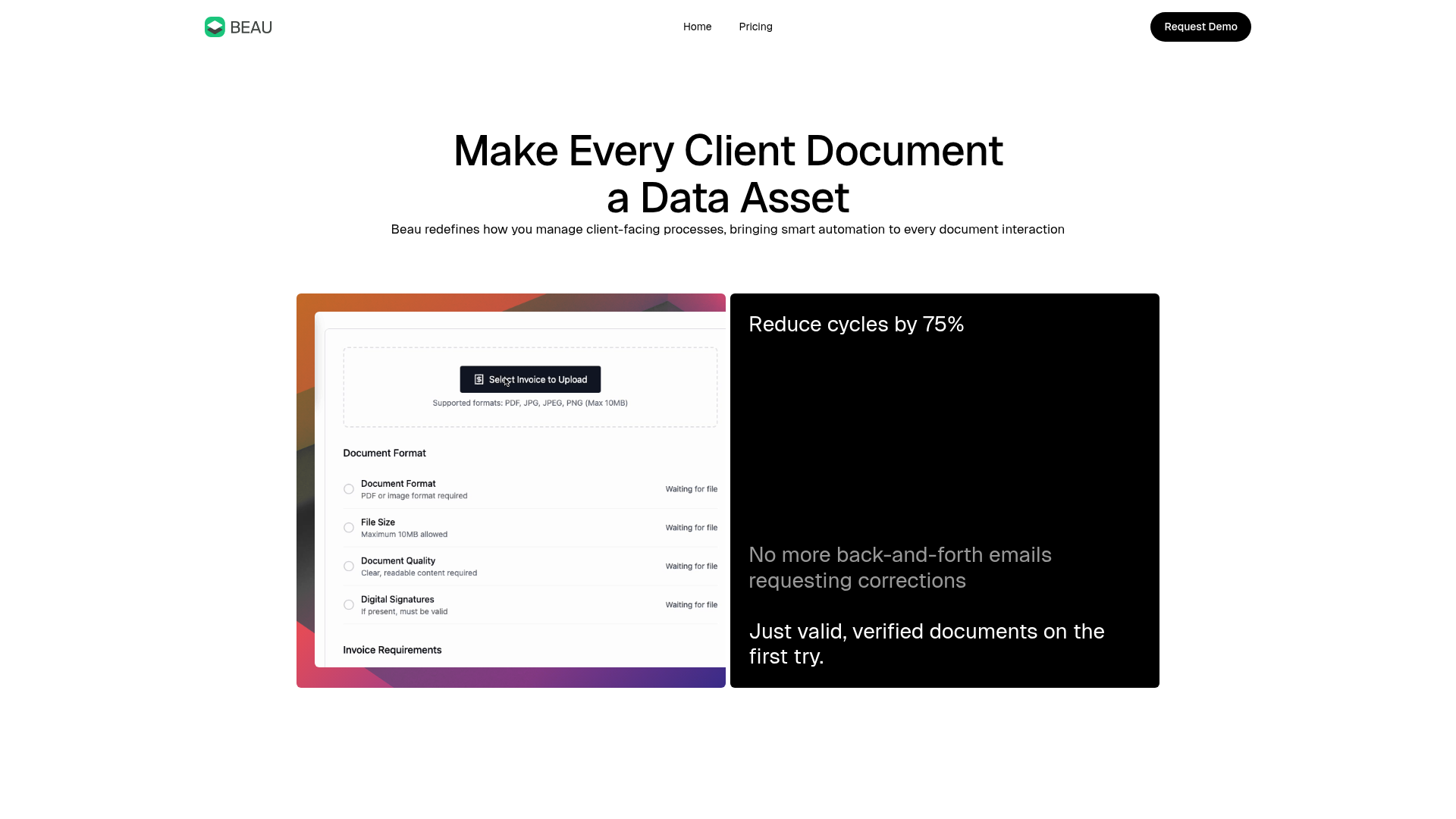
Beau Document Automation Landing Page
A modern software landing page featuring a bento-grid layout, split-screen hero assets with animated checkmarks, a step-by-step process guide, and a clean two-tier pricing table.
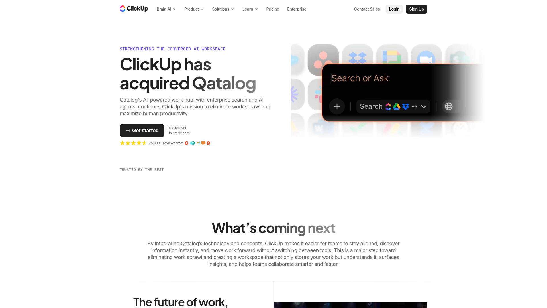
ClickUp Acquisition Hero Landing Page
Features a modern dark-themed hero section with a search UI graphic, bento-style feature grid, and a high-contrast CTA section with decorative gradients.
