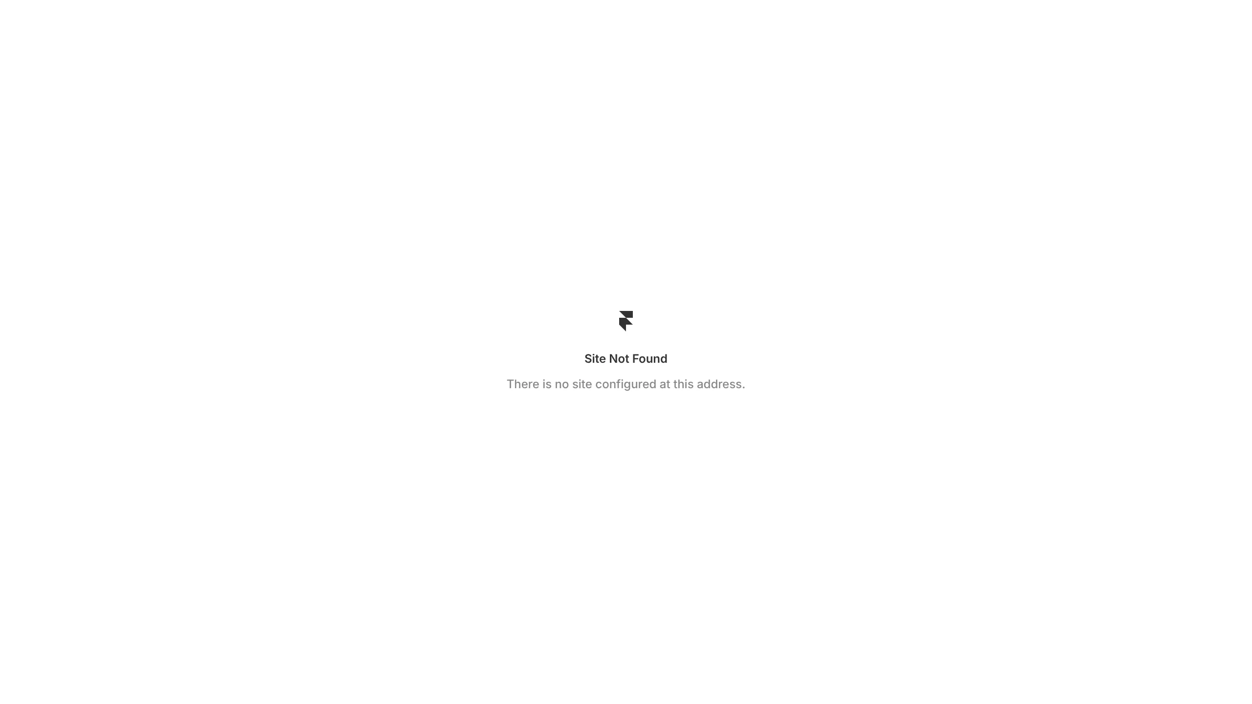
Framer Site Not Found Page
A minimalist, center-aligned 404 error page template featuring a simple logo placeholder, title, and descriptive text layout.
Overview
This is a minimalist 'Site Not Found' template designed for the Framer platform, featuring a clean, centered layout for handling 404 or configuration errors. It serves as an excellent reference for builders looking to implement high-end whitespace management and focused information hierarchy in utility pages.
Design System
- Color Palette & Visual Hierarchy: The design utilizes a stark high-contrast mono-chromatic palette, with a pure
#FFFFFFbackground and grayscale text (#333333for the title and a lighter#888888for the description). The hierarchy is strictly vertical and centered, drawing immediate focus to the status message. - Typography: The typography uses a clean sans-serif stack. The title "Site Not Found" employs a medium font weight with tight letter spacing for a professional look, while the subtext uses a smaller scale and lighter weight to denote secondary information.
- Page Structure: The layout follows a classic dead-center alignment (vertical and horizontal centering). It consists of three primary elements: a geometric logo/icon at the top, a primary header in the middle, and a single-line descriptive string at the bottom.
- Reusable Components: The core component to clone is the centered container wrapper, which provides perfectly balanced padding and alignment for error states or maintenance screens.
- Responsive Behavior: Given the minimalist structure and center-alignment visible in the capture, the layout is inherently responsive, gracefully maintaining its centered position across all viewport sizes.
Use Cases
- Who should clone this pattern: Developers or designers building custom 404 error pages, maintenance screens, or 'coming soon' splash pages who want a sophisticated, minimalist starting point.
- Product Remixes: This pattern can be effectively remixed for SaaS dashboard login screens, password-reset confirmation pages, or simple link-in-bio landing pages.
- Remix Directions: Builders should swap the placeholder logo for their brand mark, update the hex codes to match their brand palette, and add a primary 'Return Home' button beneath the description text to improve user flow.
- Clone Scope: Single-page clone. This is best used as a standalone utility page within a larger site architecture.
Related Inspirations
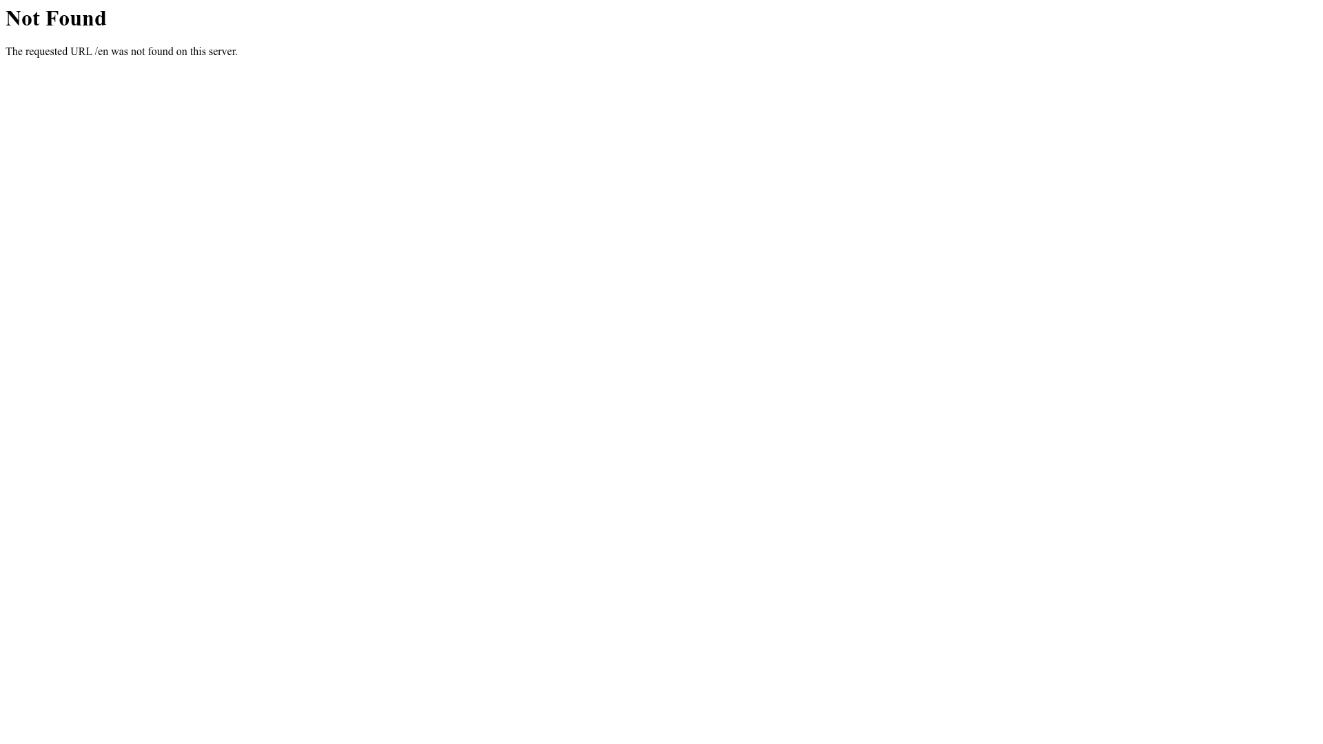
404 HTTP Error Landing Page
A minimal, text-only placeholder page showing a standard server-side 'Not Found' error message for a missing directory.
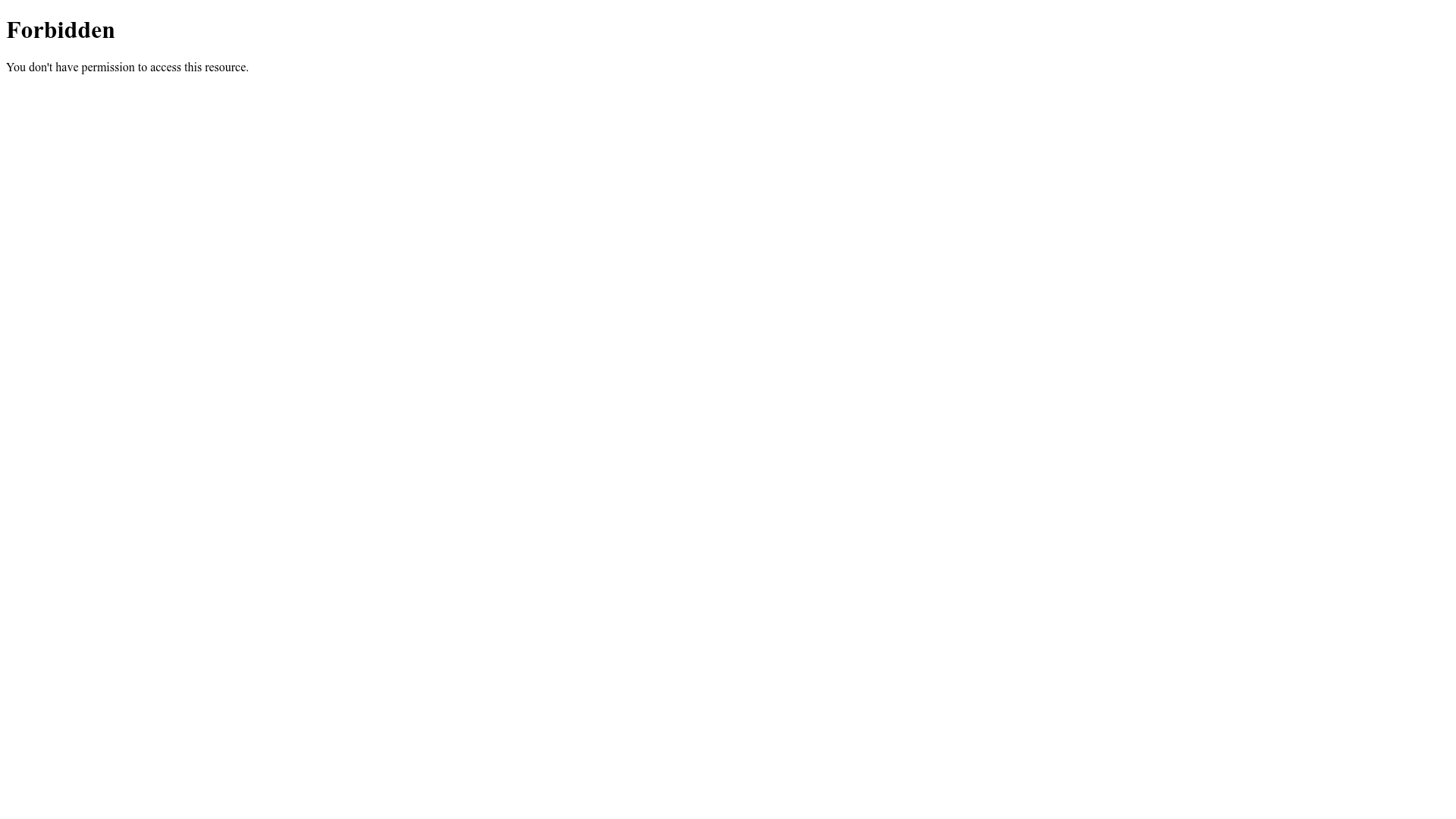
Forbidden Access Error Page
A minimal 403 Forbidden error page layout featuring basic typography and a standard access notification message.
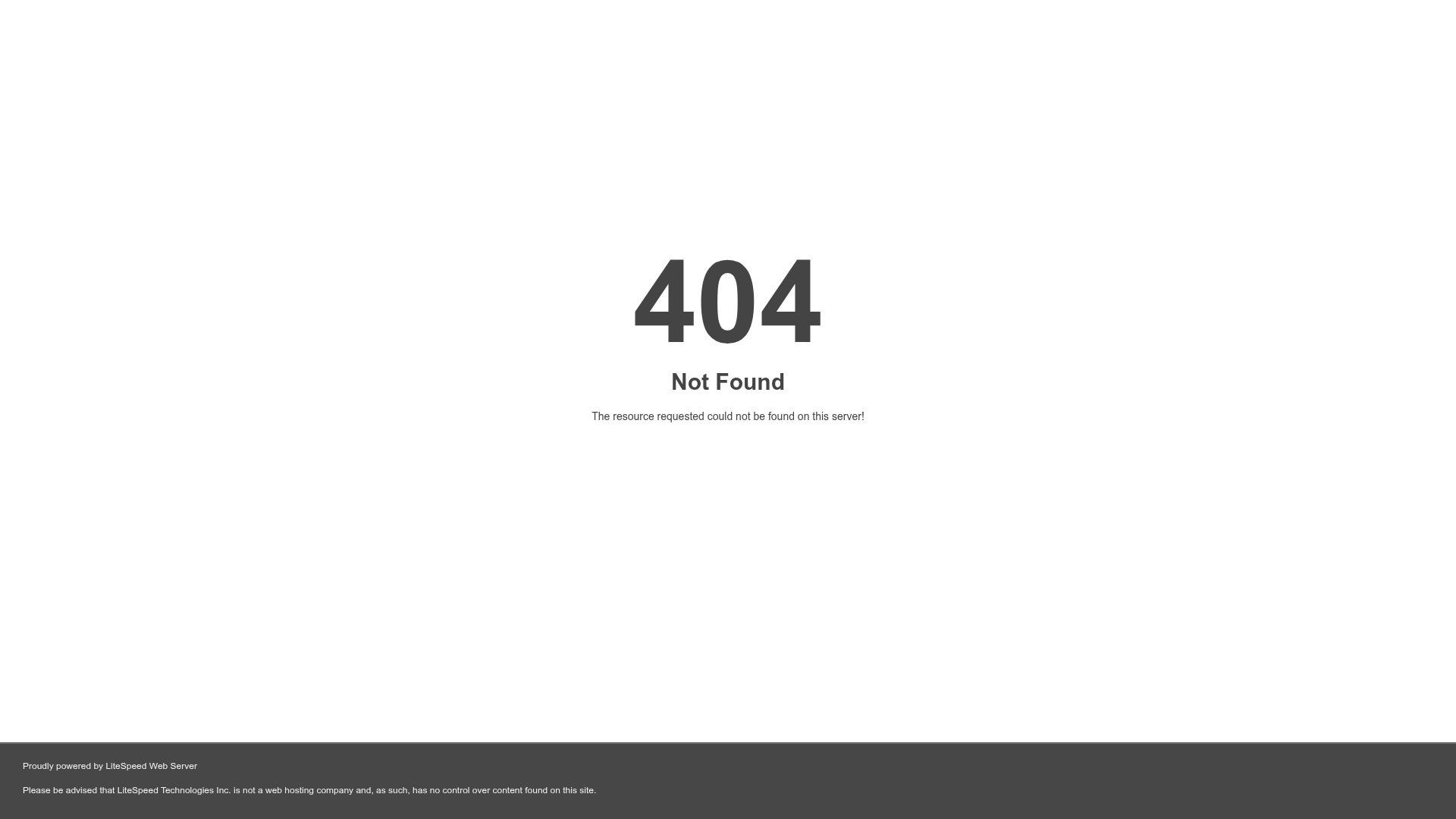
LiteSpeed Default 404 Error Page
A minimalist, centered 404 error page layout with a simple hero message and a dark footer containing technical disclaimers.
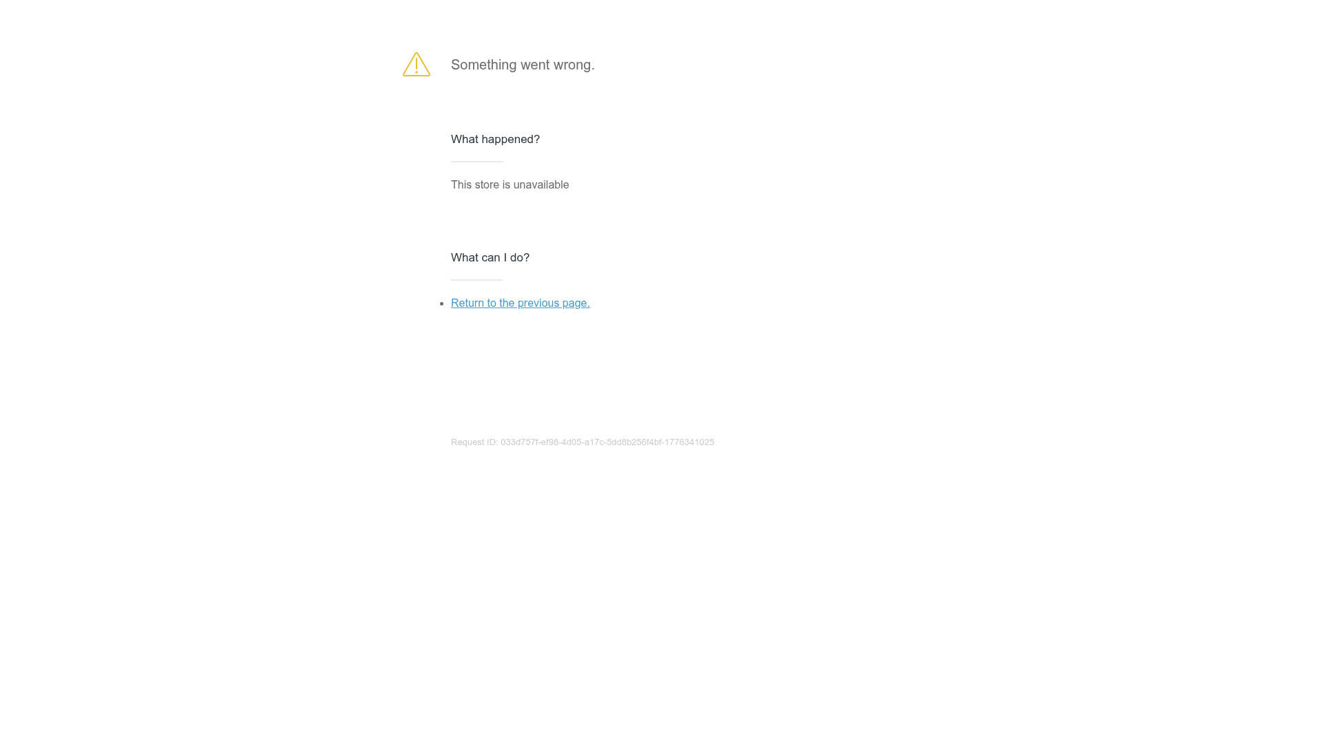
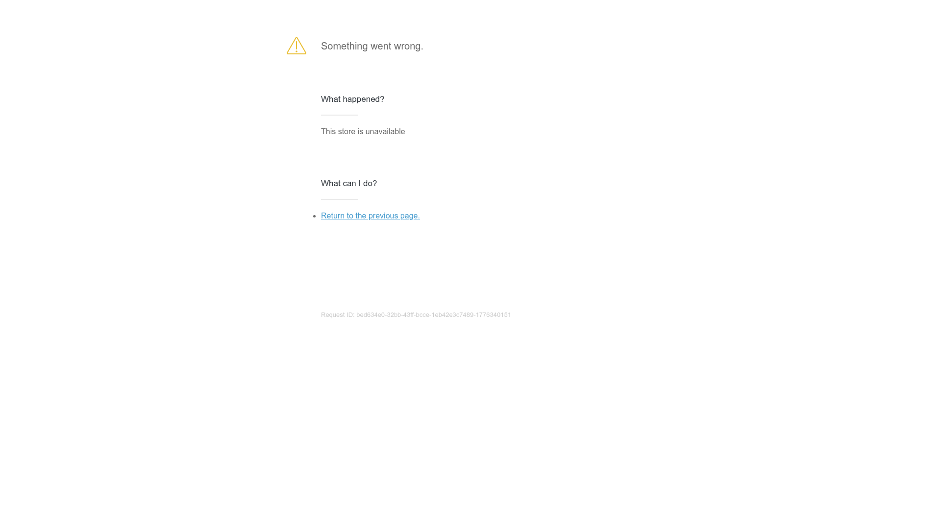
Generic Unavailable Store Error Page
A minimal error screen featuring a stacked information layout, warning icon, and simple navigation links for handling site-wide downtime.
Minimal Error Page with Troubleshooting
A clean, functional maintenance or error page layout featuring a warning icon, descriptive text sections, and simple navigation links for user recovery.

Egstad Minimalist Design Portfolio
A refined Nuxt.js portfolio featuring bold variable typography, interactive canvas elements, and a clean grid-based layout for showcasing design work.
