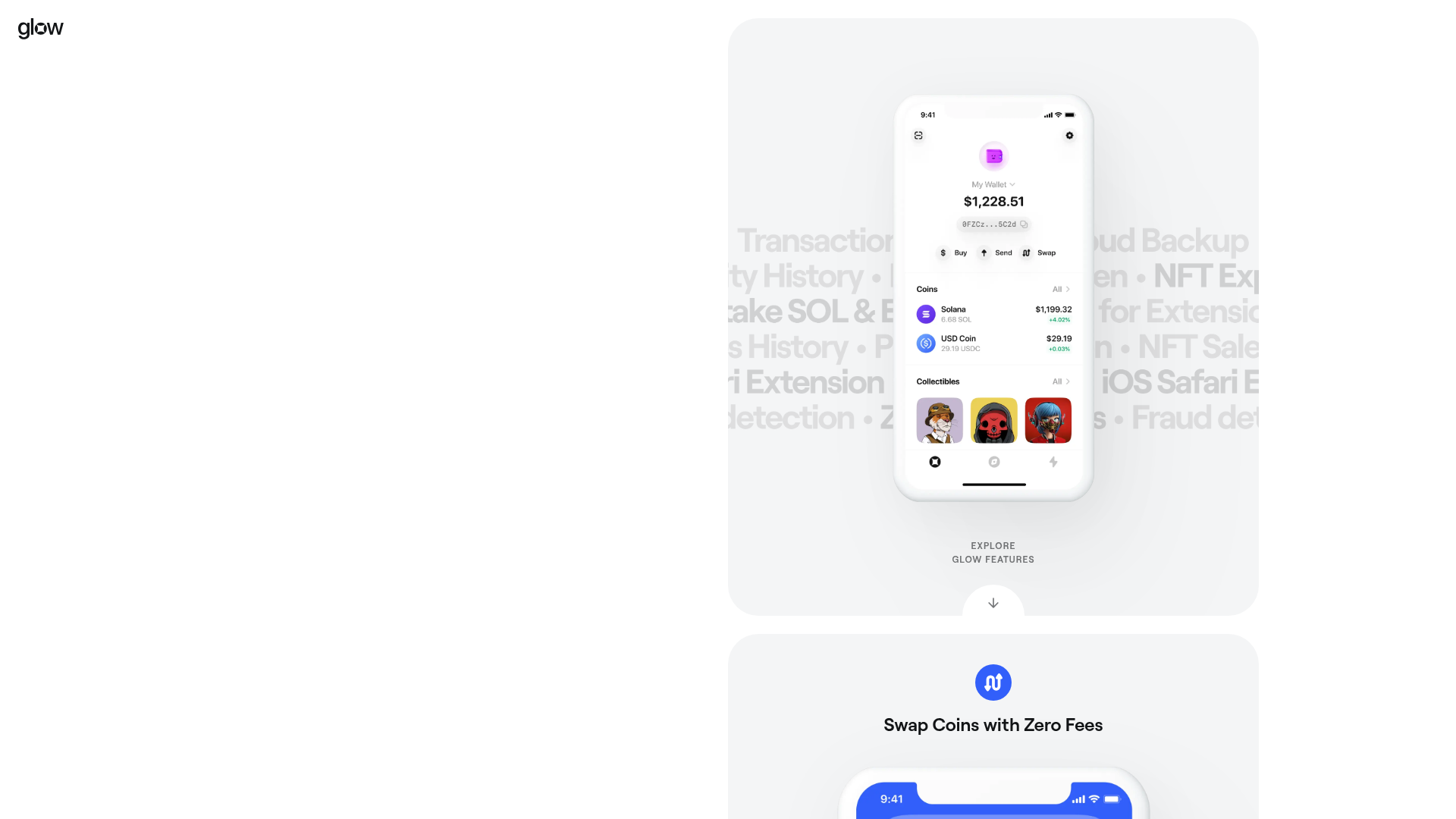
Glow App Solana Wallet Showcase
A sleek crypto landing page featuring an icon switcher hero, centered full-bleed device mockups, and vertically stacked product feature sections with smooth scroll transitions.
Overview
Glow App is a high-fidelity landing page for a Solana crypto wallet that uses a minimalist aesthetic to highlight product features. It is an excellent clone reference for developers looking to master vertical storytelling through centered device mockups, subtle background gradients, and icon-based feature modules.
Design System
- Color Palette & Visual Hierarchy: The site uses a clean, high-contrast palette with a white/light-gray background and vibrant brand colors (blue, purple, orange) for icons and call-to-action buttons. Backgrounds utilize soft radial glows that shift as the user scrolls, creating a sense of depth around the central device.
- Typography: The design uses a modern geometric sans-serif (Roobert). The scale features large, centered H2 headers for feature titles, medium-weight body text for descriptions, and small uppercase 'badges' (like the 'NEW' tag) for secondary emphasis.
- Page Structure: The layout follows a linear vertical progression: Hero section (App icon switcher and primary CTAs) -> Full-bleed device mockup -> Vertically stacked feature sections (Swap, Activity, NFTs, Staking, dApps) -> Store download matrix.
- Reusable Components:
- Icon Switcher: A hero component that cycles through different app icon variations.
- Floating Device Mockups: CSS-wrapped image containers that serve as the focal point of every scroll section.
- Interactive Buttons: Pill-shaped 'luma-button' components with solid brand colors and rounded corners.
- Section Icons: Centered circles with glyphs that introduce each new product benefit.
- Interaction & Motion: The HTML indicates an 'active' state for the app icon switcher and 'animated' classes for quotes and download cards. The primary movement is a vertical scroll that anchors device mockups in the center of the viewport.
- Responsive Elements: On mobile, the desktop browser extension CTA is hidden or deprioritized, and the layout collapses into a single-column stack with full-width images.
- Implementation Clues: Built with Next.js (
__nextid), the site uses scoped CSS (represented byjsx-classes) and handles light/dark mode variants through specificlight-onlyanddark-onlyclass wrappers for images.
Use Cases
- Who should clone this: Fintech startups, Web3 wallet developers, and SaaS companies with high-quality mobile app interfaces to showcase.
- Remix Directions: Replace the crypto-specific device screens with dashboard UI for a productivity app; adapt the 'Burn and Earn' video section into a software demo loop; or reuse the browser extension download grid for multi-platform software tools.
- Suggested Scope: A full-page clone is ideal for those wanting a cohesive, scroll-driven presentation. Alternatively, the 'Download Section' is an excellent standalone component for any cross-platform application landing page.
Related Inspirations
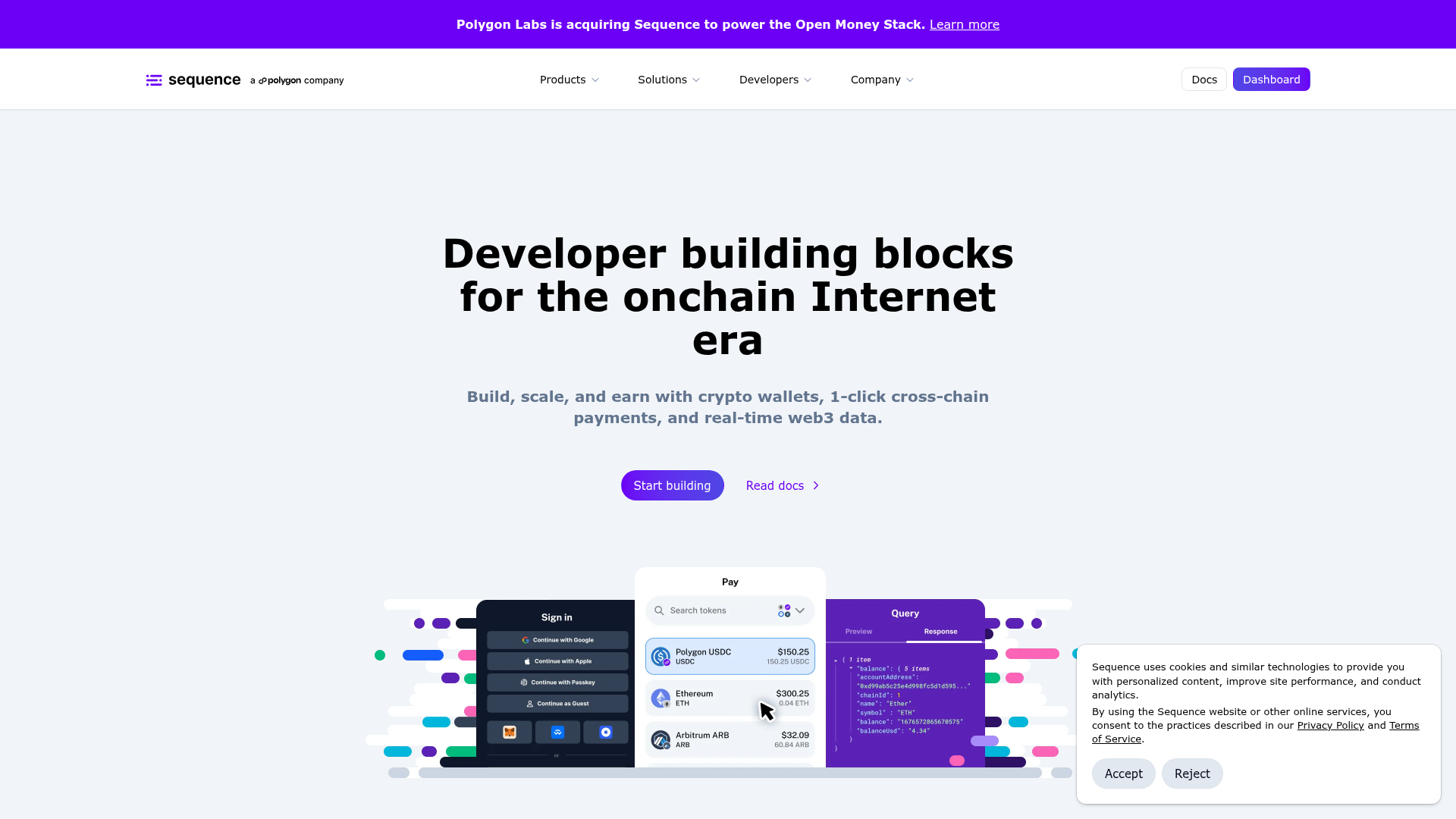
Sequence Onchain Web3 Landing Page
A developer-focused landing page featuring a purple theme, sticky navigation, alternating product feature sections, a partner logo carousel, and vertical-based solution cards.
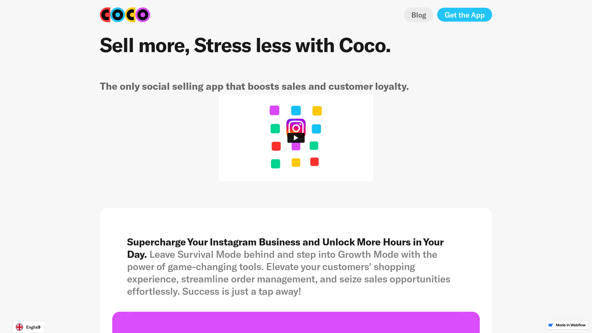
Coco Social Selling Landing Page
A clean Webflow-based landing page featuring a centered video hero section and alternating feature-rich cards with integrated mobile app mockups.
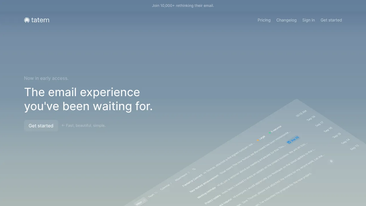
Tatem Minimalist Productivity Landing Page
A refined SaaS landing page featuring a sticky scroll-based UI, 3D CSS transforms in the hero, and clean feature sections with interactive UI component demos.
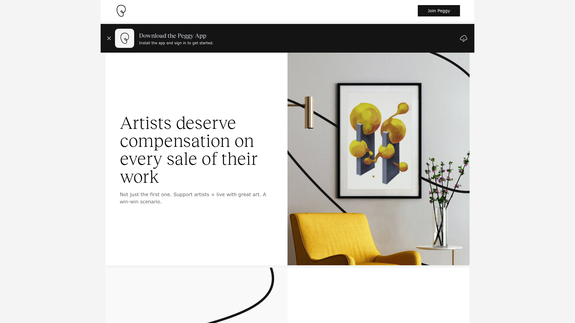
Peggy Art Royalties Pitch Page
A clean storytelling layout featuring alternating image-text sections, a three-column testimonial grid with circular avatars, and a icon-based feature grid for brand values.
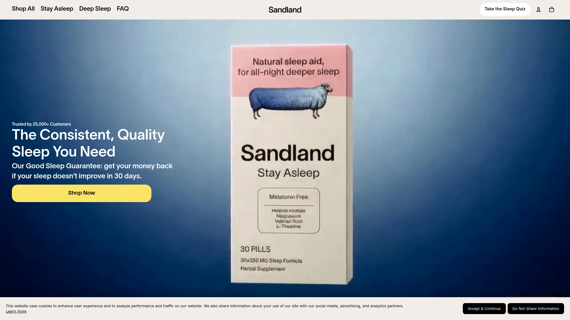
Sandland Sleep Product Landing Page
A high-conversion Shopify layout featuring split-video hero sections, logo-based social proof ribbons, and a testimonial slider integrated with biometric sleep tracker results.
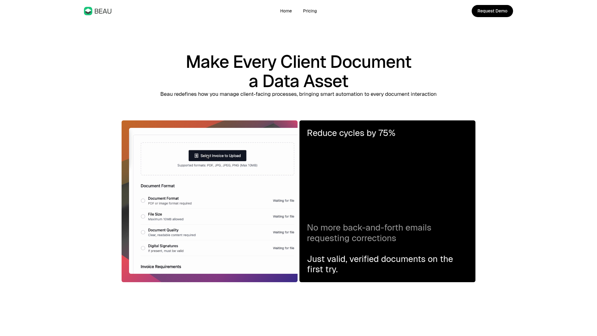
Beau Document Automation Landing Page
A modern software landing page featuring a bento-grid layout, split-screen hero assets with animated checkmarks, a step-by-step process guide, and a clean two-tier pricing table.
