Sequence Onchain Web3 Landing Page
A developer-focused landing page featuring a purple theme, sticky navigation, alternating product feature sections, a partner logo carousel, and vertical-based solution cards.
Overview
Sequence's onchain landing page is a masterclass in modern developer marketing, effectively balancing high-level value propositions with technical credibility. It is a strong clone reference for its clean execution of the "feature showcase" layout, utilizing a sophisticated purple-accented dark and light UI that feels premium and reliable.
Design System
- Color Palette & Visual Hierarchy: The site uses a foundational palette of
slate-100andwhitebackgrounds, punctuated by a vibrant brand-primary purple (#615FFF). Hierarchy is established through the bold use of these purple accents in buttons, badges, and headers, effectively drawing attention to calls-to-action against neutral text. - Typography System: The design features a heavy, geometric sans-serif for headings (
h1toh3), emphasizing authority. Body text uses a secondary scale (body-3,body-16,body-18) with varying weights to distinguish between descriptive text and customer testimonials. - Page Structure & Section Flow:
- Top Banner: High-contrast announcement bar.
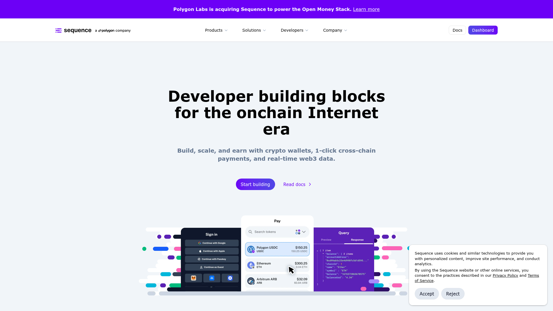
- Hero Section: Centered text with a prominent product visualization image.
- Logo Carousel: An infinite-scroll horizontal marquee of partner logos (
Google Cloud,Ubisoft, etc.) to establish social proof. - Product Feature Cards: Large, alternating
grid-cols-2blocks with a text-rich side and a graphic/screenshot side. - Vertical Solutions: A 4-column grid of smaller, uniform cards for specific industry use cases (Chains, DeFi, etc.).
- Social Proof: A single, high-impact
aspect-ratio: 16/9testimonial block. - Footer CTA: A clean "Start Building" section with a decorative graphical footer.
- Reusable Components:
- Pop Badges: Small rounded badges (e.g., "Wallets", "Payments") used above headers for categorization.
- Action Buttons: Clearly defined
data-variant="bold"(solid purple) anddata-variant="subtle"(outlined/grey) buttons. - Raised Cards: The
data-variant="raised"card component provides subtle depth using shadows and rounded corners (typically1.5rem).
- Implementation Clues: The HTML reveals a heavy reliance on Tailwind CSS utility classes (e.g.,
flex-1,gap-10,max-w-140) and custom data attributes for component variants (data-component="button"), suggesting a modular React or Vue-based architecture.
Use Cases
- Who should clone this: Web3 infrastructure providers, SaaS platforms with developer-facing APIs, and fintech startups needing a balance of "enterprise-grade" and "cutting-edge" aesthetics.
- Effective Remixes:
- Brand Swap: Replace the purple primary color with an emerald green or deep blue to pivot from "web3/crypto" to "sustainability" or "traditional enterprise."
- Info Architecture Adaptation: The alternating feature sections are perfect for any product that has three distinct value pillars (e.g., "Speed", "Security", "Scale").
- Clone Scope:
- Quick Clone: The infinite logo marquee and the alternating feature cards are the most reusable isolated sections.
- Full Clone: Recommended for a comprehensive product launch where you need to transition from a broad hero statement to specific technical features and vertical solutions.
Related Inspirations
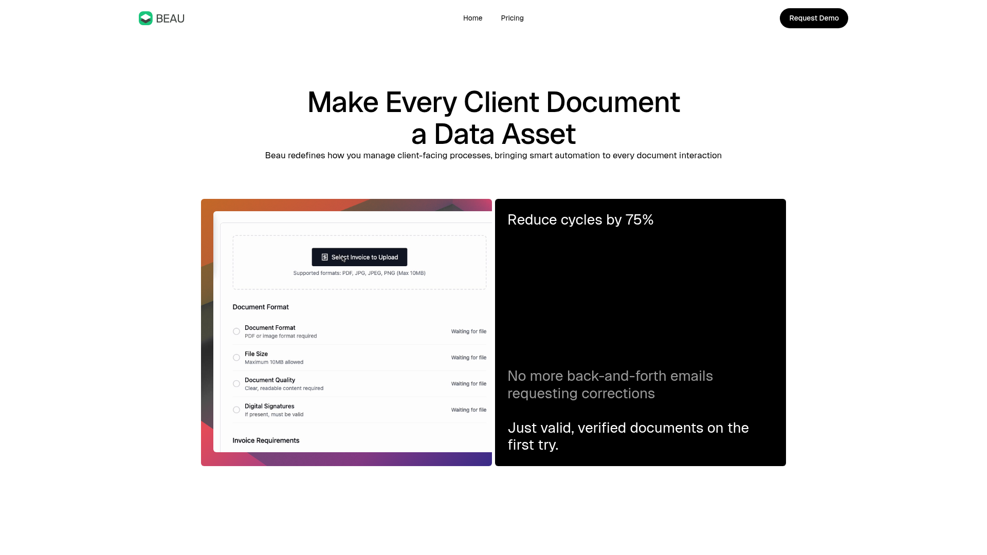
Beau Document Automation Landing Page
A modern software landing page featuring a bento-grid layout, split-screen hero assets with animated checkmarks, a step-by-step process guide, and a clean two-tier pricing table.
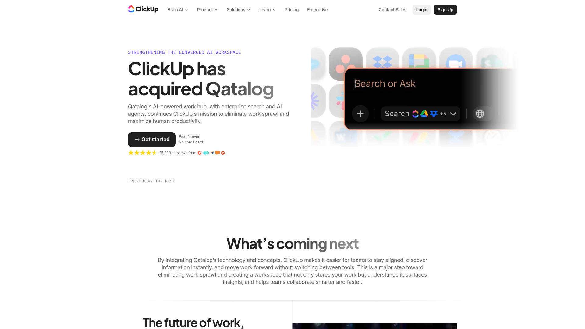
ClickUp Acquisition Hero Landing Page
Features a modern dark-themed hero section with a search UI graphic, bento-style feature grid, and a high-contrast CTA section with decorative gradients.
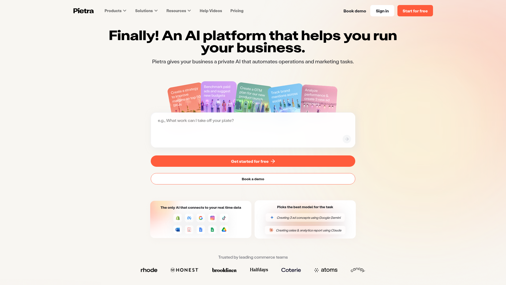
Pietra AI Platform Landing Page
A commerce-focused landing page featuring a centralized AI input hero, colorful floating value-prop cards, a bento-style integration showcase, and tabbed feature sections with side-by-side comparisons.
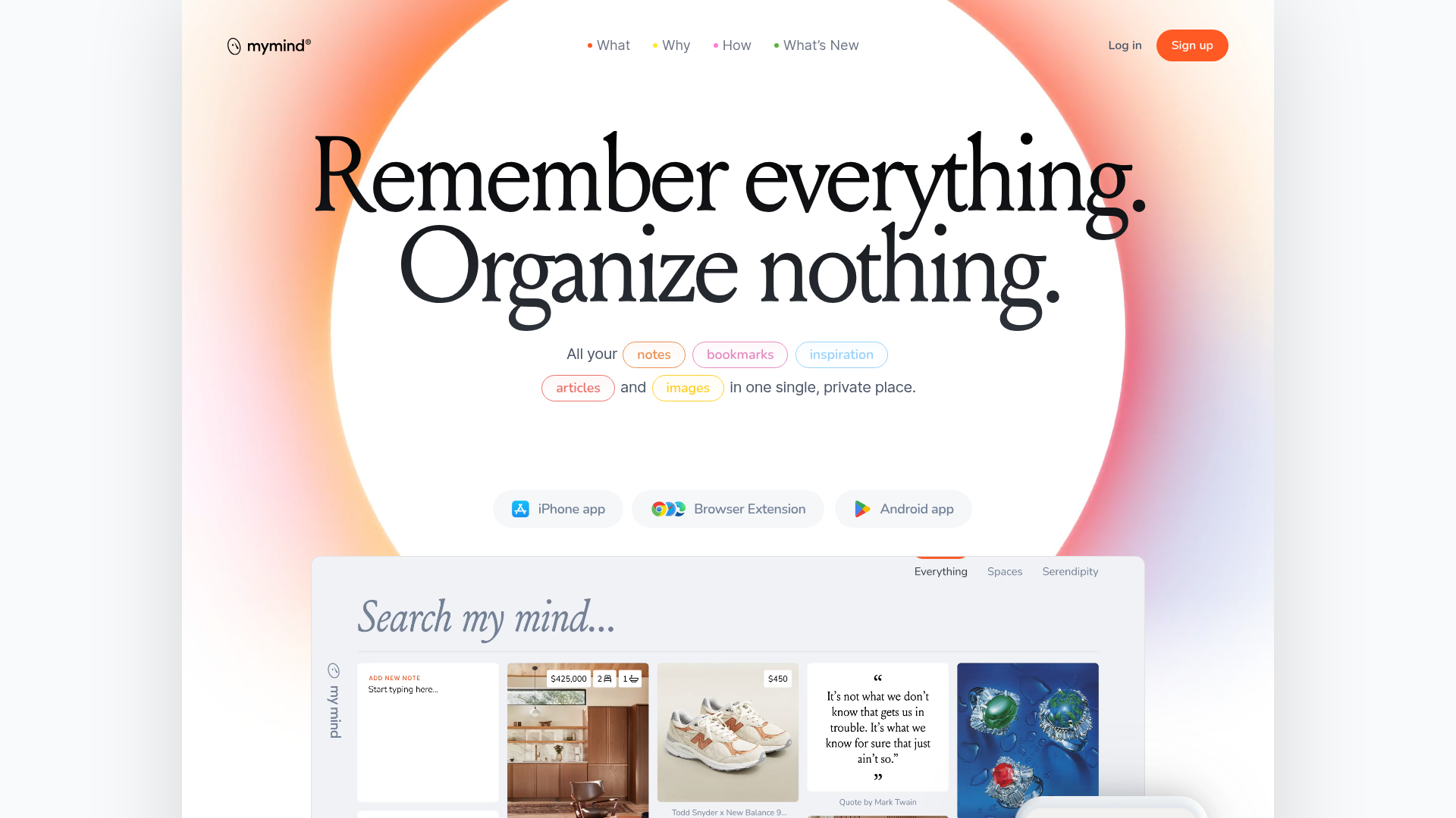
Mymind AI Tool Landing Page
A minimalist SaaS landing page featuring a soft-gradient hero section, custom pill-shaped text badges, and a dynamic bento-style search result preview grid.
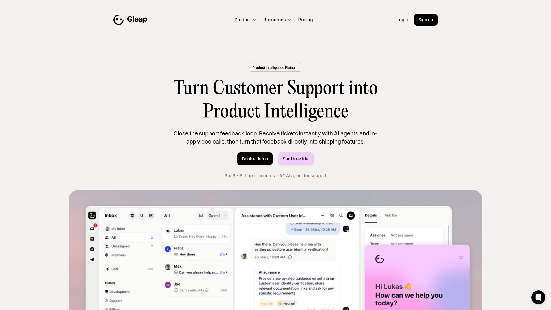
Gleap Product Intelligence Platform Landing
A SaaS template featuring a central video hero, comparison pricing tables, tabbed feature navigation, and a testimonial grid with major brand logos.
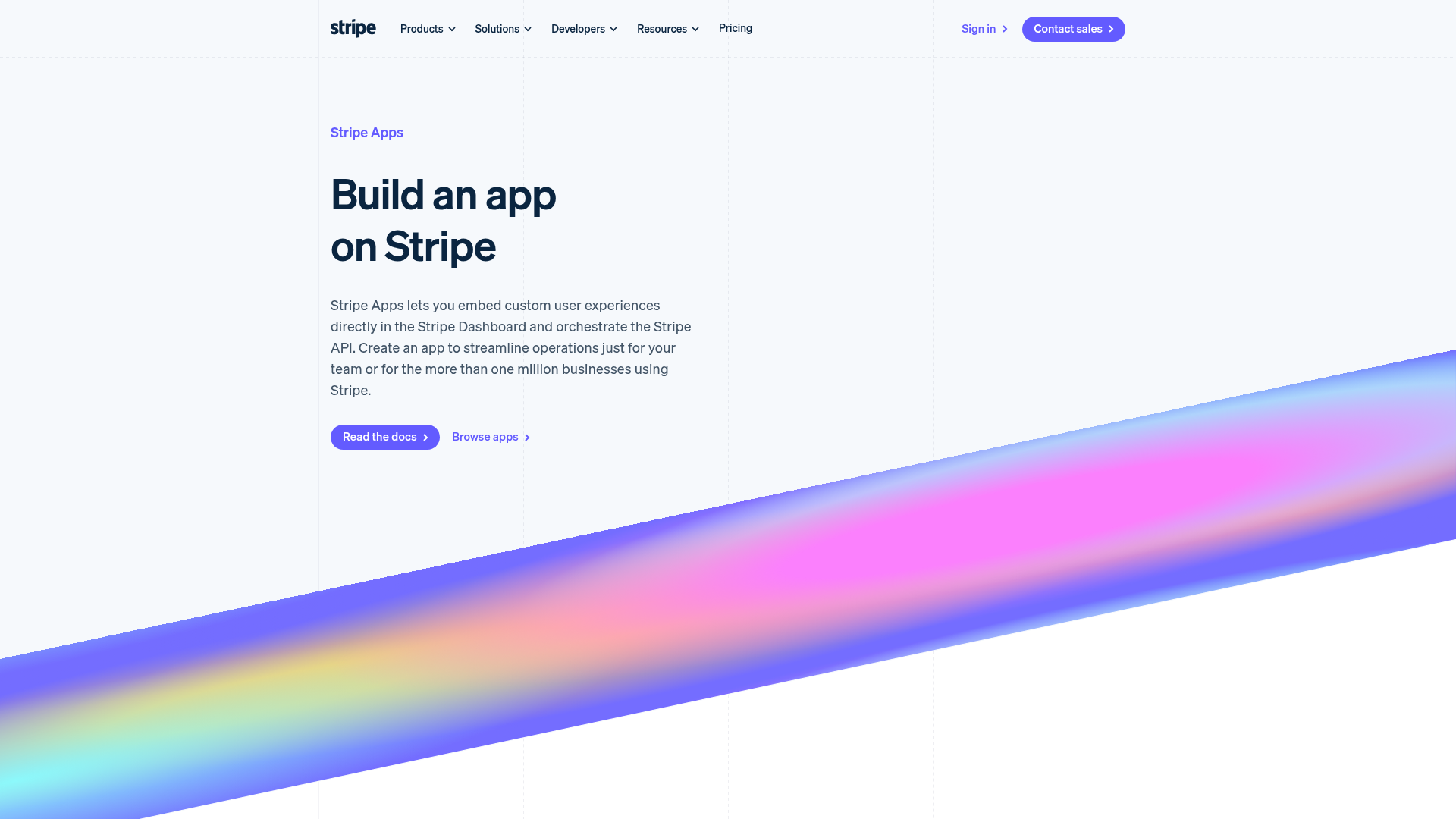
Stripe Apps Developer Portal Landing
A developer-focused landing page featuring a geometric animated gradient hero, multi-column feature sections, carousel components with code editors, and testimonial sliders.
