Coco Social Selling Landing Page
A clean Webflow-based landing page featuring a centered video hero section and alternating feature-rich cards with integrated mobile app mockups.
Overview
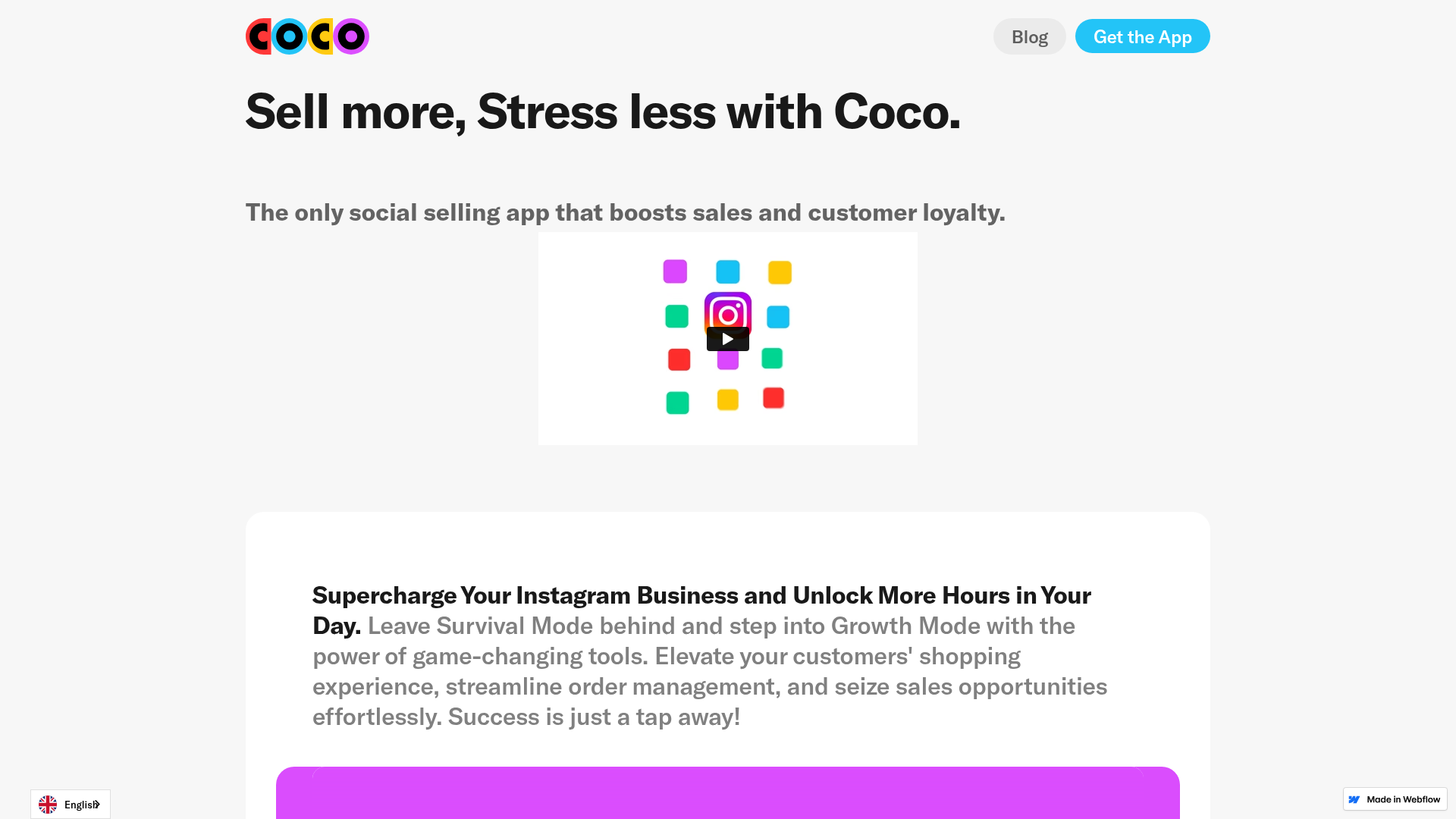
This landing page for Coco is a textbook example of a clean, high-conversion SaaS layout built on Webflow. It features a minimalist "Sell more, Stress less" hero, an embedded video showcase, and a series of high-contrast feature cards that blend product copy with mobile app mockups. It serves as an excellent reference for builders looking to create a professional product presentation with a focus on visual storytelling and clear calls to action.
Design System
- Color Palette & Visual Hierarchy: The site uses a high-key white background (
#FFFFFF) to make secondary brand colors pop. These accent colors (vibrant purple, teal, yellow, and red) are consistently used in the logo and as background containers for the feature mockups (purple,green,blueclasses in the HTML). Visual hierarchy is established by a bold, black Montserrat-style sans-serif (Coco Sans) for headlines against smaller, medium-gray body text. - Typography: The typography system emphasizes readability with a large H1 hero text (
hero-text) and bold paragraph headers (bold-text) to scan quickly. Body copy uses generous line heights to avoid clutter. - Page Structure: The flow follows a standard conversion funnel: a minimalist navigation bar, a bold value proposition, a centered video demonstration (
#meet_coco_video_section), and five alternatingfeature-cardsections. It concludes with a high-contrast "Join the waitlist" CTA block. - Reusable Components:
- Feature Cards: The
.feature-cardclass is the core layout unit, using a two-column grid (column contentandcolumn main-image) that is easily repeatable. - Navigation: A sticky-style
.navbar with a distinct rounded "Get the App" button using a bright blue gradient. - Buttons: Consistent rounded button styles (
submitcontainer button) with hover-ready states.
- Feature Cards: The
- Implementation Clues: Built on Webflow, the site uses a class-based utility system (e.g.,
spacing---s,spacing---l) for consistent vertical rhythm. Interaction is light, focusing on the Vimeo video embed and static images that provide a "mockup" feel.
Use Cases
- Who should clone this: Mobile app startups, social media tool developers, and e-commerce service providers needing a fast-loading, visually driven one-page site.
- Effective Remixes: This pattern works perfectly for any "Step-by-Step" service. A developer could swap the mobile mockups for browser screenshots to pitch a desktop SaaS, or replace the video with a static lottie animation.
- Practical Directions:
- Quick Section Clone: The alternating feature cards are the most reusable part; cloning the
.feature-cardstructure allows for a quick "Features" section on an existing site. - Full-Page Clone: Ideal for a pre-launch "Waitlist" page where the goal is to explain value quickly and capture leads immediately through the integrated buttons.
- Quick Section Clone: The alternating feature cards are the most reusable part; cloning the
- Suggested Scope: Focus on the
feature-cardflexbox/grid layout and the specificspacing---utility classes to maintain the clean, open-air aesthetic.
Related Inspirations

Tatem Minimalist Productivity Landing Page
A refined SaaS landing page featuring a sticky scroll-based UI, 3D CSS transforms in the hero, and clean feature sections with interactive UI component demos.
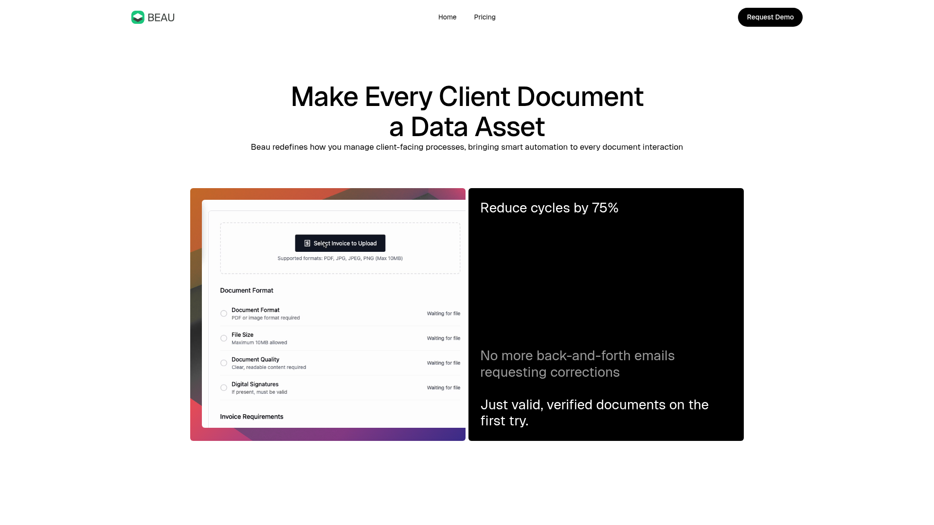
Beau Document Automation Landing Page
A modern software landing page featuring a bento-grid layout, split-screen hero assets with animated checkmarks, a step-by-step process guide, and a clean two-tier pricing table.
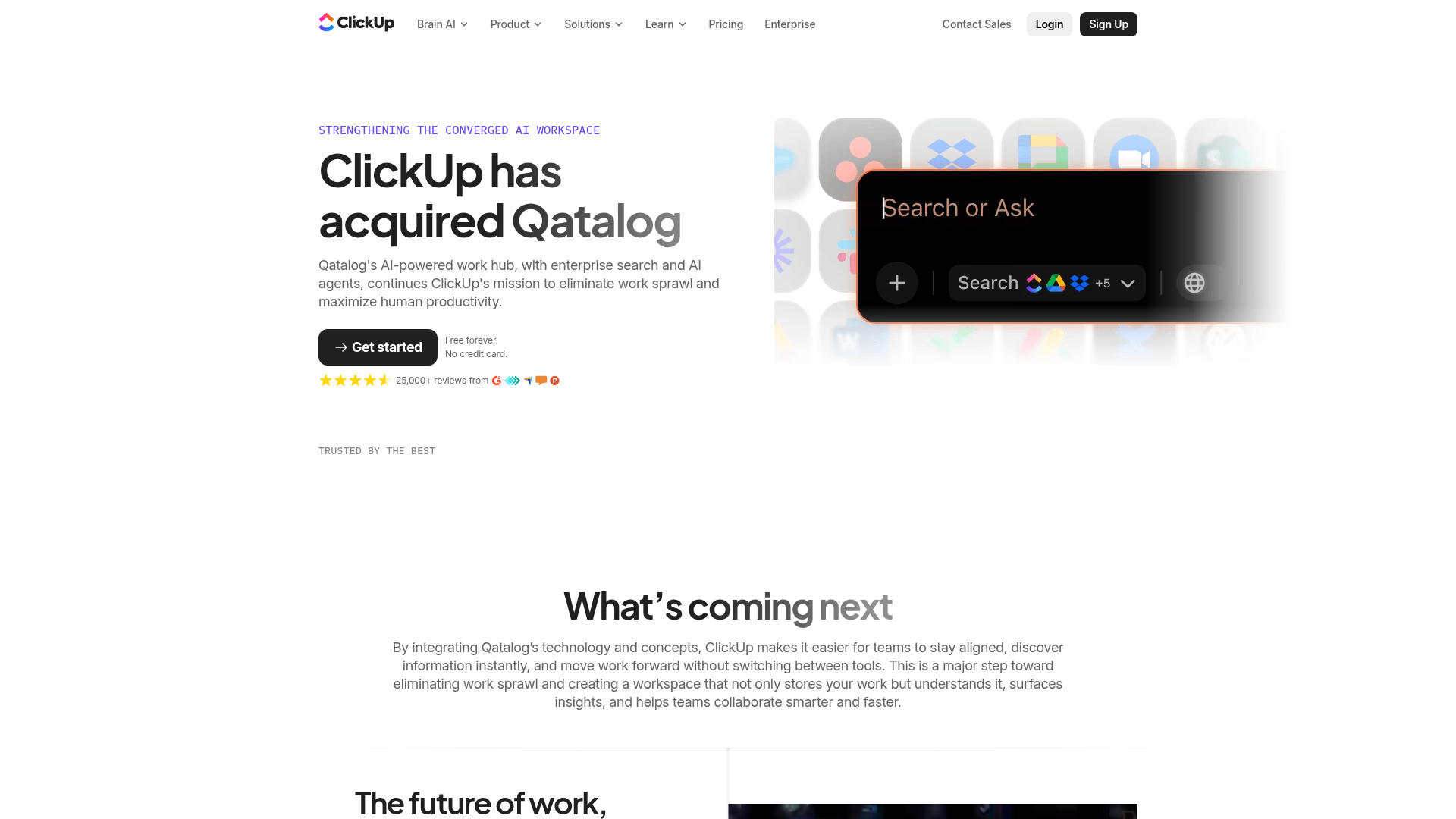
ClickUp Acquisition Hero Landing Page
Features a modern dark-themed hero section with a search UI graphic, bento-style feature grid, and a high-contrast CTA section with decorative gradients.
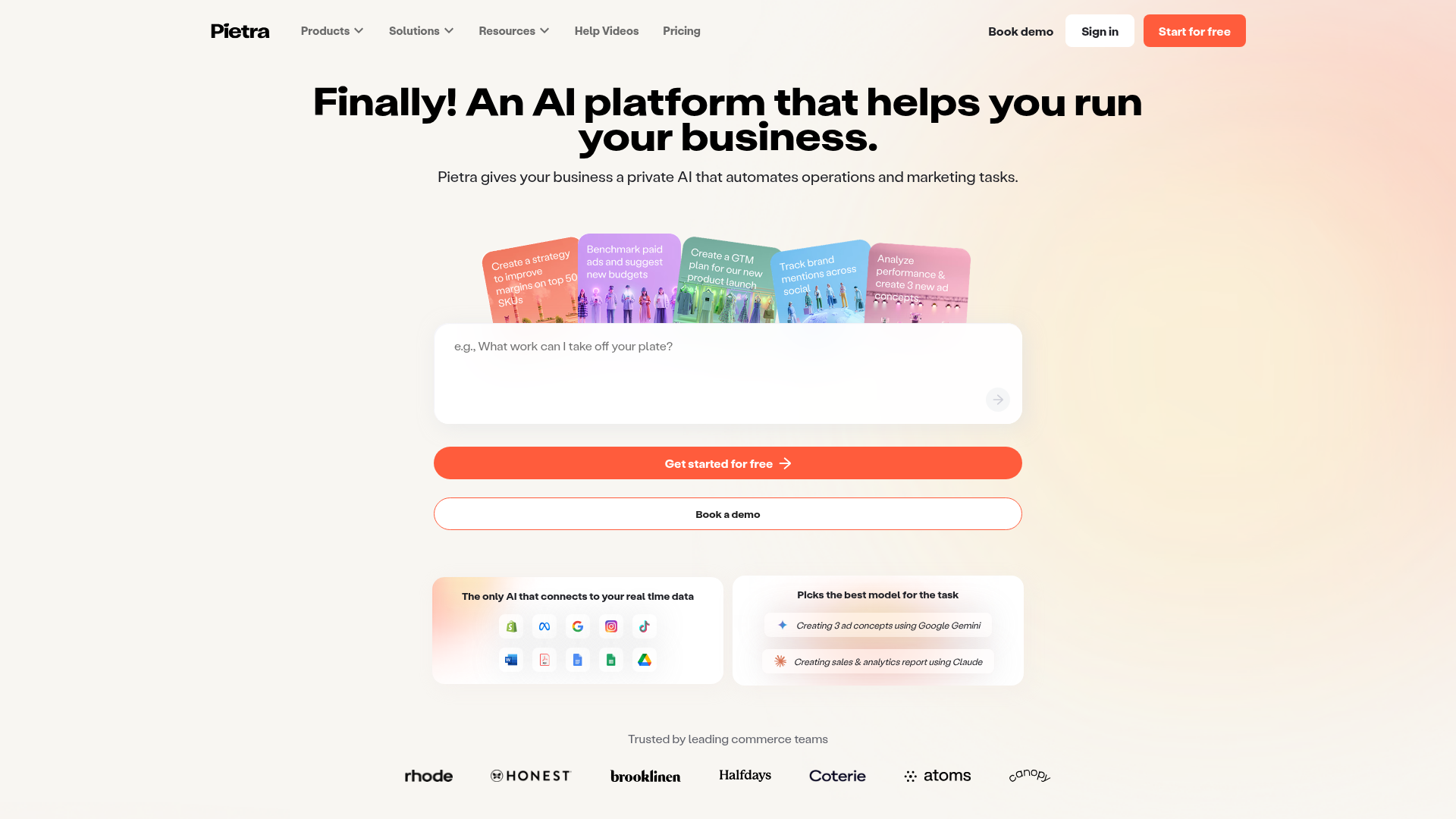
Pietra AI Platform Landing Page
A commerce-focused landing page featuring a centralized AI input hero, colorful floating value-prop cards, a bento-style integration showcase, and tabbed feature sections with side-by-side comparisons.
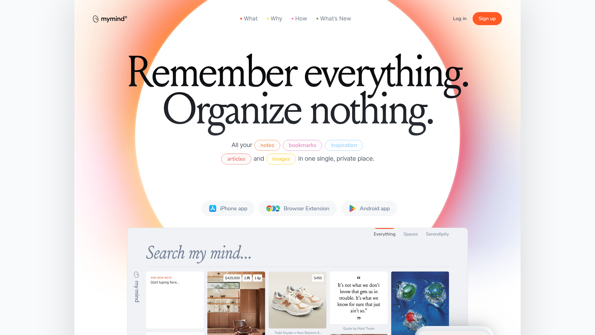
Mymind AI Tool Landing Page
A minimalist SaaS landing page featuring a soft-gradient hero section, custom pill-shaped text badges, and a dynamic bento-style search result preview grid.
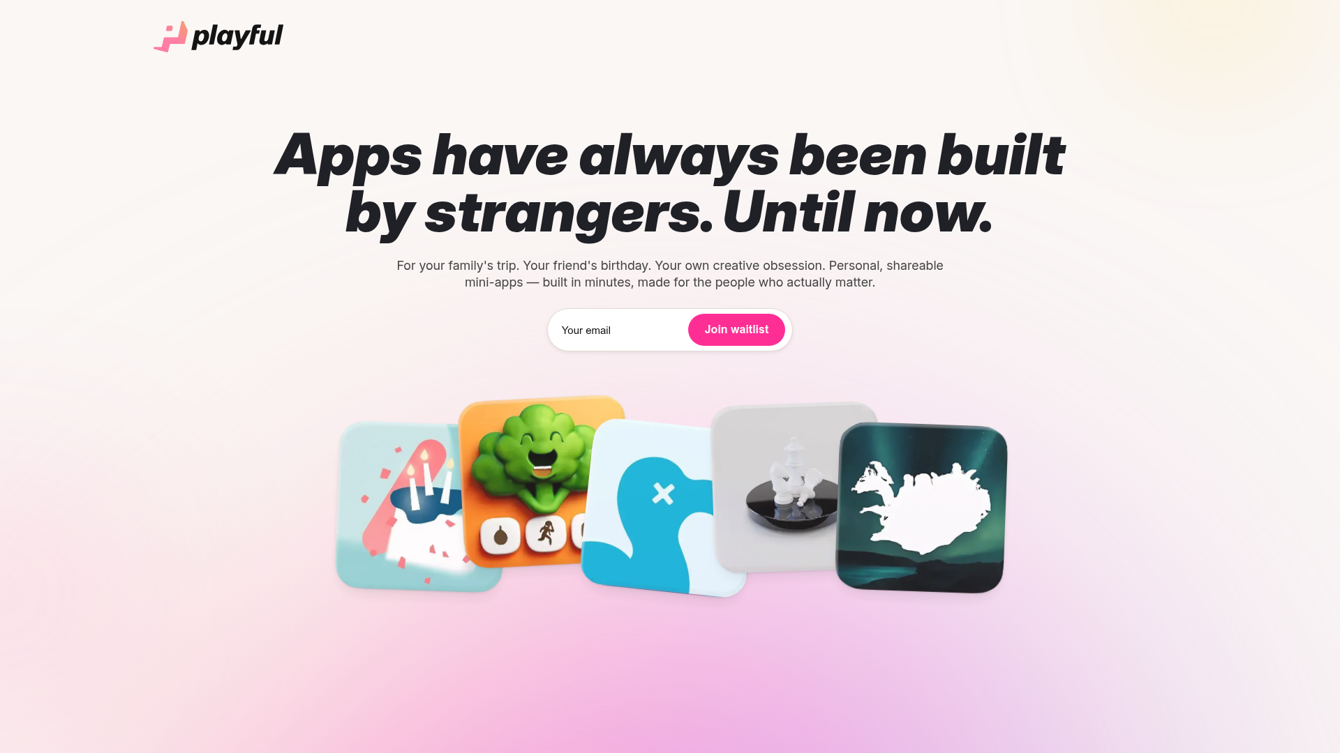
Playful Waitlist Landing Page
A minimalist landing page featuring an interactive magnetic hero image gallery, a marquee text slider, and a scroll-triggered blurred text reveal animation.
