Tatem Minimalist Productivity Landing Page
A refined SaaS landing page featuring a sticky scroll-based UI, 3D CSS transforms in the hero, and clean feature sections with interactive UI component demos.
Overview
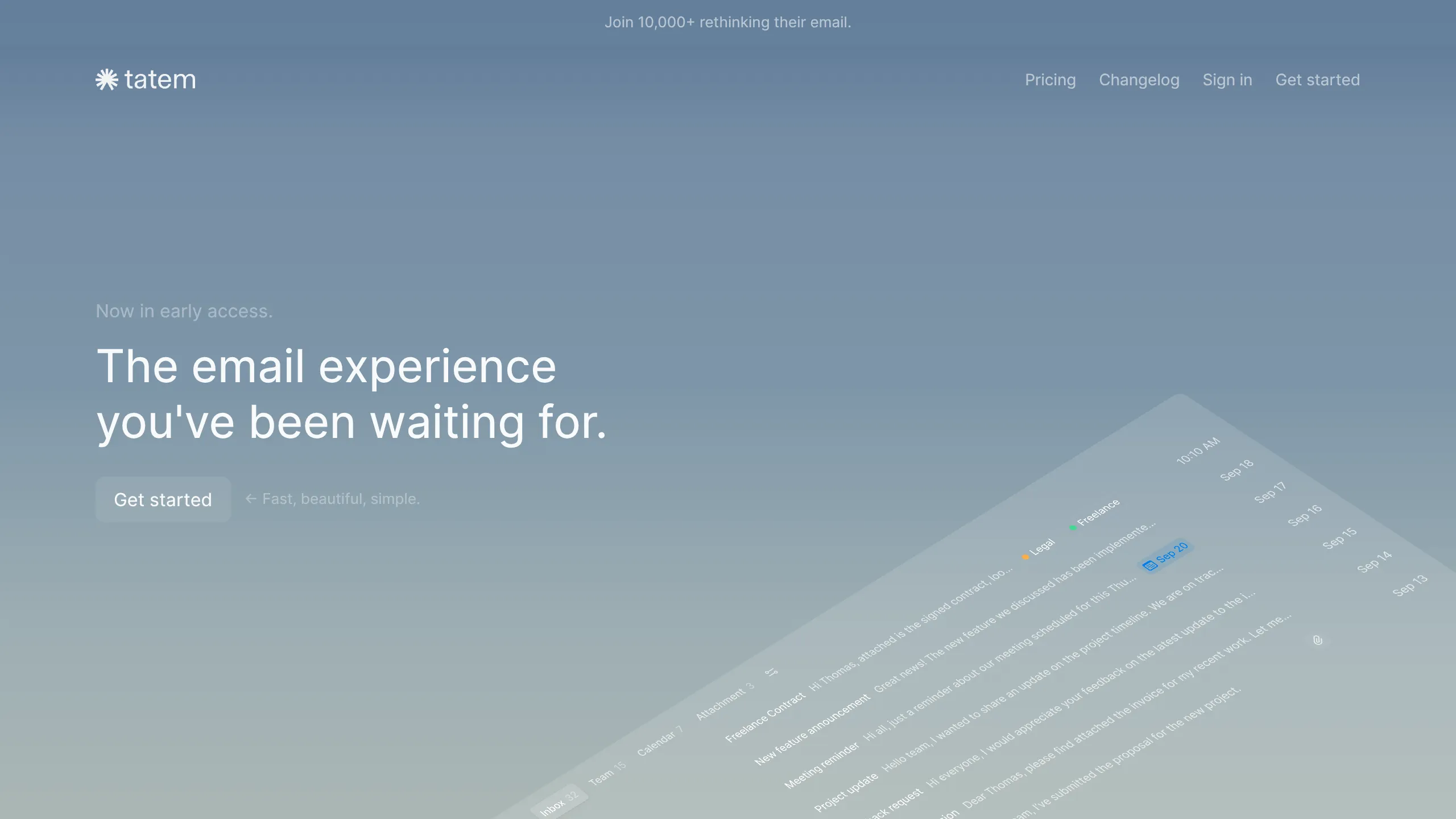
Tatem's landing page is a masterclass in minimalist SaaS web design, utilizing high-end 3D CSS transforms and scroll-driven storytelling to demonstrate product features. It is a strong reference for builders looking to implement a "show, don't just tell" approach using sophisticated layout techniques that feel both premium and incredibly fast.
Design System
- Color Palette & Visual Hierarchy: The site uses a sophisticated monochromatic base with a deep slate/blue-gray background (
bg-secondary). High-contrast white (text-primary) is reserved for headlines, while logical levels of transparency (0.75 to 0.04 opacity on white) create a layered depth for UI elements and secondary text. - Typography System: The design leans on a clean sans-serif stack. Visual hierarchy is established through extreme scale differences: large, thin-to-medium weight headlines (
text-title-large) for hero sections contrasted against small, uppercase tracking for labels (text-body) and low-contrast supporting copy. - Page Structure & Flow:
- Sticky Hero: A fixed-height container with a 3D-transformed product preview.
- Feature Scroller: A series of
stickycontainers (1520px height in HTML) that reveal feature descriptions alongside interactive UI mocks as the user scrolls. - Call-to-Action: A centered, high-contrast sign-up block.
- Multi-Column Footer: A comprehensive 8-column grid layout on desktop that collapses for mobile.
- Reusable Components:
- Interactive UI Cards: Centered containers with
rounded-lgcorners andbg-secondarysurfaces containing SVG or CSS-based app previews. - Glassmorphic Buttons: Subtle rounded buttons with
backdrop-blur-2xland slight hover transitions. - Persistent Banner: A top-of-page status bar (
fixed top-0 z-40) for social proof/announcements.
- Interactive UI Cards: Centered containers with
- Interaction and Motion: The hero utilizes a
transform-3dmatrix withperspectiveto create a tilted UI effect. Feature sections usestickypositioning to lock text in place while the user scrolls through the content height, providing a seamless "in-app" demonstration feel. - Implementation Clues: The HTML reveals a heavy reliance on Tailwind CSS utility classes (e.g.,
will-change-transform,backdrop-blur,transition-all) and Next.js for routing and image optimization.
Use Cases
- Who should clone this: Developers of productivity tools, developer experience (DX) platforms, or AI agents that prioritize speed and minimalist aesthetics.
- Remixing effectively: The "Split Inbox" and "Shortcuts" patterns can be easily adapted for any dashboard-heavy product. Instead of generic icons, use the CSS-based grid and keyboard mockups to show your specific tool's interface.
- Practical Directions:
- Brand Swap: Replace the cool blue-gray palette with a warm sepia or high-contrast dark mode to completely shift the vibe while keeping the logic.
- Partial Clone: The footer or the sticky feature section logic can be extracted and used as standalone components in existing landing pages.
- Content Adaptation: Use the 3D hero transform to display a mobile app mockup instead of an email client interface.
- Suggested Scope: Full-page clone is recommended to capture the sophisticated scroll-parallax relationship, though the individual UI mocks are excellent for quick section reuse.
Related Inspirations
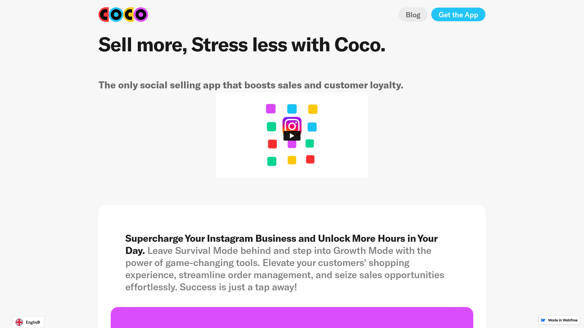
Coco Social Selling Landing Page
A clean Webflow-based landing page featuring a centered video hero section and alternating feature-rich cards with integrated mobile app mockups.
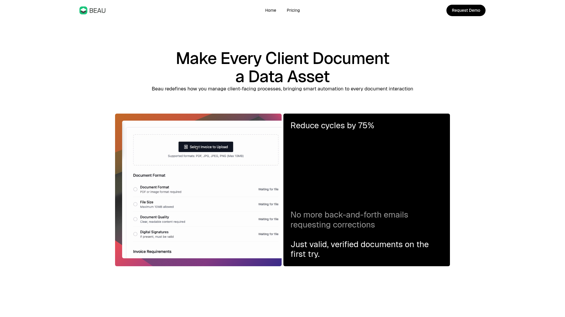
Beau Document Automation Landing Page
A modern software landing page featuring a bento-grid layout, split-screen hero assets with animated checkmarks, a step-by-step process guide, and a clean two-tier pricing table.
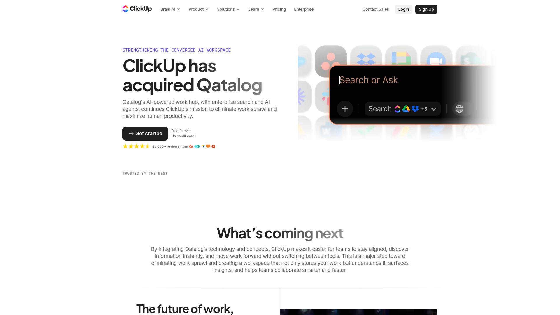
ClickUp Acquisition Hero Landing Page
Features a modern dark-themed hero section with a search UI graphic, bento-style feature grid, and a high-contrast CTA section with decorative gradients.
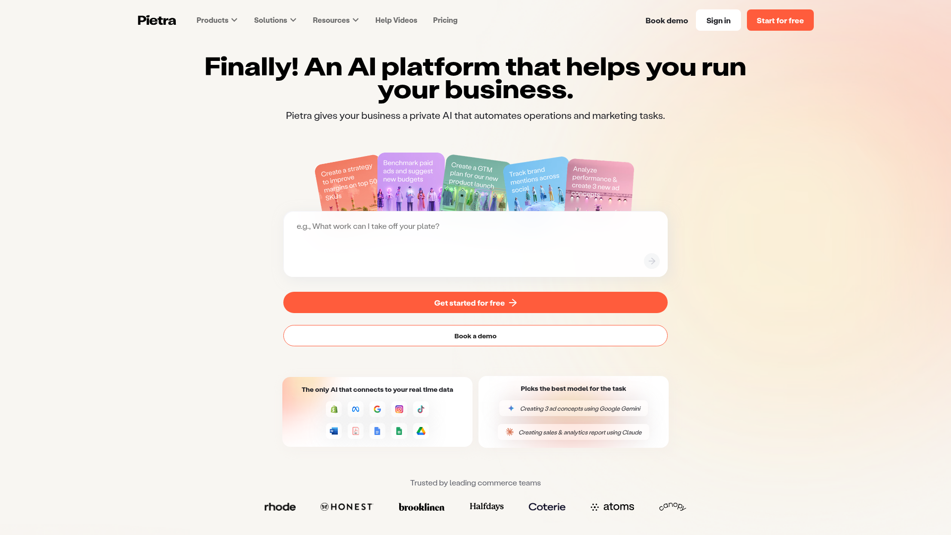
Pietra AI Platform Landing Page
A commerce-focused landing page featuring a centralized AI input hero, colorful floating value-prop cards, a bento-style integration showcase, and tabbed feature sections with side-by-side comparisons.
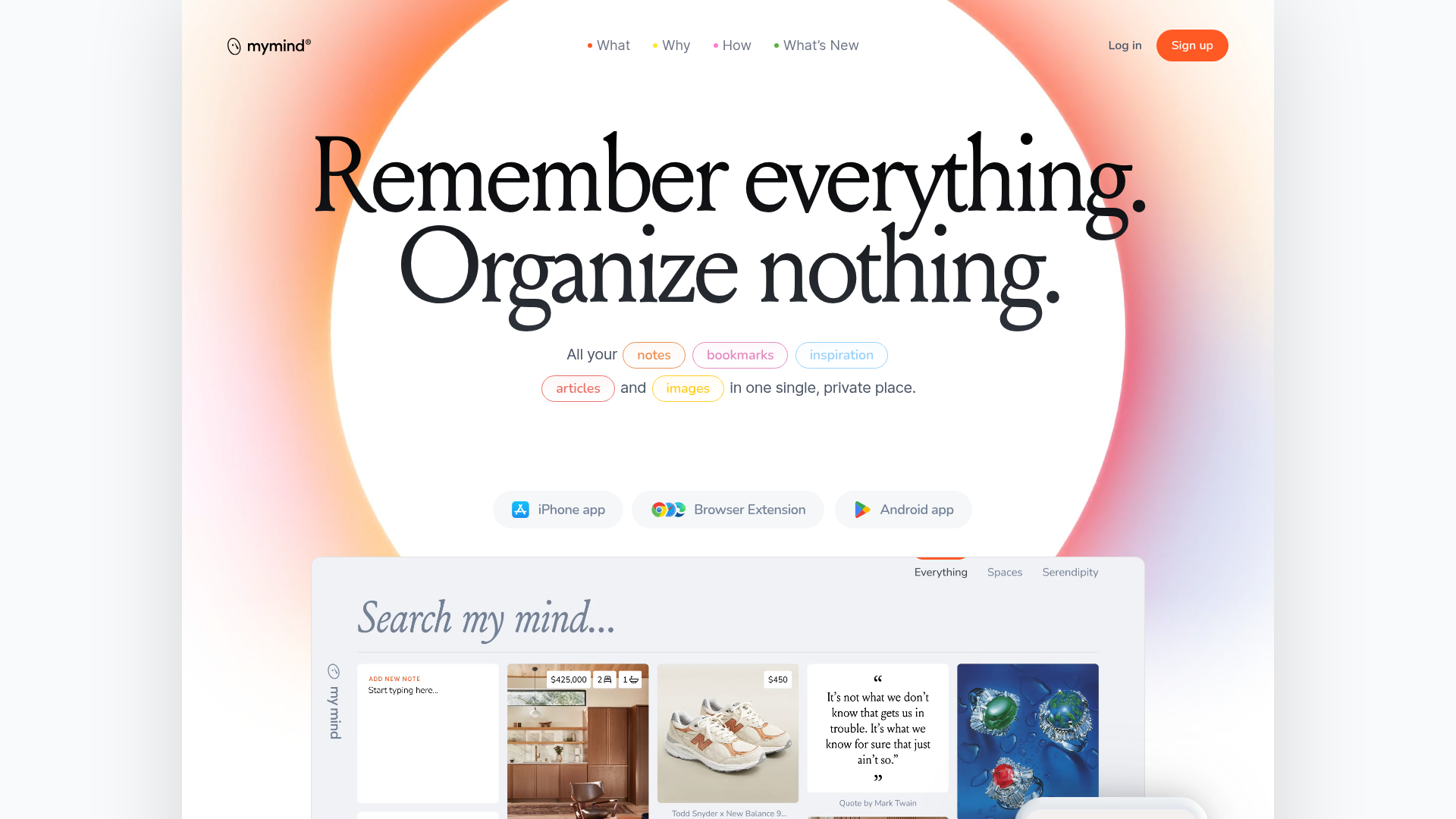
Mymind AI Tool Landing Page
A minimalist SaaS landing page featuring a soft-gradient hero section, custom pill-shaped text badges, and a dynamic bento-style search result preview grid.
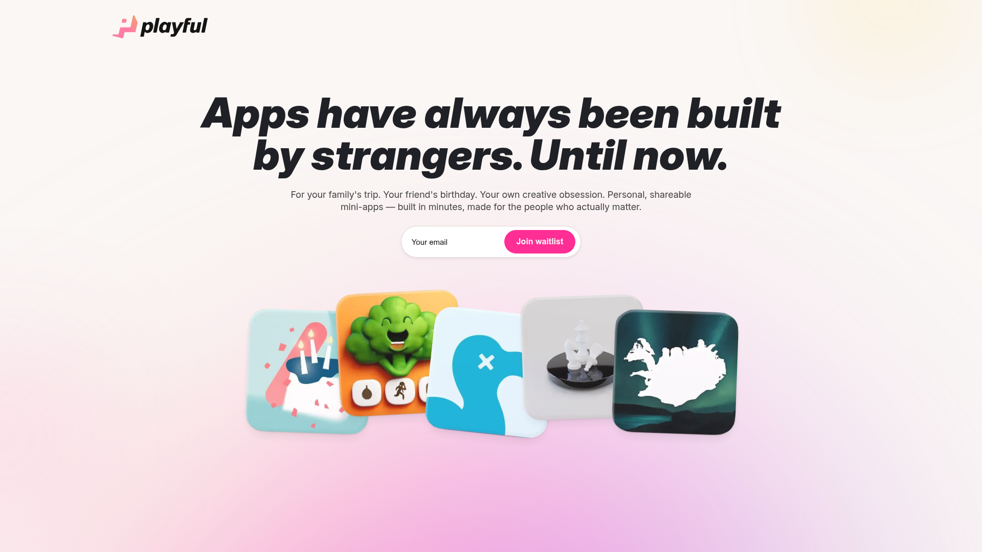
Playful Waitlist Landing Page
A minimalist landing page featuring an interactive magnetic hero image gallery, a marquee text slider, and a scroll-triggered blurred text reveal animation.
