Joshua Kaplan Portfolio Index
A minimalist, text-only portfolio layout featuring an expansive tabular list of projects with horizontal rule separators and clean typography.
Overview
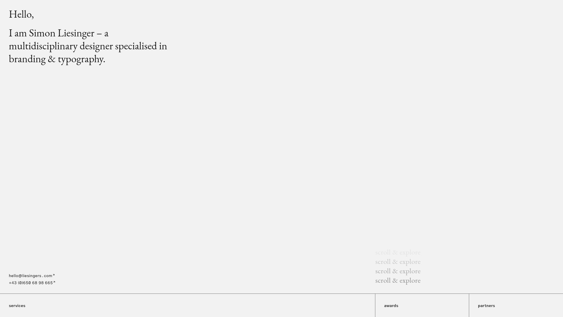
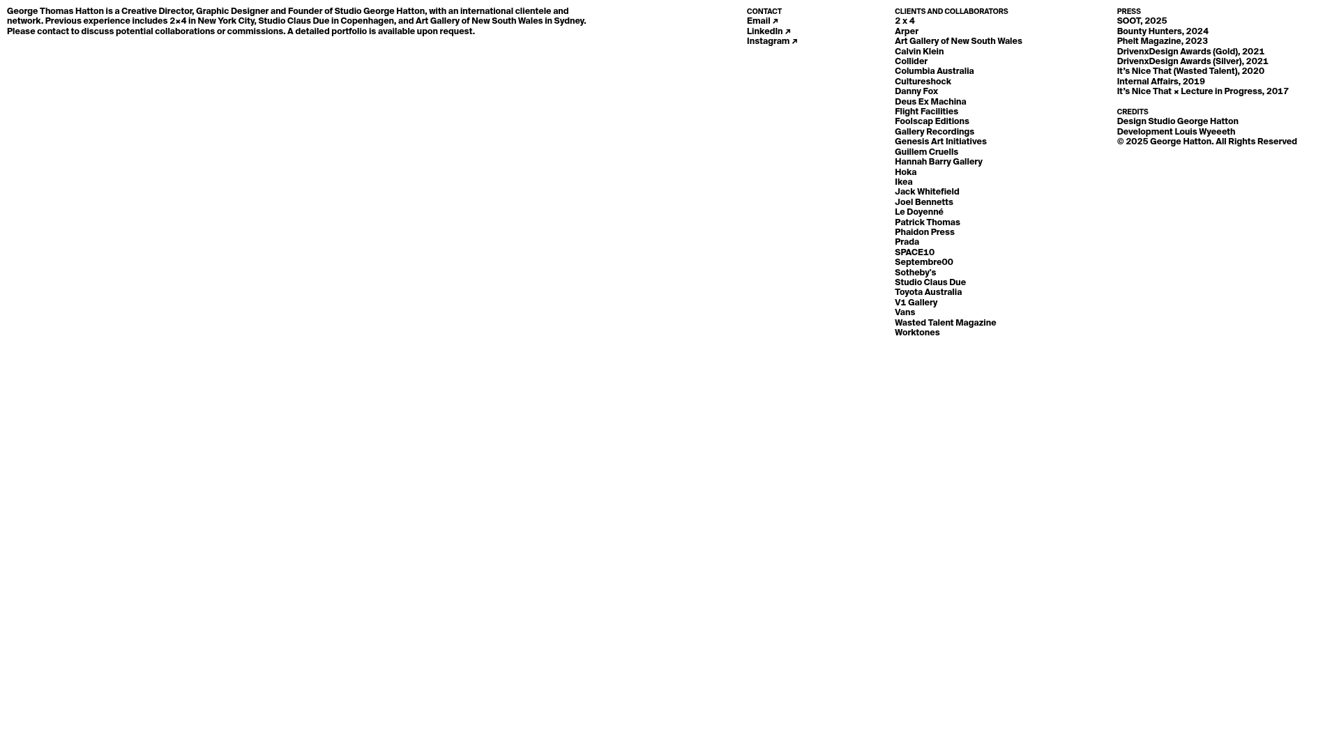
This portfolio for Joshua Kaplan is a masterclass in minimalist, high-density information design. It functions as a digital index, ditching imagery in favor of a clean, tabular list that emphasizes a prolific body of work through pure typography and structural clarity. It is a strong reference for builders looking to showcase a high volume of items while maintaining a refined, professional aesthetic.
Design System
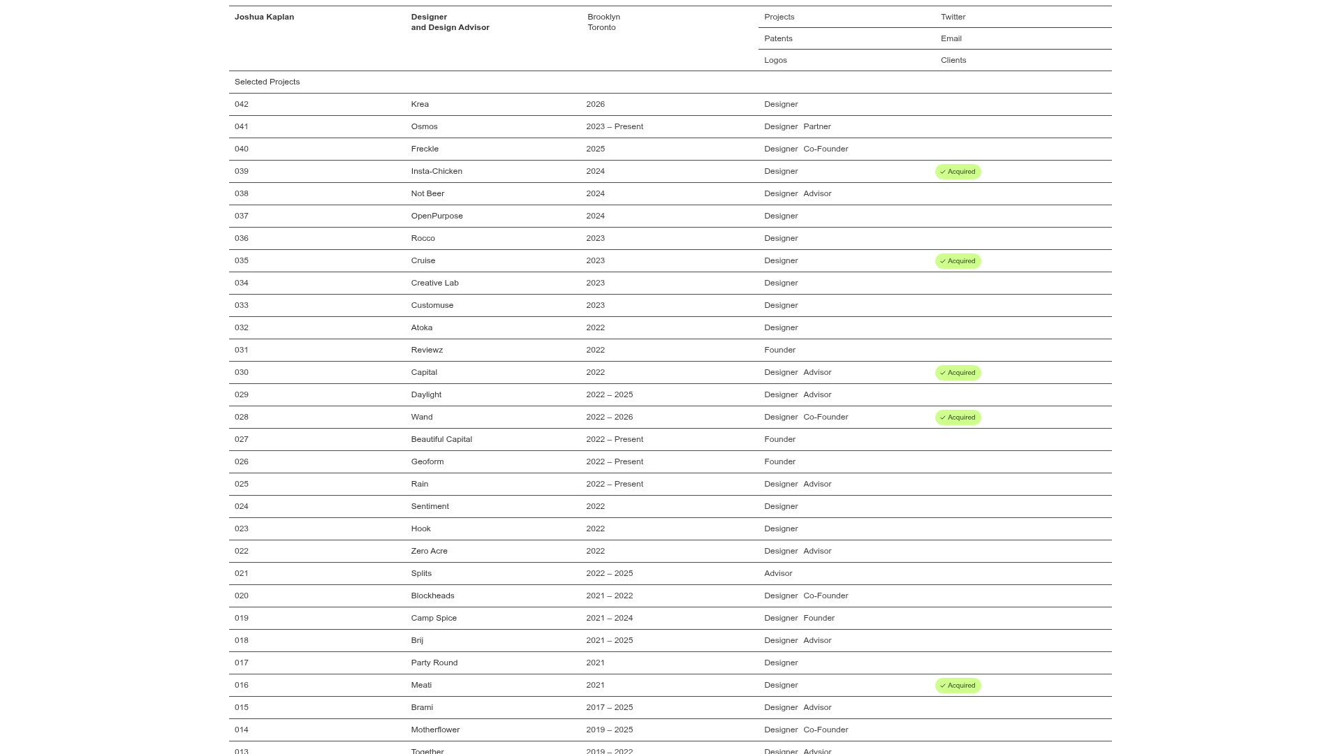
- Color Palette and Visual Hierarchy: The site uses a high-contrast monochromatic base (pure black text on a white background) to ensure legibility. Visual hierarchy is achieved through column alignment rather than color, with the exception of a bright lime-green pill component labeled "Acquired" used to signal successful project outcomes.
- Typography system: A clean, neo-grotesk sans-serif font is used throughout. It utilizes relatively small font sizes (approx 12-14px) with ample letter spacing. Emphasis is handled through positional weight; headers are distinct from list items primarily by their placement at the top of the grid.
- Page Structure and Section Flow: The layout follows a rigid grid system. A minimalist four-column header contains the site title, role, location, and navigation links (Projects, Patents, Logos, Twitter, Email, Clients). Below this, a single row title "Selected Projects" introduces a list of 40+ numbered items organized into rows separated by thin horizontal rules.
- Reusable Components: The primary component is the Index Row, which features five data columns (ID, Name, Timeline, Role, Status). Other notable components include the Sticky Header navigation and the Status Pill (a rounded light-green badge with a checkmark icon).
- Interaction and Motion Patterns: The interface is static and utilitarian. Row-level interactions typically involve hover states that might change background color or text weight, emphasizing the row being read. The list is designed for long vertical scrolling.
- Implementation Clues: The HTML structure suggests a semantic use of
header,nav, and a series ofdivorlielements acting as table rows. The layout relies heavily on CSS Flexbox or Grid to align disparate columns across hundreds of rows without breaking vertical rhythm.
Use Cases
- Who should clone this pattern: Designers, developers, and consultants with a large chronological archive of work who want to emphasize volume and experience over visual flash.
- Effective Remixes: This pattern is perfect for engineering changelogs, venture capital portfolio pages, bibliography lists, or internal company directories.
- Practical Remix Directions:
- Swap Brand Style: Introduce a serif typeface for a more editorial feel or a mono font for a technical vibe.
- Info Architecture: Replace "Timeline" or "Role" columns with categories like "Technology Stack" or "Client Name."
- Selected Sections: Reuse only the top navigation/header block for a minimalist landing page while using more traditional layouts below.
- Suggested Clone Scope: A full-page clone is recommended to capture the impact of the dense list, but the header layout itself is a valuable specific component to remix for any minimalist UI.
Related Inspirations

Baubauwerk Minimal Agency Portfolio Homepage
A clean studio site featuring a centered text hero, scatter-plot filterable project gallery, and full-bleed image sections for case studies.
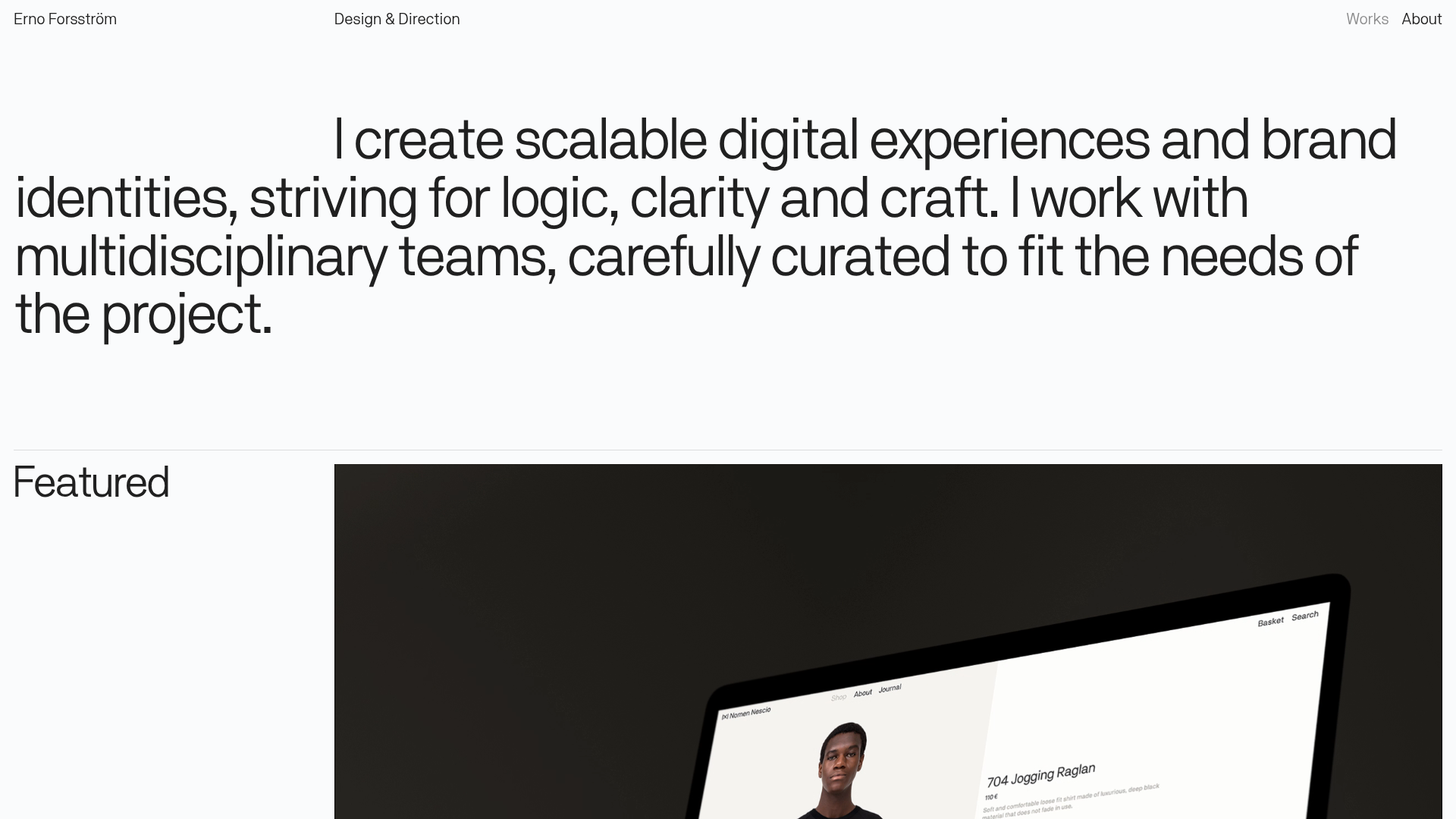
Erno Works Minimalist Design Portfolio
A clean, typography-focused portfolio featuring a sticky grid layout, large editorial headers, and integrated video project thumbnails for dynamic case study previews.
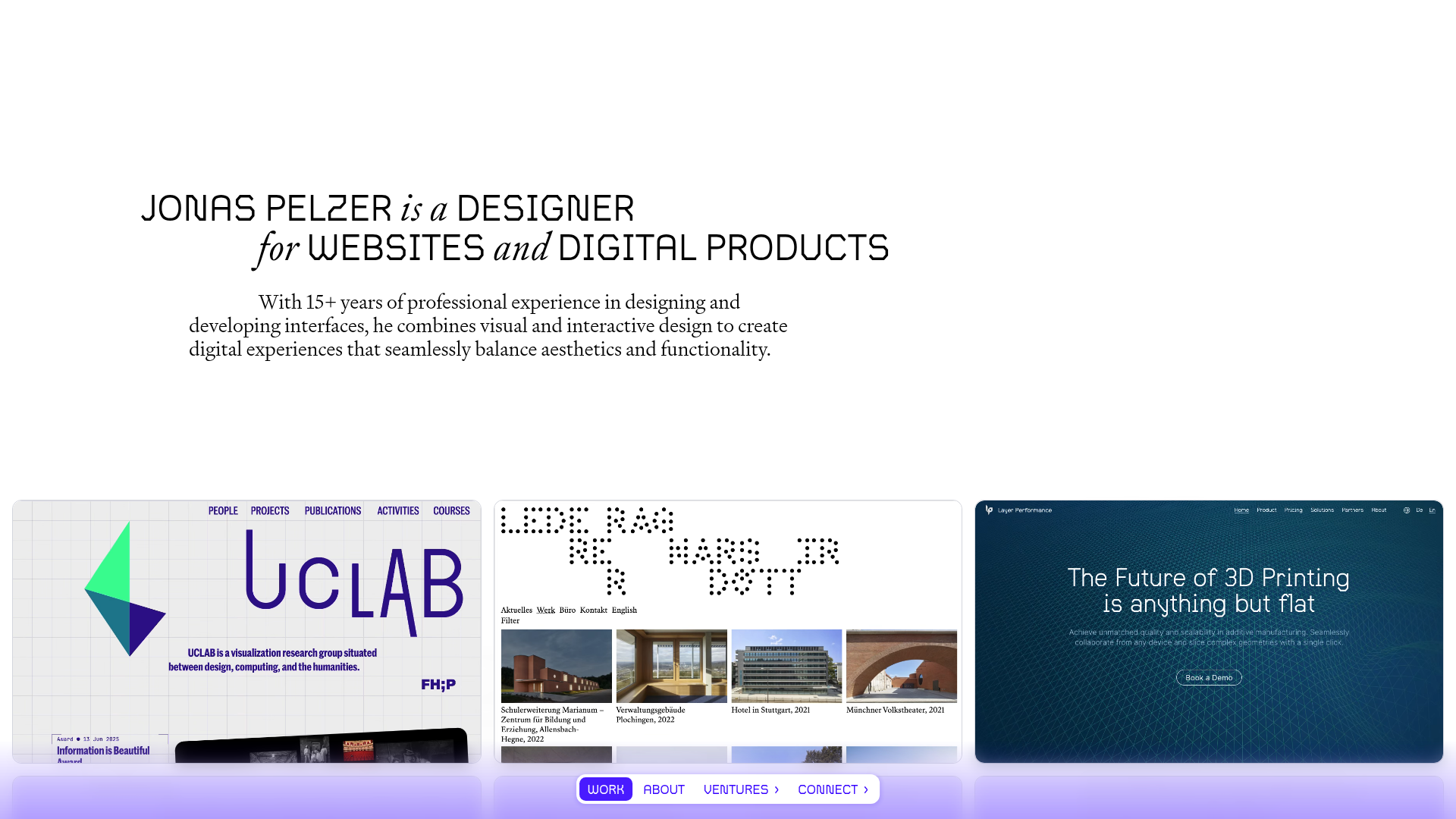
Jonas Pelzer Portfolio Showcase
A minimalist design portfolio featuring a large typography hero, a staggered video project grid, and a sticky tab-based navigation bar for content switching.
Gio Pandone Minimalist Portfolio Template
A clean, grid-based designer portfolio featuring a sticky minimalist navigation, scroll-triggered entrance animations, and a responsive 12-column work gallery with embedded video previews.
Minimalist Typography Portfolio and Services Grid
A clean, serif-heavy layout featuring an A-Frame 3D hero animation, tiered service lists, and a modular multi-column text structure for design manifestos.
Minimal Text-Based Creative Director Portfolio
A clean, typography-focused landing page featuring a multi-column layout for bio, links, and client lists using simple CSS flex or grid structures.
