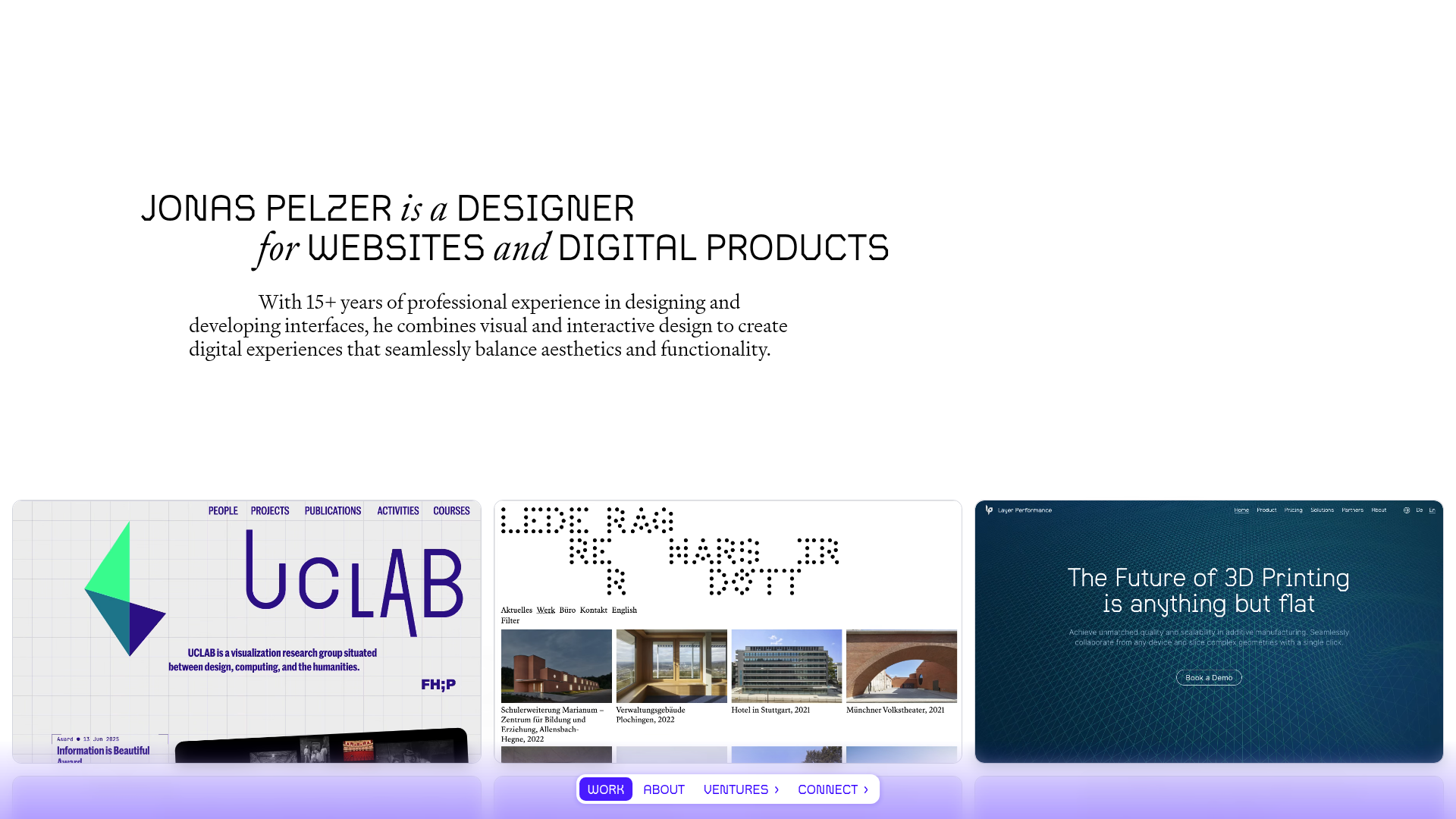
Jonas Pelzer Portfolio Showcase
A minimalist design portfolio featuring a large typography hero, a staggered video project grid, and a sticky tab-based navigation bar for content switching.
Overview
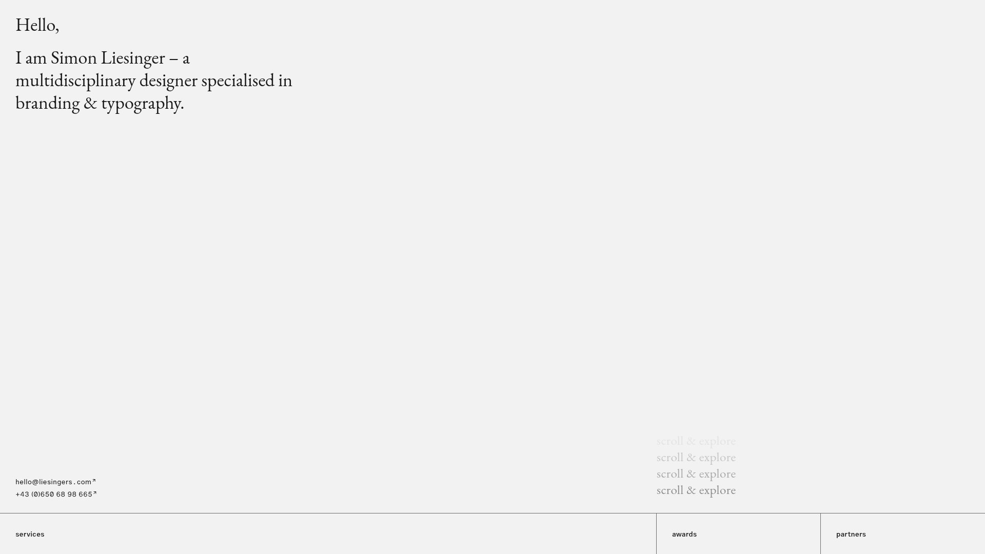
This portfolio serves as a masterclass in minimalist typography and high-impact visual storytelling for creative professionals. It utilizes a striking hero section that blends serif and sans-serif fonts to establish a sophisticated brand identity, paired with a staggered video-heavy grid that prioritizes visual proof over descriptive text. It is a strong reference for developers looking to build a 'low-chrome' interface where content and motion do the heavy lifting.
Design System
- Color Palette & Visual Hierarchy: The site uses a clean, light-gray to white background, allowing the vibrant colors of the project videos to provide the visual interest. Hierarchy is established through extreme typographic scale and the use of italics for emphasis rather than heavy container borders.
- Typography System: The design features a bold, wide sans-serif for name and title headings, contrasted with a traditional, high-contrast serif for body text and supplementary phrases. This dual-font strategy creates a 'design-forward' aesthetic typical of high-end agencies.
- Page Structure & Section Flow: The layout follows a classic vertical stack: a massive hero area, a dynamic grid of auto-playing video tiles using
data-projectattributes for filtering/captions, an 'About' section with multi-column lists for services/clients, and a final large-scale CTA for contact. - Reusable Components:
- Sticky Tab Nav: A centered, pill-shaped navigation bar (
.work,.about,.ventures) that likely toggles section visibility. - Video Project Buttons: The
.work-itemelements are buttons containing<video>tags instead of static images, providing instant interaction without clicking. - Caption Overlay System: The separate
.captionscontainer uses a data-attribute matching system to show project details (.captions-item-box) when a project is active or hovered.
- Sticky Tab Nav: A centered, pill-shaped navigation bar (
- Interaction & Motion: The site leans into micro-interactions, specifically 'See more' expansion animations for the grid (
.work-expansion) and smooth transitions between the 'Work' and 'About' pages using visibility classes (page--hidden). - Implementation Clues: The HTML reveals a data-driven approach using
data-srcfor lazy-loading videos and specificanimation-delaystyles on grid items to create a staggered entrance effect when they are revealed.
Use Cases
- Who should clone this: Individual creatives (photographers, motion designers, architects) and boutique design studios who want a site that feels premium and avoids the common 'template' look.
- What products can remix it: High-end architectural portfolios, agency 'reels' pages, or even a minimalist e-commerce storefront for artisanal goods where visual aesthetics are the primary selling point.
- Practical remix directions:
- Typography Swap: Change the wide sans-serif to a brutalist mono font for a more 'tech' or 'dev-focused' portfolio.
- Media Adaptation: Replace the auto-playing videos with high-quality PNGs or WebPs if bandwidth is a concern, maintaining the staggered grid layout.
- Info Architecture: Repurpose the multi-column 'About' section for a 'Features' or 'Services' breakdown on a SaaS landing page.
- Suggested clone scope: A full-page clone is ideal for those wanting a cohesive, minimalist brand experience. Alternatively, cloning just the hero section provides a powerful landing pattern for any content-light website.
Related Inspirations

Baubauwerk Minimal Agency Portfolio Homepage
A clean studio site featuring a centered text hero, scatter-plot filterable project gallery, and full-bleed image sections for case studies.
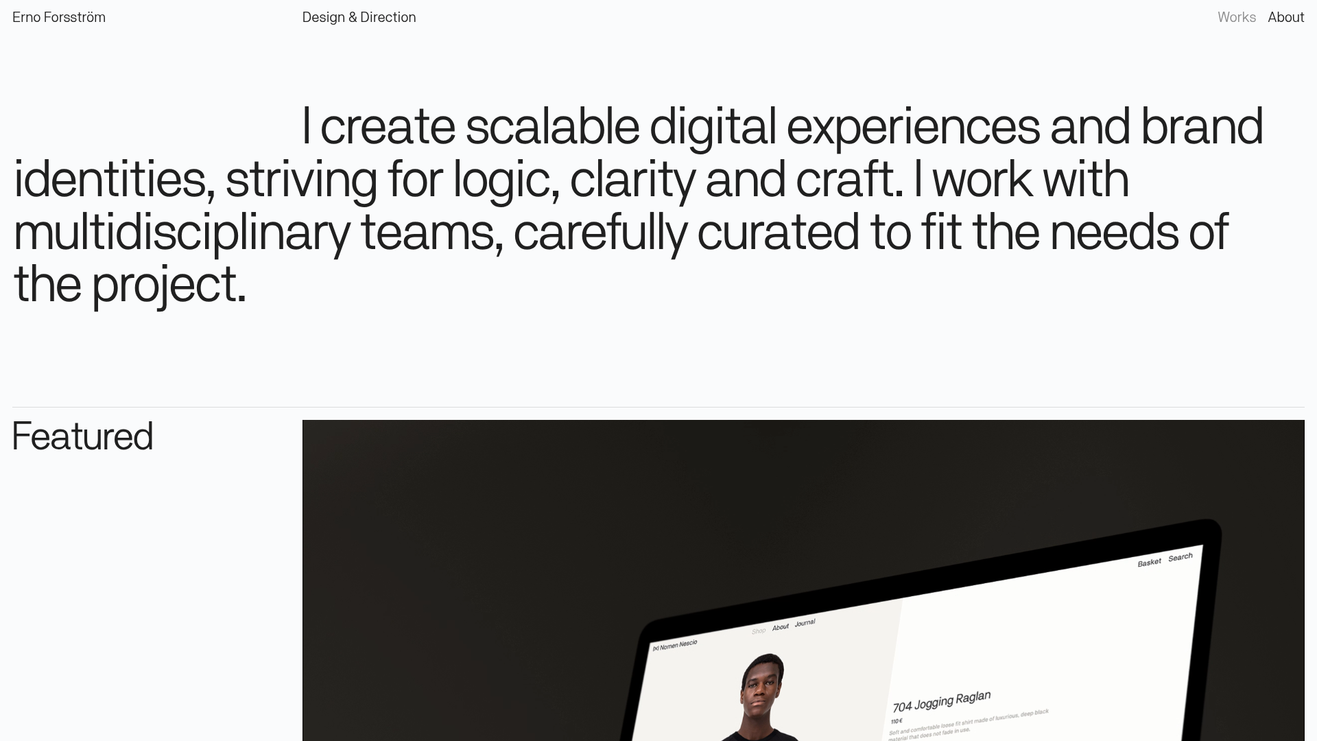
Erno Works Minimalist Design Portfolio
A clean, typography-focused portfolio featuring a sticky grid layout, large editorial headers, and integrated video project thumbnails for dynamic case study previews.
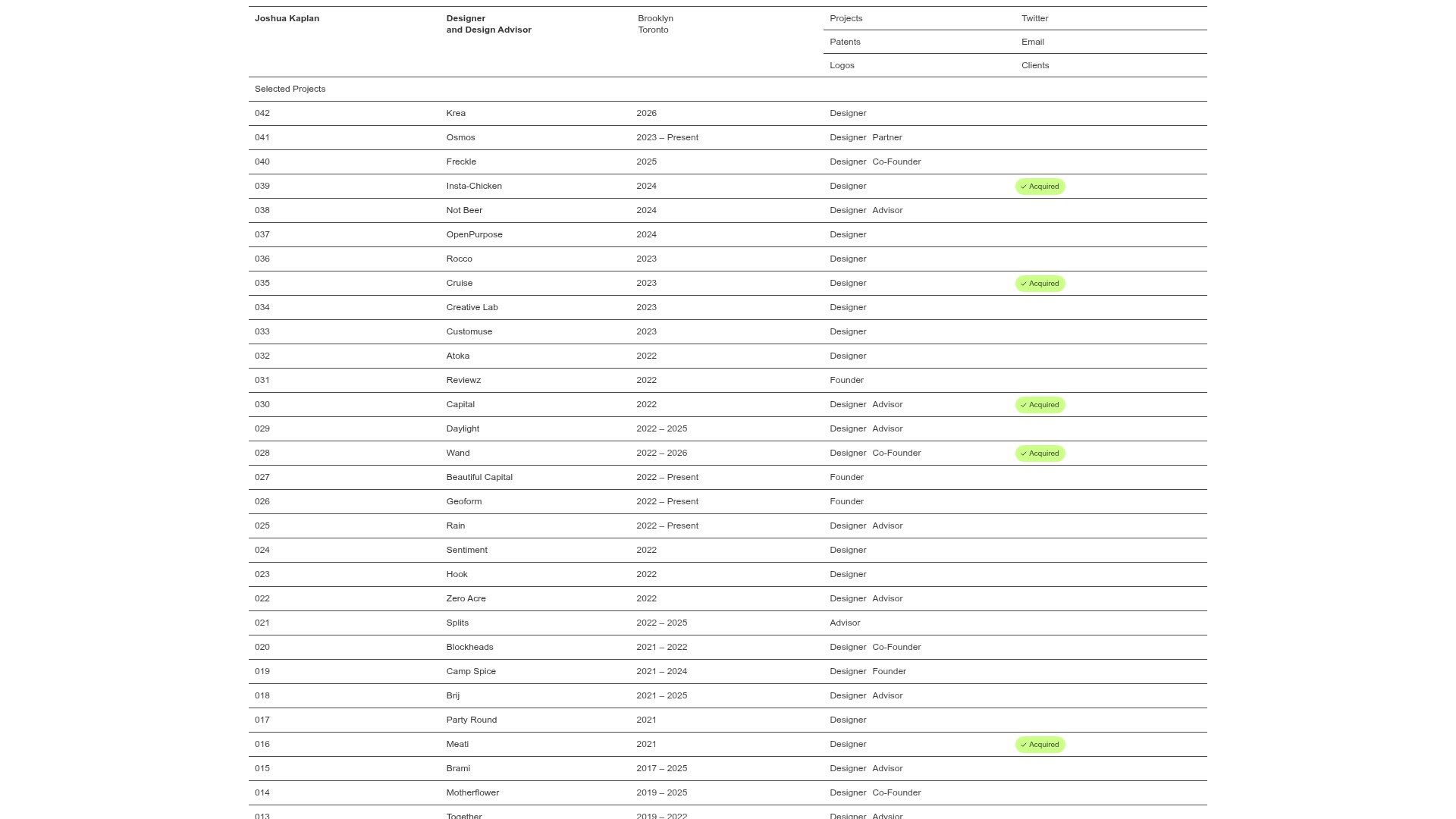
Joshua Kaplan Portfolio Index
A minimalist, text-only portfolio layout featuring an expansive tabular list of projects with horizontal rule separators and clean typography.
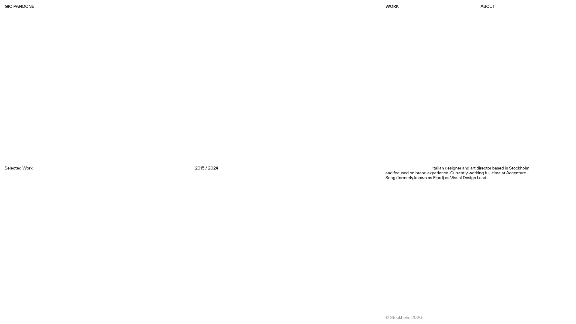
Gio Pandone Minimalist Portfolio Template
A clean, grid-based designer portfolio featuring a sticky minimalist navigation, scroll-triggered entrance animations, and a responsive 12-column work gallery with embedded video previews.
Minimalist Typography Portfolio and Services Grid
A clean, serif-heavy layout featuring an A-Frame 3D hero animation, tiered service lists, and a modular multi-column text structure for design manifestos.
Minimal Text-Based Creative Director Portfolio
A clean, typography-focused landing page featuring a multi-column layout for bio, links, and client lists using simple CSS flex or grid structures.
