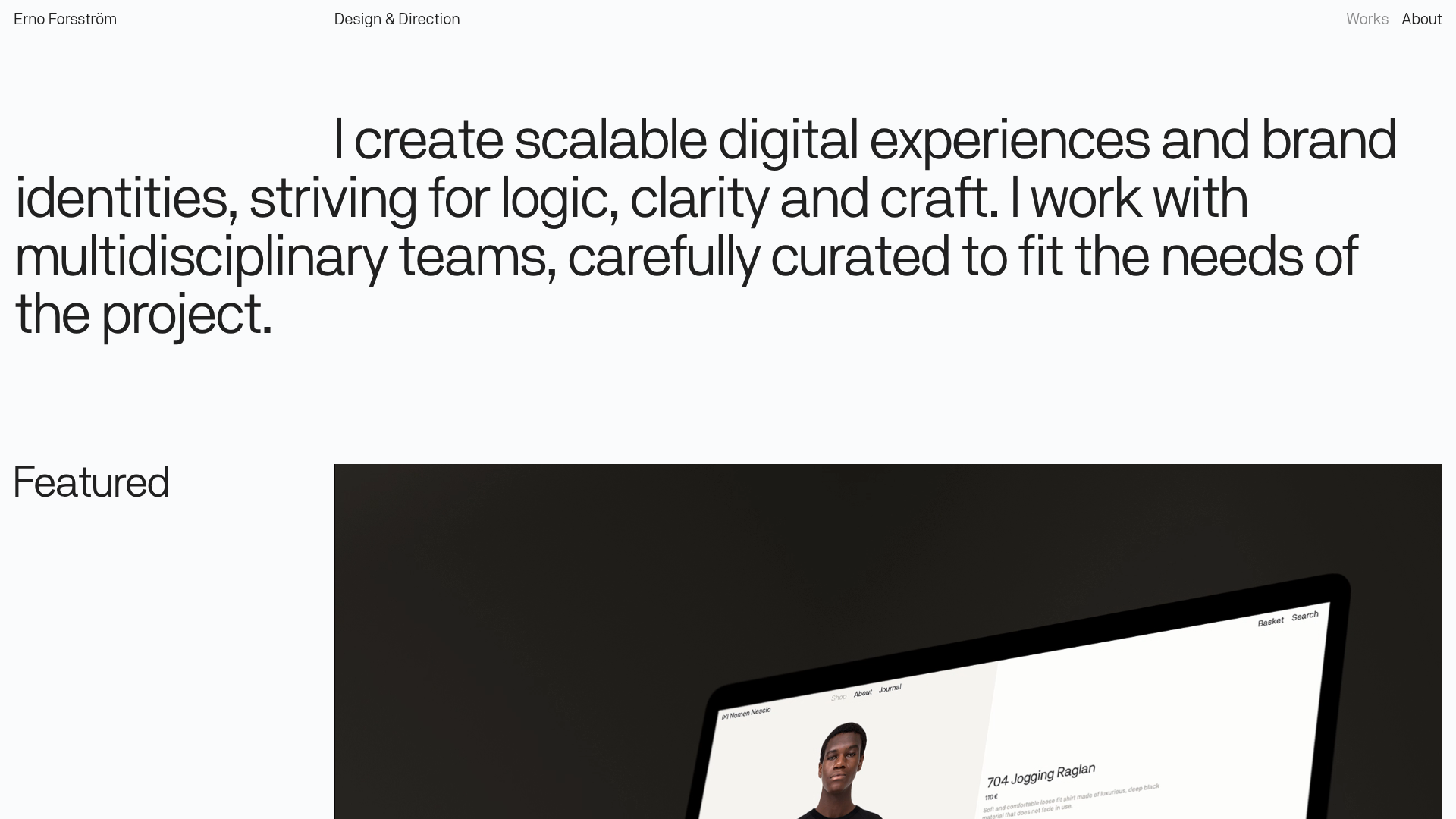
Erno Works Minimalist Design Portfolio
A clean, typography-focused portfolio featuring a sticky grid layout, large editorial headers, and integrated video project thumbnails for dynamic case study previews.
Overview
This portfolio is an exceptional example of a minimalist, typography-led digital experience that prioritizes clarity and high-end aesthetic craft. It serves as a strong clone reference for its sophisticated use of CSS Grid layouts, integrated video thumbnails, and a strict editorial heirarchy that balances heavy text with large-scale visual media.
Design System
- Color Palette & Visual Hierarchy: The design utilizes a high-contrast monochromatic base (off-white #dfdcdc backgrounds and near-black text) to establish a clean, brutalist-lite atmosphere. Hierarchy is achieved through massive font scaling rather than color shifts.
- Typography: A bold, sans-serif grotesque typeface dominates the layout. Heading sizes are extremely large with tight tracking (
h1for the intro statement), while functional text and project metadata use a smaller, consistent scale for clear readability. - Page Structure & Flow: The sequence begins with an oversized summary statement, followed by a 'Featured' project section that breaks the 12-column grid. Subsequent projects are organized chronologically ('2018—2020') in a multi-column grid, concluding with a large-scale CTA and a clean, multi-column footer.
- Reusable Components:
- Project Cards: A sophisticated mix of static images and
videoembeds (muted/autoplay/loop) that provide dynamic previews. - Sticky Side Labels: Vertical section labels like 'Featured' and years (2018—2020) that orient the user during scroll.
- One-Line Footer: A distributed grid footer that manages copyright, external social links, and legal links with minimal padding.
- Project Cards: A sophisticated mix of static images and
- Interaction & Motion: The HTML indicates opacity transitions and 3D transforms (
translate3d) on page load. Project links include hover states that likely reveal project info or trigger video playback clarity. - Implementation Clues: Built using Webflow, the site relies heavily on
w-layout-gridfor structural integrity andw-dyn-listfor the portfolio items, suggesting a CMS-driven architecture that is easy to scale.
Use Cases
- Who should clone this: Independent designers, creative directors, and boutique agencies looking for a high-signal, low-noise site to showcase premium work.
- Effective Remixing: This pattern works perfectly for high-end fashion lookbooks, architecture portfolios, or tech product landing pages where the product photography needs to speak for itself.
- Remix Directions: Replace the stark black-and-white palette with a muted earth-tone system to soften the aesthetic, or swap the oversized typography for a serif font to move toward a more traditional luxury feel. The info architecture can be adapted by changing the 'Year' labels into 'Service' categories.
- Clone Scope: A full-page clone is recommended to capture the specific spacing and grid logic, though the project grid sections can be cloned as standalone modular components for existing sites.
Related Inspirations
Gio Pandone Minimalist Portfolio Template
A clean, grid-based designer portfolio featuring a sticky minimalist navigation, scroll-triggered entrance animations, and a responsive 12-column work gallery with embedded video previews.
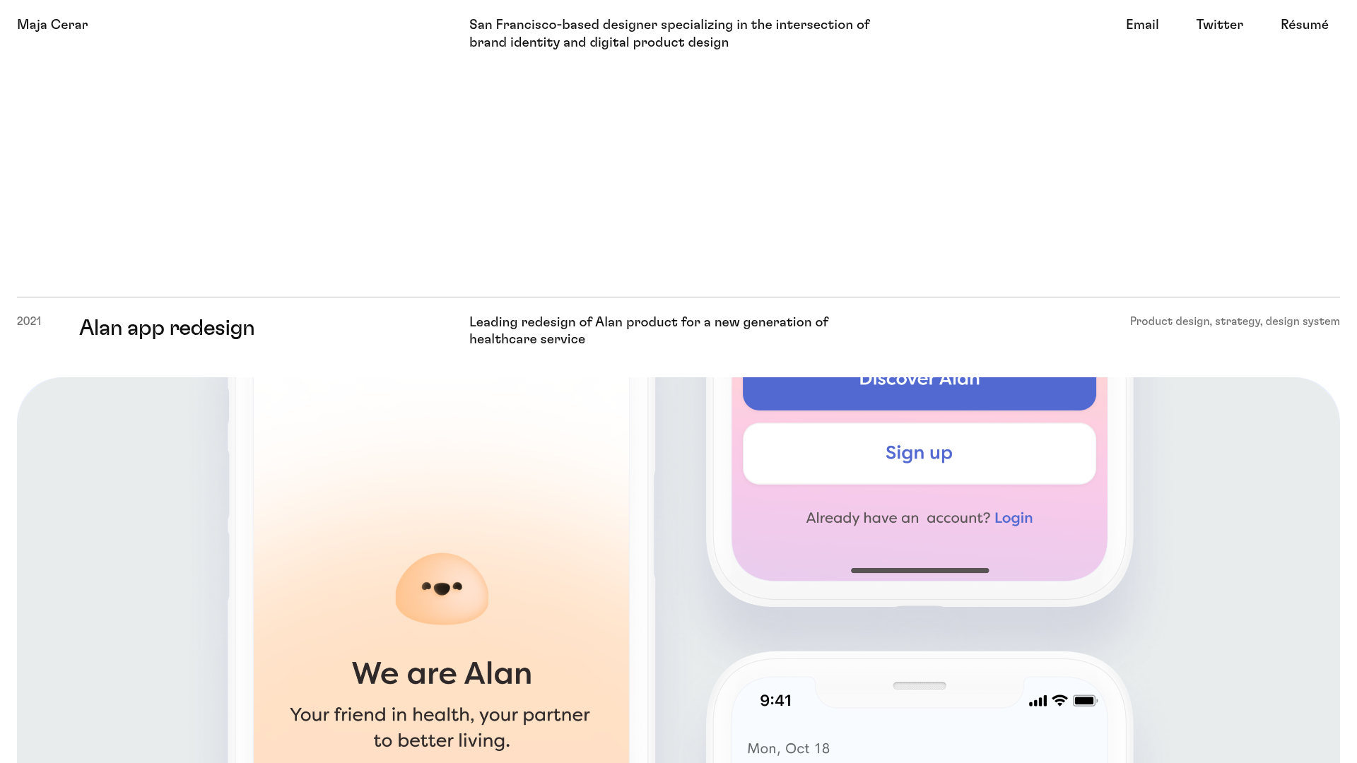
Maja Cerar Minimalist Portfolio Template
A clean, horizontal-grid portfolio featuring a sticky header, structured project metadata, and high-impact full-width imagery for product design case studies.
Ka Ra Studio Design Portfolio
A minimalist design portfolio featuring a centered typography-led layout with interactive image slideshows arranged in a flexible two-column grid.

Isla Beauty Skincare E-commerce Store
A clean Shopify-based storefront featuring a split-hero landing page, a step-by-step product system carousel, and a split-screen testimonial section with localized product image sidebars.

Christopher Doyle Agency Portfolio Layout
A minimalist, typography-led portfolio featuring a wide-margin grid system, smooth fade-in animations, and simple image-focused project cards.

Clase Agency Branding Portfolio
A minimalist design agency portfolio featuring a typographic hero section, full-width image articles, sticky title bars, and integrated scrolling text marquees for a clean editorial layout.
