Gio Pandone Minimalist Portfolio Template
A clean, grid-based designer portfolio featuring a sticky minimalist navigation, scroll-triggered entrance animations, and a responsive 12-column work gallery with embedded video previews.
Overview
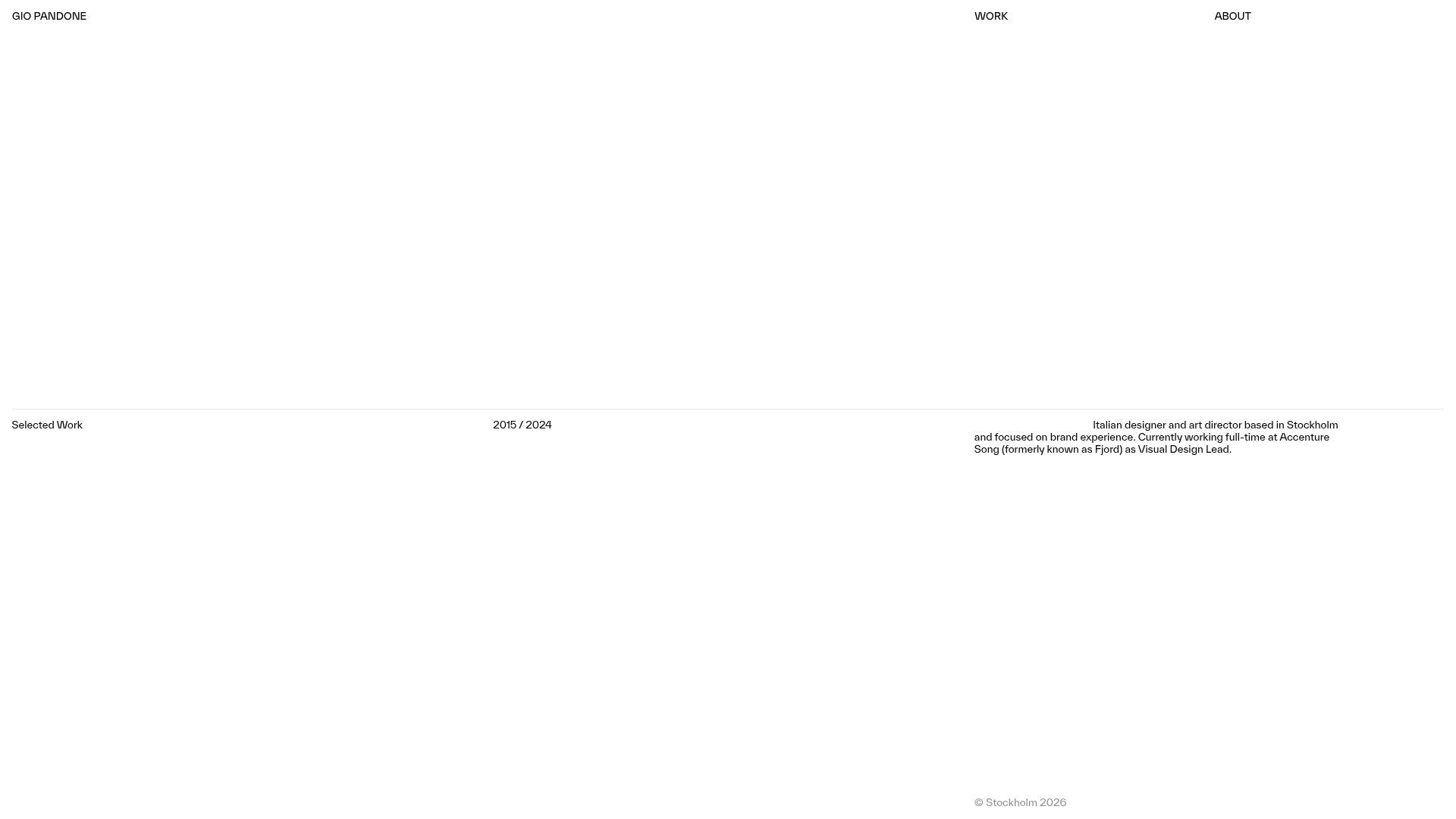
This minimalist portfolio belongs to art director Gio Pandone and serves as a masterclass in grid-based layout and sophisticated whitespace. It is an excellent clone reference for creatives seeking a high-production, "editorial" feel using a standard 12-column grid and smooth entrance animations.
Design System
- Color Palette & Visual Hierarchy: A high-contrast monochrome palette (white background, black text) uses shades of grey for metadata (e.g., footers and dates) to establish hierarchy without using color. This "clean canvas" approach ensures project media is the focal point.
- Typography System: The site uses a clean sans-serif (approx. 13px and 16px) with a heavy emphasis on modernist alignment. Headlines for project titles and metadata occupy the same scale as body text, creating a flattened, uniform hierarchy traditional in swiss-style design.
- Page Structure: The flow consists of a sticky top navigation, followed by a hero section with a three-part horizontal split (Copyright/Status, Date Range, Intro Bio). Below, the work gallery uses alternating 12-column grid spans, followed by a detailed list-based "About" section and a contact footer.
- Reusable Components:
- The Grid Gallery: Responsive
div-home-projectblocks that utilizew-layout-gridto occupy different column widths (e.g., 8-column vs 4-column offsets). - Sticky Nav: A minimalist top bar with a custom "logo-scale-wrapper" that maintains visibility during scroll.
- Video Previews: Embedded Vimeo/video wrappers (
media-wrapper-copy) set to 3:2 or 2:3 aspect ratios for consistent modularity.
- The Grid Gallery: Responsive
- Interaction & Motion: The site features significant scroll-triggered entrance animations (
opacity: 0to1withtranslate3d(0, 4%, 0)). Hover states on links include subtle scale and opacity transitions (delay-trans). - Implementation Clues: Built with Webflow, as evidenced by
w-nodeattributes and the_12-column-gridclass naming convention. It relies heavily on absolute positioning for metadata labels and fixed containers for the core layout.
Use Cases
- Who should clone this: Designers, art directors, and photographers who want their work to feel architecturally structured and professional rather than decorative.
- Effective Remixes: This pattern works exceptionally well for high-end digital agencies, architecture firms, or luxury fashion lookbooks.
- Remix Directions:
- Typography Swap: Change the sans-serif to a high-contrast serif for a more traditional luxury aesthetic.
- Asymmetric Shift: Maintain the 12-column grid but shift the project spans to create a more jagged, experimental rhythm.
- Selected Sections: Clone the Hero metadata block to create a distinct, informative landing page intro for any corporate site.
- Clone Scope: A full-page clone is recommended to preserve the sophisticated spatial relationships between the sticky navigation and the scrolling content blocks.
Related Inspirations
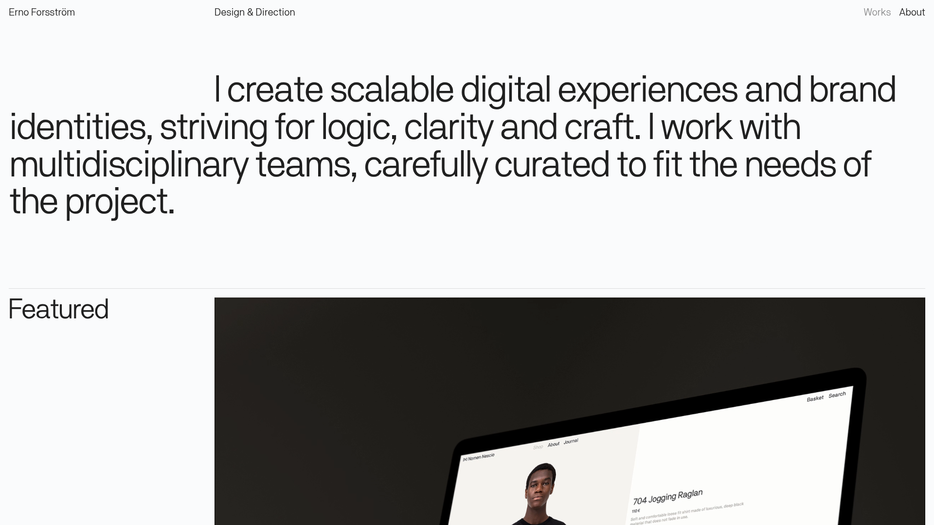
Erno Works Minimalist Design Portfolio
A clean, typography-focused portfolio featuring a sticky grid layout, large editorial headers, and integrated video project thumbnails for dynamic case study previews.
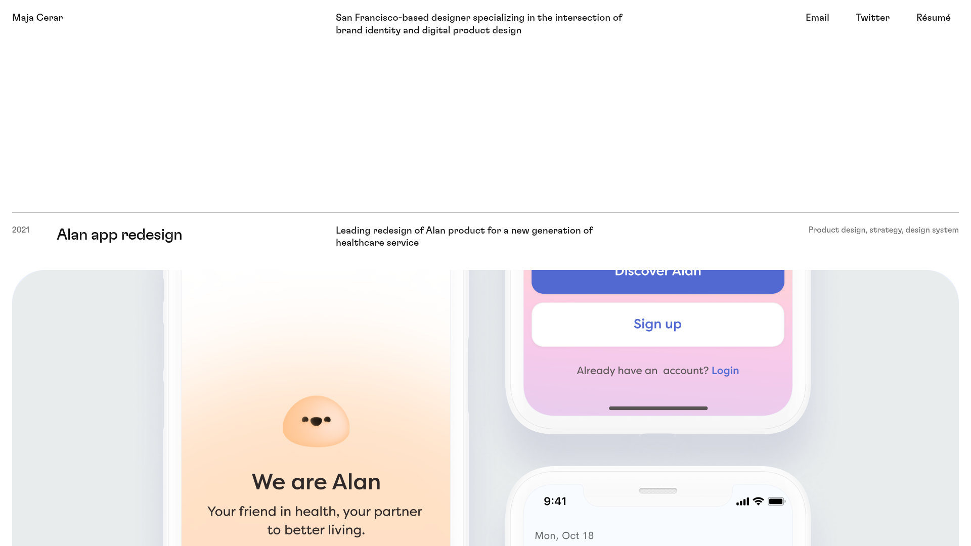
Maja Cerar Minimalist Portfolio Template
A clean, horizontal-grid portfolio featuring a sticky header, structured project metadata, and high-impact full-width imagery for product design case studies.
Ka Ra Studio Design Portfolio
A minimalist design portfolio featuring a centered typography-led layout with interactive image slideshows arranged in a flexible two-column grid.

Isla Beauty Skincare E-commerce Store
A clean Shopify-based storefront featuring a split-hero landing page, a step-by-step product system carousel, and a split-screen testimonial section with localized product image sidebars.

Christopher Doyle Agency Portfolio Layout
A minimalist, typography-led portfolio featuring a wide-margin grid system, smooth fade-in animations, and simple image-focused project cards.

Clase Agency Branding Portfolio
A minimalist design agency portfolio featuring a typographic hero section, full-width image articles, sticky title bars, and integrated scrolling text marquees for a clean editorial layout.
