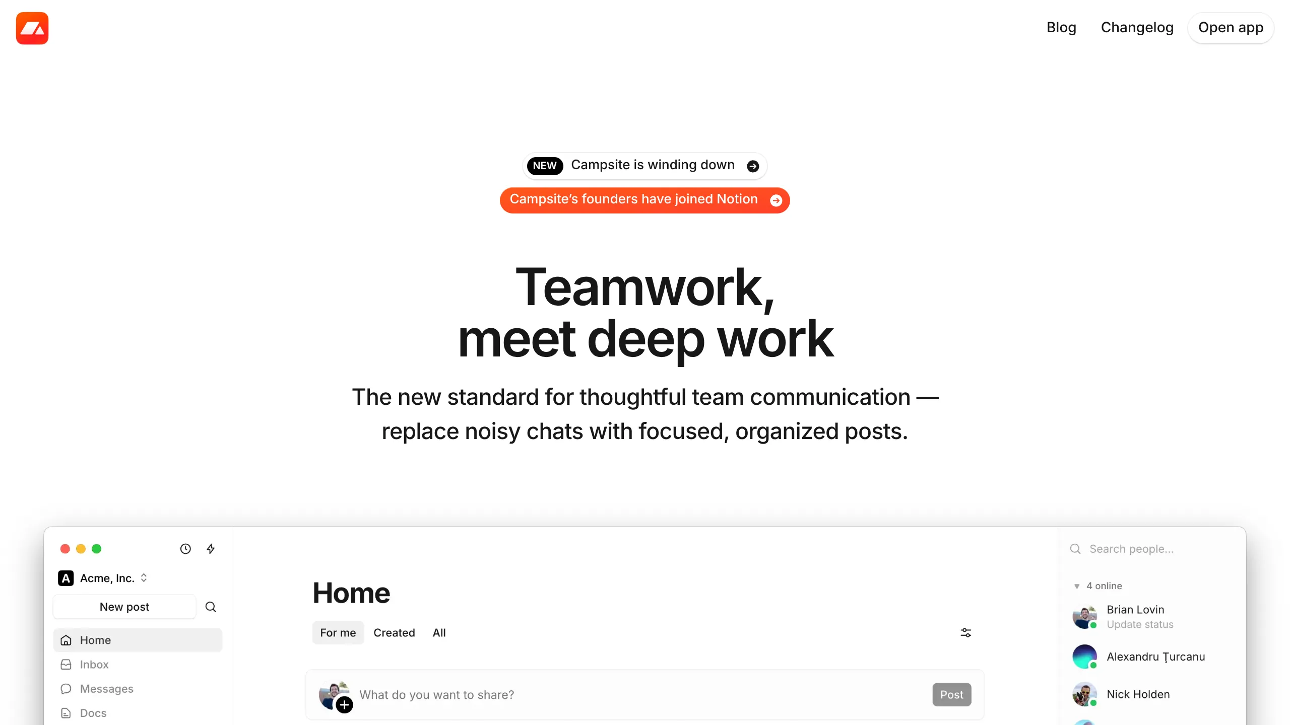
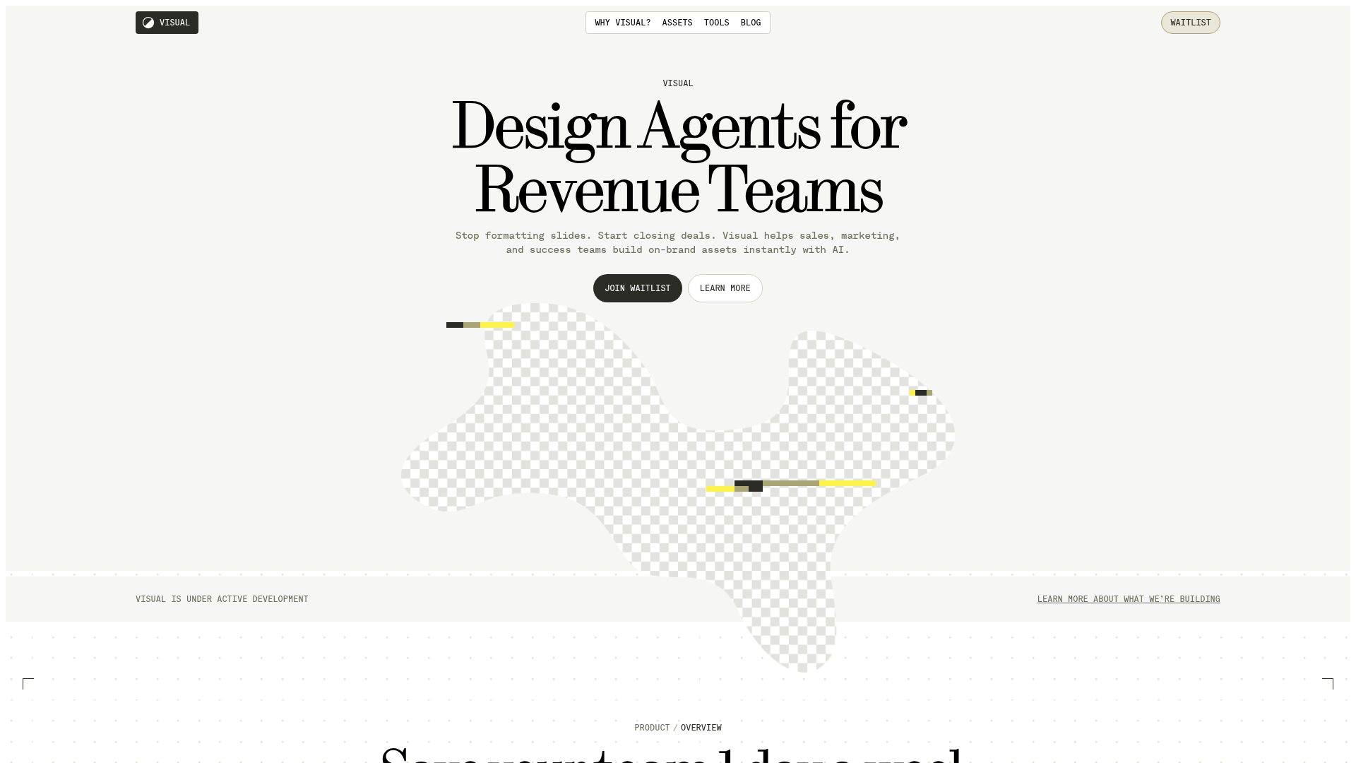
Campsite Async Team Communication Landing Page
A clean, minimalist landing page design featuring layered UI mockups, conversational thread layouts, and a handwritten-style founder's memo component.
Overview
Campsite's landing page is a masterclass in minimalist SaaS design, using layered UI mockups and depth effects to demonstrate a complex product through simple visuals. It effectively bridges the gap between marketing copy and functional software demonstration, making it an excellent reference for builders who want to showcase application features without relying on static horizontal screenshots.
Design System
- Color Palette & Visual Hierarchy: The site uses a high-contrast monochromatic base (clean whites and
neutral-950blacks) with strategic pops of color. High-utility elements like the "Open App" button and status badges use a vibrant green, while a brand-specific orange identifies the founder’s join-announcement. Backgrounds utilize subtle off-white#FFFDF9blocks to distinguish long-form text content from feature grids. - Typography: The system uses a clean sans-serif (Inter or similar) with tight letter-spacing (
-tracking-[1px]) for oversized headers. Body text maintains high readability with a medium weight andtext-balanceclasses to prevent awkward line breaks. - Page Structure: The flow follows a "Hero -> Stacked Product Pillars -> Testimonials-in-context -> Founder Memo -> Footer" sequence. Each feature section leads with a bold header followed by a unique interactive visualization of the software interface.
- Reusable Components:
- UI Layer Stacks: Specifically the "Posts" component that uses
absolutepositioning andbackdrop-blur-lgto simulate depth. - Rounded Pill Buttons: Consistent use of
rounded-fullbuttons with delicateshadow-button-baseand hover states driven by opacity shifts. - Founder Memo Card: A distinct ivory-colored block that breaks the standard grid to provide a personal narrative.
- Avatar Piles: Dense clusters of users used to show social proof and collaborative activity.
- UI Layer Stacks: Specifically the "Posts" component that uses
- Interactions & Motion: The page utilizes CSS transforms for subtle tilting (e.g.,
-rotate-2) to create a playful, "physical" feel for digital windows. Hover effects on links include saturation shifts (from grayscale to color) and horizontal translations on group-hover triggers. - Implementation Clues: Built with React/Next.js and styled via Tailwind CSS, the HTML reveals a heavy reliance on utility classes for spatial management (e.g.,
gap-4,mx-auto,isolate) and conditional dark mode styles using thedark:prefix.
Use Cases
- Who should clone this: Small teams building collaborative tools, project management software, or async communication platforms who need to convey "calm" and "focus."
- Remix Directions: Reuse the layered mockup logic to showcase different software views (e.g., a dashboard overlapping a code editor). The "Founder Memo" section can be adapted into a company mission statement or a unique "Why Us" block for mid-page narrative breaks.
- Practical Adaptations: Builders can strip the specific brand assets and keep the layout for a high-converting "Features" page. The avatar and notification stack is highly reusable for any social or team-based app.
- Suggested Clone Scope: A full-page clone is ideal for those seeking a complete brand identity refresh, while the layered feature cards (
group/posts) are perfect for quick, single-section integration into existing sites.
Related Inspirations

Slite SaaS Knowledge Base Landing Page
A clean SaaS hero section with a conversational headline, secondary call-to-action buttons, and a structured software interface preview featuring user testimonials.
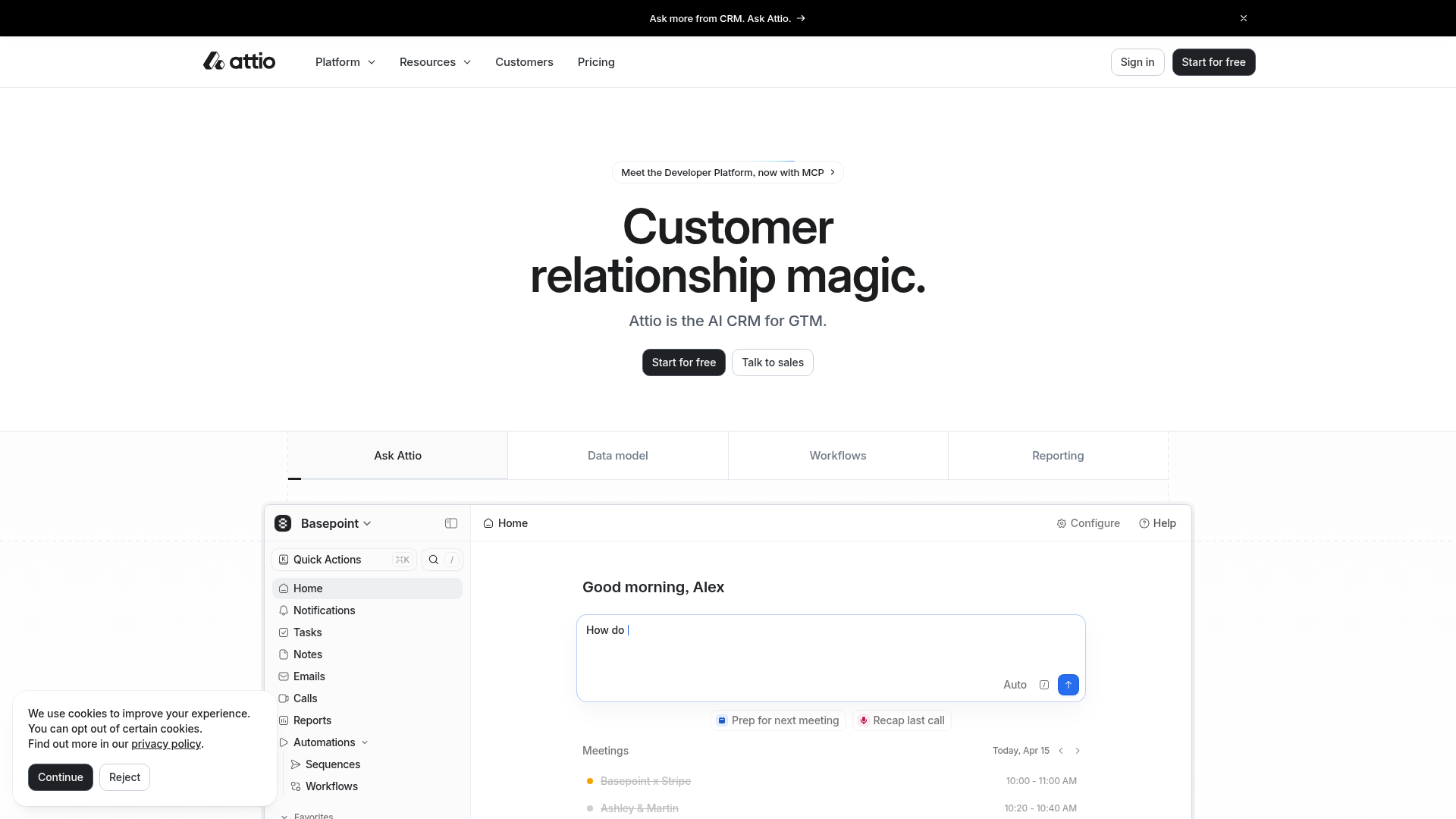
Attio AI CRM Landing Page
A clean SaaS landing page featuring a tiered navigation bar, a centered hero section with twin CTAs, and a detailed interactive dashboard preview.
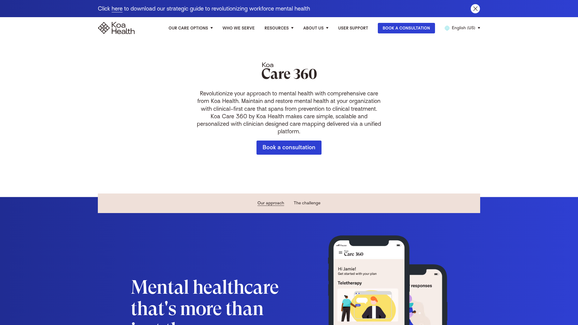
Koa Health Mental Care Landing Page
A clean healthcare landing page featuring a centered hero section, scroll-based fade-in animations, overlapping mobile mockups, and a multi-column feature grid with accent borders.
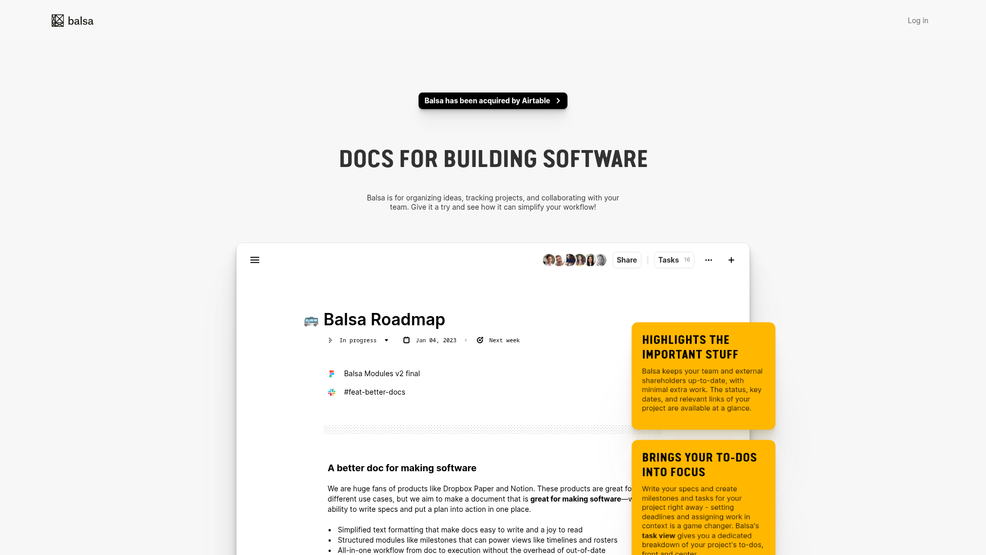
Balsa Software Documentation Landing Page
A clean document-centric layout featuring a centered hero section, high-contrast callout boxes, and a nested dashboard UI preview for collaborative tool showcases.
Firebase Hosting Site Not Found
A minimal placeholder layout for 404 error states including a centered logo, numbered troubleshooting guide, and linked utility text.
Visual AI Landing Page Templates
A high-end SaaS layout featuring a serif-heavy typography system, bento-style product showcase grids, accordion-style feature blocks, and minimalist wireframe UI components.
