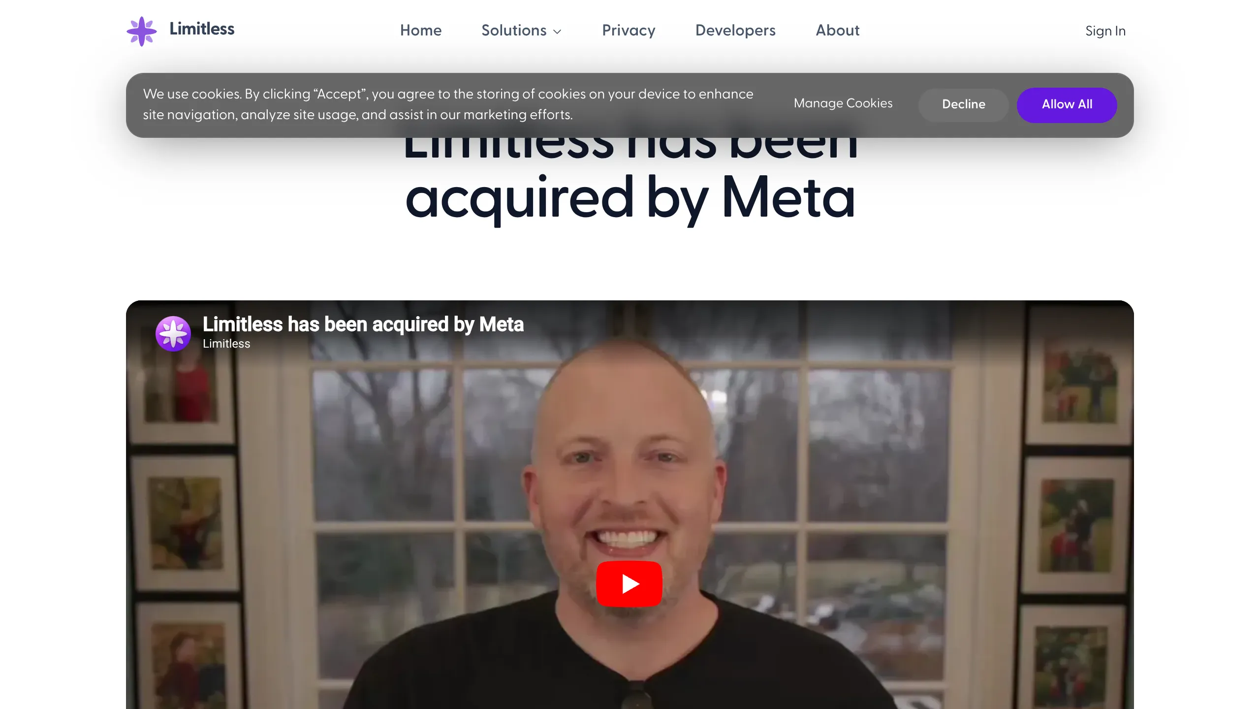
Limitless Acquisition Announcement Page
A clean announcement layout featuring a sticky blurred navigation bar, embedded video hero, glassmorphism cards for text content, and integrated FAQ accordions.
Overview
This acquisition announcement page for Limitless AI is an excellent reference for high-stakes corporate communication. It effectively balances a minimal aesthetic with technical sophistication, utilizing a clear visual hierarchy to communicate major news to a global user base. Builders should study this for its masterclass in using white space, typography, and glassmorphism to create a trust-focused, informative landing page.
Design System
- Color Palette & Visual Hierarchy: The design uses a clean, light-mode palette centered on Slate scales (
text-slate-700/90). Primary headlines usetext-slate-900for maximum contrast, while body text usestext-slate-600for readability. A subtle gradient (from-white/40 to-white/10) creates a glassmorphic effect on content cards. - Typography: The system relies on high-contrast sans-serif type. Headlines use
text-3xl md:text-6xlwithtracking-tightandfont-semiboldfor a modern, bold impact. Body text is set attext-lgwithleading-relaxedto ensure long-form messages remain accessible. - Page Structure: The layout follows a linear narrative: a sticky translucent header, a centered H1 hero, an embedded high-resolution video, a signature-signed announcement card, and a comprehensive FAQ section.
- Reusable Components:
- Sticky Navbar: A
backdrop-blur-xlbar that stays fixed at the top, featuring rounded-pill hover states (rounded-full). - Glassmorphism Cards: Large
rounded-3xlcontainers withshadow-2xland a1pxsubtle border for content separation. - FAQ Accordions: Native
<details>and<summary>elements styled withbg-slate-600/5and smooth transition durations (duration-200).
- Sticky Navbar: A
- Interactions & Motion: Hover effects are subtle, such as
hover:bg-slate-700/[8%]on nav links and scale/opacity transitions on buttons. The cookie banner uses a floating centered layout with high-contrast call-to-actions. - Implementation Clues: Built with Tailwind CSS, the code reveals a heavy reliance on utility classes for responsiveness (e.g.,
md:grid-cols-[1fr_max-content_1fr]). It uses Radix UI for accessible menu components and Next.js for the underlying framework.
Use Cases
- Who should clone this: Startups announcing pivots, acquisitions, or major product sunsets who need a professional, reliable-looking interface to manage user expectations.
- Effective Remixes: This pattern works perfectly for "Investors Relations" pages, "About Us" deep dives, or detailed technical documentation hubs where hierarchy and long-form reading are priorities.
- Remix Directions: Swap the purple
primaryaccent ("Allow All" button) for your brand's core color, replace the video hero with a Lottie animation for software launches, or adapt the FAQ grid into a three-column layout for simpler queries. - Clone Scope: A full-page clone is recommended to maintain the specific narrative flow, but the FAQ section and the glass-textured message card are highly modular and can be extracted as standalone components for existing sites.
Related Inspirations
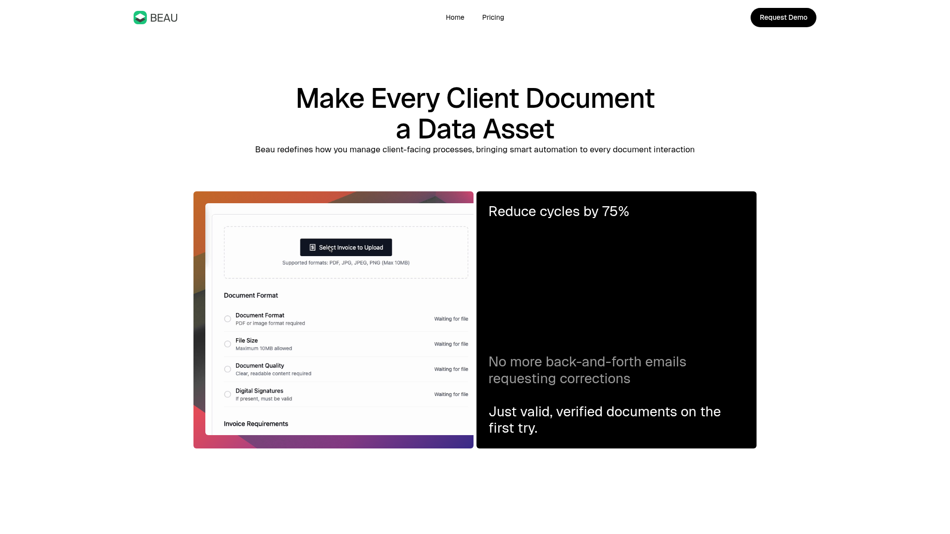
Beau Document Automation Landing Page
A modern software landing page featuring a bento-grid layout, split-screen hero assets with animated checkmarks, a step-by-step process guide, and a clean two-tier pricing table.
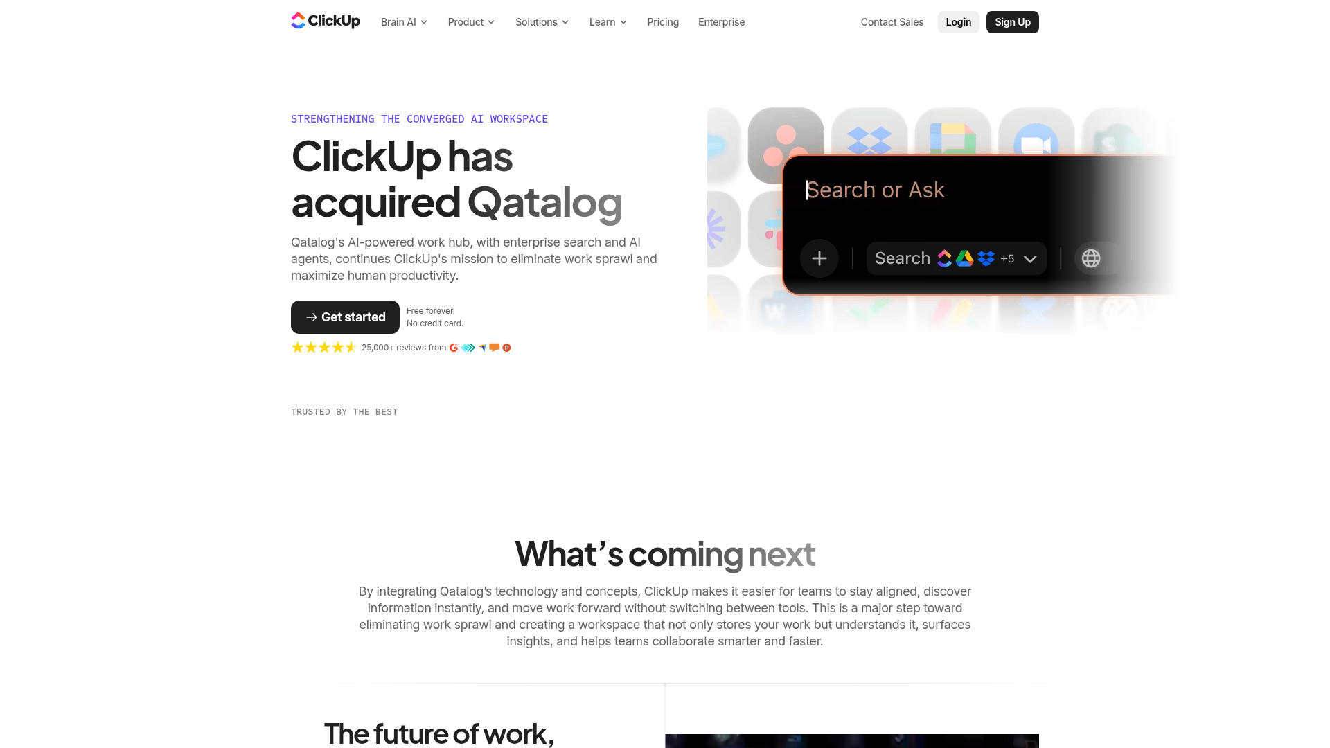
ClickUp Acquisition Hero Landing Page
Features a modern dark-themed hero section with a search UI graphic, bento-style feature grid, and a high-contrast CTA section with decorative gradients.
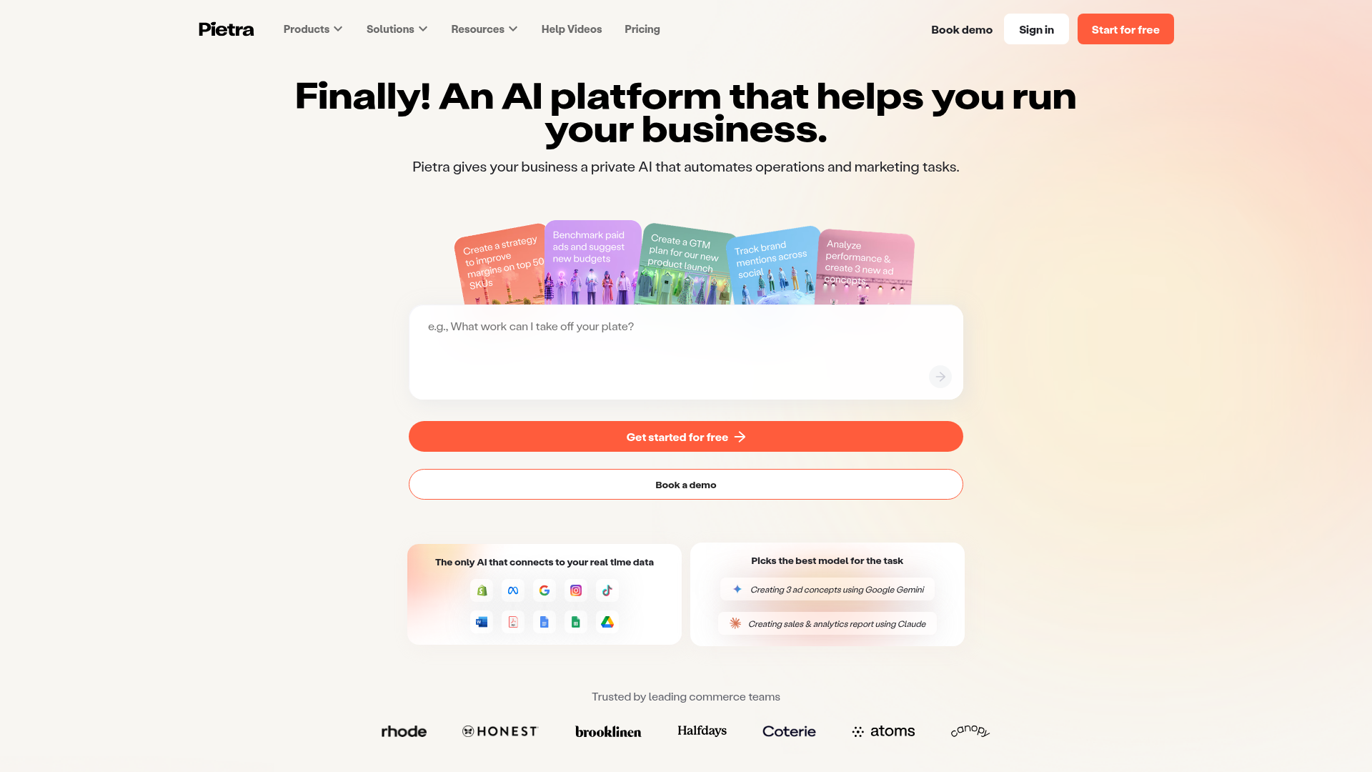
Pietra AI Platform Landing Page
A commerce-focused landing page featuring a centralized AI input hero, colorful floating value-prop cards, a bento-style integration showcase, and tabbed feature sections with side-by-side comparisons.
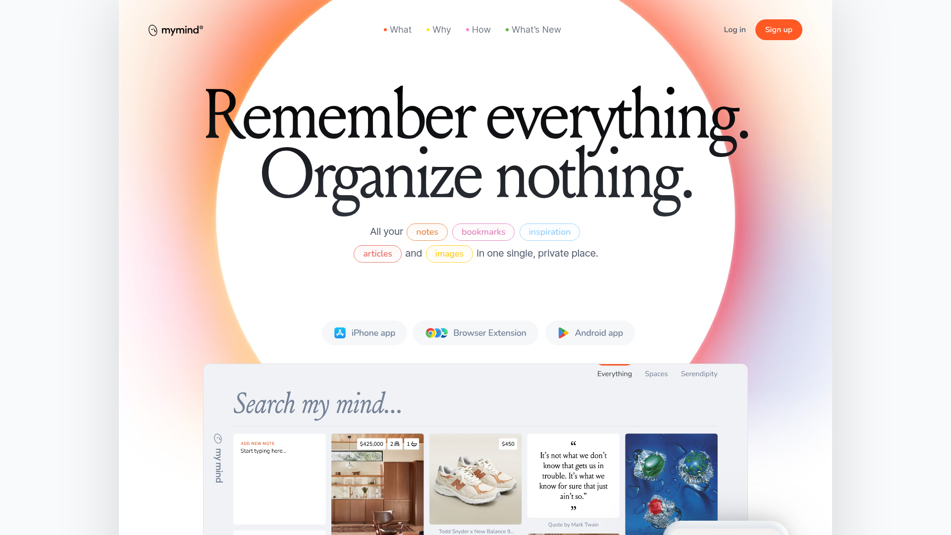
Mymind AI Tool Landing Page
A minimalist SaaS landing page featuring a soft-gradient hero section, custom pill-shaped text badges, and a dynamic bento-style search result preview grid.
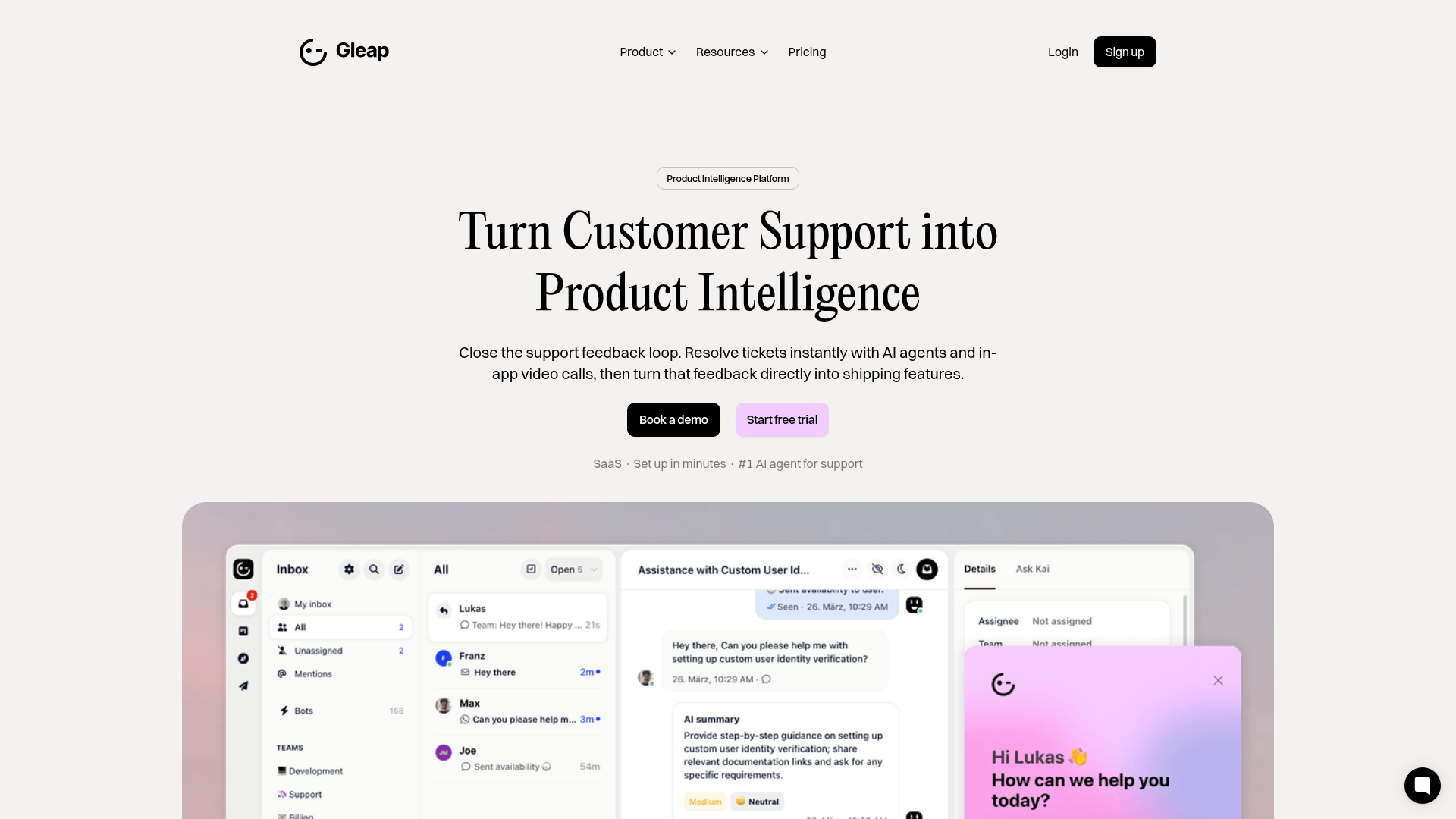
Gleap Product Intelligence Platform Landing
A SaaS template featuring a central video hero, comparison pricing tables, tabbed feature navigation, and a testimonial grid with major brand logos.
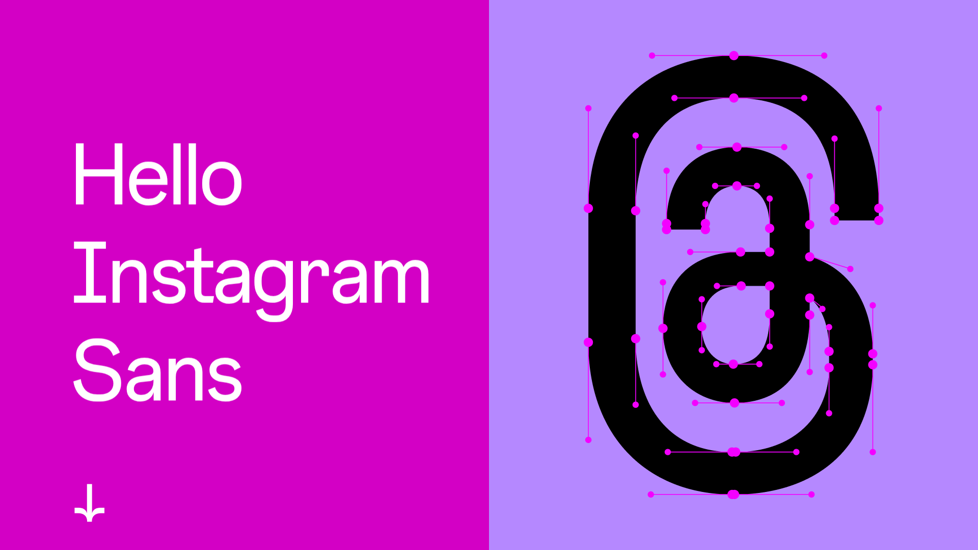
Instagram Sans Typography Showcase
A high-impact brand page featuring split-screen layouts, a character picker with technical font data, interactive type testers, and horizontal-scroll image and video carousels.
