Twingate Zero Trust Security Landing Page
A dark-themed SaaS landing page featuring a high-contrast hero section with a two-column layout, call-to-action buttons, and a clean three-column feature grid.
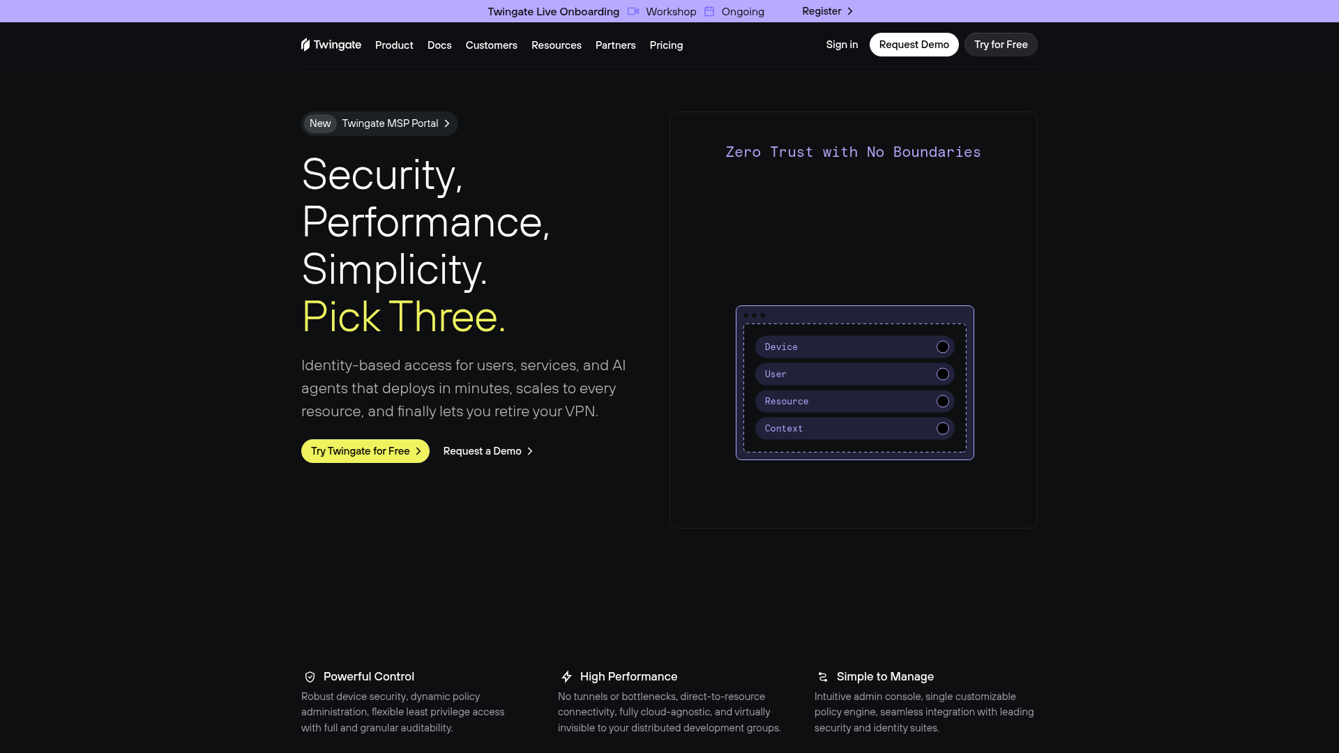
Overview
Twingate’s landing page is a premier example of a high-conversion, dark-mode B2B SaaS layout. It leverages high-contrast typography and a clean two-column hero section to communicate technical value propositions with professional clarity, making it an excellent reference for developers building security or infrastructure-focused marketing sites.
Design System
- Color Palette & Visual Hierarchy: Utilizing a deep black background (
#000000), the site creates a striking contrast with white headings and a vibrant lime-green primary accent (#E2FD52) for calls to action. A secondary palette of muted purples and grays is used within the product illustration to soften the technical aesthetic. - Typography System: The interface uses a clean sans-serif typeface (likely Inter or similar) with tight letter spacing. It employs a clear hierarchy using massive font sizes for the main heading (H1) and monospaced fonts for technical details like the "Zero Trust" illustration text to signify a "developer-first" feel.
- Page Structure: The layout follows a classic pattern: a thin top-bar announcement, a sticky navigation header, a split-screen hero (text left, visual right), and a horizontal three-column feature grid below the fold.
- Reusable Components:
- Buttons: Two distinct styles—a high-visibility lime-green pill button with a right arrow and a secondary ghost button with a thin border.
- Navigation: Centered links on a transparent background with a prominent "Request Demo" CTA.
- Info Cards: The bottom feature grid uses simple icons with bold subheads and descriptive body text, ideal for quick scanning.
- Implementation Clues: The HTML structure indicates a modular approach with a top-down flow (
<header>,<main>,<footer>). The use of SVG icons and utility-first styling suggests a framework like Tailwind CSS for quick layout management and spacing.
Use Cases
- Who should clone this: Developers or designers working on dev-tooling, cybersecurity products, or high-end enterprise software that requires a "trustworthy but modern" aesthetic.
- Effective Remixes: This pattern can be easily adapted for AI platforms or data infrastructure services. Swap the lime-green for an electric blue or neon orange to instantly shift the brand personality while maintaining the professional structure.
- Practical Remix Directions:
- Layout: Keep the two-column hero for desktop and stack it for mobile.
- Component reuse: Extract the announcement banner and the three-column feature grid for use across multiple landing pages.
- Suggested Clone Scope: A full-page clone is recommended to capture the spatial balance between the large typography and the interactive product visual. Alternatively, cloning just the hero section provides a solid foundation for any software-as-a-service homepage.
Related Inspirations
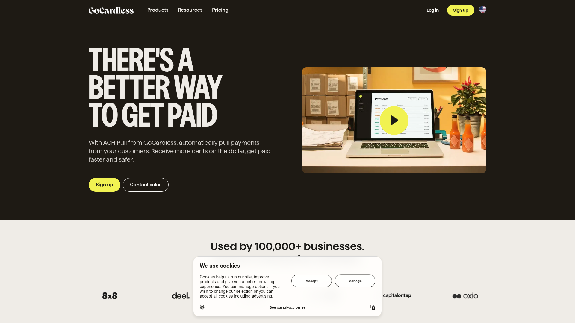
GoCardless Payments Platform Landing Page
A dark-themed fintech landing page featuring a split-screen video hero, bento-style feature cards, a horizontal logo slider, and step-by-step accordion guides.
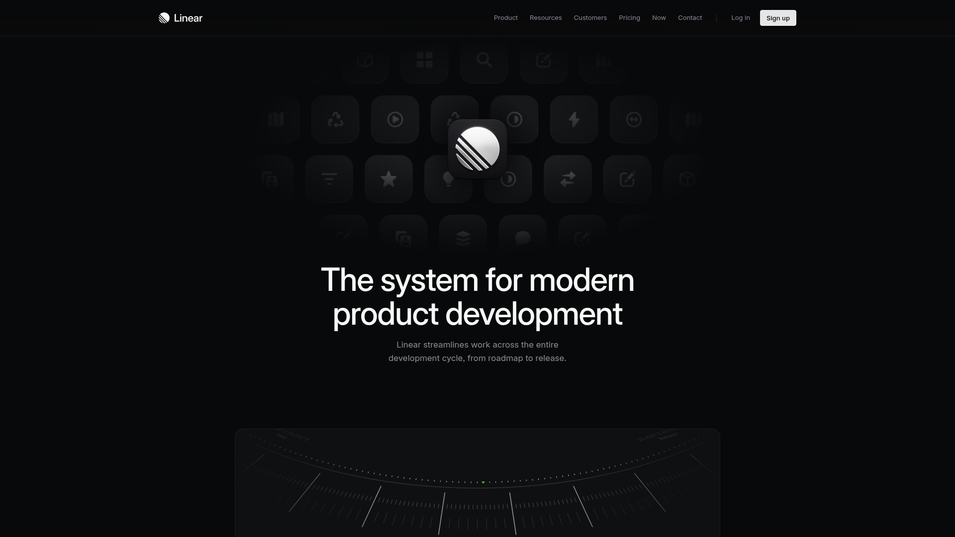
Linear Product Features Landing Page
A premium dark-themed landing page featuring a minimalist aesthetic, bento style icon grids, sleek typography, and high-contrast call-to-action buttons.
Framer Dark 404 Error Page
A minimalist dark mode error page featuring a clean centered layout, monochromatic navigation, and pill-shaped call-to-action buttons.
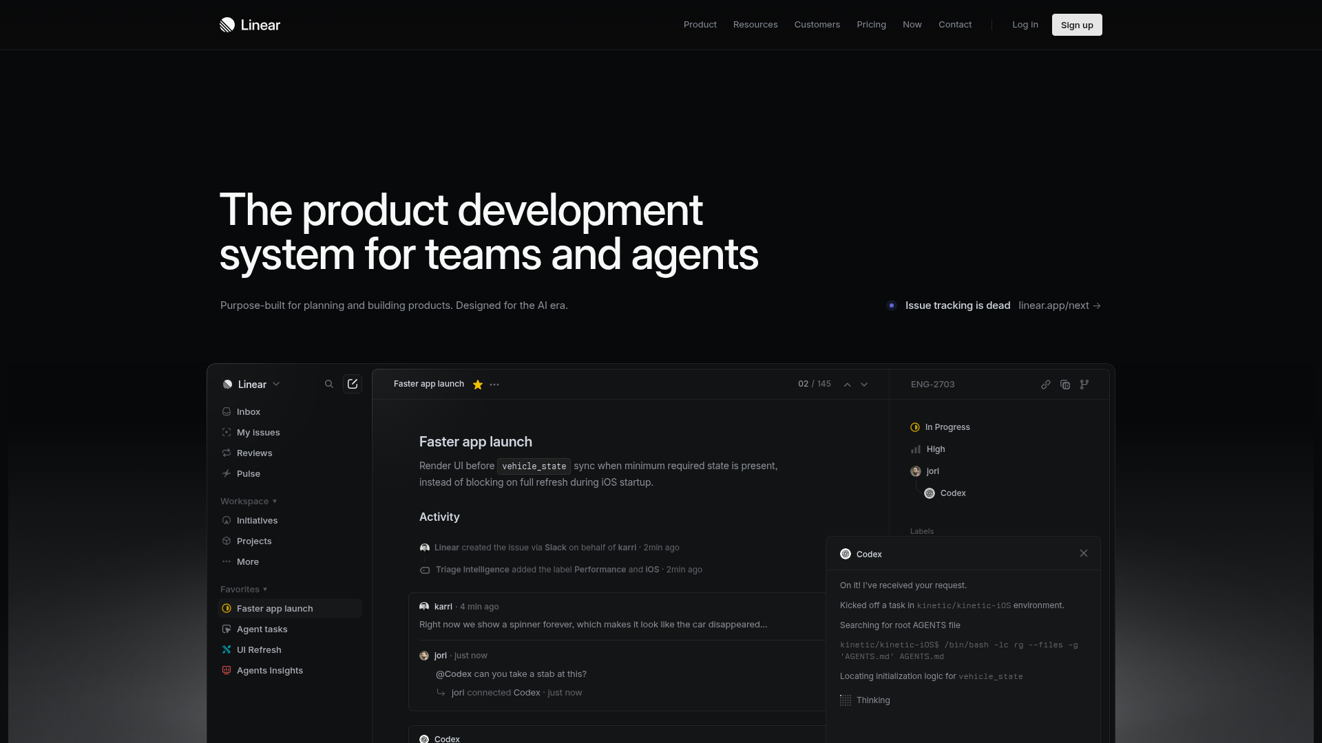
Linear Product Development System Landing Page
A high-fidelity dark-themed landing page featuring a complex dashboard UI mockup, glassmorphism effects, and a sophisticated sidebar navigation layout.
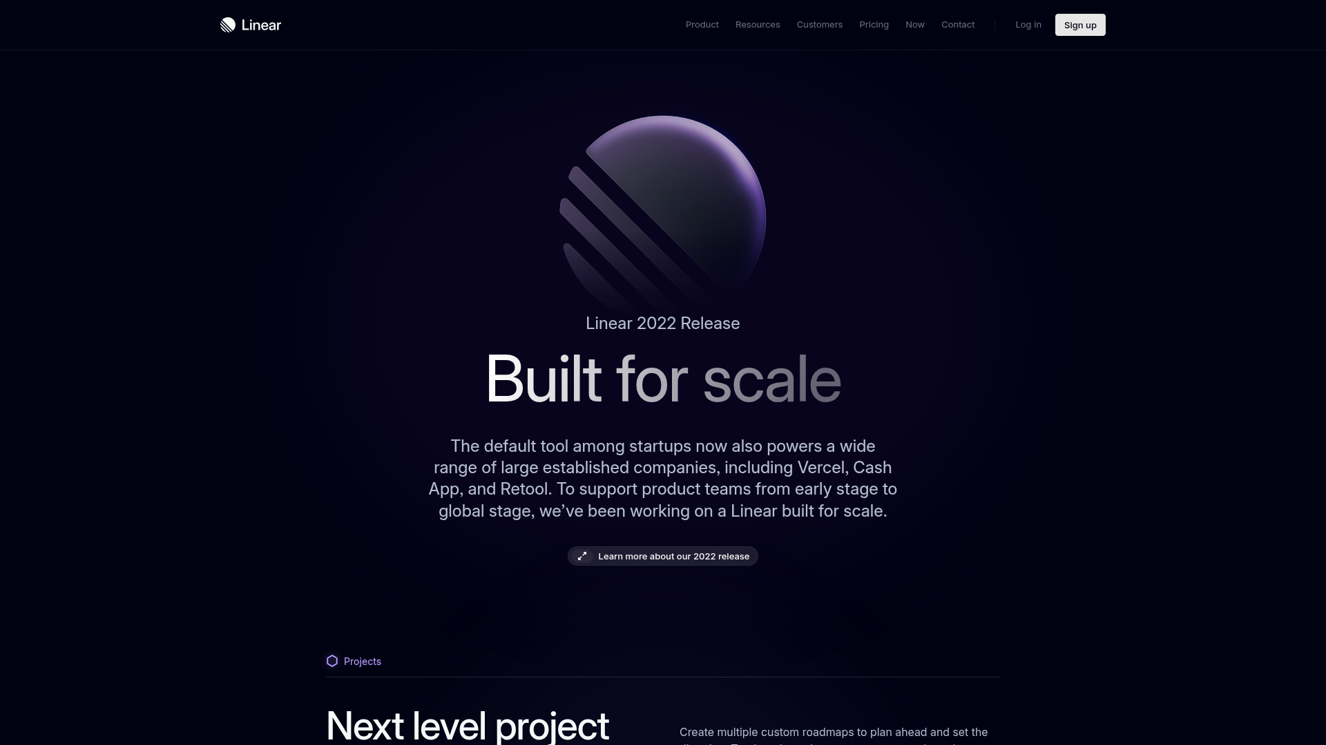
Linear 2022 Product Release Page
A high-end dark mode product launch page featuring a 3D glassmorphic logo, sleek typography, and a structured layout for feature announcements.
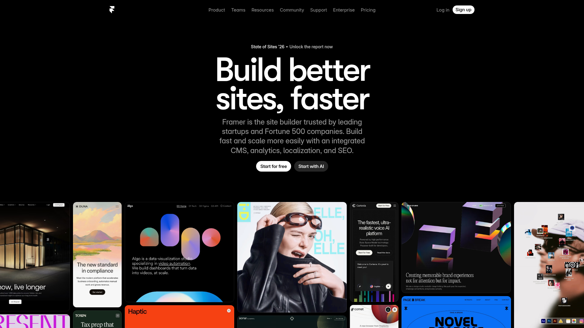
Framer Hero and Showcase Portfolio
A dark-themed landing page featuring a centered typography hero, integrated CMS/AI CTAs, and a horizontal scrollable masonry grid of site previews.
