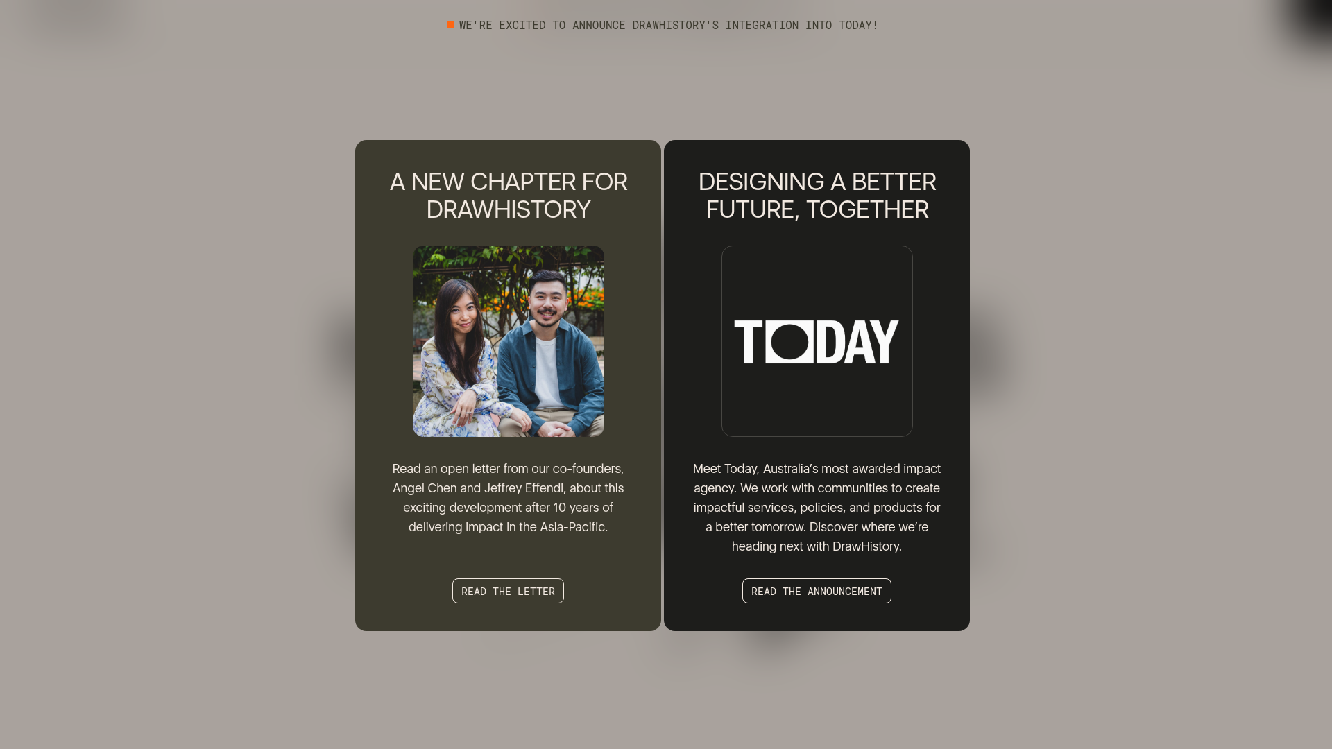
DrawHistory Social Impact Agency Portal
A split-layout announcement page featuring high-contrast cards, typography-driven hero sections, vertical border treatments, and touch-responsive case study carousels.
Overview
DrawHistory is a social impact agency portal that utilizes a bold, high-contrast aesthetic to bridge corporate strategy with grassroots activism. It is a premier reference for builders wanting to master intentional whitespace, dual-tone card layouts, and refined typography-driven messaging for agency portfolios.
Design System
- Color Palette & Visual Hierarchy: The primary palette is grounded in earthy tones like
onyx(#222),warm-sand, andwet-sand, contrasted with vibrantorange-flairaccents. Hierarchy is established through oversized headings and heavy vertical borders that act as structural anchors. - Typography System: The site uses a mix of a clean sans-serif for body text (
Roboto) and a high-impact, expressive display typeface (Eloquia) for headings and hero sections. Scales range from tight eyebrow titles to massive fluid headings that occupy 50% of the viewport width. - Page Structure & Section Flow: The layout begins with a typography-heavy hero, followed by an "Our Latest" horizontal carousel. It follows a rhythmic pattern of two-column split layouts where one side contains imagery and the other contains text with significant indentation (8-em range offset).
- Reusable Components:
- Announcement Cards: The dual-card modal/portal features rounded corners (2xl), centered text, and nested square image blocks.
- Segmented Horizontal Spacing: Sections are separated by thin, low-opacity (40%) black or sand borders that extend to the browser edge.
- Button Styles: Ghost-style buttons with thick borders and rectangular shapes, utilizing uppercase sans-serif labels.
- Interaction & Motion Patterns: The site employs a "custom cursor" that changes state (text/color) based on the hovered element (e.g., "Read Case" or "Drag"). Entrance animations are orchestrated using an
animate-downutility that creates a staggered reveal effect. - Responsive Behavior: On mobile, the split-screen layouts collapse into stacks, and horizontal sliders (built with Swiper.js) allow for touch-based navigation. Navigation transforms from a persistent header to a full-screen
fixedoverlay. - Implementation Clues: The HTML reveals a heavy reliance on Tailwind CSS for layout (e.g.,
lg:grid-cols-4,space-y-8) and custom animation attributes (animate-observing="true") for scroll-triggered transitions.
Use Cases
- Who Should Clone: Agency owners, social enterprises, and creative consultancies looking to present a balance of professional weight and creative fearlessness.
- Effective Remixes: This pattern works exceptionally well for nonprofits launching an annual report, or B2B SaaS sites that want to stand out from typical "utility" layouts with a high-end editorial feel.
- Practical Directions: Remix the background colors to a monochromatic grayscale for a more corporate look, or increase the corner rounding (radius) for a softer, tech-friendly brand identity. Keep the split-screen hierarchy to emphasize case studies alongside philosophical text.
- Suggested Scope: A full-page clone is ideal for those needing a cohesive brand story; however, the split-hero and horizontal card carousels are excellent candidates for a quick section-only clone.
Related Inspirations
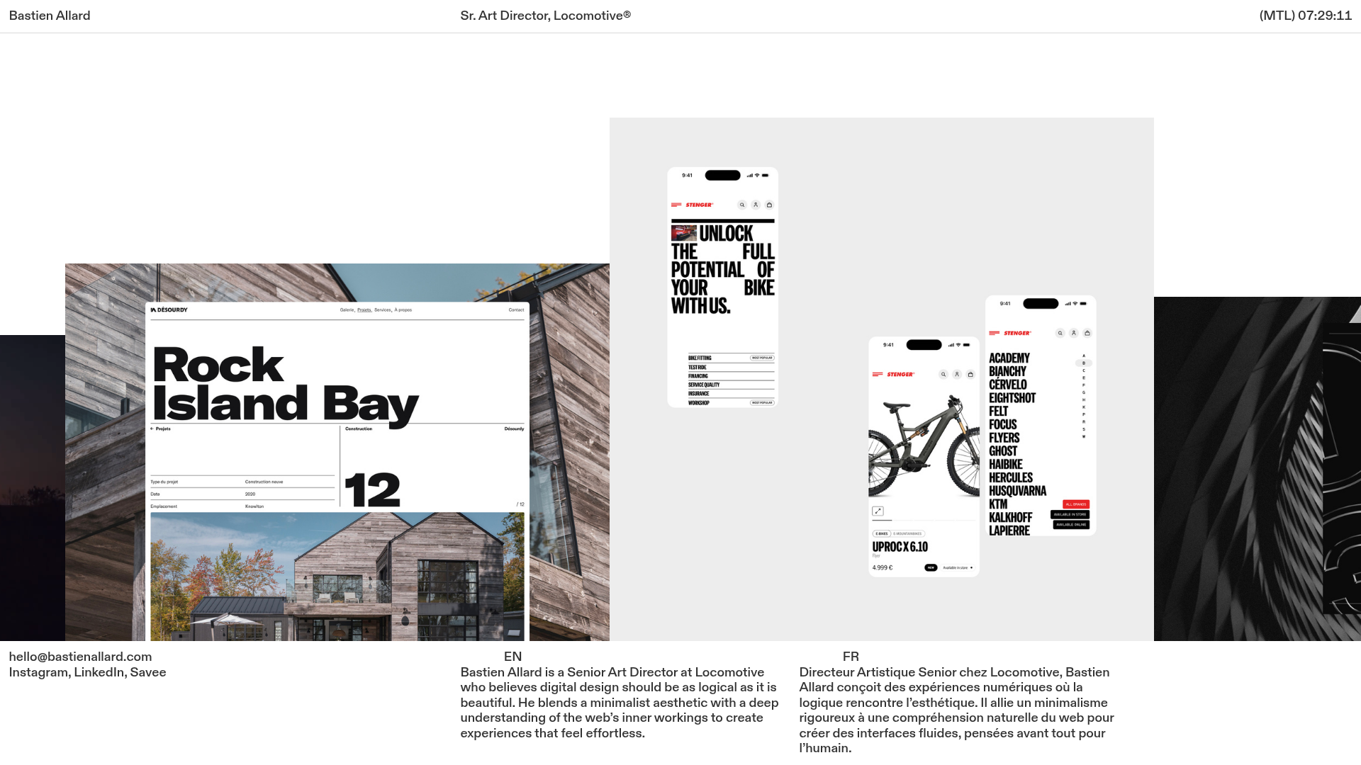
Bastien Allard Minimalist Portfolio Gallery
A clean, horizontal marquee-based portfolio featuring a sticky header/footer layout, digital clock integration, and responsive bilingual text columns for minimalist art director showcases.
Studio Lathe Minimalist Portfolio List
A high-contrast, minimalist portfolio layout featuring a dense list-based project index with flexible category labeling and a full-screen yellow background.

Niklas Rosén Designer Portfolio Index
A minimalist, responsive grid-based portfolio index featuring a clean 16-column layout, typographic list components, and a custom dark mode transition.

Clase Agency Branding Portfolio
A minimalist design agency portfolio featuring a typographic hero section, full-width image articles, sticky title bars, and integrated scrolling text marquees for a clean editorial layout.

Lundqvist & Dallyn Studio Portfolio
Minimalist design studio portfolio featuring a custom video loader, world clock navigation, and a fluid masonry-style grid for high-quality photography and type design showcases.

Baubauwerk Minimal Agency Portfolio Homepage
A clean studio site featuring a centered text hero, scatter-plot filterable project gallery, and full-bleed image sections for case studies.
