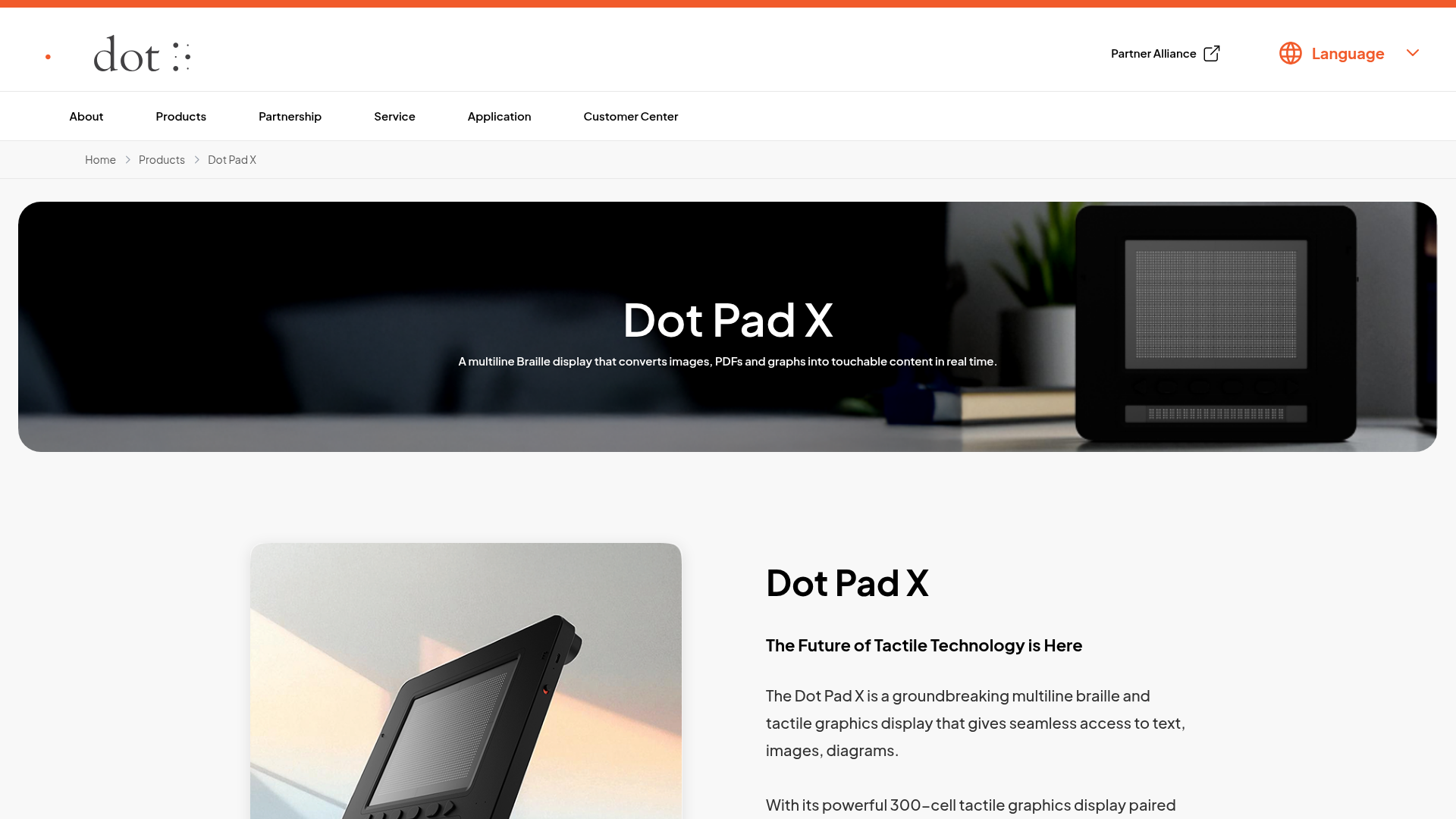
Dot Pad X Product Showcase Landing
A clean product page featuring a wide-screen hero banner, structured text blocks, and high-fidelity product imagery ideal for hardware or gadget portfolios.
Overview
This project is a high-fidelity product showcase landing page for a specialized hardware device (Dot Pad X). It effectively balances cinematic, wide-screen hero imagery with information-dense sections like grid-based value propositions, technical specifications, and interactive forms, making it an excellent reference for marketing technical gadgets or niche hardware.
Design System
- Color Palette & Visual Hierarchy: The site uses a clean, high-contrast monochrome base (white background, black text) with an accent orange color (
#ff4500approximate) used for primary brand touchpoints like buttons and top header borders. Visual hierarchy is established through massive photographic banners and varying scale in headings. - Typography System: A clean, geometric sans-serif (resembling circular or Montserrat styles) is used throughout. Bold
h2andh3tags create clear entry points for content, while a light-gray color is used for secondary descriptive text to reduce cognitive load. - Page Structure & Flow:
- Global Header: Minimalist nav with a language switcher.
- Hero Banner: A full-width immersive image with centered text overlay.
- Product Intro: Split layout with a large product shot and descriptive text with primary/outline CTAs.
- Value Grid (Who Can Benefit): A 2x2 card layout with icons and descriptive paragraphs.
- Feature Matrix: Icon-led cards with tags (e.g., "Display", "Portability") and bulleted lists.
- Interactive Diagram: A hardware breakdown section using hotspot-style labels.
- Technical Specs & FAQ: Structured data grids followed by an accordion-style FAQ using the
<details>element. - Testimonial Grid & Video Review: Social proof sections featuring user quotes and a video embed with a play button overlay.
- Reusable Components: The split-screen intro block (
dotpadx__section1), the icon-based feature cards (dotpadx__section4-card), and the clean technical spec grid are highly reusable for any physical product page. - Implementation Details: The HTML suggests a structured approach using BEM-like naming conventions (e.g.,
dotpadx__section3-inner) and utilizes modern semantic tags like<details>for FAQs and standard form sets for country selection and recaptcha integration.
Use Cases
- Who should clone this: Developers building landing pages for hardware tech, assistive technology, or specialized industrial equipment.
- Effective Remixes: This pattern works well for complex SaaS features that require separate "Who is this for?" and "Technical Specs" sections. Individual blocks like the feature grid or the FAQ can be extracted for smaller landing pages.
- Remix Directions: Swap the monochromatic scheme for a more vibrant brand palette; adapt the "Benefit" grid icon style to match a software UI; or replace the detailed hardware technical specs with a software API documentation summary.
- Suggested Scope: A full-page clone is ideal for a launch or product-specific page. For a quicker win, the Section 4 Feature Grid and Section 9 FAQ are the most modular and easy to adapt to any brand identity.
Related Inspirations
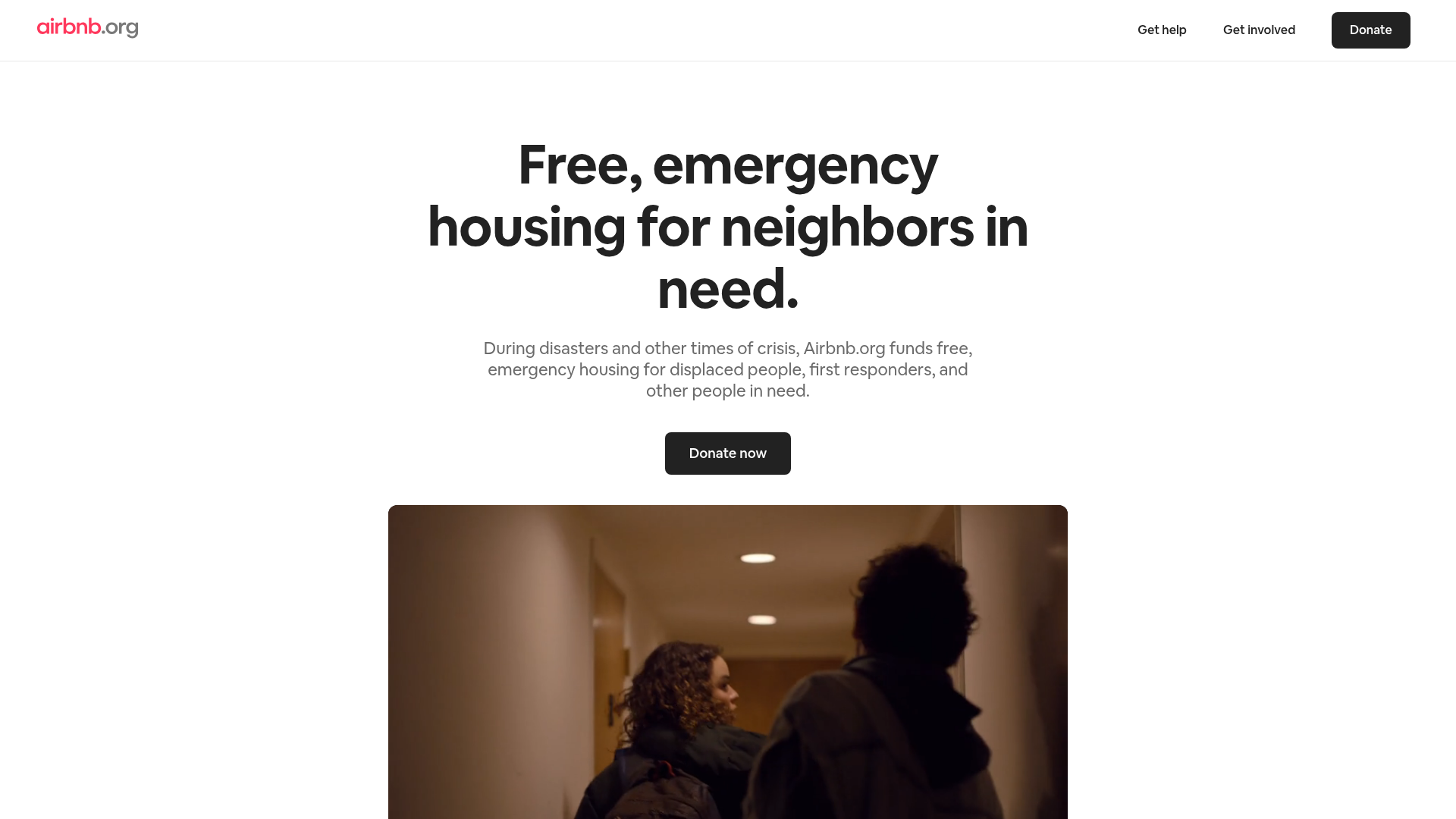
Airbnb.org Relief Housing Landing Page
A clean nonprofit landing page featuring a minimalist logo header, high-contrast CTA buttons, centered typography hero section, and an embedded video container.
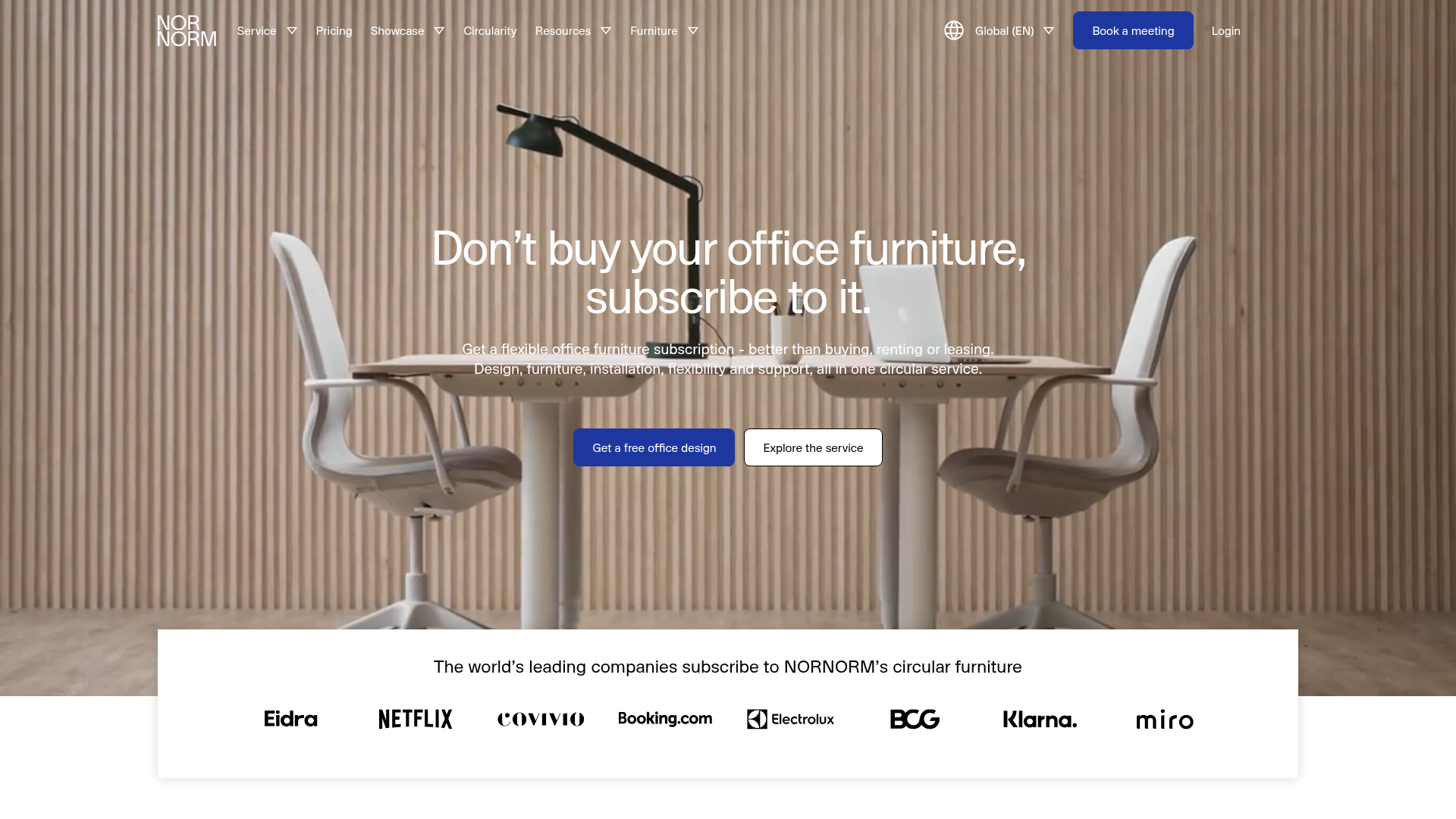
NORNORM Circular Furniture Subscription Homepage
A clean corporate landing page featuring a full-width hero with centered dual CTAs, a sleek brand logo marquee, and a minimalist navigation menu.
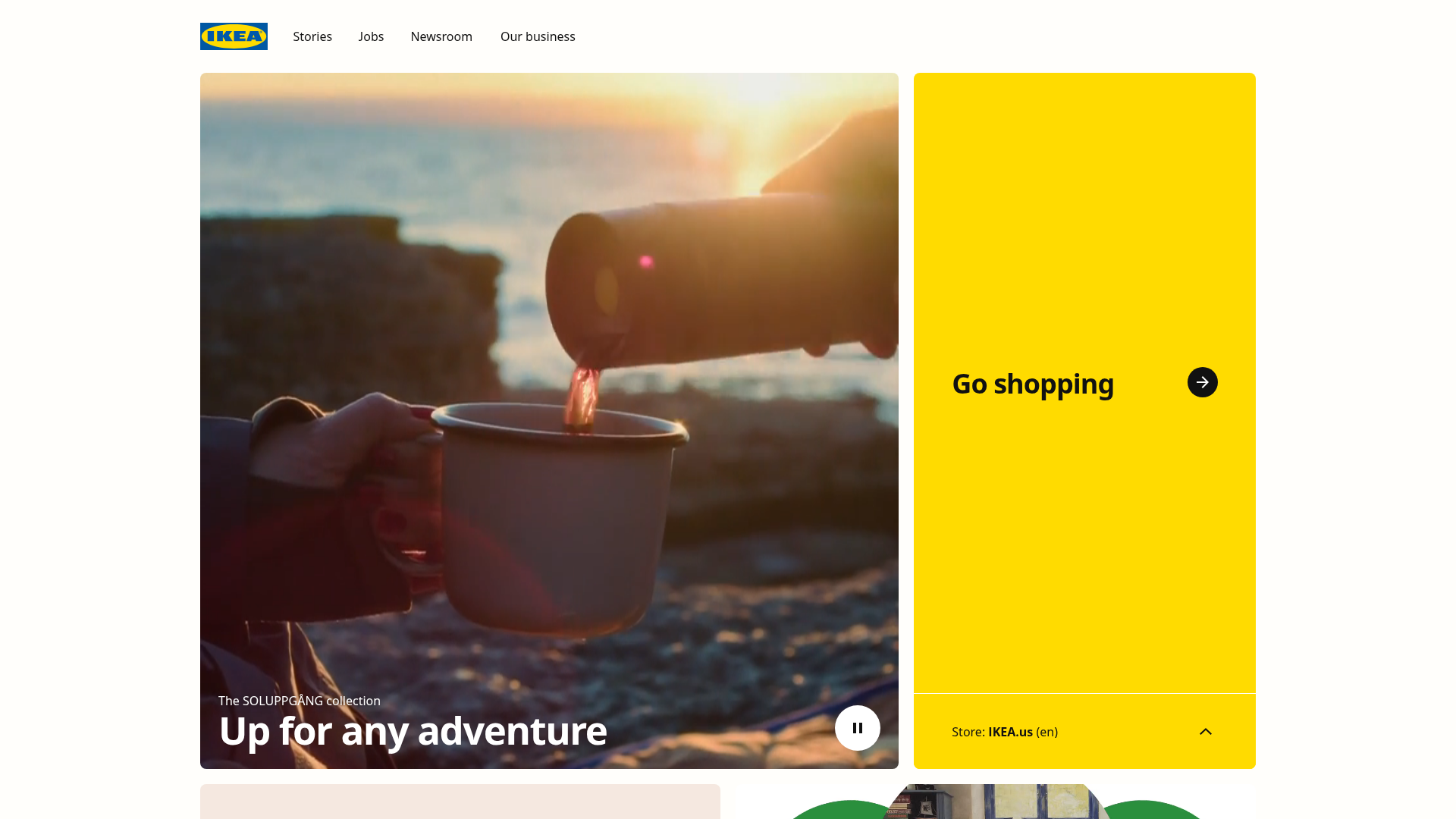
IKEA Corporate Landing Page Layout
A clean corporate portal featuring a large hero hero section with video playback, a split-screen call-to-action block, and a minimalist navigation bar.

Finn Pet Supplements Landing Page
An e-commerce landing page featuring high-contrast typography, a sticky brand logo banner, parallax scroll effects on product headers, and a clean product grid.
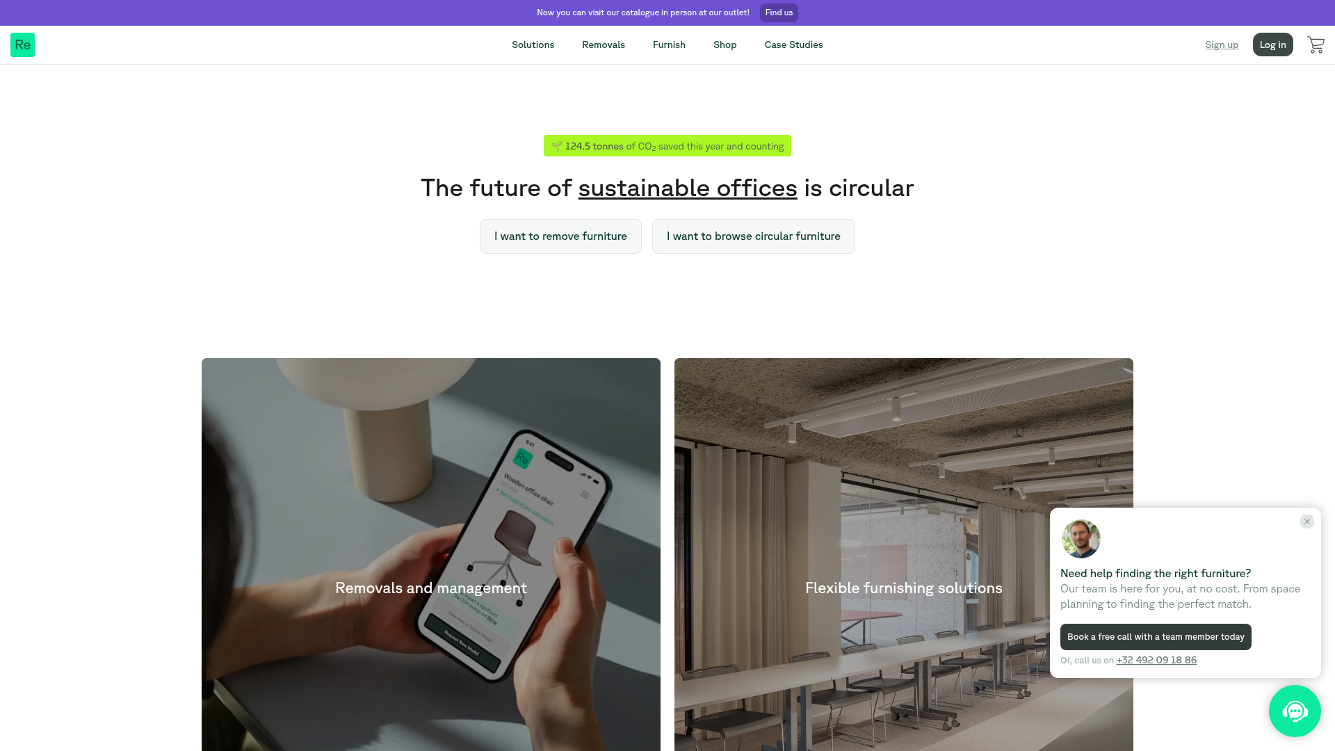
Relieve Furniture Sustainable Marketplace Landing Page
A clean sustainability-focused landing page featuring a hero with environmental impact stats, two-column visual category grid, horizontal logo slider, and a testimonial carousel.
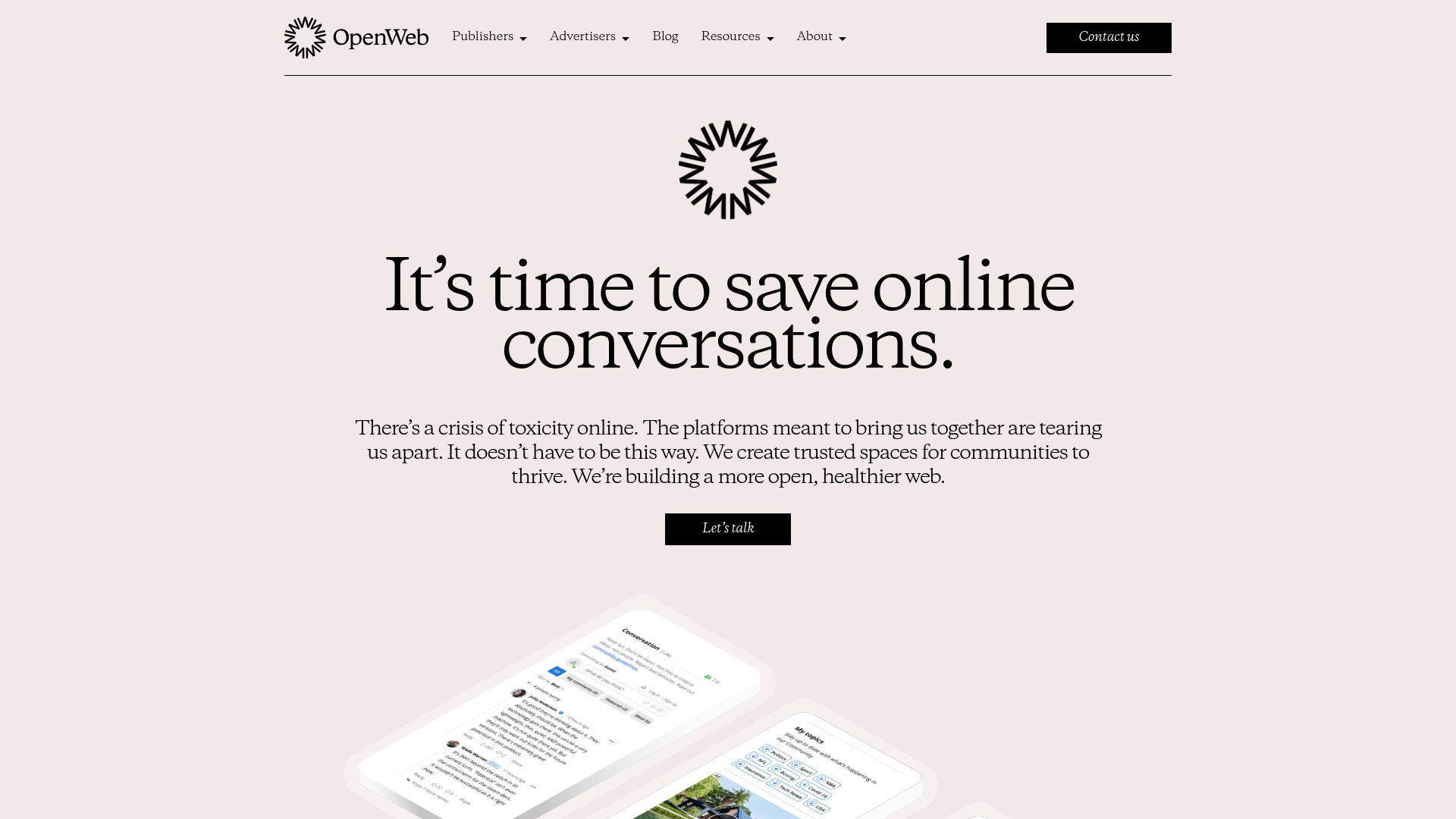
OpenWeb B2B Service Landing Page
A professional landing page layout featuring a central animated hero area, data visualization counters, a client logo grid, testimonial slider, and tabbed lead generation forms.
