Jean Paul Gaultier Fashion Storefront
High-fashion e-commerce site featuring a full-screen hero video, sticky navigation, alternating editorial grid layouts, and hover-sensitive product cards with size selectors.
Overview
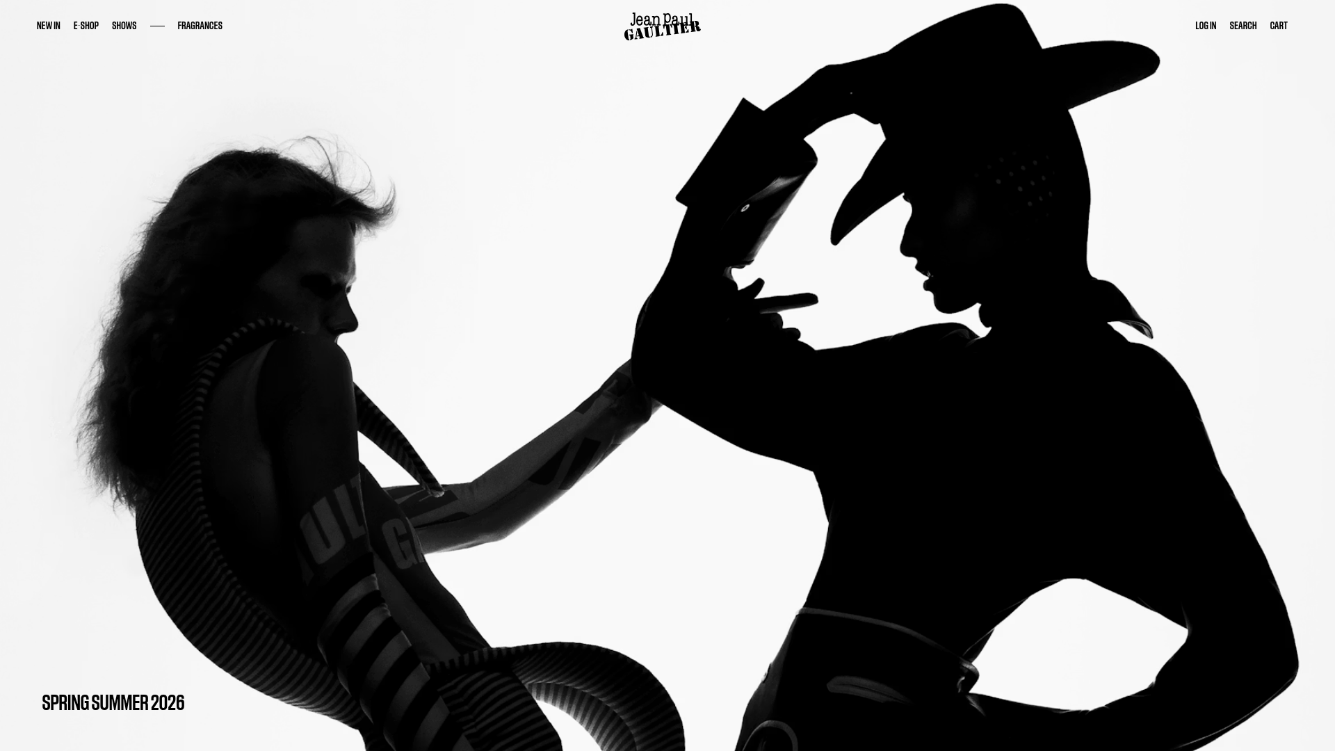
This high-fashion e-commerce storefront for Jean Paul Gaultier balances editorial artistry with clinical e-commerce functionality. It utilizes a striking black-and-white aesthetic, full-bleed media, and a sophisticated grid system, making it an excellent reference for luxury brands aiming to merge brand storytelling with direct-to-consumer sales.
Design System
- Color Palette & Visual Hierarchy: A high-contrast monochrome palette (#000000 and #FFFFFF) dominates, ensuring that campaign photography provides the only tonal variety. Visual hierarchy is established through extreme scale, ranging from tiny 11px utility text to massive fluid headings.
- Typography: The system uses a clean sans-serif (appearing as a customized Neo-Grotesque or similar to Helvetica/Inter). It features a mix of all-caps for navigation and titles, while product information uses a tiny, regular-weight scale for a minimal, premium feel.
- Page Structure:
- Sticky Header: Persistent navigation with a centered logo and minimalist utility links.
- Hero Section: A full-screen container (
styles_fullScreen__RHUKB) designed for high-resolution video or silhouetted campaign imagery with sticky captions. - Alternating Editorial Grid: A series of
styles_DoubleEditoCoverrows that alternate between full-screen items and weighted portrait images. - Product Grid: A four-column responsive layout (
styles_four__VyM67) featuring dense metadata.
- Reusable Components:
- Hover-Active Product Cards: Cards utilize
data-card-hover-imageto swap images and reveal size selectors (XXSthroughXXL) upon mouse-over. - The Slider/Carousel: An Embla-based slider (
styles_EmblaSlider__bkK_8) for product images that includes a progress dot stepper. - Minimalist Country/Lang Switcher: A clean select-menu UI found in the mobile/side navigation drawers.
- Hover-Active Product Cards: Cards utilize
- Interaction Patterns: Hover states on images often involve subtle opacity shifts or reveal a "hover image." The site utilizes sticky positioning for section headers that stay centered as the user scrolls past the content block.
- Implementation Clues: Built with Next.js (
__next), the site uses CSS Modules (indicated bystyles_name__hash) and Prismic for headless CMS image delivery. Responsive logic is handled via explicit class toggles likestyles_hideOnSmallScreenandstyles_hideOnLargeScreen.
Use Cases
- Who should clone this: Small-to-medium luxury boutiques, high-end streetwear labels, or design agencies building portfolio sites that need to feel authoritative yet minimalist.
- Effective Remixes: Perfect for products where imagery is the primary selling point—such as high-end furniture, boutique fragrances, or architectural hardware.
- Remix Directions:
- Style Swap: Keep the layout but introduce a soft pastel or earth-toned palette for a sustainable/organic brand.
- IA Adaptation: Use the large-scale editorial grid for a digital lookbook, omitting the e-commerce purchase buttons for a pure gallery experience.
- Clone Scope:
- Full-page clone: Ideal for a launch-focused landing page.
- Section clone: The product card with integrated size selection is a highly efficient utility component for any React-based store.
Related Inspirations

Context Gallery High-End Furniture Landing Page
A minimal editorial layout featuring a multi-column product carousel, designer biographies with image-text pairings, and a magazine-style content grid for curated design stories.

Glein Minimalistic Bento Grid eCommerce
A clean, modular layout using a bento-style responsive grid of text teasers and large-scale product imagery for lookbooks and collection browsing.

Isla Beauty Skincare E-commerce Store
A clean Shopify-based storefront featuring a split-hero landing page, a step-by-step product system carousel, and a split-screen testimonial section with localized product image sidebars.
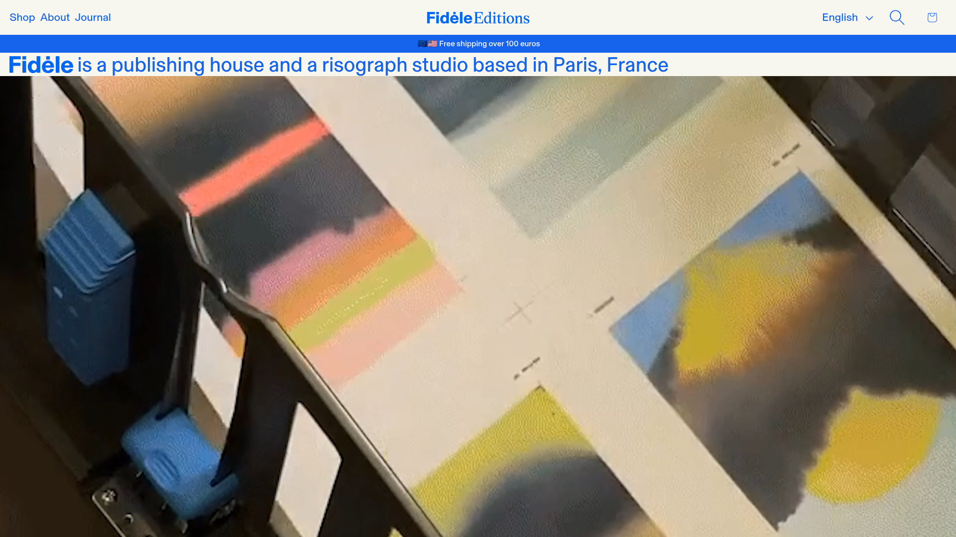
Fidèle Editions Art Studio Store
A minimalist e-commerce layout featuring a high-impact video hero, horizontal product carousels with hover-triggered image swaps, and a clean editorial-style blog section.

Stojo Collapsible E-commerce Storefront
A Shopify layout featuring a prominent discount modal, mosaic grid hero sections, and clean product cards with integrated color swatches and quick-buy functionality.
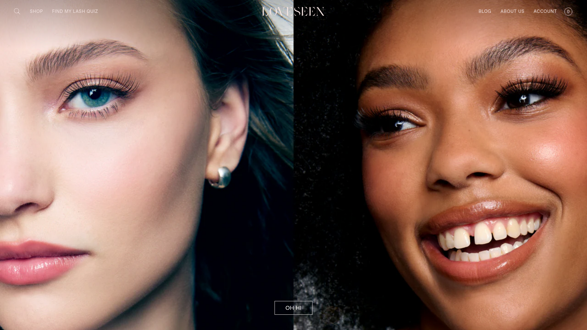
LoveSeen Beauty E-commerce Landing Page
A high-impact beauty retail site featuring a split-screen full-bleed hero image, minimalist navigation, and a horizontally scrolling user-generated content (UGC) Instagram slider.
