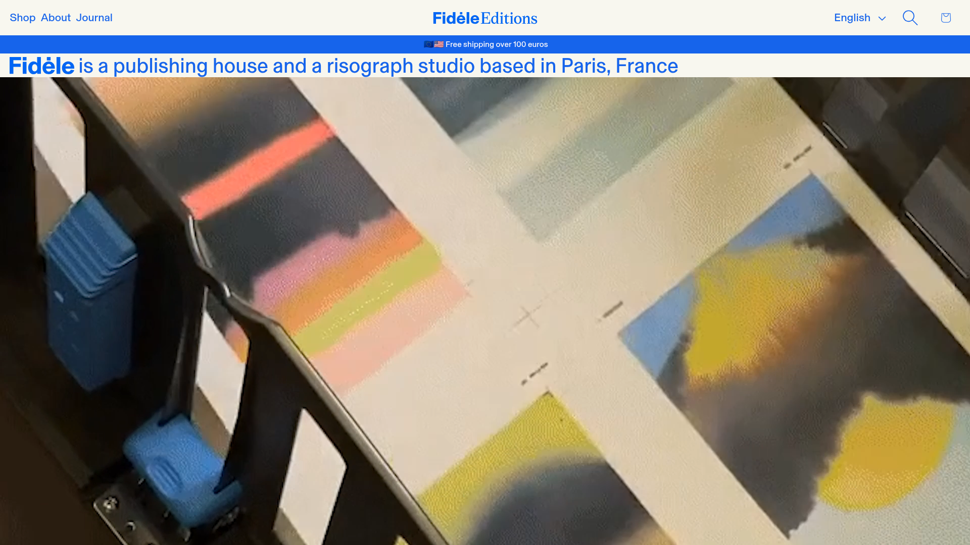
Fidèle Editions Art Studio Store
A minimalist e-commerce layout featuring a high-impact video hero, horizontal product carousels with hover-triggered image swaps, and a clean editorial-style blog section.
Overview
This site for Fidèle Editions is a masterclass in editorial-led e-commerce, blending a minimalist art-house aesthetic with robust shop functionality. It is a powerful reference for builders because it treats product listings like gallery entries, using high-quality video and negative space to elevate a niche brand.
Design System
- Color Palette & Visual Hierarchy: The design uses a high-contrast black-on-white foundation, emphasizing art through large-scale imagery. A bold blue primary color (
#0055FFlogic) is used for the site brand and critical announcement bars, creating a distinct visual anchor against neutral backgrounds. - Typography: The system relies on a grotesque sans-serif (Basel Grotesk) for clean, bold headings and navigation, paired with a sophisticated serif for body copy and editorial sections. Visual hierarchy is achieved through extreme scale differences between giant header logos and tiny, precise caption text.
- Page Structure: The flow starts with an announcement bar, followed by a bold oversized logo/intro line. A full-width video hero provides texture before transitioning into horizontal product carousels (Latest), an editorial section with embedded interviews, and finally, specialized collection grids (Confidens Series).
- Reusable Components:
- Interactive Hero: A simple flex section combining an SVG brand mark with a large-scale video element.
- Product Cards: Minimalist square containers featuring hidden secondary images that swap on hover, a clean title/vendor/price stack, and no visible 'Add to Cart' button on the grid to maintain cleanliness.
- Editorial List: A single-column article block that mixes large imagery with a 'Read more' CTA, ideal for storytelling.
- Interactions & Motion: The primary interaction is the hover-triggered image swap in product lists. The site uses a sticky header that persists on scroll to maintain navigational accessibility.
- Implementation Clues: Built on Shopify using the PageFly page builder, utilizing structural classes like
sc-jRGIGG(flex sections) andpf-sliderfor the custom product carousels. It uses standard form-based cart handling within a drawer (cart-drawer).
Use Cases
- Who should clone this: Independent publishers, boutique fashion labels, and digital art studios looking for a site that feels more like an exhibition than a retail warehouse.
- Effective Remixes: Ideal for high-ticket items with few SKUs where storytelling is as important as the purchase. The layout can be remixed for portfolio sites by swapping product carousels for project galleries.
- Practical Directions: Reuse the horizontal 'ProductList2' component for cross-selling related items. To remix, designers could swap the stark white background for a muted cream or dark mode while keeping the bold blue accent for brand identity.
- Clone Scope: Start with the high-impact hero section and one product carousel for a 'quick' landing page clone. A full clone is recommended for brands that possess high-quality photography and video assets.
Related Inspirations

Context Gallery High-End Furniture Landing Page
A minimal editorial layout featuring a multi-column product carousel, designer biographies with image-text pairings, and a magazine-style content grid for curated design stories.

Glein Minimalistic Bento Grid eCommerce
A clean, modular layout using a bento-style responsive grid of text teasers and large-scale product imagery for lookbooks and collection browsing.
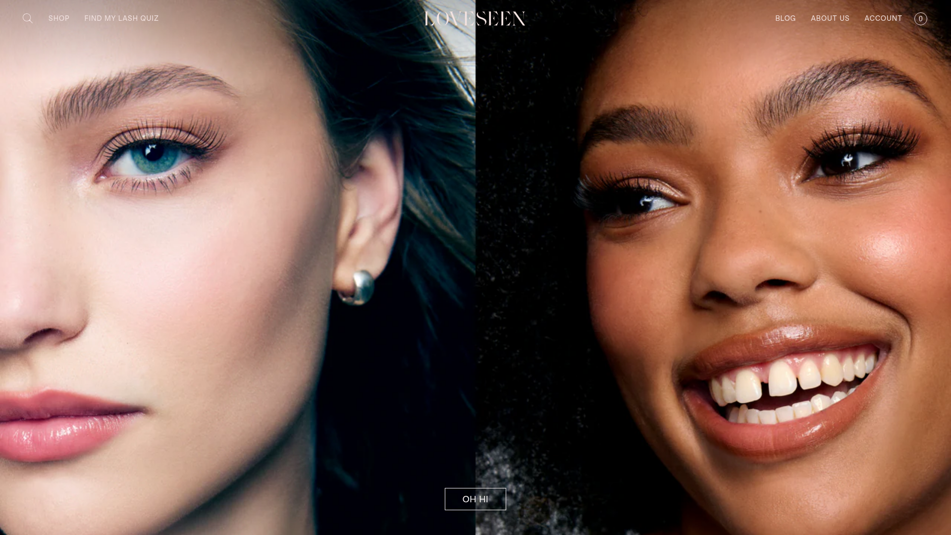
LoveSeen Beauty E-commerce Landing Page
A high-impact beauty retail site featuring a split-screen full-bleed hero image, minimalist navigation, and a horizontally scrolling user-generated content (UGC) Instagram slider.

Basic.Space E-commerce Gallery Clone
A minimalist product marketplace featuring a clean sticky navigation bar, nested flyout menus, and a horizontally scrollable product carousel with hover-state image switching.
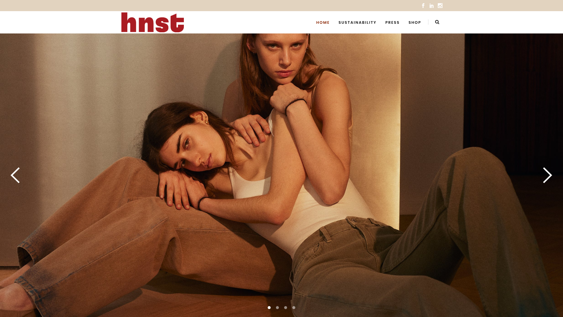
HNST Circular Fashion eCommerce Gallery
A minimalist apparel site featuring a full-screen image slider with parallax effects, grid-based product sections, and a clean typography-focused header for sustainable brand storytelling.

Ashley & Co Lifestyle E-commerce
An elegant Shopify-based storefront featuring a split-screen animated hero, horizontal ticker-tape collection carousel, and dynamic mega-menus with scent-specific color switching and image previews.
