Stojo Collapsible E-commerce Storefront
A Shopify layout featuring a prominent discount modal, mosaic grid hero sections, and clean product cards with integrated color swatches and quick-buy functionality.
Overview
This Stojo storefront is a high-conversion Shopify layout designed for lifestyle and eco-friendly products. It masterfully uses a minimalist aesthetic to highlight physical product variations, featuring a sophisticated survey-style discount modal and a clean, swatch-heavy grid that simplifies complex SKU sets. It is a strong reference for builders needing to balance high-density product information with a premium, airy brand feel.
Design System
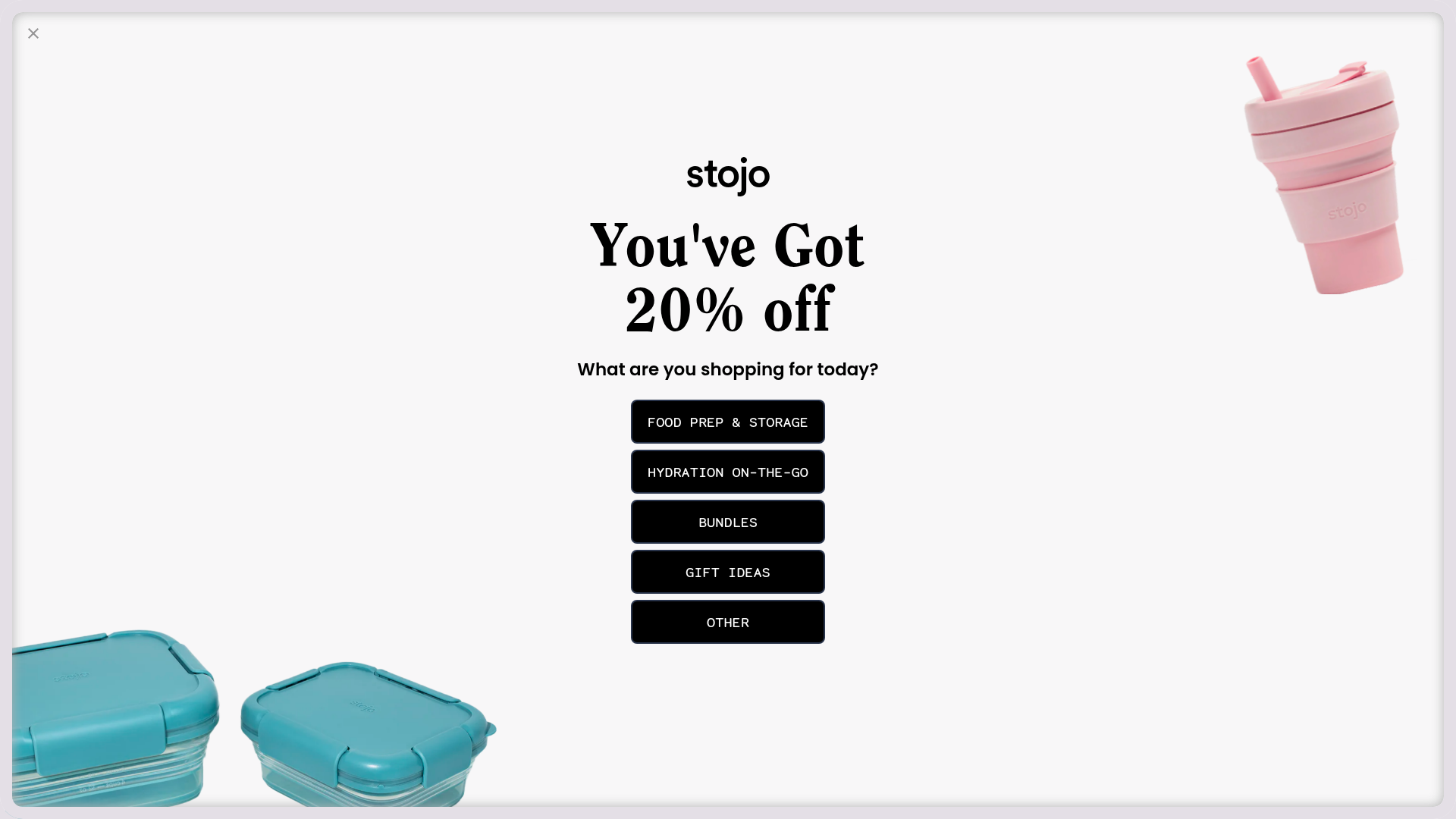
- Color Palette & Visual Hierarchy: The site uses a clean white background (#FFFFFF) and soft off-white sections to create a "high-key" lighting effect. Visual hierarchy is established through high-contrast black buttons and bold serif headings against muted product colors (Sage, Eucalyptus, Cashmere). The discount modal utilizes a centered layout with bold black CTA buttons to ground the floating product imagery.
- Typography: A dual-font system is employed. Serif fonts (seen in the "You've Got 20% off" heading) provide a premium, editorial feel, while sans-serif fonts (Noto Sans and Poppins as evidenced in HTML) are used for product titles, prices, and small uppercase UI elements like navigation and button labels.
- Page Structure: The flow begins with an incentivized entry modal, followed by a full-width "Mosaic" hero section with a right-aligned CTA. It then transitions into a text-based social proof section (5-star reviews), followed by a dense 3-column product grid with integrated filtering components.
- Reusable Components:
- Quick-Buy Cards: Product blocks feature integrated color swatches (
product-grid-item-swatch), "Quick Buy" overlays, and secondary "Buy it Now" buttons for fast conversion. - Discount Modal: A tiered selection modal that categorizes user intent (Food Prep, Hydration, Bundles) before revealing a code.
- Icon Row: A minimalist horizontal bar featuring stroke-style icons and utility-focused copy (Dishwasher safe, etc.).
- Quick-Buy Cards: Product blocks feature integrated color swatches (
- Interactions: The HTML reveals
product__media__image--hover-slide-inclasses, suggesting an image-swap or slide effect on hover to show products in various states (e.g., collapsed vs. expanded). Swatches update the primary image asynchronously usingdata-swatch-imageattributes. - Implementation Clues: Built on Shopify, utilizing the
flickityslider for announcement bars andrebuy-smart-cartfor enhanced shopping cart interactions. The layout relies heavily on a standard 12-column grid that collapses to a 2-column view on mobile (mobile--one-half).
Use Cases
- Who should clone this: Small-to-medium DTC brands with products that come in several colorways or sizes. It is particularly effective for "lifestyle hardware" like kitchenware, tech accessories, or apparel.
- Effective Remixes: Reuse the survey-style modal to collect lead data by asking users their preferences before showing a discount. Adapt the color swatch logic to show fabric textures or material types instead of just colors.
- Practical Directions: Swap the minimalist white for a dark-mode palette to cater to a luxury tech brand. Reuse the "Mosaic Grid" hero to create a multi-product lookbook without cluttering the fold.
- Clone Scope: A full-page clone is ideal for new Shopify builds, but the product card with the integrated swatch/quick-buy logic is a highly valuable standalone module for any existing e-commerce site.
Related Inspirations

Context Gallery High-End Furniture Landing Page
A minimal editorial layout featuring a multi-column product carousel, designer biographies with image-text pairings, and a magazine-style content grid for curated design stories.

Glein Minimalistic Bento Grid eCommerce
A clean, modular layout using a bento-style responsive grid of text teasers and large-scale product imagery for lookbooks and collection browsing.

Isla Beauty Skincare E-commerce Store
A clean Shopify-based storefront featuring a split-hero landing page, a step-by-step product system carousel, and a split-screen testimonial section with localized product image sidebars.

Basic.Space E-commerce Gallery Clone
A minimalist product marketplace featuring a clean sticky navigation bar, nested flyout menus, and a horizontally scrollable product carousel with hover-state image switching.

Ashley & Co Lifestyle E-commerce
An elegant Shopify-based storefront featuring a split-screen animated hero, horizontal ticker-tape collection carousel, and dynamic mega-menus with scent-specific color switching and image previews.
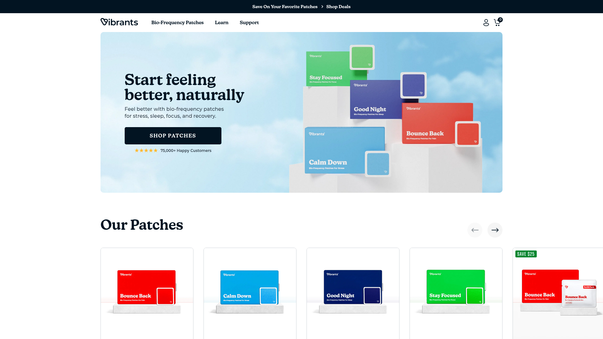
Vibrants Wellbeing E-commerce Landing Page
A clean Shopify-style landing page featuring a full-width hero with overlaid product cards, a horizontal product slider, and interactive cart drawer with utility progress bars.
