Wise Design System Documentation
A design system site featuring a scroll-animated hero, sticky navigation with segmented controls, and accessible grids for typography, icons, and components.
Overview
Wise Design System is a high-impact documentation site that showcases the branding and technical foundations of the Wise product suite. It is a premier reference for builders due to its seamless integration of motion design, sophisticated grid layouts, and a unique "Product vs. Editorial" navigation switch that offers two distinct perspectives on the same system.
Design System
- Color Palette & Visual Hierarchy: The system is anchored by a vibrant "Forest Green" (#25b218) primary brand color, supported by a deep charcoal for text and a high-contrast white background. Accents of purple, orange, and gold are used in specific sections to differentiate content blocks.
- Typography: The custom "Wise Sans" typeface features a geometric, high-clarity design. The hierarchy uses massive
mw-display-1headers for scroll-triggered sections and balancedmw-heading-2labels for informational transitions. - Section Flow: The landing page follows a storytelling flow: a scroll-animated hero icon, followed by alternating full-width video sections, multi-column media grids, and finally a grid of navigation blocks leading to deep documentation.
- Reusable Components:
- Sticky Navigation: Features a sophisticated segmented control for switching themes and a minimalist horizontal link list.
- Segmented Control: Uses a sliding highlight effect to toggle between user types (Product/Editorial).
- Interactive Cards: Grid columns containing autoplaying, looping videos paired with high-priority action buttons.
- Infinite Marquee: A multilingual text slider at the footer demonstrating global reach.
- Motion Patterns: The site utilizes extensive scroll-triggered animations (using
transform: translateY) where text appears to "rise" into view. HTML classes likeMotionLoopandSteamrollerindicate sophisticated CSS transitions for language switching and currency symbol overlays. - Implementation Clues: The site is built on Next.js (
__nextid) using utility-based CSS modules. The layout heavily leverages CSS Grid for its responsiveStack_rowandBlocks_rowstructures.
Use Cases
- Design System Documentation: Perfect for teams wanting to move beyond static docs into a living design system site that feels like an extension of the brand.
- Creative Portfolios: The scroll-driven hero and large-scale typography make it an excellent template for visual designers or agencies showcasing high-finesse media.
- Marketing for Global Products: The localized marquee and language-switching blocks (Steamroller component) are ideal for products emphasizing international accessibility.
- Remix Directions: Builders can clone the navigation and header structure to implement the theme-switching logic, or reuse the media-heavy grid sections to create a high-conversion landing page. For a quicker scope, focus on cloning the
Hero_sectionandNavigation_horizontalcomponents to capture the brand's core identity.
Related Inspirations
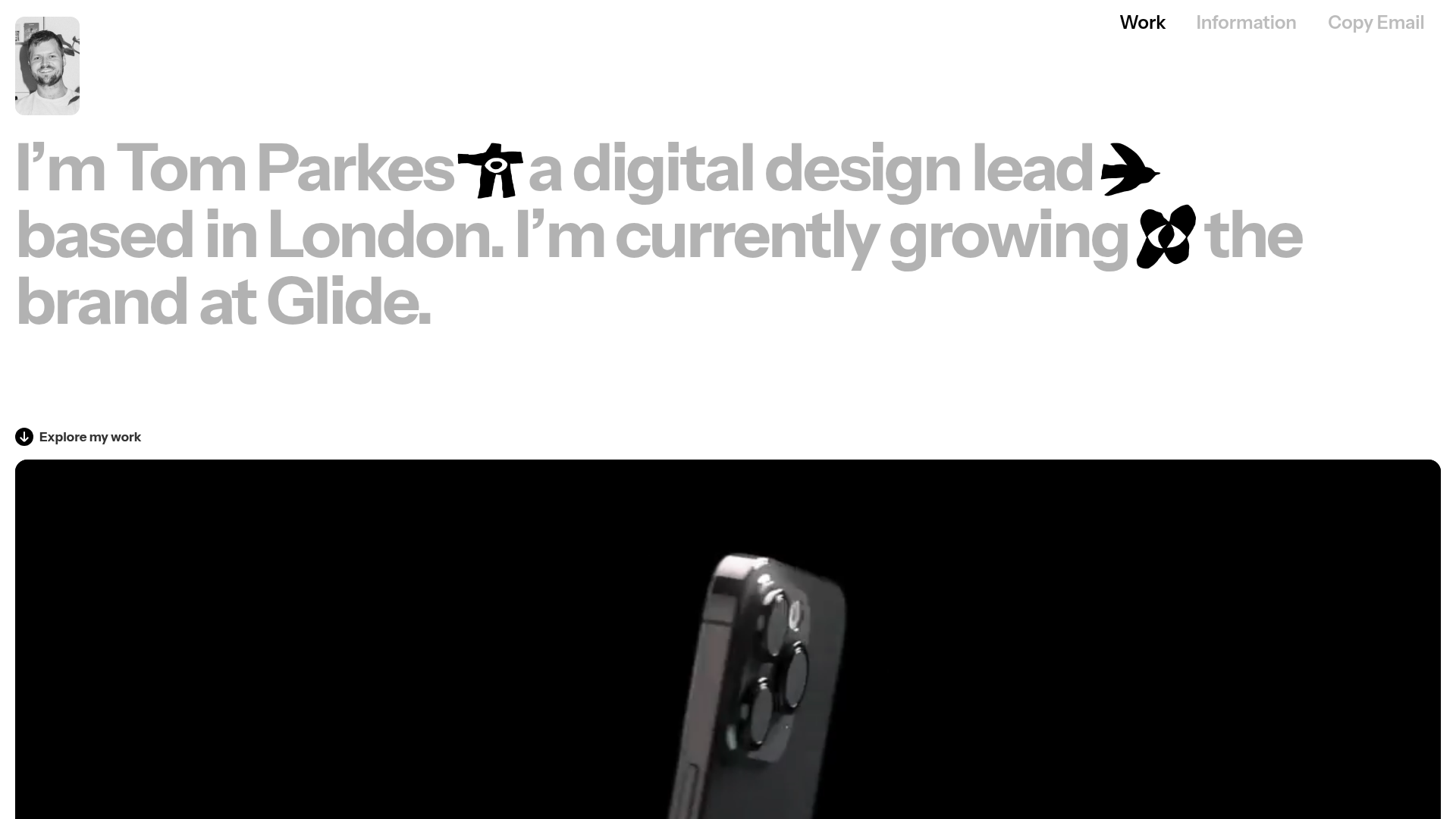
Tom Parkes Portfolio Design Gallery
A minimalist portfolio layout featuring a typography-focused hero section with inline icons, full-width video scroll reveals, and a dense masonry grid for visual assets.
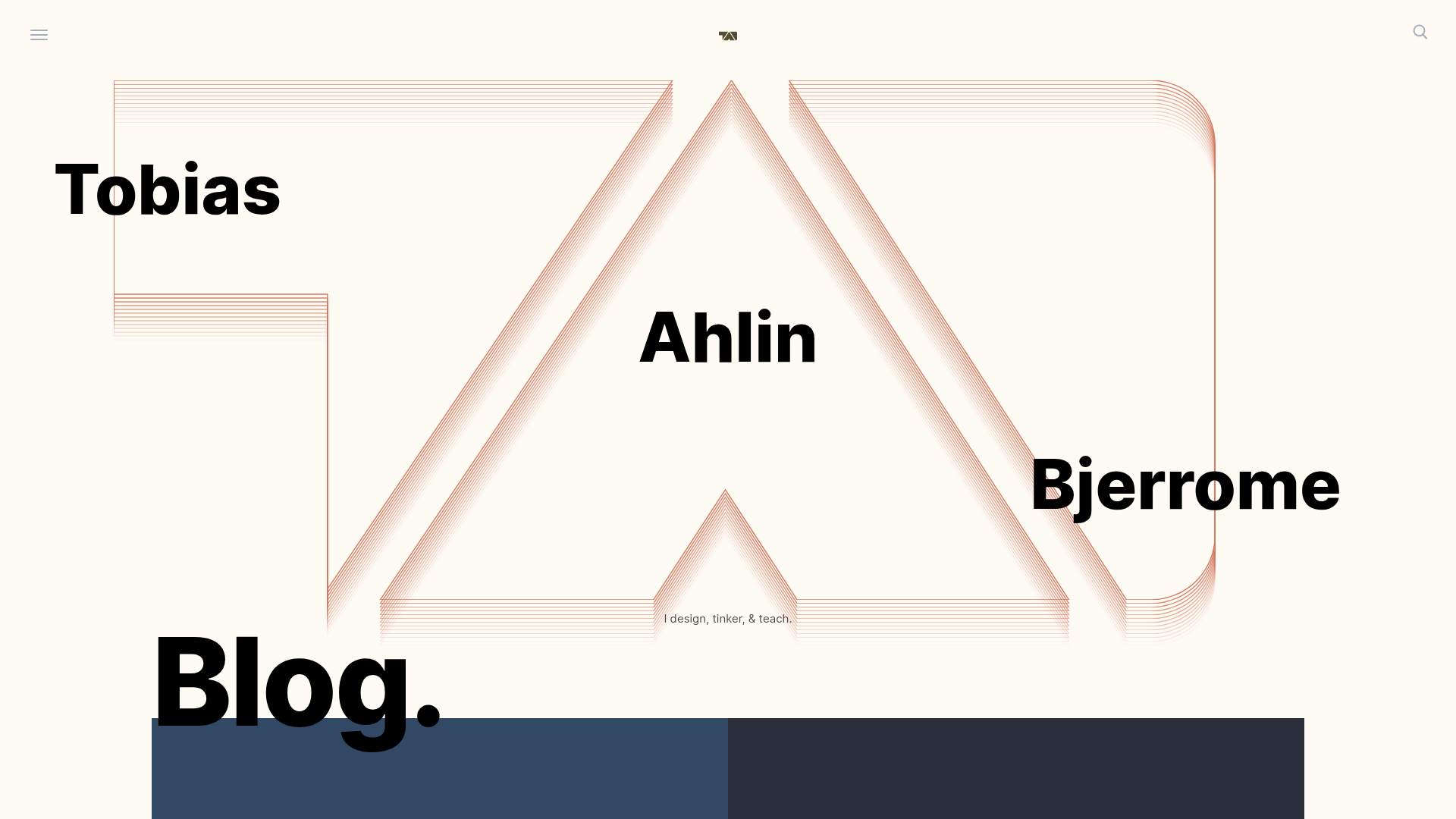
Tobias Ahlin Portfolio Design Portfolio
A layout-driven portfolio featuring a geometric animated hero, custom SVG typography transitions, and a responsive grid of card-based blog posts and project highlights.
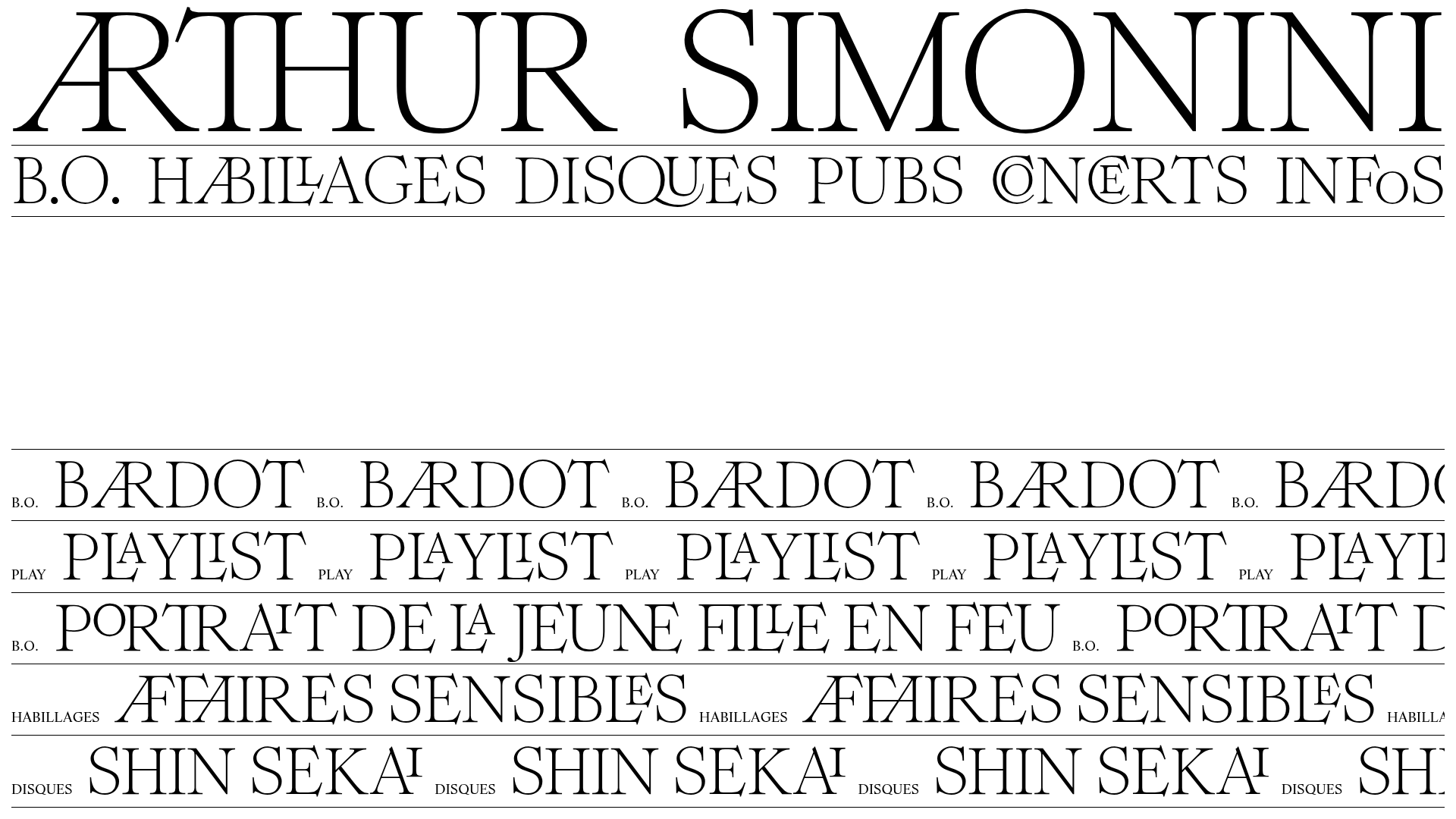
Arthur Simonini Portfolio Layout
A minimalist musical portfolio featuring horizontal scrolling marquees, a persistent audio player with progress tracking, and expandable accordions for project credits and video reels.

Re_Grocery E-commerce Storefront
A minimalist zero-waste shop layout featuring a full-width image hero, horizontally scrolling product sliders with attribute tags, a marquee text ticker, and rounded two-up content sections.
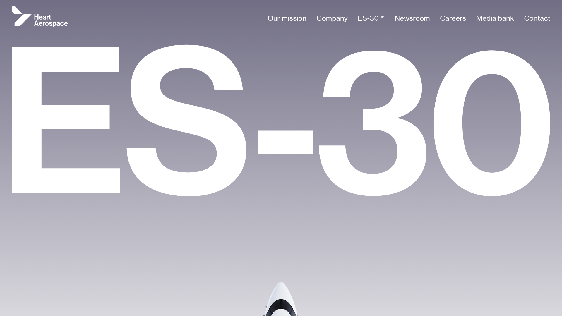
Heart Aerospace Landing Page
A minimalist industrial design featuring a full-screen video hero section, large-scale typography, high-contrast grid layouts, and an interactive partner logo gallery.
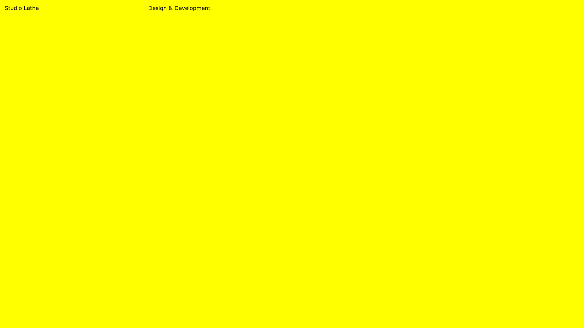
Studio Lathe Minimalist Portfolio List
A high-contrast, minimalist portfolio layout featuring a dense list-based project index with flexible category labeling and a full-screen yellow background.
