Re_Grocery E-commerce Storefront
A minimalist zero-waste shop layout featuring a full-width image hero, horizontally scrolling product sliders with attribute tags, a marquee text ticker, and rounded two-up content sections.
Overview
Re_Grocery is a high-end e-commerce storefront designed for a zero-waste, sustainable shopping experience. It is a premier reference for builders because it successfully balances a clean, minimalist aesthetic with data-rich product cards and engaging motion elements like marquee tickers and product carousels.
Design System
- Color Palette & Visual Hierarchy: The system uses a warm, neutral "Cream" background (
var(--cream)) to create an organic, earthy feel. High-contrast black typography and border-defined buttons provide clear hierarchy. Accents are minimal, allowing product photography to drive the visual interest. - Typography: The design employs a mix of a clean sans-serif for UI elements and a bold serif or heavy-weight sans for headings. Button labels utilize a small-caps or specifically case-styled approach as seen in the "Order" and "More" buttons.
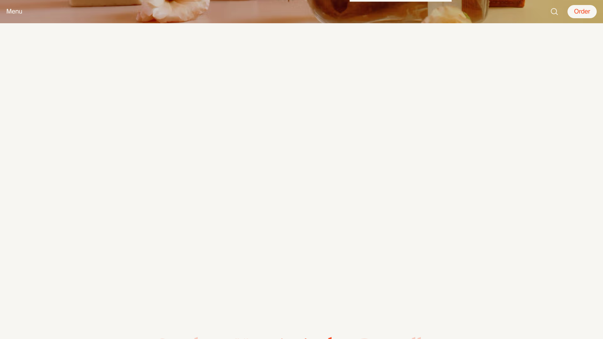
- Page Structure: The layout follows a modular flow: Full-width Image Hero → Tabbed Product Sliders → Word Marquee Ticker → Alternating Two-Up Content Blocks (Image + Text) → Grid-based Category List with floating "cutout" PNG decor → Social/Instagram Grid.
- Reusable Components:
- Product Cards: Complex but clean cards featuring image containers, pricing ranges (
$2.75–27.04), and a horizontal list of attribute tags (e.g., "Vegan", "Non-GMO"). - Two-Up Sections: Vertically stacked rows with rounded corner images and side-aligned text/CTA blocks.
- Collection Buttons: Large, border-only buttons used for both product filtering and category navigation.
- Product Cards: Complex but clean cards featuring image containers, pricing ranges (
- Motion & Interaction: The marquee ticker provides constant subtle motion. Product carousels feature horizontal scrolling with custom "Previous/Next" button overlays. Product images appear to have a slight scaling or transform-origin transition container.
- Implementation Clues: The site is built with Next.js (indicated by
id="__next") and uses Utility-first CSS or CSS Modules (e.g.,Header_hero__PYE0B). It utilizes the Headless UI library for accessible components like disclosures.
Use Cases
- Who should clone this pattern: Developers building boutique retail sites, sustainable brand landing pages, or high-end grocery apps that require specific product attributes (tags) to be visible at a glance.
- What products can remix it effectively: Skincare lines, organic food brands, or home goods stores that benefit from a "lifestyle" editorial feel rather than a dense grid of items.
- Practical remix directions:
- Brand Swap: Replace the cream/black palette with a more clinical white/blue for a pharmacy or tech-focused storefront.
- Information Architecture: Adapt the "Attribute Tags" on product cards to show different metadata like "In Stock", "Staff Pick", or dimensions.
- Section Re-use: Clone only the marquee ticker and the two-up image blocks for a high-impact promotional landing page.
- Suggested clone scope: A full-page clone is ideal for brands with professional lifestyle photography, as the layout relies heavily on the quality of the image assets to maintain its premium feel.
Related Inspirations

Context Gallery High-End Furniture Landing Page
A minimal editorial layout featuring a multi-column product carousel, designer biographies with image-text pairings, and a magazine-style content grid for curated design stories.

Glein Minimalistic Bento Grid eCommerce
A clean, modular layout using a bento-style responsive grid of text teasers and large-scale product imagery for lookbooks and collection browsing.

Isla Beauty Skincare E-commerce Store
A clean Shopify-based storefront featuring a split-hero landing page, a step-by-step product system carousel, and a split-screen testimonial section with localized product image sidebars.

Stojo Collapsible E-commerce Storefront
A Shopify layout featuring a prominent discount modal, mosaic grid hero sections, and clean product cards with integrated color swatches and quick-buy functionality.

Basic.Space E-commerce Gallery Clone
A minimalist product marketplace featuring a clean sticky navigation bar, nested flyout menus, and a horizontally scrollable product carousel with hover-state image switching.

Ashley & Co Lifestyle E-commerce
An elegant Shopify-based storefront featuring a split-screen animated hero, horizontal ticker-tape collection carousel, and dynamic mega-menus with scent-specific color switching and image previews.
