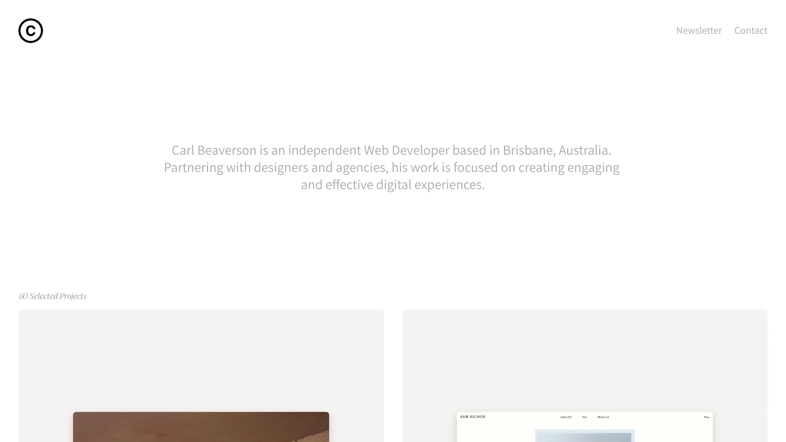
Carl Beaverson Minimalist Portfolio Portfolio
A clean, minimalist grid-based portfolio featuring centered typography, subtle hover effects, and a responsive two-column project showcase layout.
Overview
Carl Beaverson's portfolio is a masterclass in high-contrast minimalism and functional negative space. It serves as an excellent reference for builders who want to showcase a large volume of work (60 projects) without overwhelming the user, using a simplified navigation structure and a clean grid system.
Design System
- Color Palette & Visual Hierarchy: The design utilizes a monochromatic, high-key palette of stark whites and light grays (#F7F7F7 or similar) to allow project imagery to stand out. Visual hierarchy is established through spatial distribution rather than color, with a clear focus on the centered hero text.
- Typography: The system utilizes a mix of clean sans-serif for body text and navigation (Newsletter, Contact) and a refined serif font for meta-information like "60 Selected Projects." The hero text uses a medium font weight with generous line height for readability.
- Layout Structure:
- Header: Minimalist top bar with a circular 'C' logo on the left and utility links on the right.
- Hero Section: A vertically centered introduction paragraph that creates significant white space at the top of the fold.
- Project Grid: A responsive two-column grid layout consisting of large image containers with subtle background fills to define the boundaries of each card.
- Reusable Components:
- Project Card: A simple container designed for large, high-aspect-ratio images.
- Navigation Bar: A fixed or top-aligned utility bar that avoids visual clutter.
- Interaction Patterns: Based on the visual layout, the design suggests a focus on hover-states for project cards and smooth scrolling transitions to manage the long list of 60 items.
Use Cases
- Who should clone this: Independent developers, graphic designers, and photographers who want a "gallery-first" website that feels premium and curated.
- Effective Remixes: This pattern is perfect for architectural portfolios or fashion lookbooks where large imagery is more important than descriptive text blocks.
- Remix Directions:
- Information Architecture: Adapt the two-column grid into a single-column layout for mobile or a masonry grid for varying image heights.
- Styling: Switch the white background to a deep charcoal or navy for a "dark mode" aesthetic while retaining the same typography scale.
- Suggested Scope: A full-page clone is recommended to maintain the specific balance of white space, as the effectiveness of the design relies on the relationship between the empty hero section and the dense project grid below.
Related Inspirations

Baubauwerk Minimal Agency Portfolio Homepage
A clean studio site featuring a centered text hero, scatter-plot filterable project gallery, and full-bleed image sections for case studies.
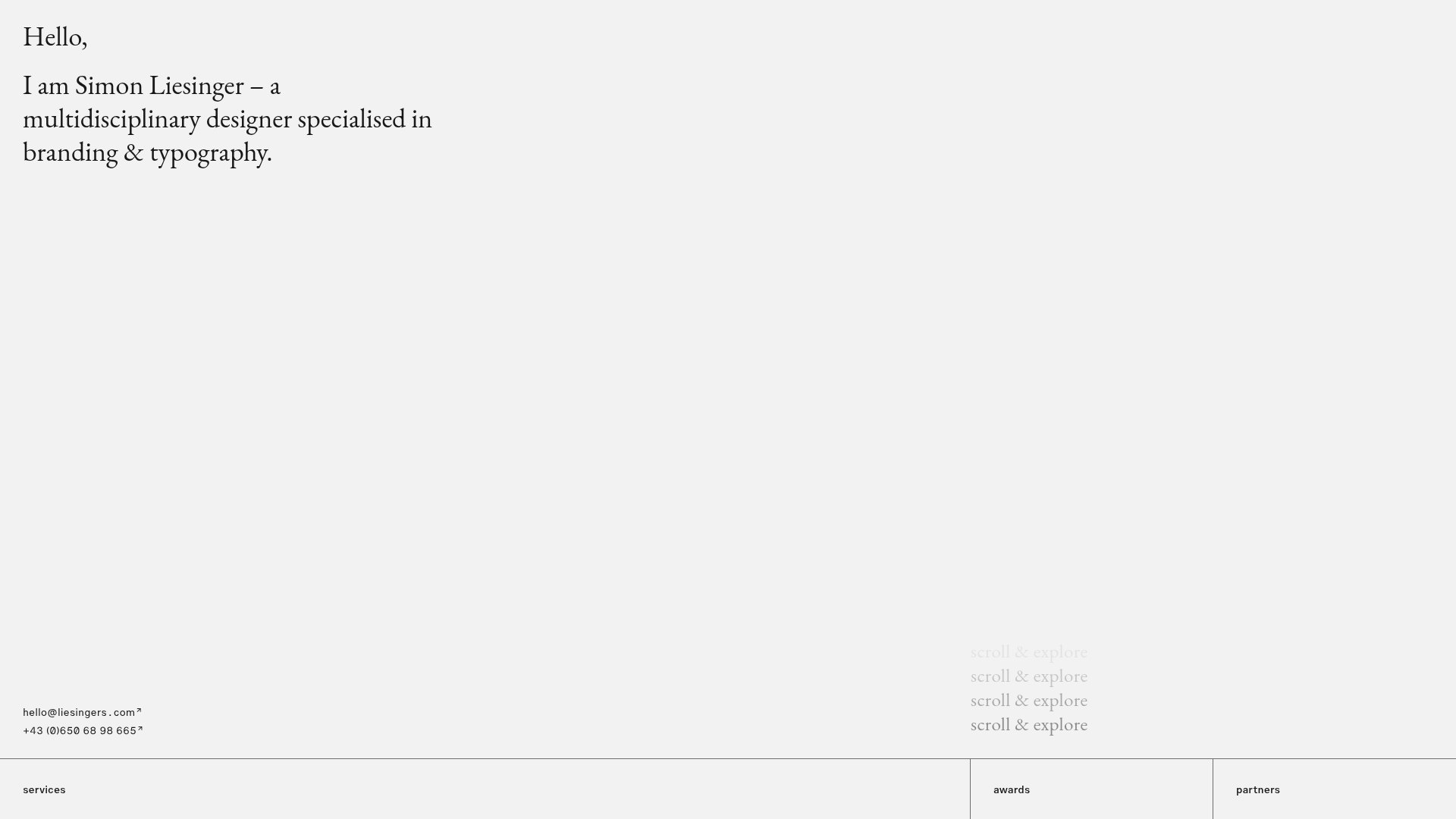
Minimalist Typography Portfolio and Services Grid
A clean, serif-heavy layout featuring an A-Frame 3D hero animation, tiered service lists, and a modular multi-column text structure for design manifestos.
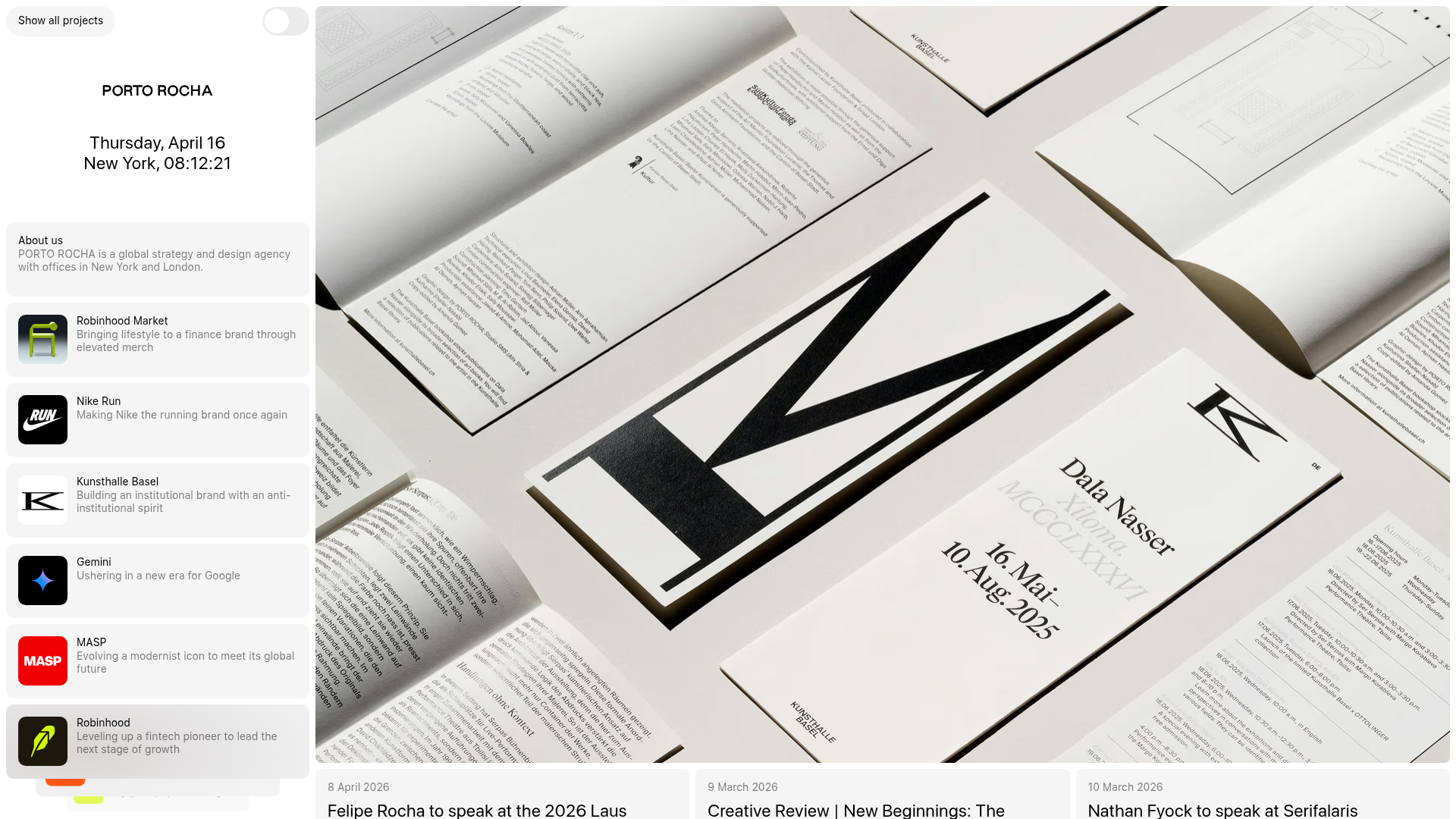
Porto Rocha Design Portfolio Mockup
A minimalist, side-bar navigation portfolio featuring a dual-column layout with a scrollable project feed and high-contrast typography.
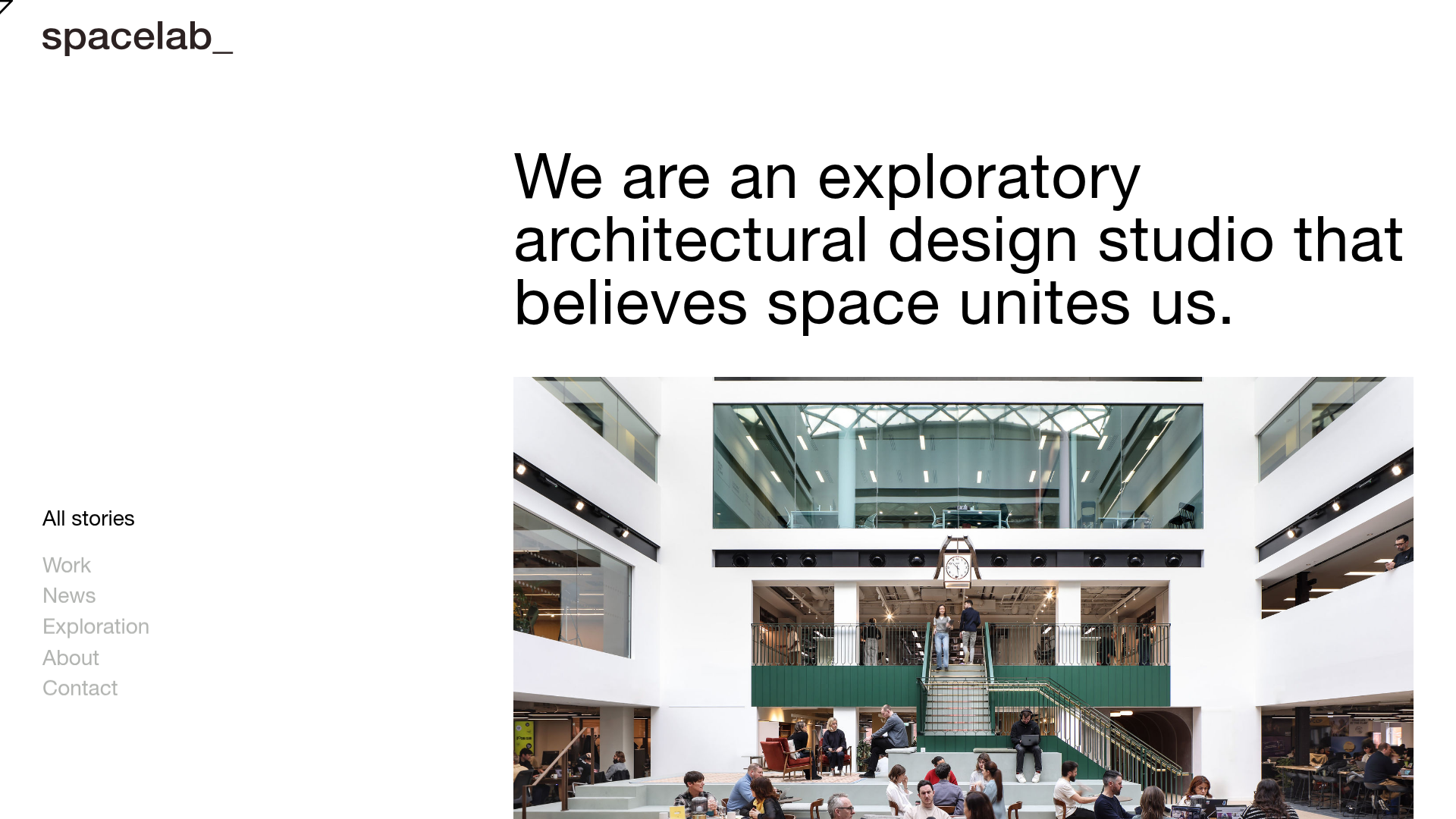
Spacelab Exploratory Architectural Portfolio
A minimalist studio website featuring a clean sidebar navigation and a high-impact asymmetric grid layout designed for visual storytelling.
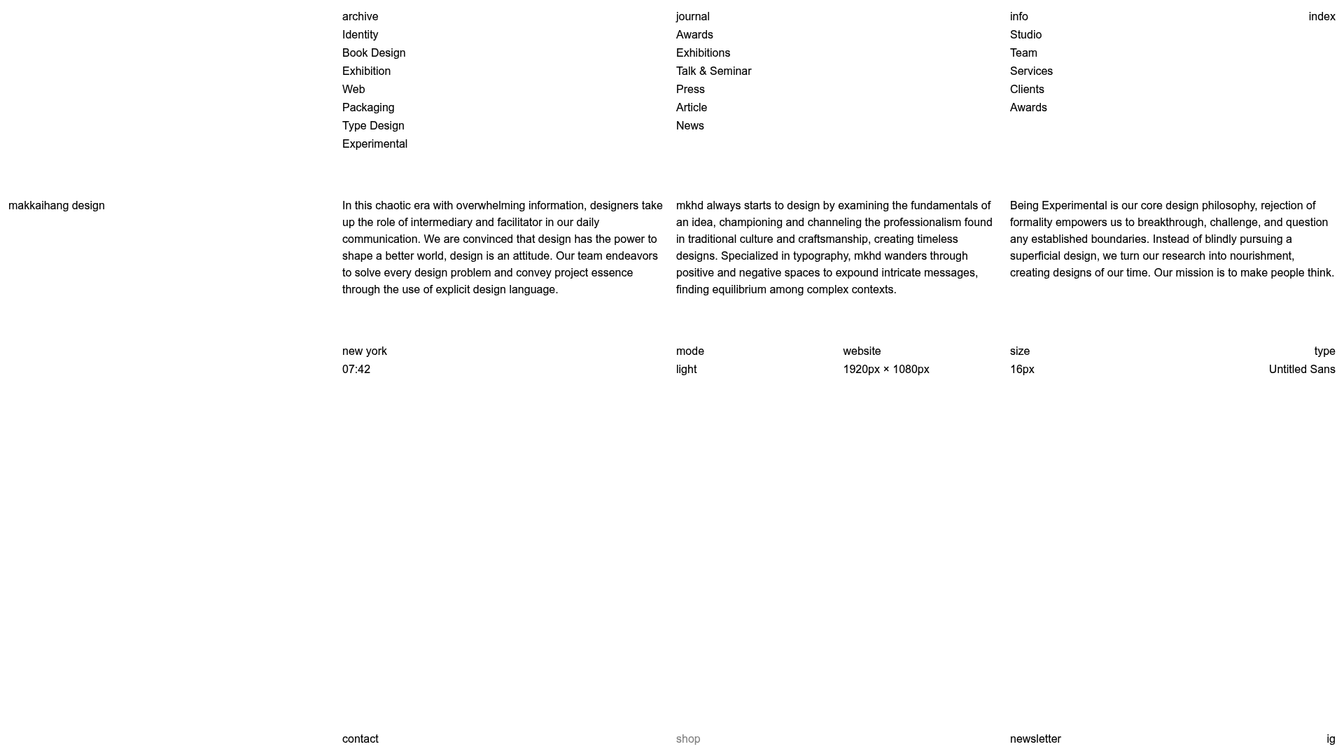
Makkaihang Design Studio Portfolio
A minimalist design agency landing page featuring a full-bleed video hero, a multi-column typographic layout, and a functional footer tracker for real-time local time and font details.
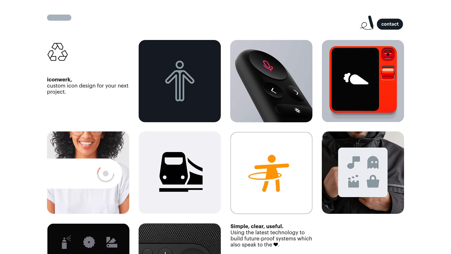
Iconwerk Design Portfolio Bento Layout
A minimalist bento grid portfolio featuring varying square tile sizes, clean iconography showcases, and a simple fixed navigation header for creative work.
