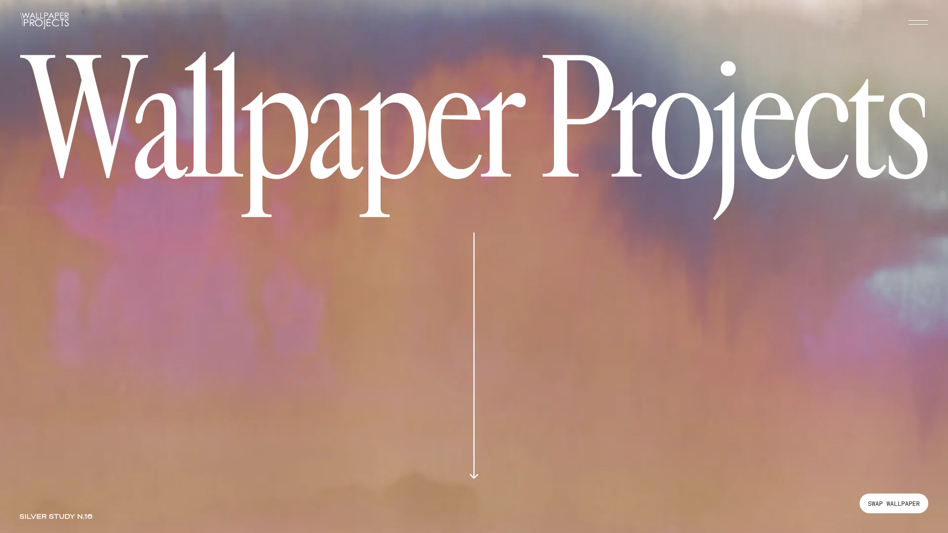
Wallpaper Projects Design Studio Landing
A high-end Shopify site featuring an animated hero slider with a 'swap' toggle, large-scale serif typography, an asymmetric project grid, and a split-view process section.
Overview
This landing page for Wallpaper Projects is a masterclass in high-end aesthetic commerce, utilizing a minimal UI to let large-scale imagery drive the brand narrative. It is a strong reference for builders looking to create premium, portfolio-centric Shopify sites that balance atmospheric design with functional product discovery.
Design System
- Color Palette & Visual Hierarchy: The design follows a high-contrast minimalist approach using a base of white and black to frame vivid, full-bleed imagery. Hierarchy is established through extreme scale, where massive typography and edge-to-edge photography dominate smaller UI elements.
- Typography System: A sophisticated mix of three families: a large, high-contrast serif for main headers and brand identity; a clean sans-serif (e.g., in the hero overlays and numbers) for metadata and uppercase captions; and a monospace font for body descriptions (e.g., "Creating with us is easy") providing a studio/technical feel.
- Page Structure: The layout follows a layered narrative:
- Hero Slider: Full-screen atmospheric slider with a toggle.
- Multi-Image CTA: Split-view introductory text and secondary image grid.
- Process Grid: A large-scale numbered list ("Creating with us is easy") using a 12-column grid.
- Asymmetric Project/Collection Grids: Staggered image blocks that break standard row layouts.
- Looping Text Sliders: Marquee-style modules for social proof/credits.
- Reusable Components:
- Slider Switch Button: A custom toggle (
js-changeWallpaper) that interacts with the hero state. - CTA Hover Effect: Buttons with a specific
ease-in-out-quarttransition and revealing arrows. - Asymmetric Image Cards: Responsive grid items that shift position based on column starts (e.g.,
col-start-6,col-start-3).
- Slider Switch Button: A custom toggle (
- Interaction & Motion: The site uses the
keen-sliderlibrary for a fader-style hero. Many elements utilizeopacity-0transitions for smooth entry. Text loops provide subtle, continuous motion to highlight partnerships. - Responsive Behavior: The 12-column Desktop grid collapses into a simplified single-column stack on mobile. Technical sections like "Creating with us is easy" switch from a grid to an
overflow-x-scrollhorizontal list for better mobile navigation. - Implementation Clues: Built on Shopify, the site uses Tailwind-like utility classes (e.g.,
grid-cols-12,py-80,tracking-tighter) for layout management and responsive breakpoints (specifically an800pxand2000pxbreakpoint).
Use Cases
- Who should clone this: Design studios, architectural firms, boutique artists, and luxury decor brands needing a portfolio that feels expensive and curated rather than "templated."
- Product Remixing: This pattern works effectively for high-ticket items where the process and brand story are as important as the product, such as custom furniture, high-end fashion, or physical craft workshops.
- Remix Directions: Replace the wallpaper focus with custom upholstery or industrial design. The "Process Section" (Steps 01-04) can be isolated and reused to explain any service-based onboarding. The asymmetric grid can be used to showcase a seasonal lookbook.
- Clone Scope: A full-page clone is recommended for brands with high-quality photography; otherwise, the "Process Grid" and the "Text Looping" modules are excellent candidates for quick, standalone section clones.
Related Inspirations
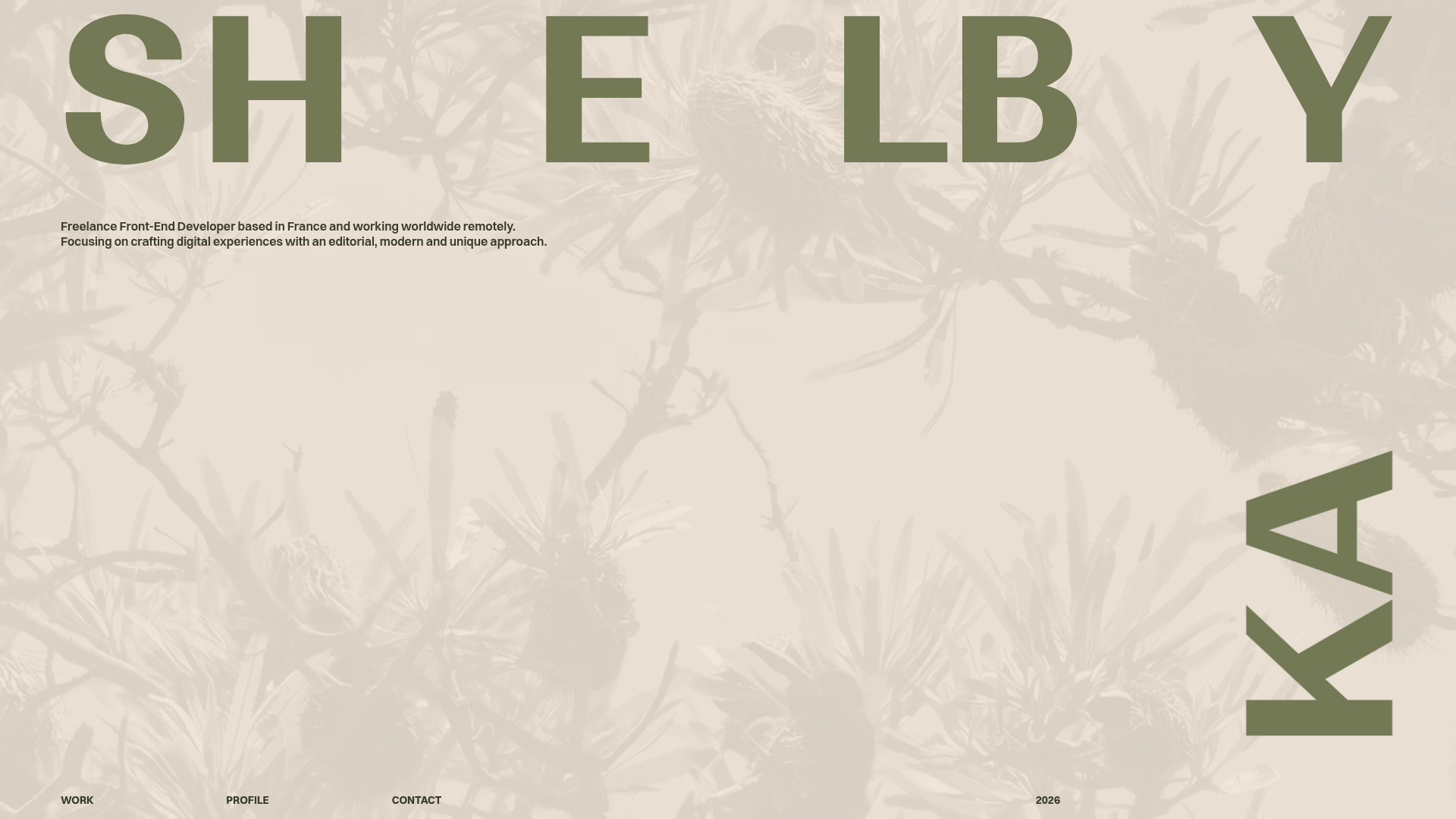
Shelby Kay Portfolio Hero and Masonry Grid
A minimalist developer portfolio featuring an oversized typography hero with parallax video background and a dense, high-frequency image/video project masonry grid.
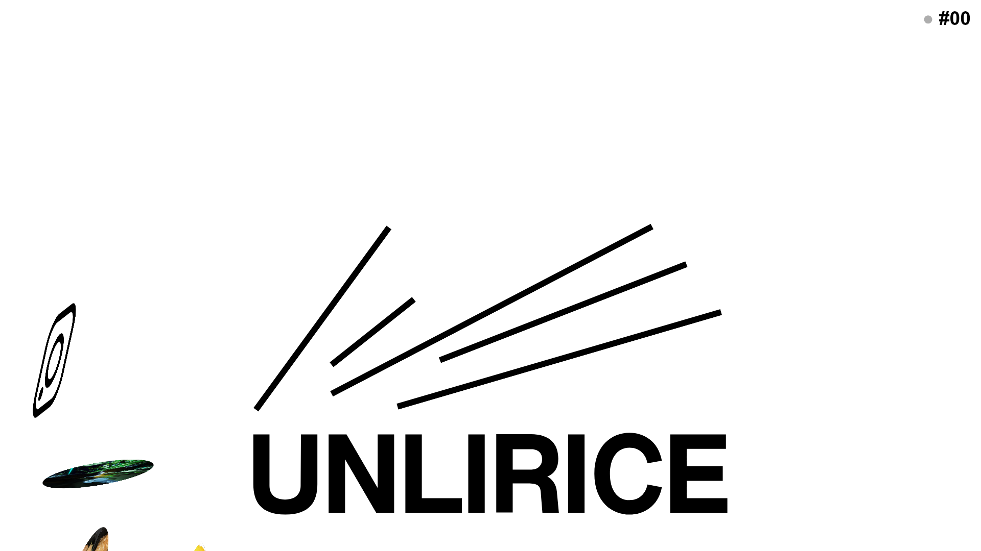
UNLIRICE Minimalist Floating Gallery Landing
A creative landing page featuring a central logo with randomized floating image components, CSS rotation animations, and an overlay-style link system.
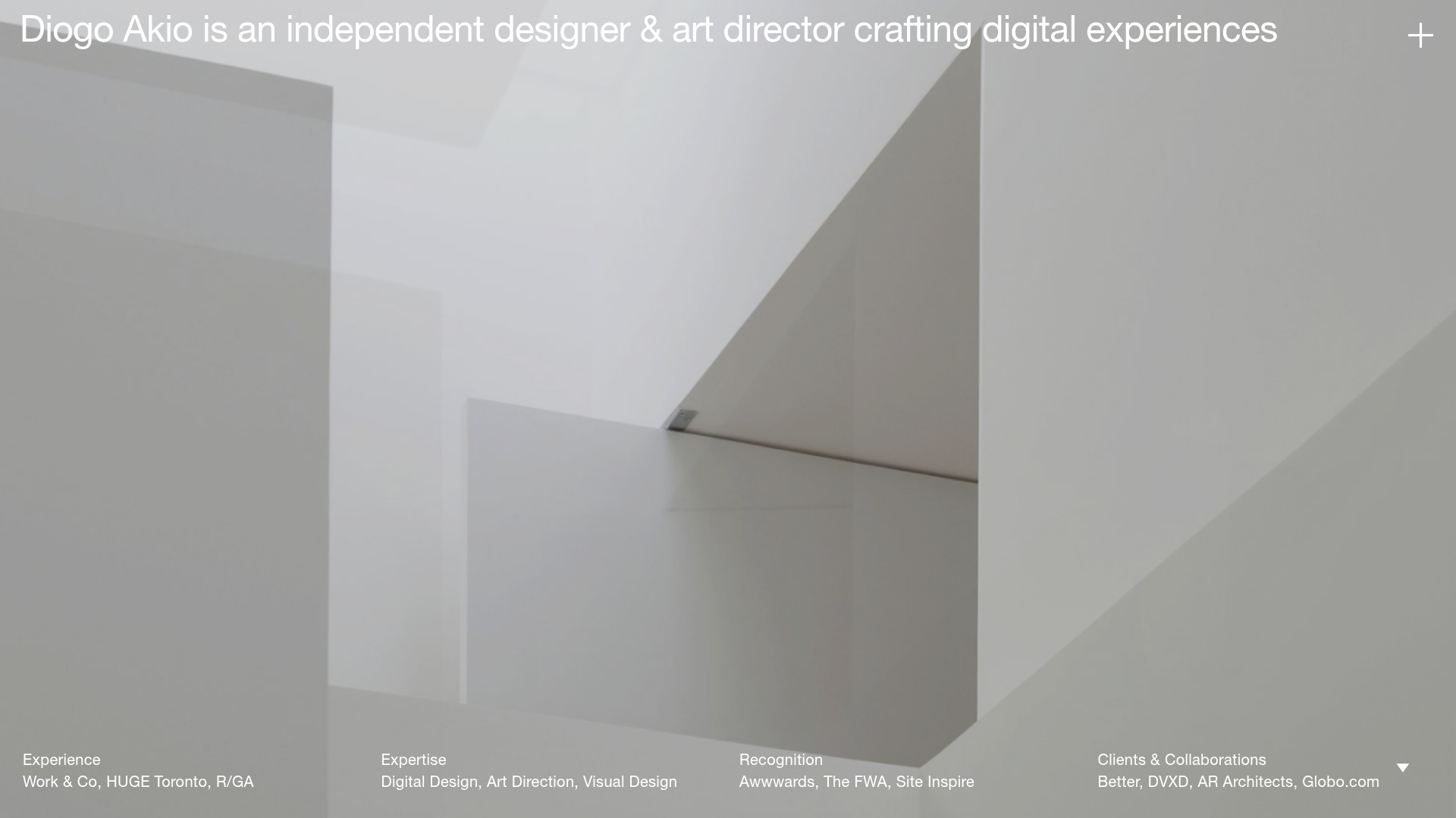
Diogo Akio Minimalist Portfolio Landing
A high-concept portfolio layout featuring a full-screen video hero, marquee footer components, and a smooth vertical-slide overlay for detailed bio and experience lists.
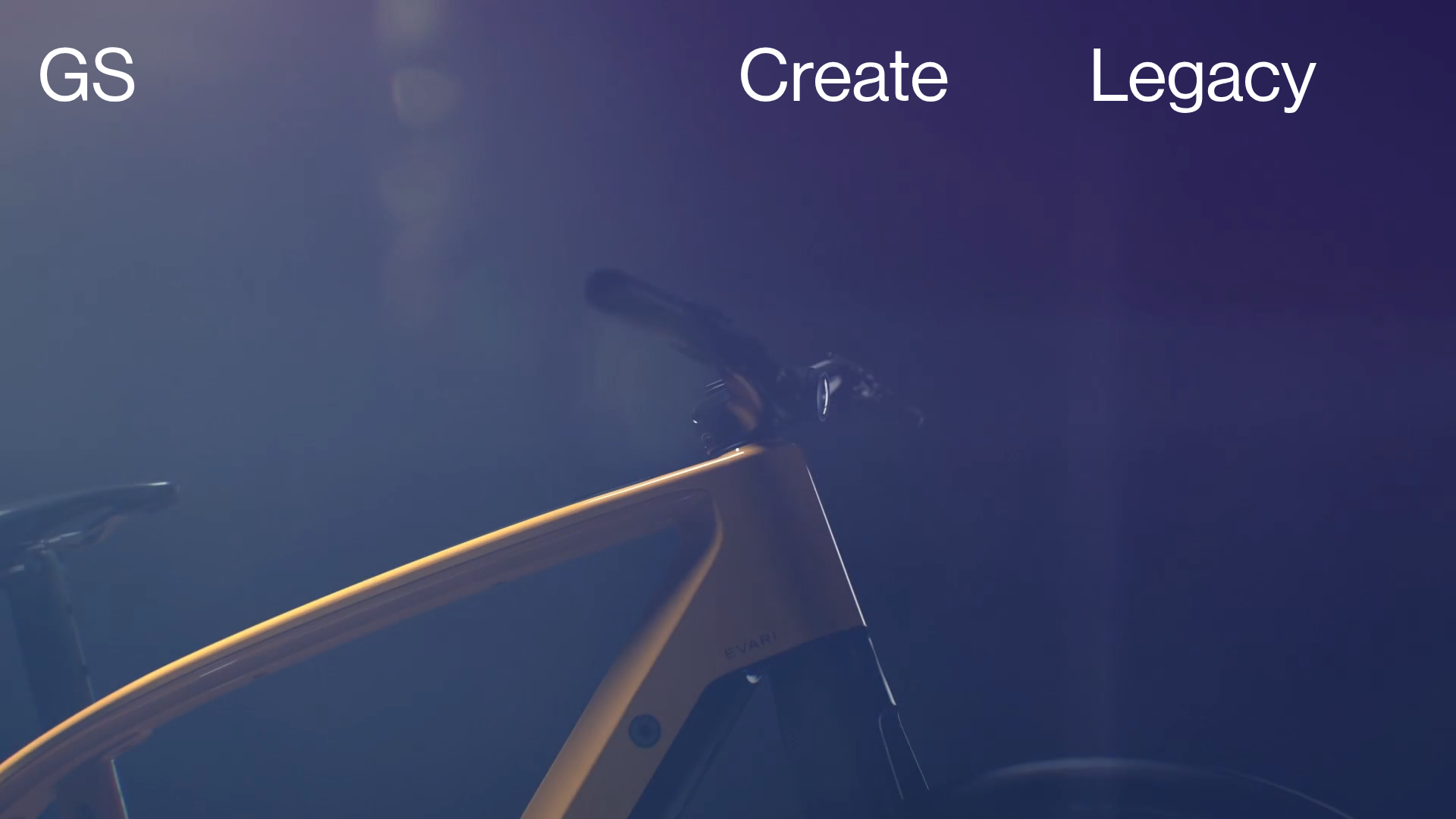
Greenspace Immersive Portfolio Landing Page
A minimalist, video-first site featuring full-screen media backgrounds, a floating navigation menu, and a hover-triggered project list with dynamic image previews.
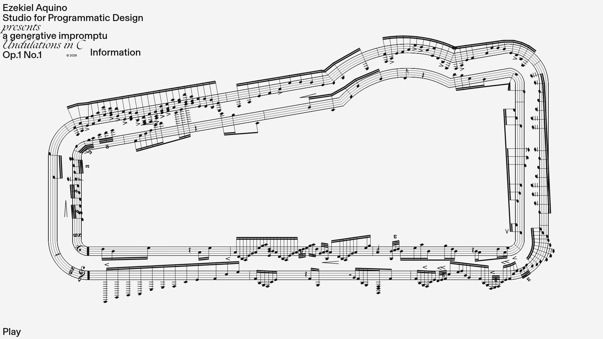
Generative Music Visualization Portfolio Canvas
A creative coding project featuring a generative musical score on a dynamic canvas with a play/pause interaction and custom notation rendering.
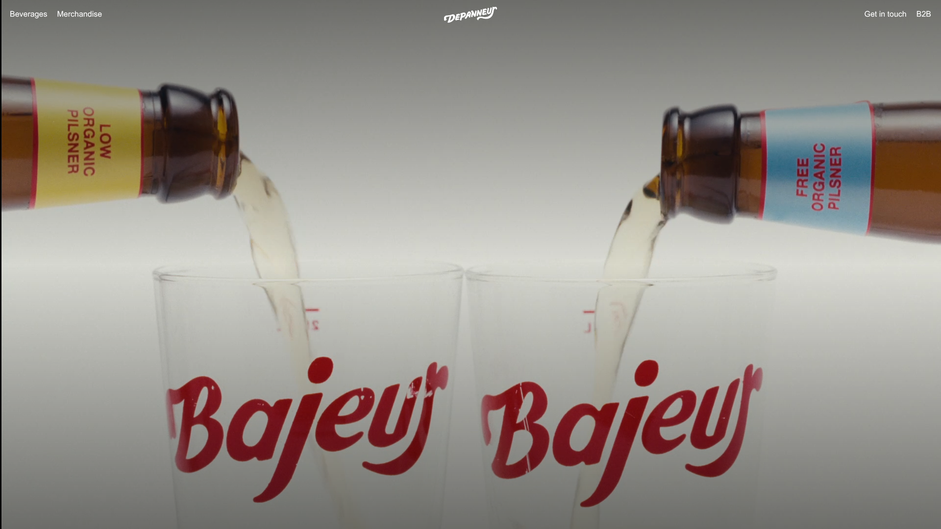
Depanneur Beverage E-commerce Hero
A minimalist Shopify storefront featuring a full-screen background video hero, sticky translucent navigation, and integrated mobile menu components.
