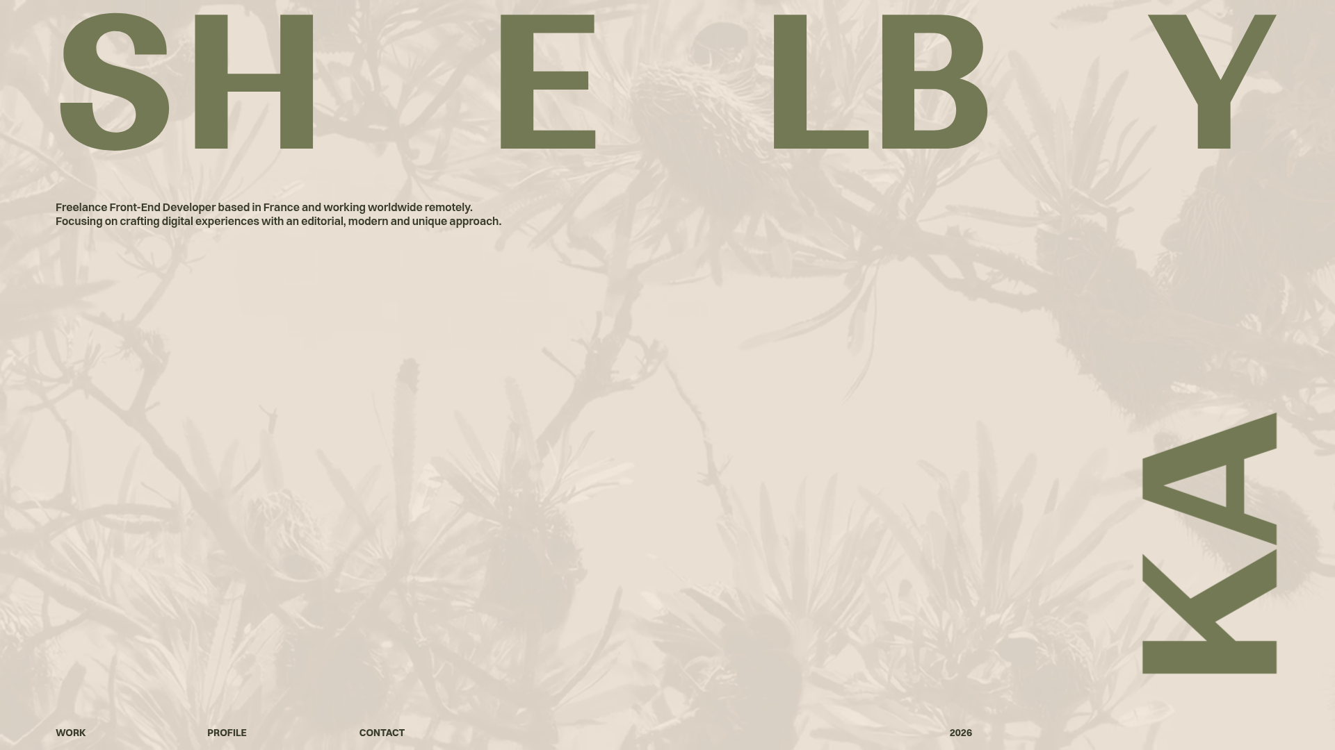
Shelby Kay Portfolio Hero and Masonry Grid
A minimalist developer portfolio featuring an oversized typography hero with parallax video background and a dense, high-frequency image/video project masonry grid.
Overview
This minimalist developer portfolio is a masterclass in editorial web design, utilizing high-scale typography and a dense masonry grid to create a sophisticated, high-end feel. It serves as an excellent reference for builders wanting to combine bold typographic layouts with immersive video backgrounds while maintaining a clean, professional aesthetic.
Design System
- Color Palette & Visual Hierarchy: The palette is a monochromatic, warm-neutral (beige/oatmeal) with olive-drab typography (#6d7350). The hierarchy is established through extreme scale rather than color contrast; the dominant heading creates a foreground layer while the content shifts between beige and deep charcoal (#100d16) as users scroll through different project blocks.
- Typography: The design relies on a large, high-impact sans-serif for the name "SHELBY KAY" in the hero. The secondary system utilizes "title-small-bold" for labels and "title-small-caps" for skills, providing a structured, grid-based reading experience that feels like a physical magazine.
- Page Structure: The site follows a vertical single-page flow: a Hero header with a full-bleed parallax video backdrop, a dense project gallery section, a structured Profile/Resume section with a portrait, and a high-scale Contact footer.
- Reusable Components:
- Typography Hero: A responsive header that spreads letters across the viewport.
- Project Grid: A high-frequency masonry layout where individual
projectitems display either static images (picturetags) or auto-playing videos (videotag withplaysinline). - Tiling Status Labels: Small numeric tags (e.g., #01–04) that add a technical, catalog-like feel to project cards.
- Interaction & Motion: The HTML reveals complex motion preparation, such as individual
spanoffsets for letters to enable staggered entrance animations. Projects use CSS variables (--color) to dynamically update background colors as specific items enter the viewport, creating a seamless wipe effect. - Implementation Clues: Built with Svelte/SvelteKit, the site uses scoped CSS (indicated by
svelte-classes) and handles asset optimization with AVIF/WebP formats. Grid layouts are heavily utilized for both the masonry section and the content description blocks.
Use Cases
- Who Should Clone This: Creative developers, motion designers, and studio photographers who have high-quality visual assets and want their name to be the primary brand identifier.
- Effective Remixes: This pattern works exceptionally well for luxury brand lookbooks, architectural portfolios, or digital agency landing pages where the work needs to speak through high-density imagery.
- Remix Directions:
- Architecture: Swap the floral background for architectural blueprints and the project grid for floor plans.
- Brand Adaption: Keep the layout but replace the neutral tones with high-contrast neon/black for a more "cyber" or technical coder aesthetic.
- Scope: Builders should focus on cloning the Hero typography structure for an immediate impact or the Project Grid for its efficient handling of mixed video/image media.
- Clone Scope: A full-page clone is ideal for those seeking a complete personal identity refresh, while the masonry grid component alone can be extracted to enhance any existing portfolio.
Related Inspirations
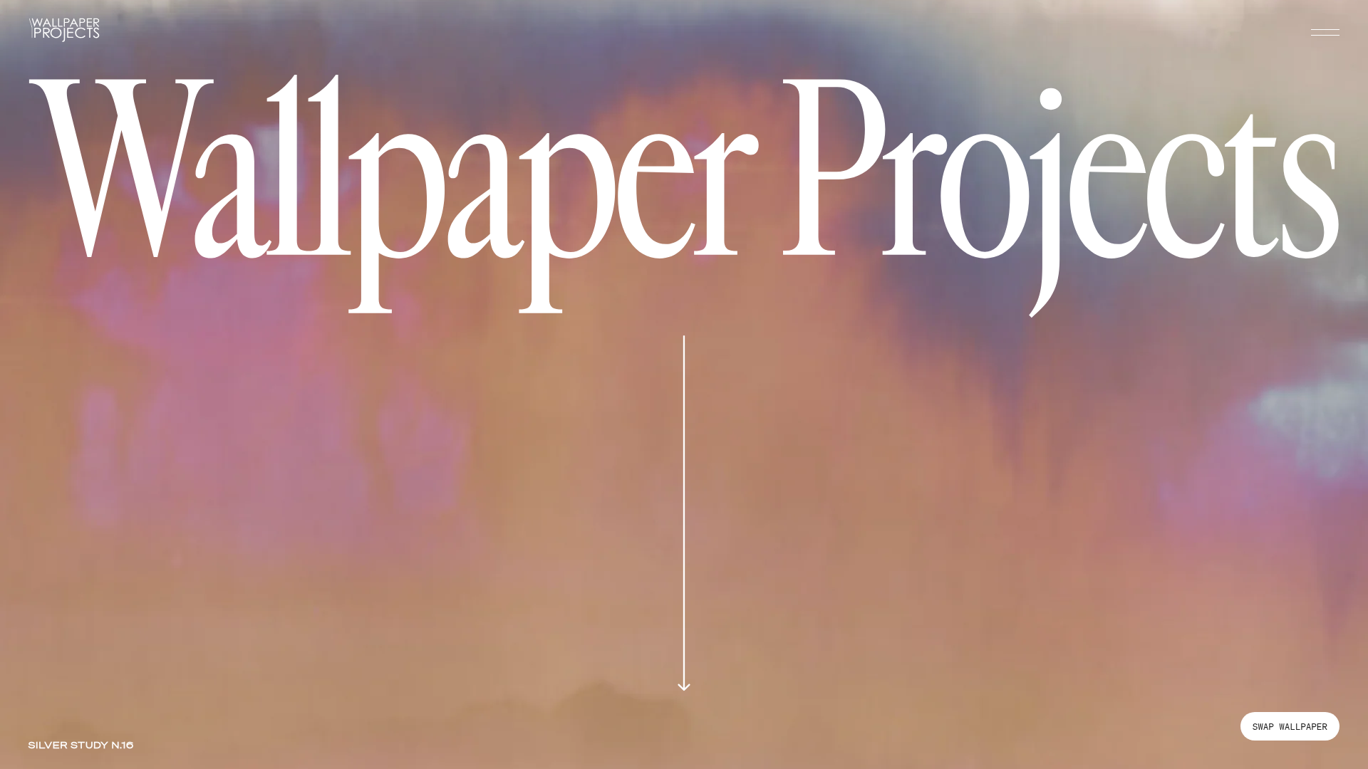
Wallpaper Projects Design Studio Landing
A high-end Shopify site featuring an animated hero slider with a 'swap' toggle, large-scale serif typography, an asymmetric project grid, and a split-view process section.
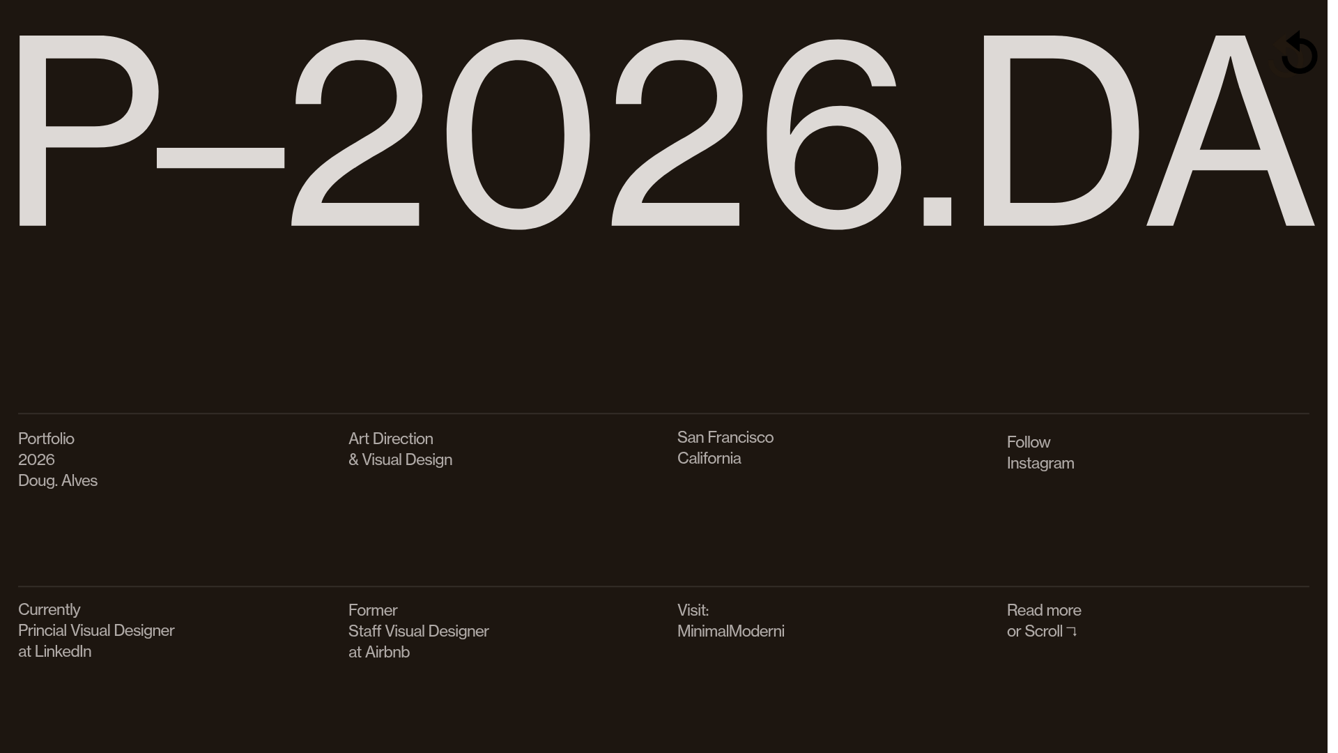
Doug Alves Visual Design Portfolio
A minimalist, high-contrast design portfolio featuring oversized typography, a sticky four-column grid footer, and a vertical scroll-triggered slide-show for project showcases.
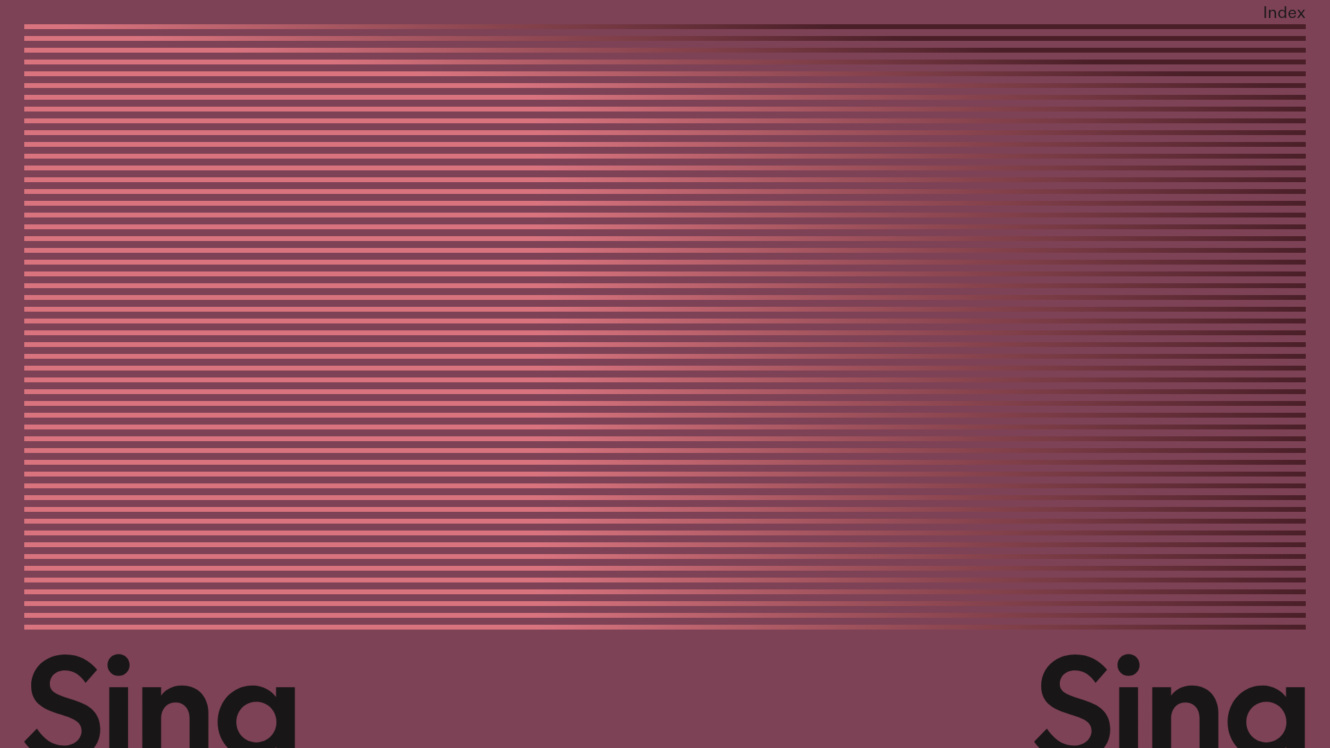
Sing-Sing Creative Portfolio Landing Page
A minimalist studio portfolio featuring high-contrast typography, a horizontal line-grid hero section, and responsive image components with custom cursor interactions.
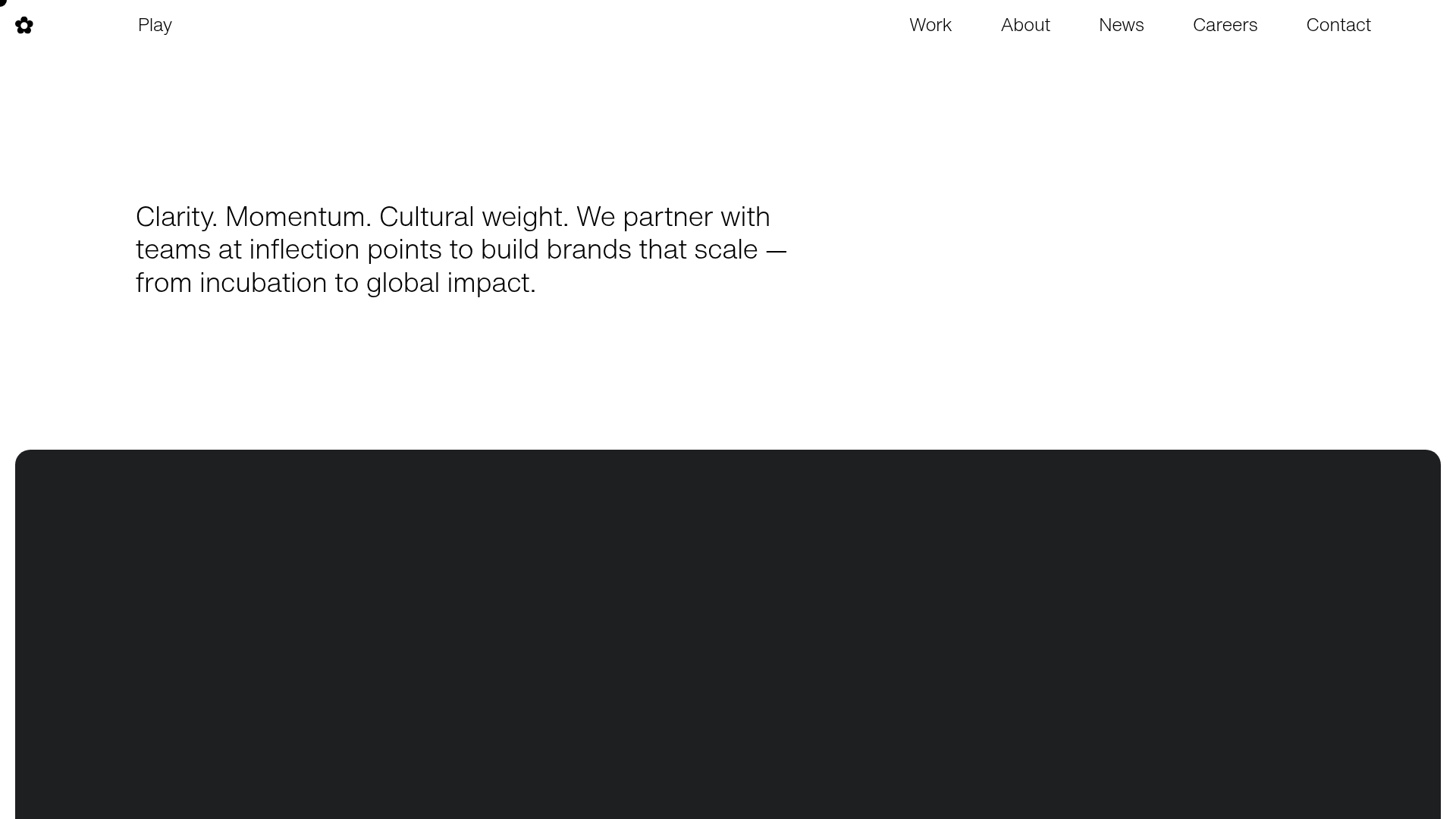
Play Studio Minimalist Portfolio Landing
A high-impact agency layout featuring a oversized typography header, a full-width integrated Vimeo video background, and a unique expandable accordion list for industry showcases.
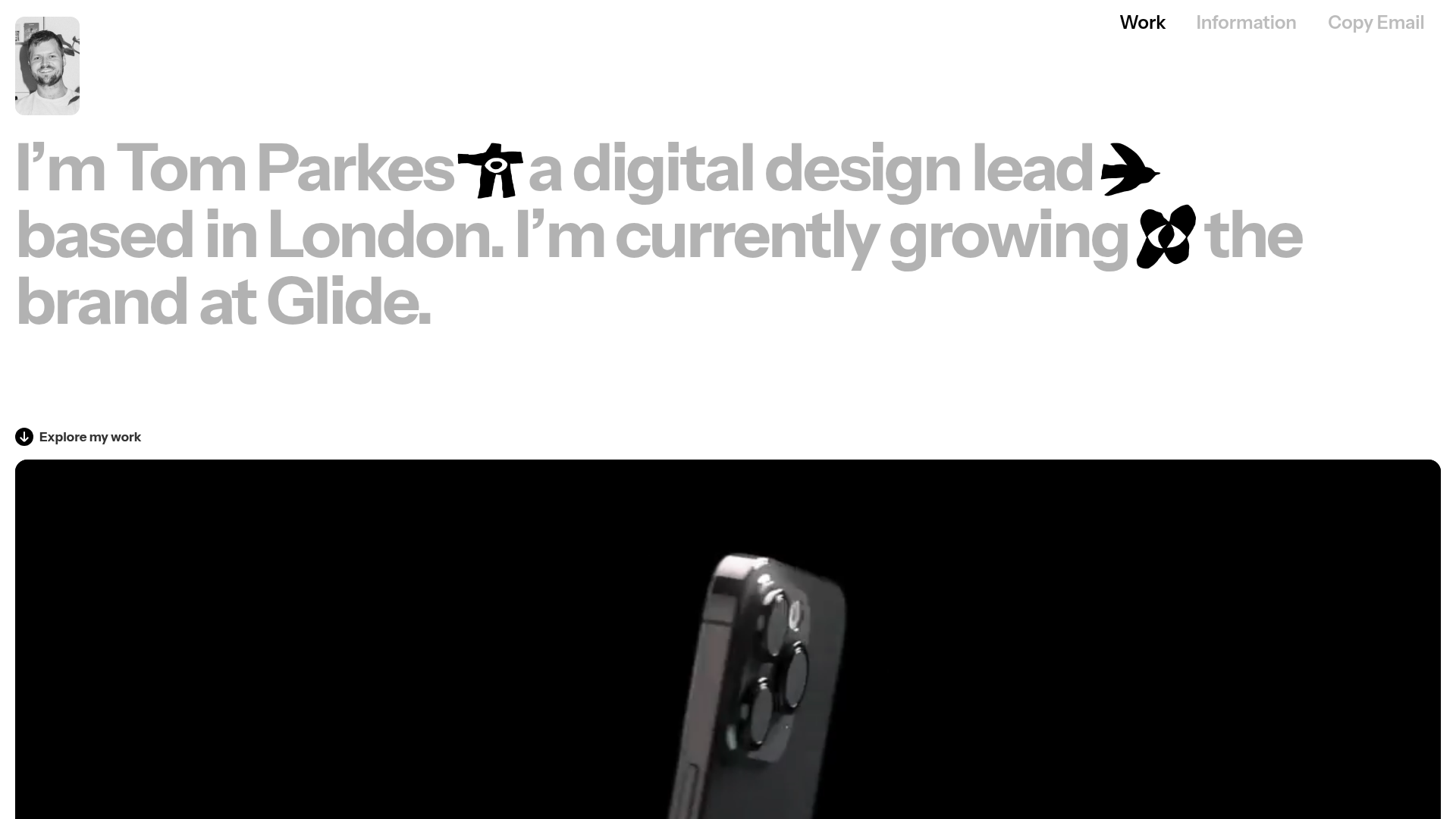
Tom Parkes Portfolio Design Gallery
A minimalist portfolio layout featuring a typography-focused hero section with inline icons, full-width video scroll reveals, and a dense masonry grid for visual assets.
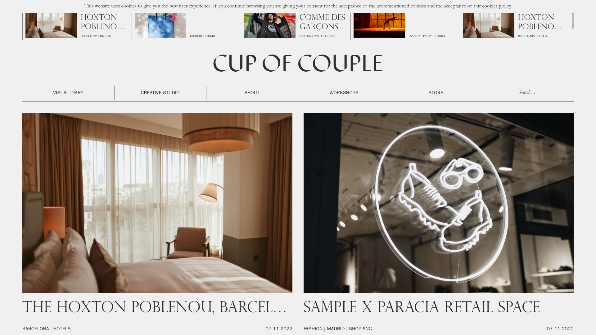
Cup of Couple Editorial Portfolio
A high-fashion editorial layout featuring a sticky compartmentalized header, a horizontal marquee carousel, and a mixed-width masonry grid with marquee typography effects.
