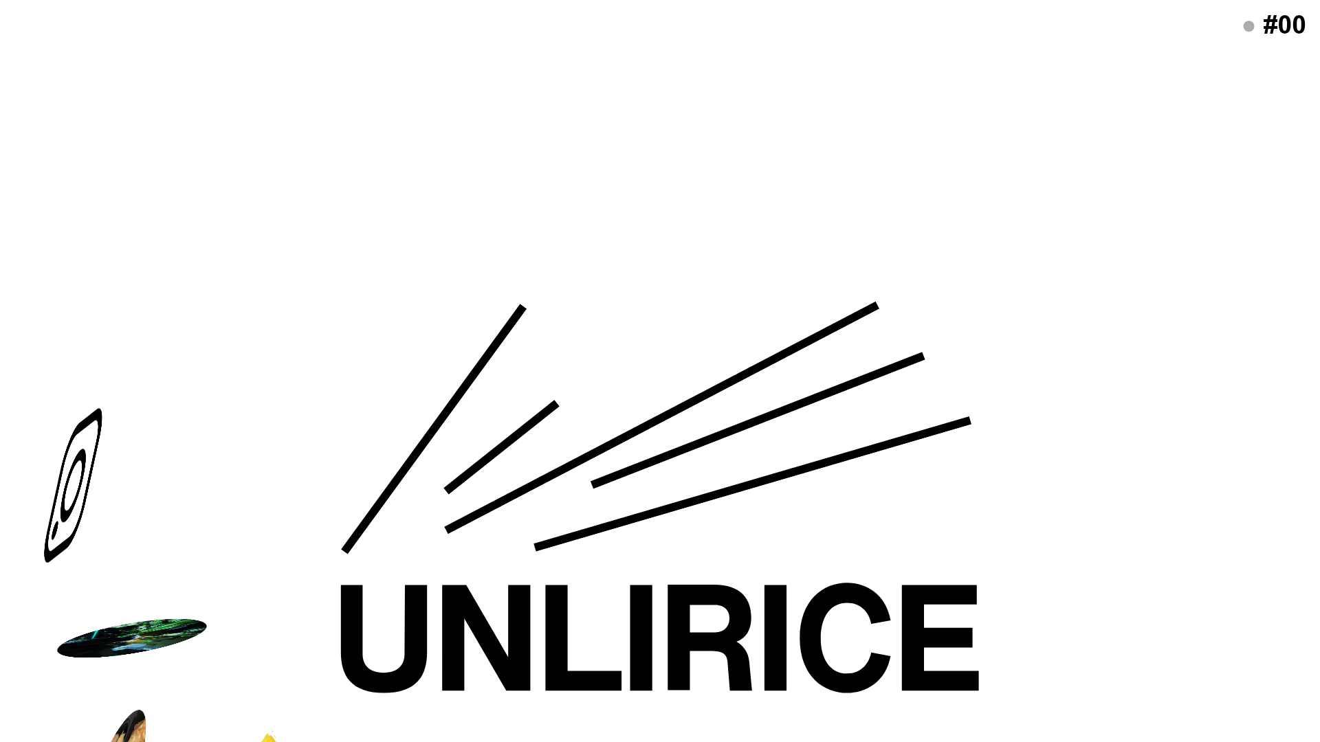
UNLIRICE Minimalist Floating Gallery Landing
A creative landing page featuring a central logo with randomized floating image components, CSS rotation animations, and an overlay-style link system.
Overview
UNLIRICE is a minimalist, high-impact landing page that uses a dynamic gallery system where images drift and rotate across the viewport. It is an excellent reference for creatives looking to build an unconventional, non-linear portfolio or a brand splash page that emphasizes motion and serendipity over traditional grid layouts.
Design System
- Color Palette and Visual Hierarchy: The design uses a stark, high-contrast monochrome base (pure white background #FFFFFF and black text #000000). Hierarchy is established through scale; the central logotype acts as the primary anchor, while floating perimeter elements create a secondary layer of visual interest.
- Typography System: The typography is bold and functional. It features a heavy sans-serif typeface for the main brand mark ("UNLIRICE") and a medium-weight sans-serif for secondary links like the pagination/version marker ("#00"). Text is used sparingly, primarily for functional navigation and brand identity.
- Page Structure and Section Flow: Unlike standard vertical scrolls, this is a single-screen "stage." The center is occupied by the brand logo (
home-logo), while the background and foreground layers (home-gallery) house floating image components that move independently. - Reusable Components:
- Floating Post Container: A
divwrapper with CSS-basedgallery-handgallery-vanimations for directional movement. - Rotating Image Child: Nested image containers (
image-container) that apply continuous CSS keyframe rotations (rotatingandrotating2). - Utility Overlay: The
#00fixed link serves as a minimal navigation anchor in the top right.
- Floating Post Container: A
- Interaction and Motion Patterns: The primary interaction is passive; images float across the screen using randomized speeds and durations (visible in the inline styles as varied
animation-duration). Elements also feature a persistent 360-degree rotation. The logo uses a class-based transition system (is-start) for entry animations. - Implementation Clues: The site utilizes a WordPress backend with custom JavaScript to handle the distribution and animation of elements. Inline styles are used heavily to inject randomized timing and starting positions (
top,left,width) for the floating gallery items.
Use Cases
- Who should clone this pattern: Creative directors, visual artists, and experimental fashion brands who want a landing page that feels like a digital installation rather than a store.
- Products for remixing: Music label homepages, lookbooks for seasonal fashion drops, or digital design agency portfolios where "vibe" precedes information density.
- Practical remix directions:
- Architecture: Swap the central text for a video loop or a 3D canvas while keeping the floating perimeter image logic.
- Interactivity: Change the passive floating to cursor-reactive movement where images flee or follow the mouse.
- Branding: Adjust the heavy black-on-white theme to a "dark mode" aesthetic with neon accents for a tech-focused feel.
- Suggested clone scope: A full-page clone is best to preserve the spatial logic, though the floating image container logic can be extracted as a standalone background effect for more traditional sites.
Related Inspirations
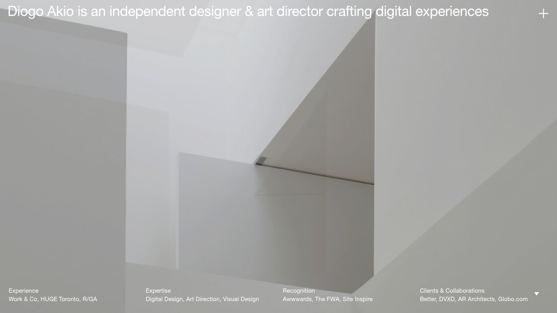
Diogo Akio Minimalist Portfolio Landing
A high-concept portfolio layout featuring a full-screen video hero, marquee footer components, and a smooth vertical-slide overlay for detailed bio and experience lists.
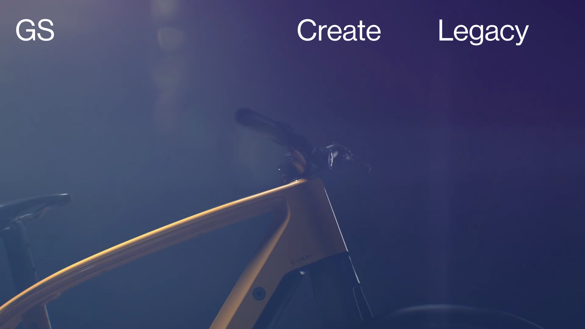
Greenspace Immersive Portfolio Landing Page
A minimalist, video-first site featuring full-screen media backgrounds, a floating navigation menu, and a hover-triggered project list with dynamic image previews.
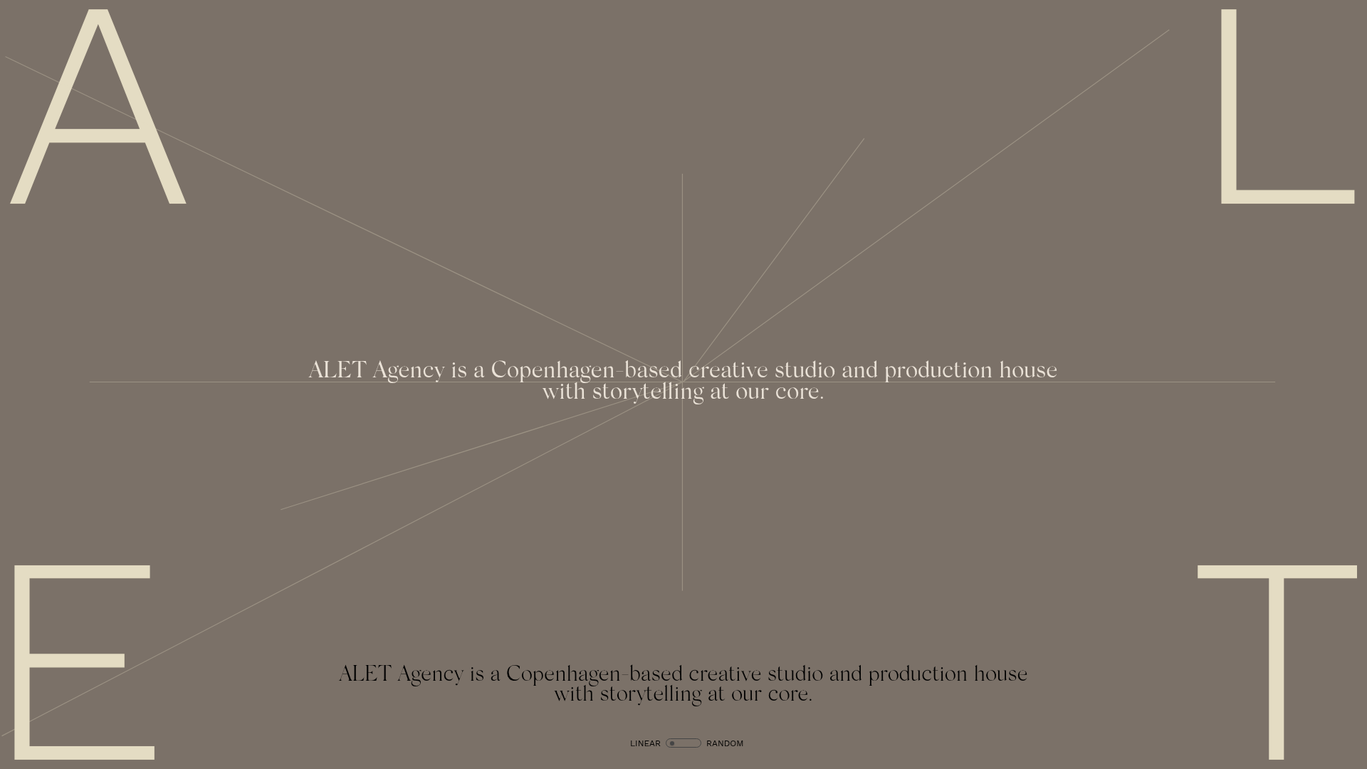
ALET Agency Creative Portfolio Hero
A minimalist immersive landing page featuring a full-viewport mouse-parallax image grid, centered typography, and large-scale decorative characters in the viewport corners.
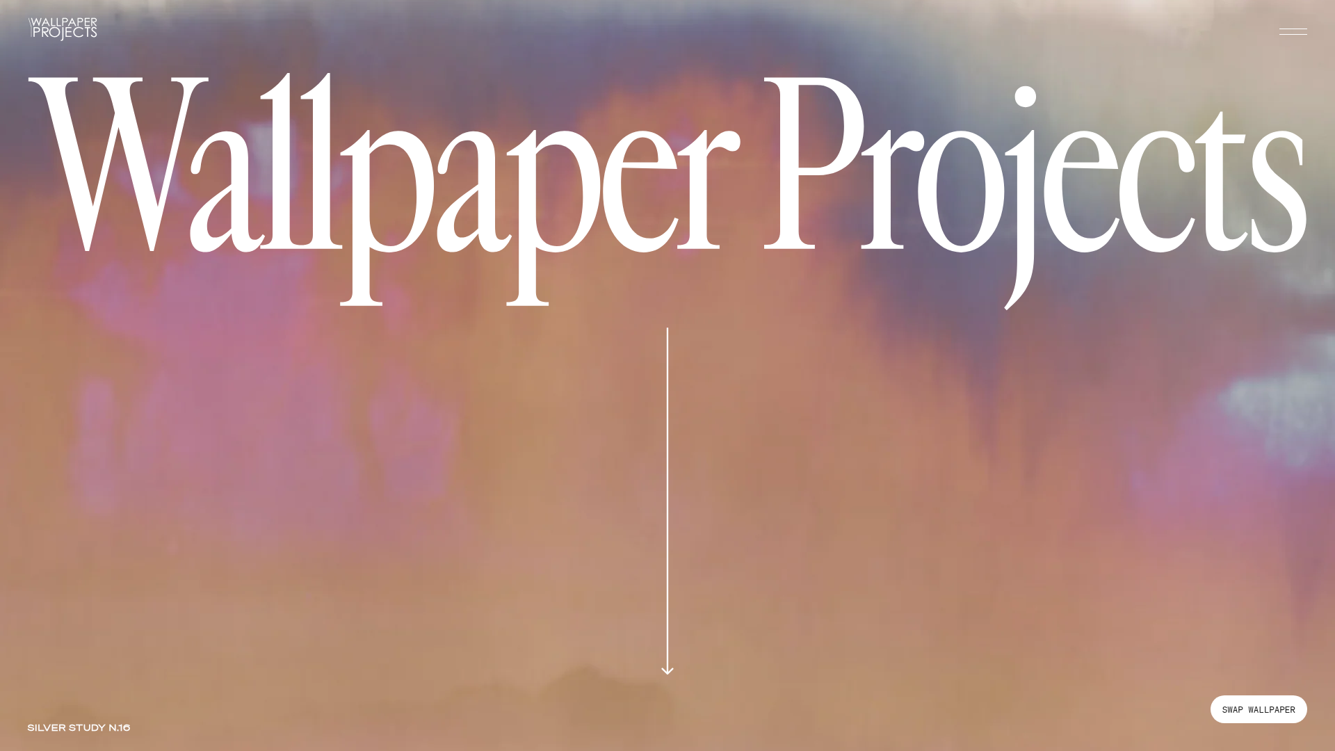
Wallpaper Projects Design Studio Landing
A high-end Shopify site featuring an animated hero slider with a 'swap' toggle, large-scale serif typography, an asymmetric project grid, and a split-view process section.
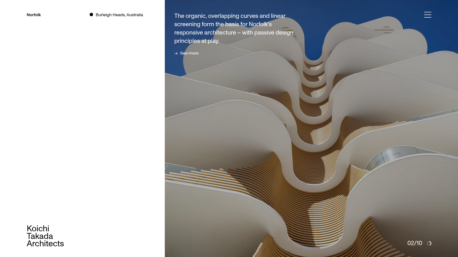
Koichi Takada Architects Portfolio Home
A high-end architectural portfolio featuring a split-screen layout with an interactive project slider, sticky typography, and smooth transition animations.

Bruno Arizio Designer Portfolio Website
A minimalist creative director portfolio featuring a clean typographic layout, side-aligned image previews, and high-contrast spacing patterns suitable for luxury or design showcases.
