Diogo Akio Minimalist Portfolio Landing
A high-concept portfolio layout featuring a full-screen video hero, marquee footer components, and a smooth vertical-slide overlay for detailed bio and experience lists.
Overview
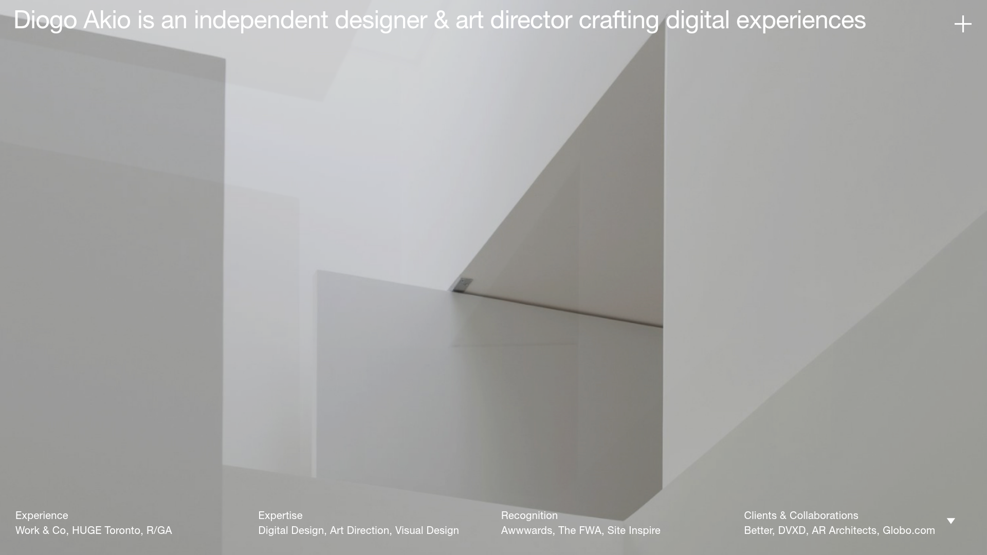
Diogo Akio’s portfolio is a masterclass in high-concept minimalism, utilizing a full-screen video background layered with clean, oversized typography. It is an excellent reference for designers or agencies wanting to build an immersive digital greeting card that feels both sophisticated and lightweight. The site excels at hiding complex information (like detailed bios and full client lists) behind a smooth vertical-slide overlay, maintaining a clean visual field.
Design System
- Color Palette & Visual Hierarchy: The visual system is monochromatic and high-contrast, designed to let underlying media (video/images) provide the color. Text is primarily white and positioned at the edges to act as a frame for the central content.
- Typography: Features a clean, utilitarian sans-serif (resembling Helvetica or Inter). The headline uses a large scale sitting at the top left, while secondary information at the bottom uses a smaller, uniform font size that creates a modular "grid" feel in the footer.
- Page Structure:
- Hero Layer: The base layer is a loopable
<video>or high-res image component (layout_video__vwI1a). - Interactive Overlay: The UI components are pinned to the viewport corners: title (top-left), menu/toggle (top-right), and a multi-column marquee footer (bottom).
- Drawer Layer: An
about_containerthat usestransform: translateY(100%)to slide up and cover the screen, revealing a detailed bio, portrait, and list of experience.
- Hero Layer: The base layer is a loopable
- Reusable Components:
- Marquee Footer: Four columns that display static summary text, but contain hidden marquee variations (
layout_marquee__2UEvr) for hover states. - Vertical Slide Overlay: A full-height container (
layout_about_container__1FO2X) triggered by the down arrow icon. - Progress Bar: A thin, horizontal line indicating scroll depth or loading state.
- Marquee Footer: Four columns that display static summary text, but contain hidden marquee variations (
- Interaction & Motion: The site relies on viewport-relative positioning and CSS transforms. The HTML structure indicates a Next.js implementation with styled modules, using transitions to animate the transition between the video landing and the text-heavy about page.
Use Cases
- Who should clone this: Independent creative professionals, architects, or boutique design studios who want a high-impact, low-friction landing page that prioritizes atmosphere over immediate text density.
- Effective Remixes:
- Art Galleries: Replace the personal bio with an exhibition list and the background video with slow-motion footage of an installation.
- Video Production Houses: Use individual project showreels as the background layer for a truly dynamic portfolio.
- Practical Directions: Builders should focus on cloning the layout_colfooter logic—the way it organizes professional metadata (Experience, Expertise, Recognition) into four equal columns—and the full-screen slide interaction. For a quick remix, swap the video source and update the global font to a serif to drastically shift the aesthetic from "Tech Minimalist" to "Editorial Luxury."
- Clone Scope: A full-page clone is recommended to maintain the intent of the spatial layout, though the four-column marquee footer is a highly reusable individual component for any minimalist footer.
Related Inspirations
UNLIRICE Minimalist Floating Gallery Landing
A creative landing page featuring a central logo with randomized floating image components, CSS rotation animations, and an overlay-style link system.
Greenspace Immersive Portfolio Landing Page
A minimalist, video-first site featuring full-screen media backgrounds, a floating navigation menu, and a hover-triggered project list with dynamic image previews.
Wallpaper Projects Design Studio Landing
A high-end Shopify site featuring an animated hero slider with a 'swap' toggle, large-scale serif typography, an asymmetric project grid, and a split-view process section.
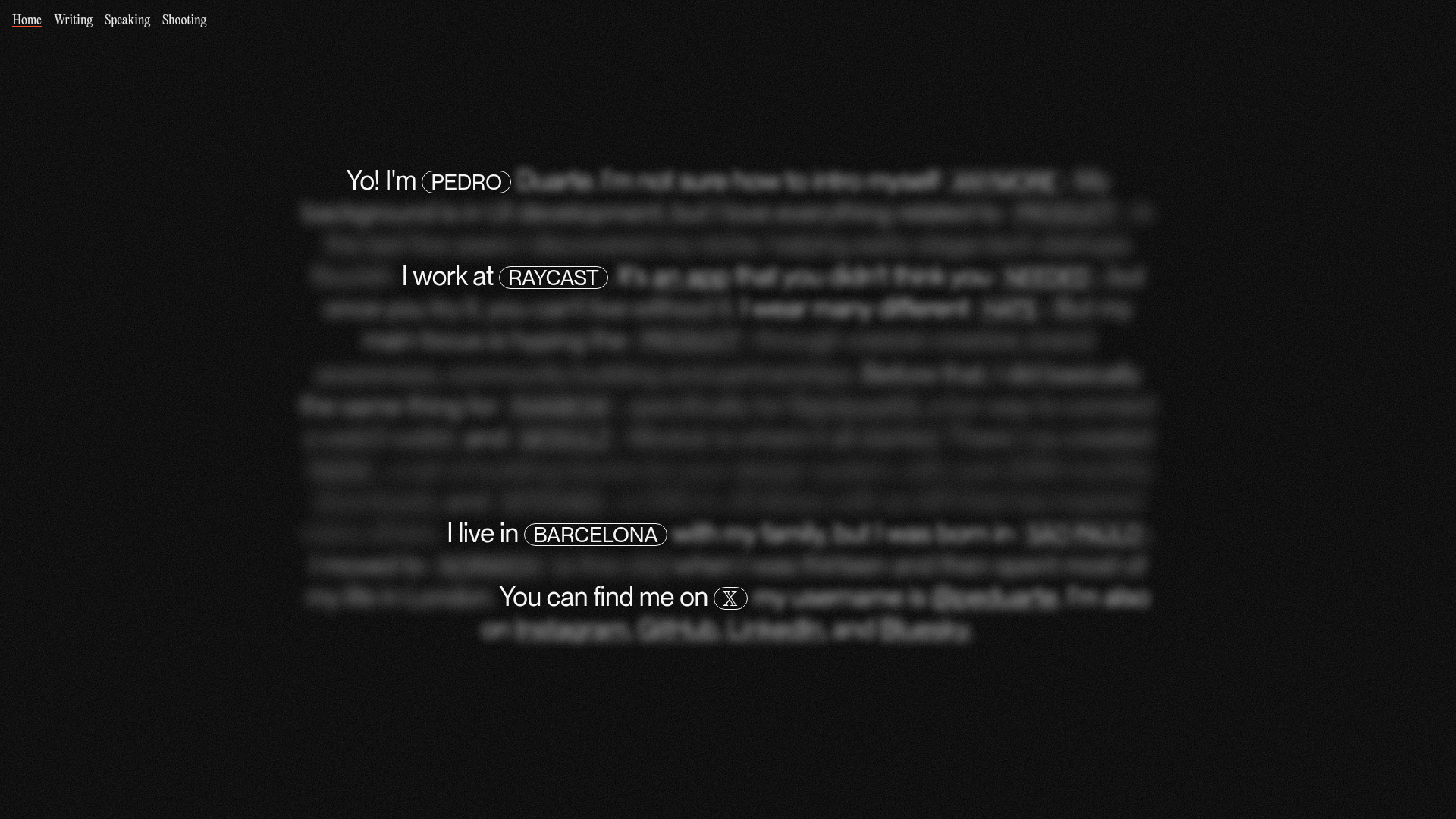
Pedro Duarte Personal Portfolio Site
A minimalist portfolio featuring an interactive text-reveal interface, a full-screen background video, and Radix UI components with a distinct dark aesthetic.
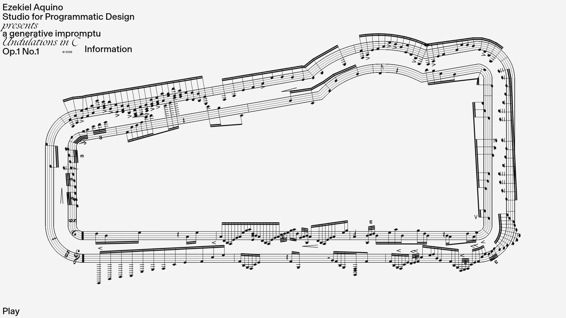
Generative Music Visualization Portfolio Canvas
A creative coding project featuring a generative musical score on a dynamic canvas with a play/pause interaction and custom notation rendering.
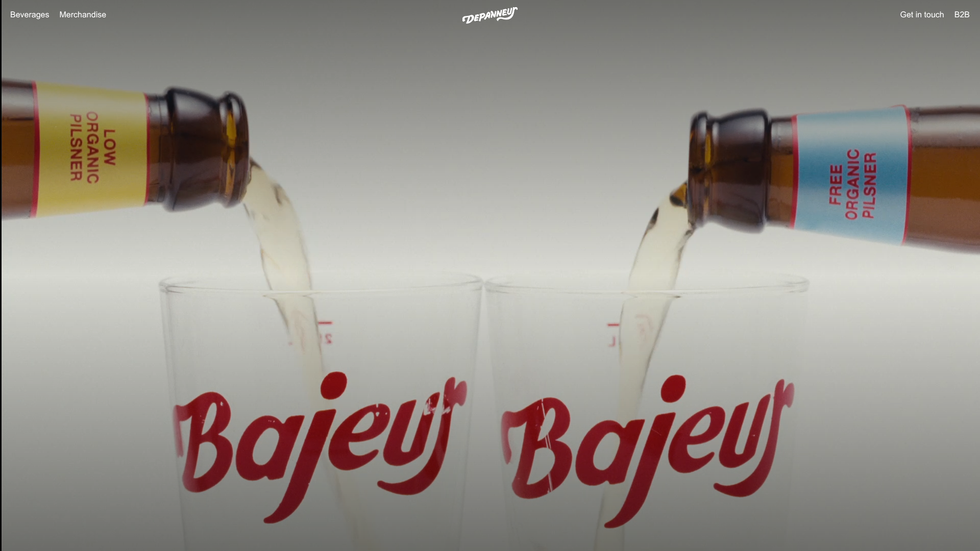
Depanneur Beverage E-commerce Hero
A minimalist Shopify storefront featuring a full-screen background video hero, sticky translucent navigation, and integrated mobile menu components.
