Laura Monin Fashion Portfolio Archive
A minimalist horizontal-scroll portfolio featuring a delicate serif typography hero, smooth canvas transitions, and an image patchwork grid that reveals more content on interaction.
Overview
This portfolio for fashion designer Laura Monin is a masterclass in high-end minimalism, using an experimental horizontal scroll and an interactive image 'patchwork' system. It is a strong reference for builders looking to create immersive, image-heavy experiences that prioritize refined typography and smooth canvas-like transitions over traditional UI layouts.
Design System
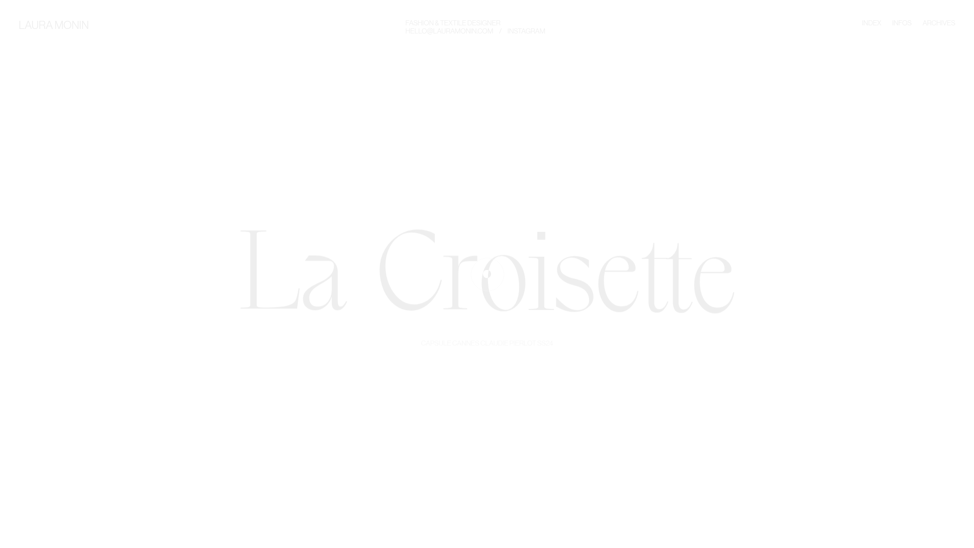
- Color Palette & Visual Hierarchy: The site utilizes an ultra-minimalist 'high-key' palette, primarily featuring a white or light-grey background (#FFFFFF) with very low-contrast monochromatic text. Visual hierarchy is driven by physical scale rather than color, with massive hero titles commanding attention while navigation and metadata are pushed to the extreme corners.
- Typography System: The system centers on a high-contrast serif typeface for project titles (e.g., "La Croisette"), likely a custom or display font with thin hairlines. This is balanced against a secondary sans-serif typeface used in all-caps (uppercase) for utility links, subtitles, and the navigation bar to maintain a clean, architectural look.
- Page Structure & Section Flow: The homepage functions as a horizontal slider (
#projects-container). Each project is a full-screen<li>element containing a centered title, a subtitle, and a hiddenpatchwork-containerof absolute-positioned images that reveal themselves during interaction or scroll transitions. - Reusable Components:
- The Patchwork Grid: A collection of media wrappers (
wrapper-portraitandwrapper-paysage) with varied widths and offsets (e.g.,margin-left: 11%) that create a non-linear gallery. - Corner-Pinned Navigation: Essential links (Index, Infos, Archives) are fixed to the corners to maximize center-screen focus on art assets.
- Custom Cursor: A sophisticated cursor system (
#cursor-dot) that provides contextual feedback like "Explore" or "Next" based on the user's focus.
- The Patchwork Grid: A collection of media wrappers (
- Interaction and Motion: The movement is managed by
barba.jsfor seamless page transitions. Individual characters in titles are wrapped in divs to allow for staggered entrance animations (visible in HTML astranslate3dand variableopacityvalues on separate characters). - Implementation Clues: The site uses the Barba.js framework for PJAX transitions and likely GSAP for the intricate motion of the patchwork elements. Images are implemented with
<picture>tags and lazy loading to manage the heavy media load without sacrificing performance.
Use Cases
- Who should clone this: Architectural firms, fashion designers, luxury editorial photographers, and high-end boutique agencies who want a digital presence that feels like a physical gallery.
- Remix Directions:
- Brand Swap: Keep the horizontal mechanics but shift to a dark mode palette with neon accents for a tech or gaming portfolio.
- Information Architecture: Adapt the patchwork grid for a product lookbook where each image links to a specific SKU rather than a project case study.
- Section Reuse: Extract specifically the staggered character animation logic or the corner-aligned navigation layout for a standard vertical scroll site.
- Suggested Scope: A full-page clone is recommended to capture the delicate interplay between the scroll-jacking mechanics and the animation of the image clusters.
Related Inspirations
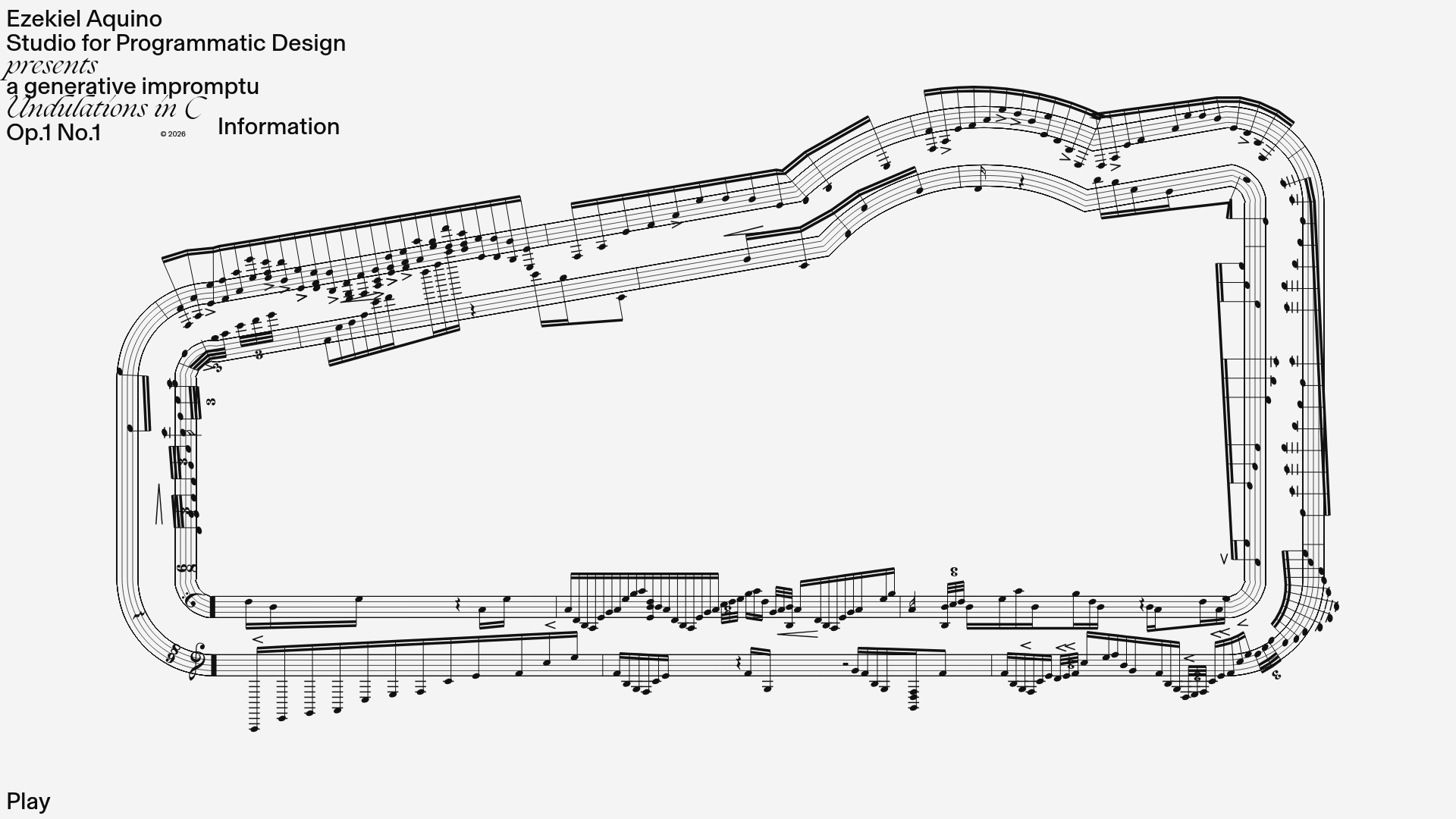
Generative Music Visualization Portfolio Canvas
A creative coding project featuring a generative musical score on a dynamic canvas with a play/pause interaction and custom notation rendering.
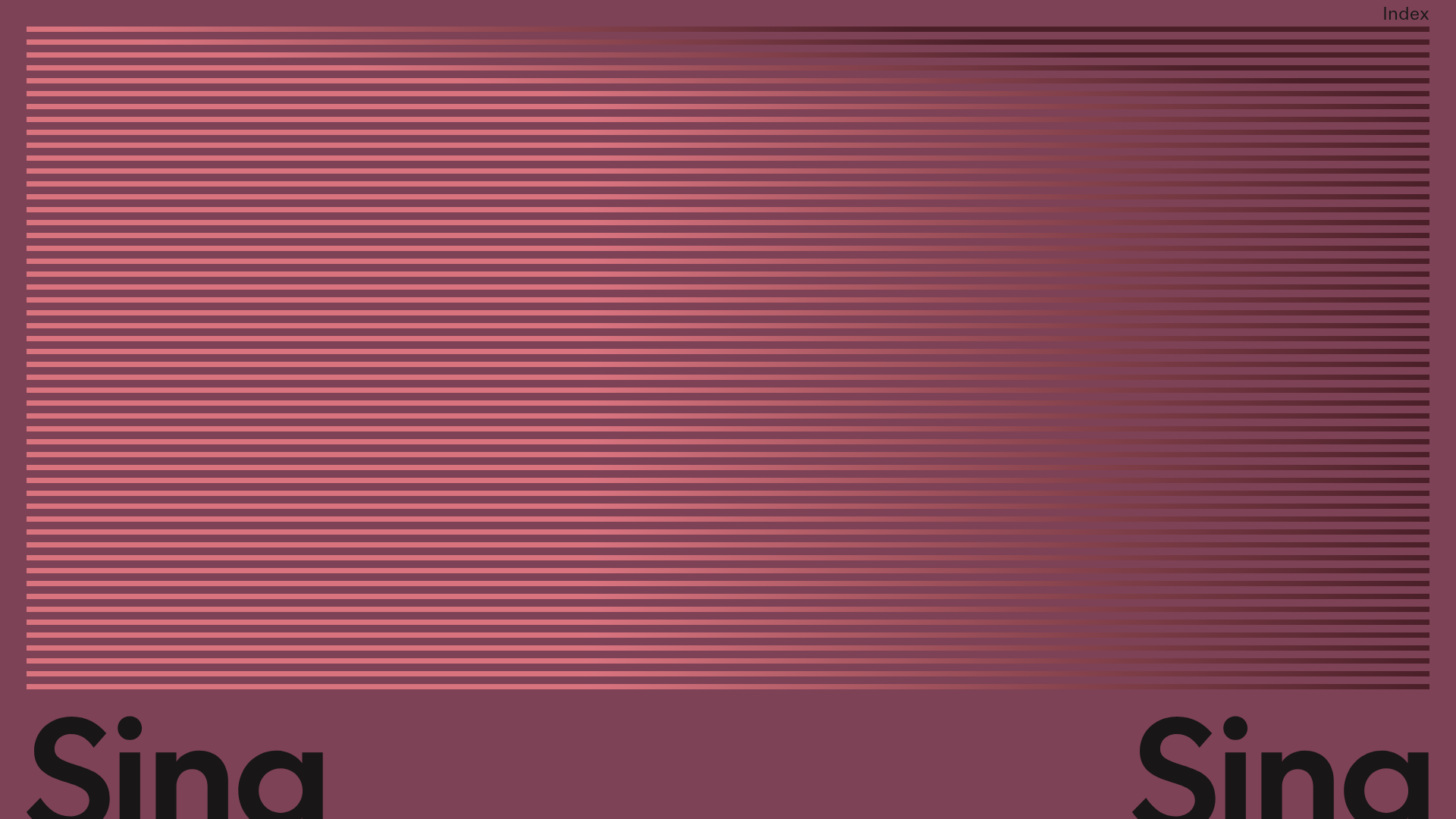
Sing-Sing Creative Portfolio Landing Page
A minimalist studio portfolio featuring high-contrast typography, a horizontal line-grid hero section, and responsive image components with custom cursor interactions.
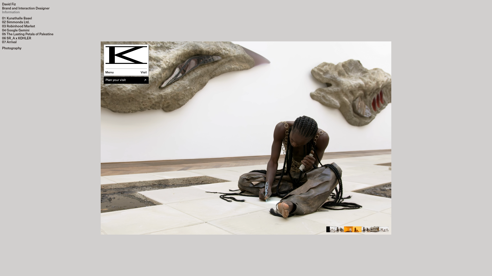
David Fiz Visual Design Portfolio
A minimalist portfolio featuring a fixed sidebar navigation paired with an immersive, full-screen media showcase and interactive project-specific image carousels.
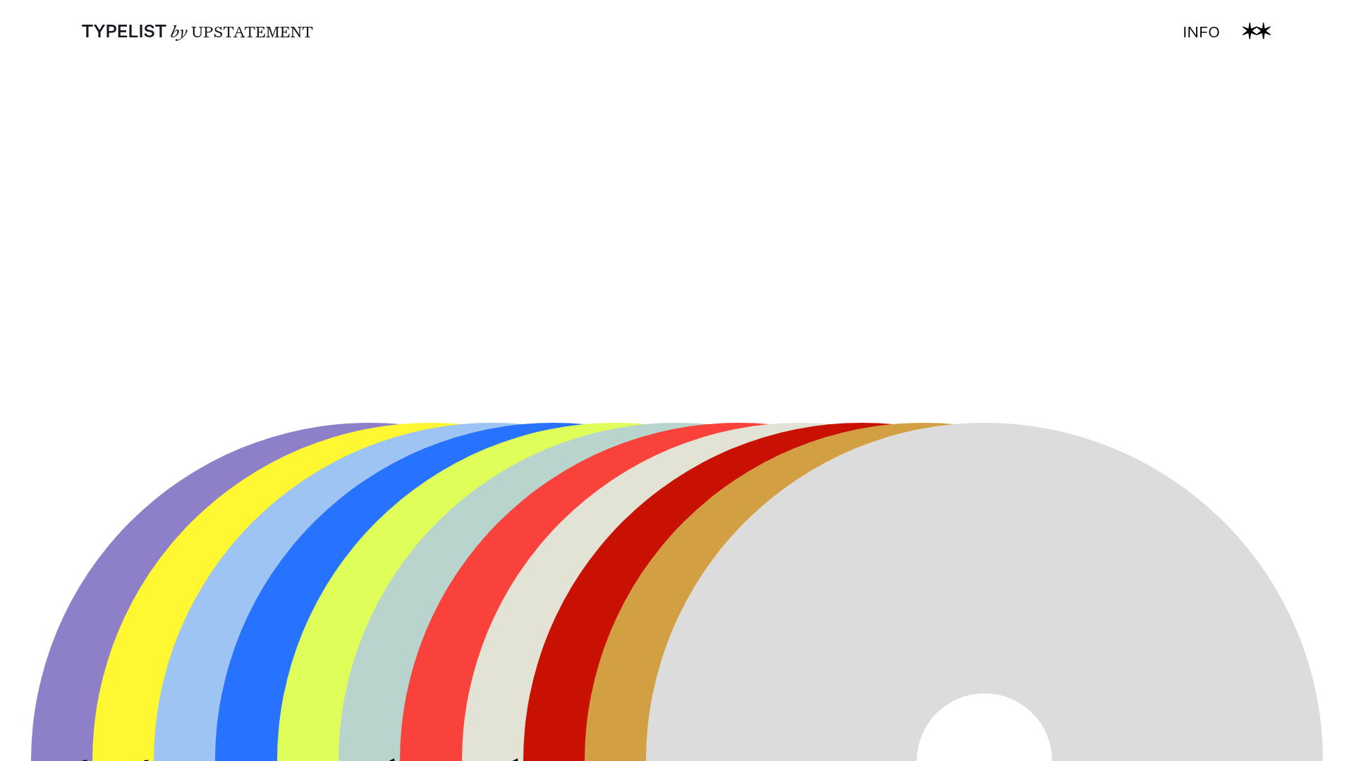
Typelist Typography Playlist Gallery
A creative curated gallery featuring a horizontal overlapping disc navigation pattern, CSS-driven theme color shifting, and smooth page transitions for showcasing design collections.

Offten Interactive Typographic Hero
A Svelte-based immersive landing page featuring a full-screen WebGL background, brush-style text underlines, and scroll-triggered character animations.
Waka Waka Furniture Portfolio
A minimalist design showcase featuring a custom cursor, parallax scroll effects, and a vertical image grid layout for high-end product displays.
