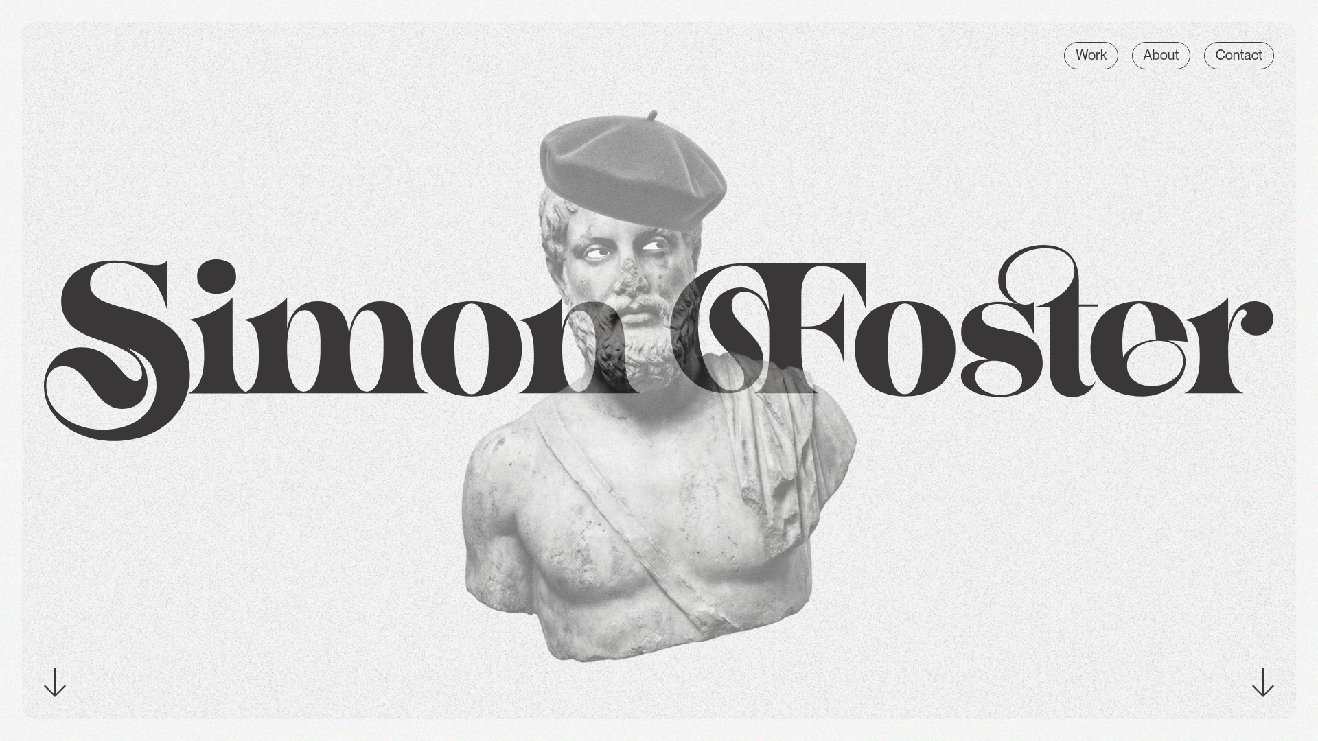
Simon Foster Design Portfolio Archetype
A minimalist portfolio featuring an interactive animated hero, horizontal scroll project carousels, and playful image-masking components for brand-forward digital designers.
Overview
This portfolio for Simon Foster is a masterclass in brand-forward, minimalist web design that balances high-end typography with playful interactivity. It is an exceptional reference for builders who want to create a high-impact professional presence using simple horizontal scroll mechanics and clever SVG-based animations.
Design System
- Color Palette & Visual Hierarchy: The site uses a high-contrast mono-plus-noise aesthetic. The background is an off-white textured grain, while the primary elements use a deep charcoal/black (#1A1A1A). Accent colors are restricted to specific project cards (e.g., pink or teal), ensuring the designer's personal brand remains neutral and sophisticated.
- Typography: The typography system features a high-character, high-contrast serif (similar to Ogg or Nantes) for the hero nameplate and large headings (
.heading-grande,.xx-large). This is paired with a clean, functional sans-serif for navigation and body metadata, creating a clear hierarchy between artistic expression and readability. - Page Structure: The layout follows a linear narrative: a full-height interactive hero section, followed by a bold text introduction, multiple categorized horizontal scroll project carousels (
.portfolio-carousel-container), a skills list with a dynamic "hat" graphic, and a call-to-action footer. - Reusable Components:
- Interactive Hero: A centered statue image (
.statue-with-jaunty-beret) with cursor-tracking eyes implemented via separated pupil and white SVG layers. - Horizontal Carousels: Row-based project sliders that allow for dense content display without vertical bloat.
- Project Cards: Flexible
.portfolio-cardunits with distinct states for brand colors and simple arrow indicators. - Pill Navigation: Minimal top-right navigation buttons with high-border-radius outlines.
- Interactive Hero: A centered statue image (
- Interactions & Motion: The site utilizes mouse-tracking for the hero eyes and scroll-triggered transforms. The "many hats" section features a stacked image component (
.many-hats) that likely reveals or cycles through assets based on scroll position or hover. - Implementation Clues: Built with a clear utility-first approach (visible via classes like
w-nodeandw-inline-block), emphasizing the use of absolute positioning for decorative overlays and flexbox for the horizontal carousel layouts.
Use Cases
- Who should clone this: Creative directors, brand designers, and front-end developers looking for a portfolio that feels "expensive" but remains technically accessible.
- Effective Remixes: This pattern works perfectly for agency landing pages where the "statue" can be replaced with a 3D product render, or for curated galleries like font foundries and architecture firms.
- Remix Directions: One could swap the grainy texture for a clean gradient, replace the serif font with a brutalist mono-spaced typeface for a more technical feel, or extract specifically the horizontal scroll rows to add interest to a standard vertical case study page.
- Clone Scope: A full-page clone is ideal for those needing a complete personal brand overhaul, while the interactive hero and the horizontal project rows are the most valuable individual units for surgical cloning.
Related Inspirations

Bruno Arizio Designer Portfolio Website
A minimalist creative director portfolio featuring a clean typographic layout, side-aligned image previews, and high-contrast spacing patterns suitable for luxury or design showcases.
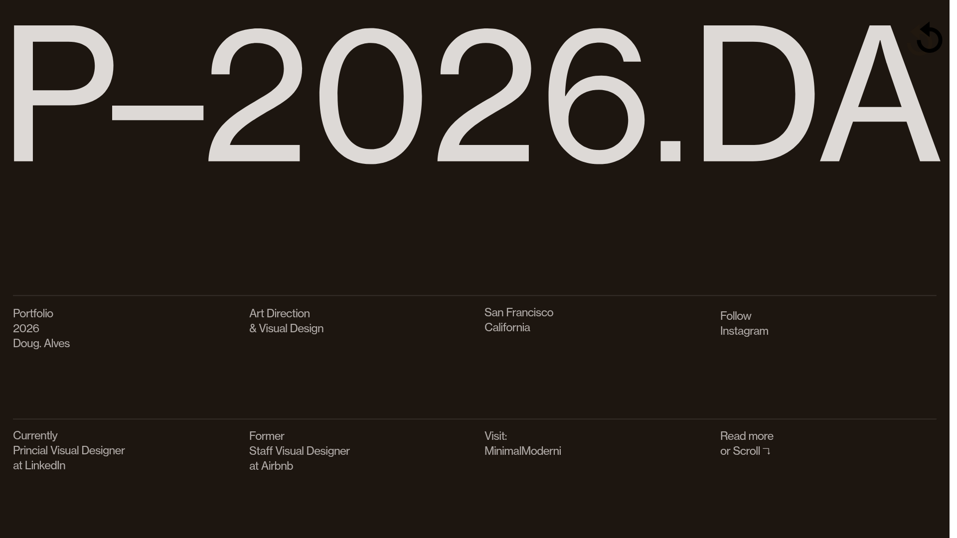
Doug Alves Visual Design Portfolio
A minimalist, high-contrast design portfolio featuring oversized typography, a sticky four-column grid footer, and a vertical scroll-triggered slide-show for project showcases.
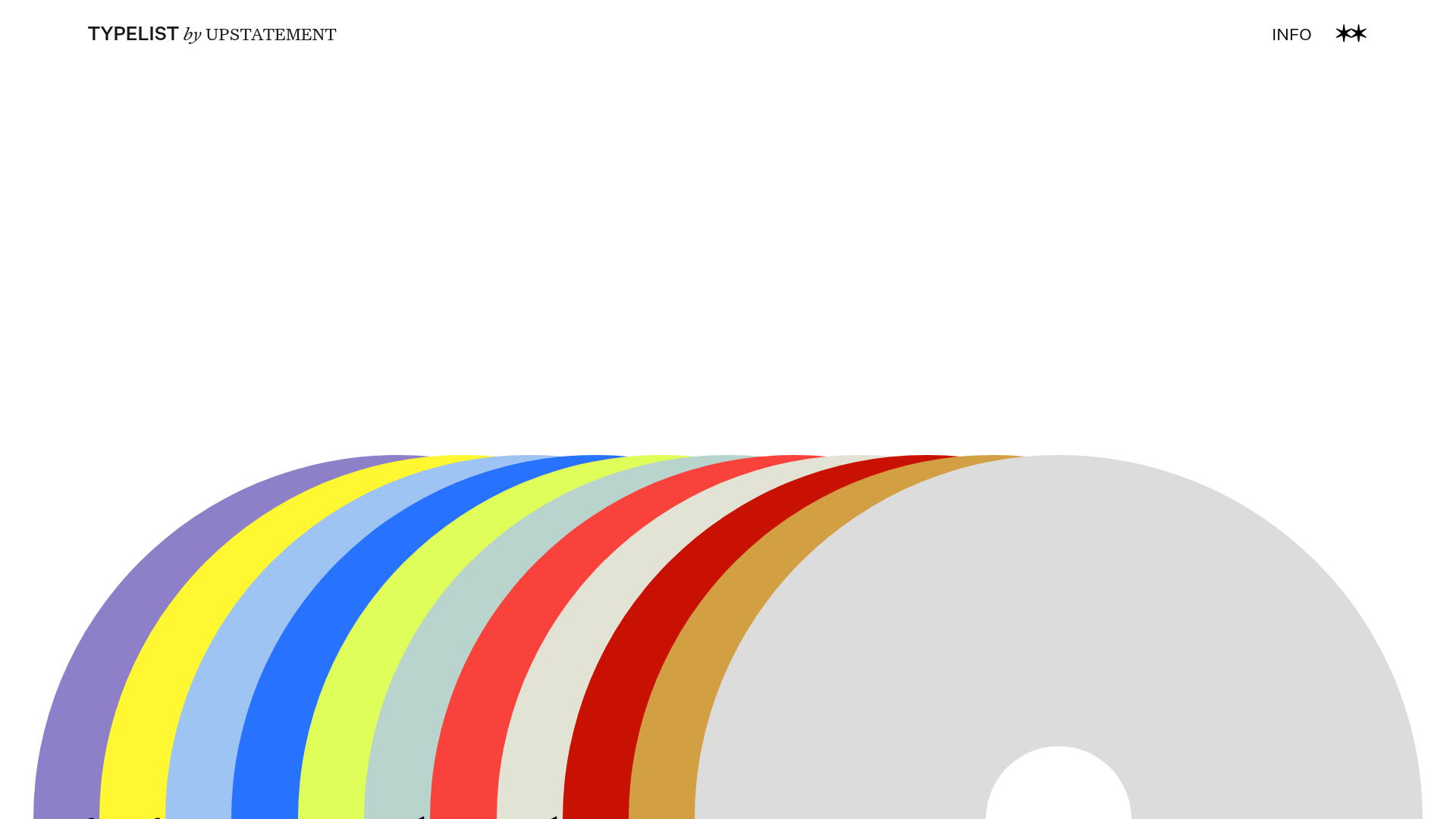
Typelist Typography Playlist Gallery
A creative curated gallery featuring a horizontal overlapping disc navigation pattern, CSS-driven theme color shifting, and smooth page transitions for showcasing design collections.

OhDaDa Handcrafted Kinetic Sculpture E-commerce
A minimalist Svelte-based store featuring a horizontal-scroll product showcase, transform-driven image gallery, and a full-screen sliding cart overlay.
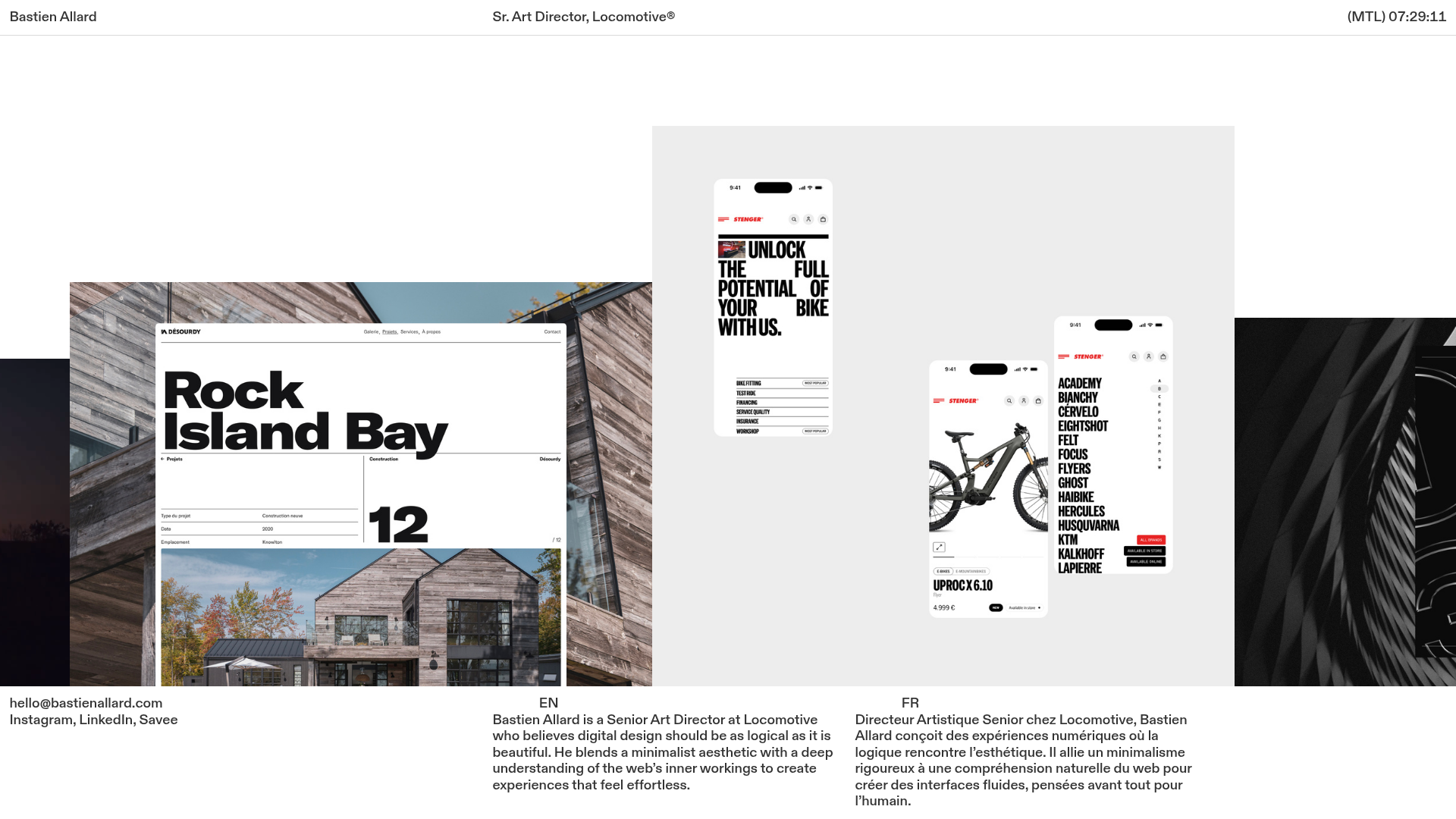
Bastien Allard Minimalist Portfolio Gallery
A clean, horizontal marquee-based portfolio featuring a sticky header/footer layout, digital clock integration, and responsive bilingual text columns for minimalist art director showcases.

Magda Reyman Designer Portfolio
A minimalist portfolio layout featuring a fixed hero intro, absolute-positioned mobile UI mockups, and a distinctive high-contrast footer with rounded interaction buttons.
