Faccia Brutto Spirits E-commerce Showcase
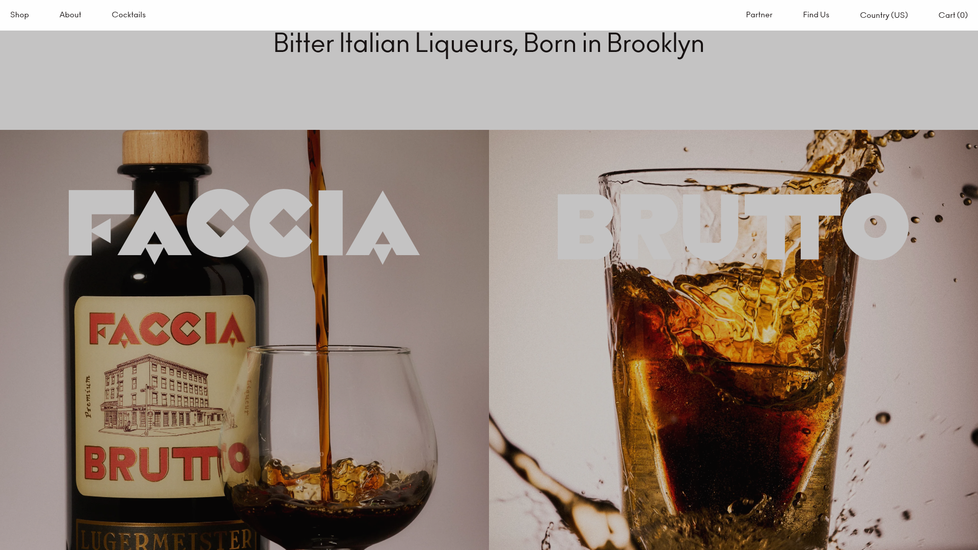
A refined Shopify layout featuring a split-hero landing, monochromatic bento grid product layouts, and a slide-out cart interaction with a heavy focus on typography-driven design.
Overview
This is a high-end Shopify e-commerce site for Faccia Brutto Spirits, characterized by its bold typography, split-screen layouts, and a refined Italian-modernist aesthetic. It serves as an excellent reference for builders looking to create a premium, editorial-style shopping experience that balances large-scale imagery with utilitarian grid systems.
Design System
- Typography: The design is heavily typography-driven, utilizing a bold, high-contrast sans-serif for display headings (e.g., "Bitter Italian Liqueurs") and wide-letterspaced uppercase labels for navigation and product titles. The scale is extreme, with display text reaching
text-display-3xlfor impact. - Color Palette: A sophisticated mix of monochromatic neutrals (whites, grays) punctuated by high-saturation primary-style backgrounds (Red-500, Blue-500) behind specific product tiles. This creates a rhythmic, color-blocked bento grid effect.
- Page Structure: The layout follows a modular flow: a centered text banner, followed by a split-hero image section with overlapping SVG logos, leading into a multi-column product/article grid with varied aspect ratios.
- Interaction & Components:
- Split Hero: Uses absolute positioning for a large brand logo that overlays two distinct lifestyle images.
- Product Cards: features a minimalist 'hover-to-reveal' Add to Cart button that slides into view, maintaining a clean aesthetic until user interaction.
- Slide-out Cart/Country Select: Side-drawer menus (drawers) built with Alpine.js (
x-data="$store.cart") that use smooth $X$-axis translations and backdrop blurs. - Newsletter: A rounded-pill input field with a submission state animation integrated into a centered section.
- Implementation Clues: Built with Shopify and heavily utilizing Tailwind CSS for layout (e.g.,
grid-cols-6,col-span-full) and Alpine.js for state management and interactions.
Use Cases
- Artisanal Beverage Brands: Perfect for craft distilleries, wineries, or coffee roasters who want an 'elevated' feel that emphasizes brand story over bulk cataloging.
- High-Fashion or Lifestyle Merch: The bento-grid product layout and editorial typography translate well to boutique apparel collections.
- Remixing Strategy: Builders should clone the 'Product Card' behavior for a cleaner UI, or the 'Split Hero' section for an impactful landing page. The grid system can be easily adapted by swapping the background colors of the collection blocks (
var(--color-red-500)) to match any brand identity. - Recommended Scope: A full-page clone is ideal for those needing a cohesive brand launchpad, while the slide-out cart and product grid modules are the most valuable standalone components for partial remixes.
Related Inspirations
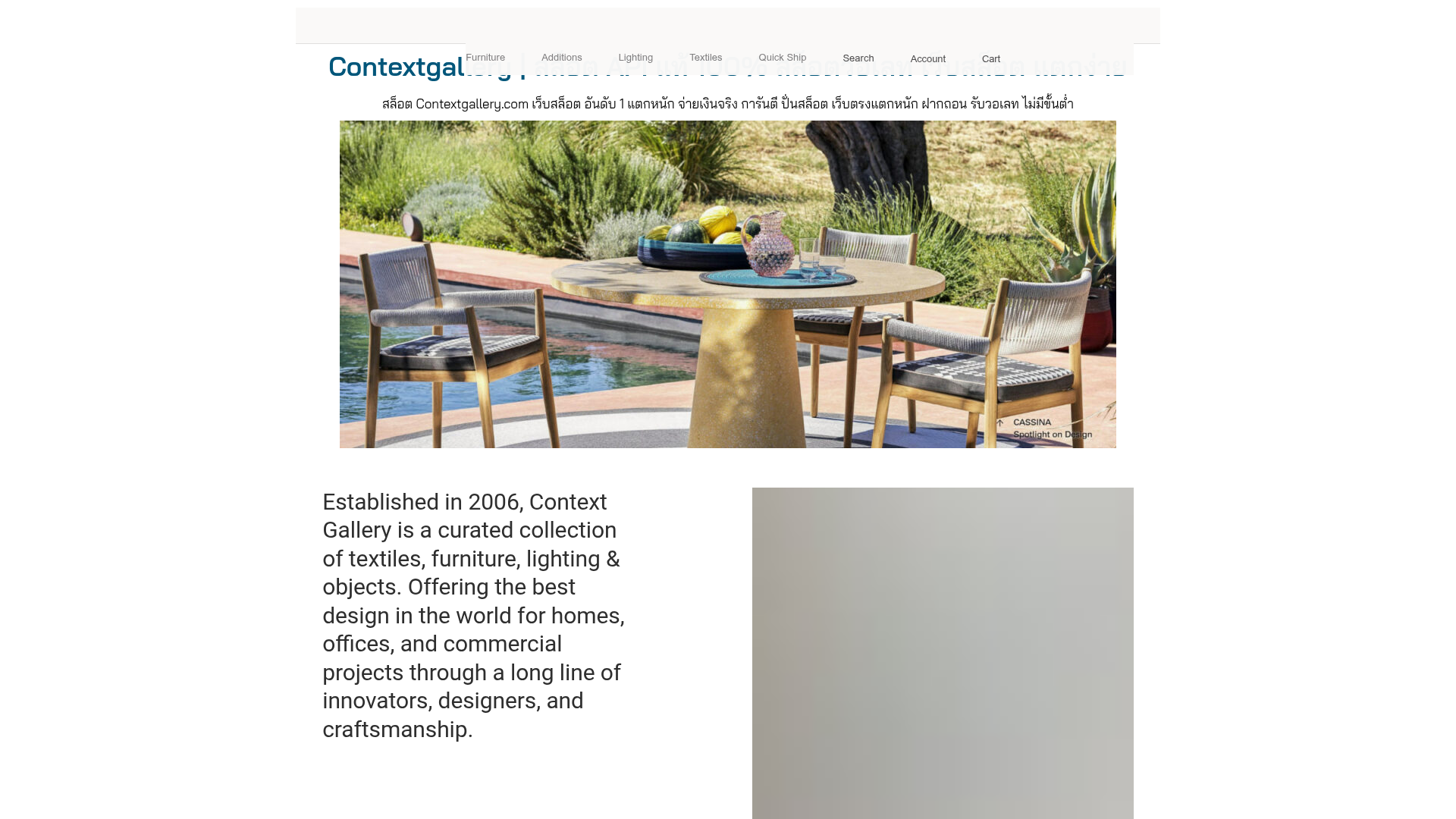
Context Gallery High-End Furniture Landing Page
A minimal editorial layout featuring a multi-column product carousel, designer biographies with image-text pairings, and a magazine-style content grid for curated design stories.
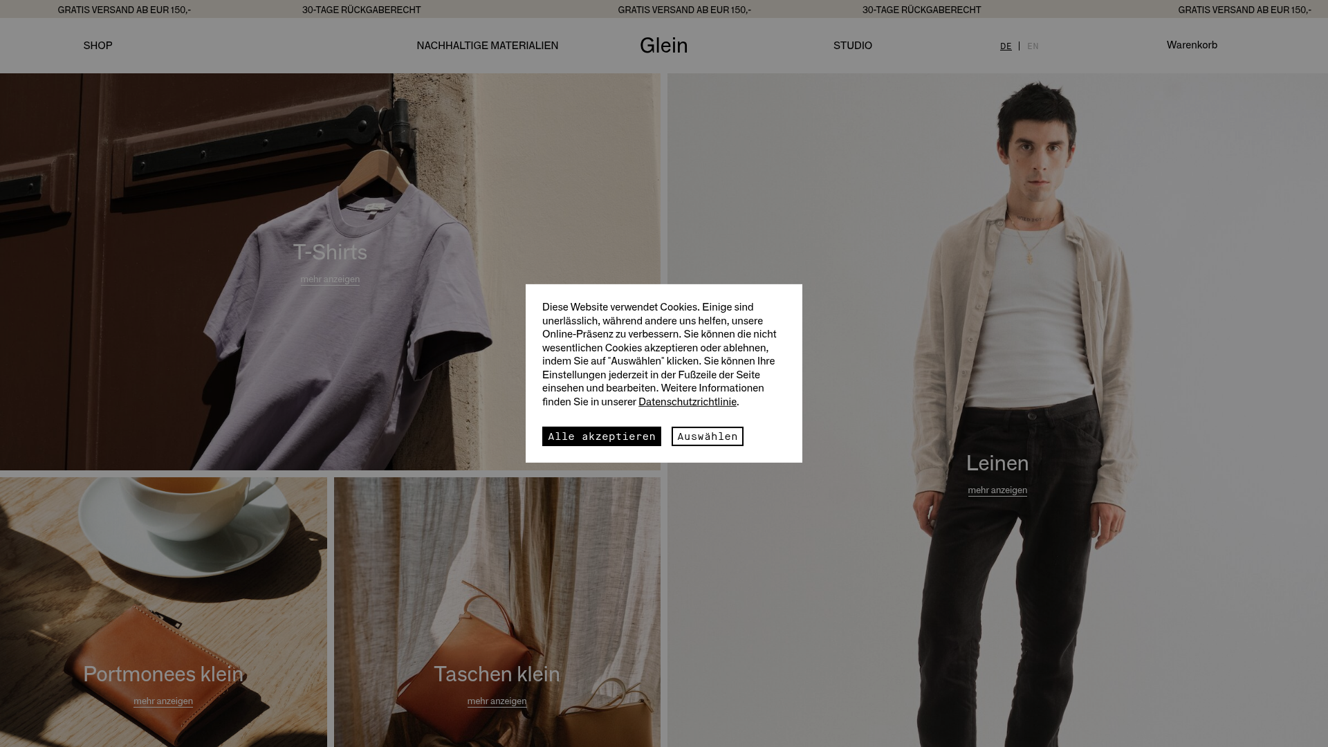
Glein Minimalistic Bento Grid eCommerce
A clean, modular layout using a bento-style responsive grid of text teasers and large-scale product imagery for lookbooks and collection browsing.
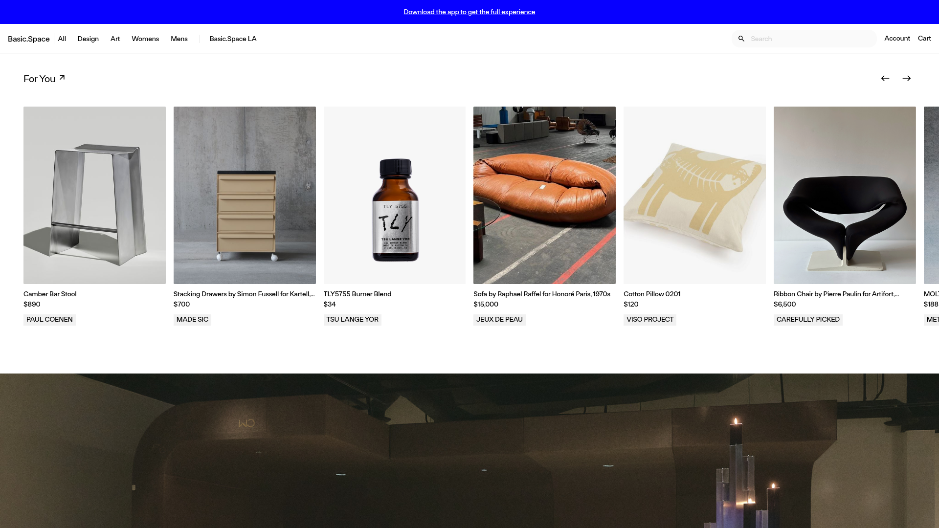
Basic.Space E-commerce Gallery Clone
A minimalist product marketplace featuring a clean sticky navigation bar, nested flyout menus, and a horizontally scrollable product carousel with hover-state image switching.
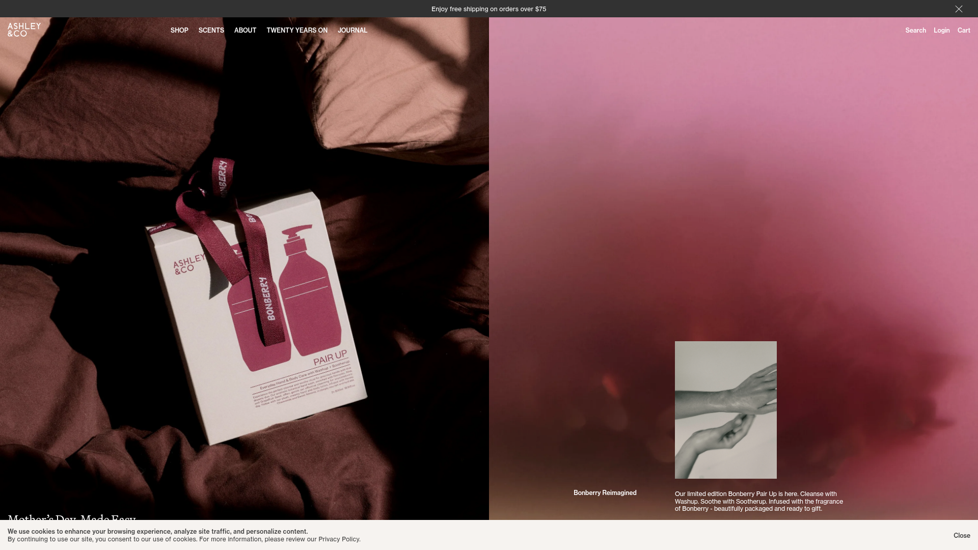
Ashley & Co Lifestyle E-commerce
An elegant Shopify-based storefront featuring a split-screen animated hero, horizontal ticker-tape collection carousel, and dynamic mega-menus with scent-specific color switching and image previews.
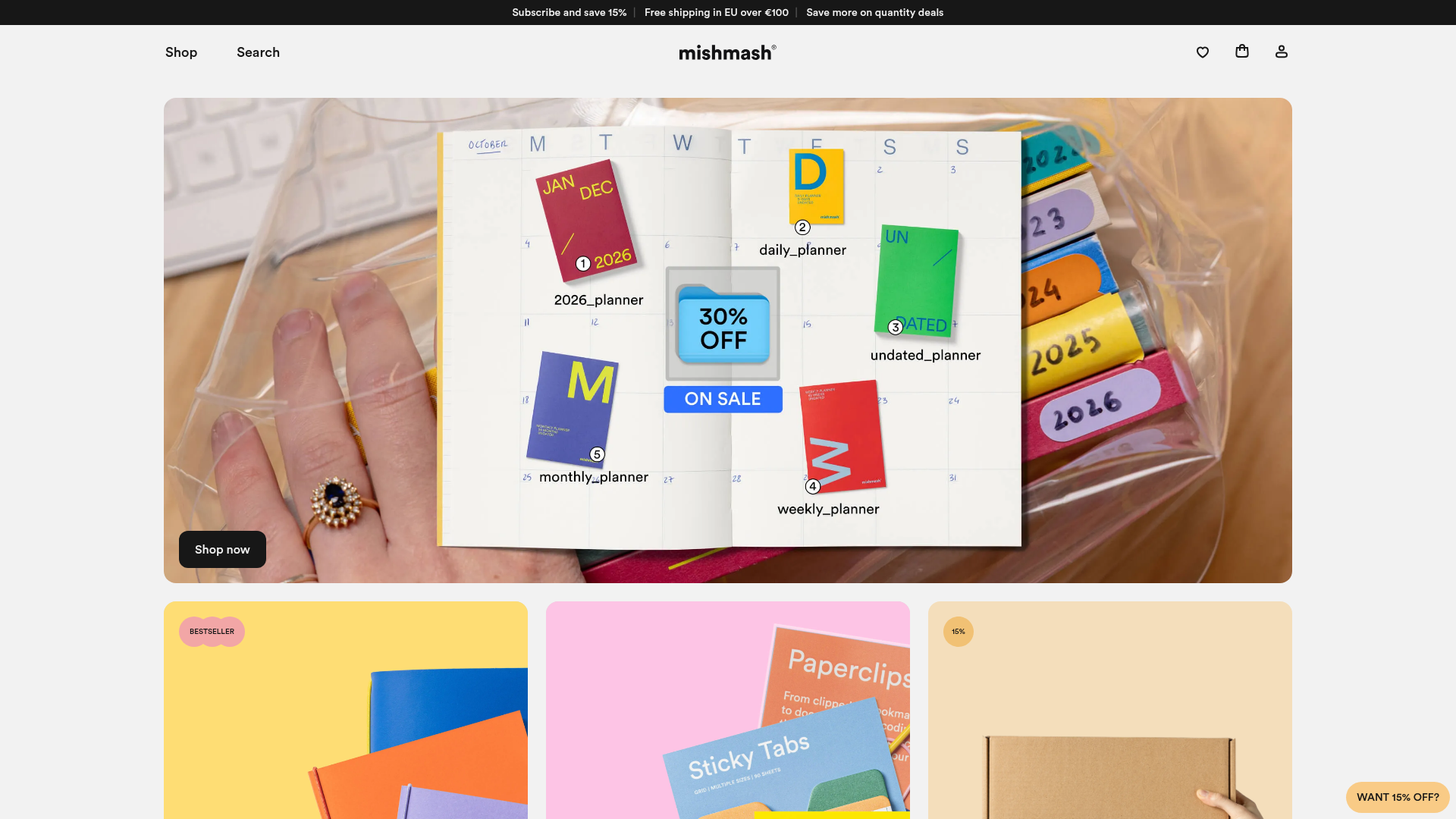
Mishmash Stationery E-commerce Layout
A clean retail template featuring rounded image grids, a multi-column comparison section with custom iconography, and a responsive products carousel.
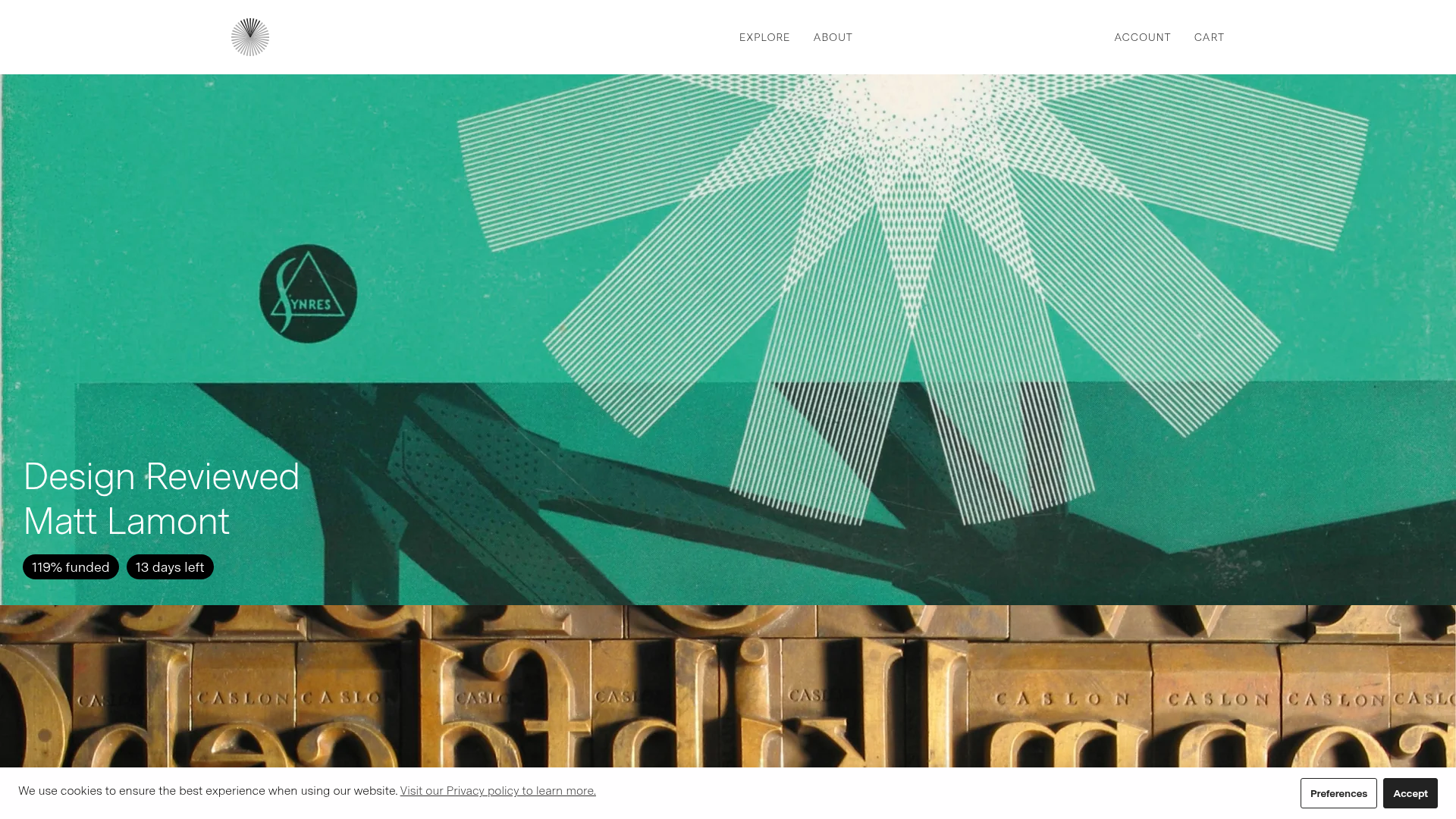
Volume Crowdfunding Book Gallery
A minimalist editorial storefront featuring full-width high-resolution image cards, status pills for campaign progress, and a clean typography-focused navigation layout.
