Minimalissimo Design Gallery and Portfolio
A clean magazine-style layout featuring horizontal scroll sections for featured portraits, an balanced article grid, and a bottom-anchored floating navigation bar with integrated search.
Overview
Minimalissimo is a curated digital magazine and portfolio focused on high-end minimalist design across architecture, technology, and art. It serves as an excellent clone reference for its masterclass in whitespace, horizontal scrolling "Portrait" carousels, and an innovative bottom-anchored floating navigation bar that replaces traditional header menus.
Design System
- Color Palette & Visual Hierarchy: The foundation is monochromatic, primarily using
bg-whiteandtext-blackwith neutral grays (neutral-100for empty image containers,neutral-500for metadata). Visual hierarchy is driven by high-quality photography rather than graphic elements. - Typography: Uses a sans-serif system (referenced as
text-baseandtext-2xl) with tight leading (leading-[1.1]for headers). Descriptions use a larger body size for the mission statement to create an impactful secondary header effect. - Page Structure:
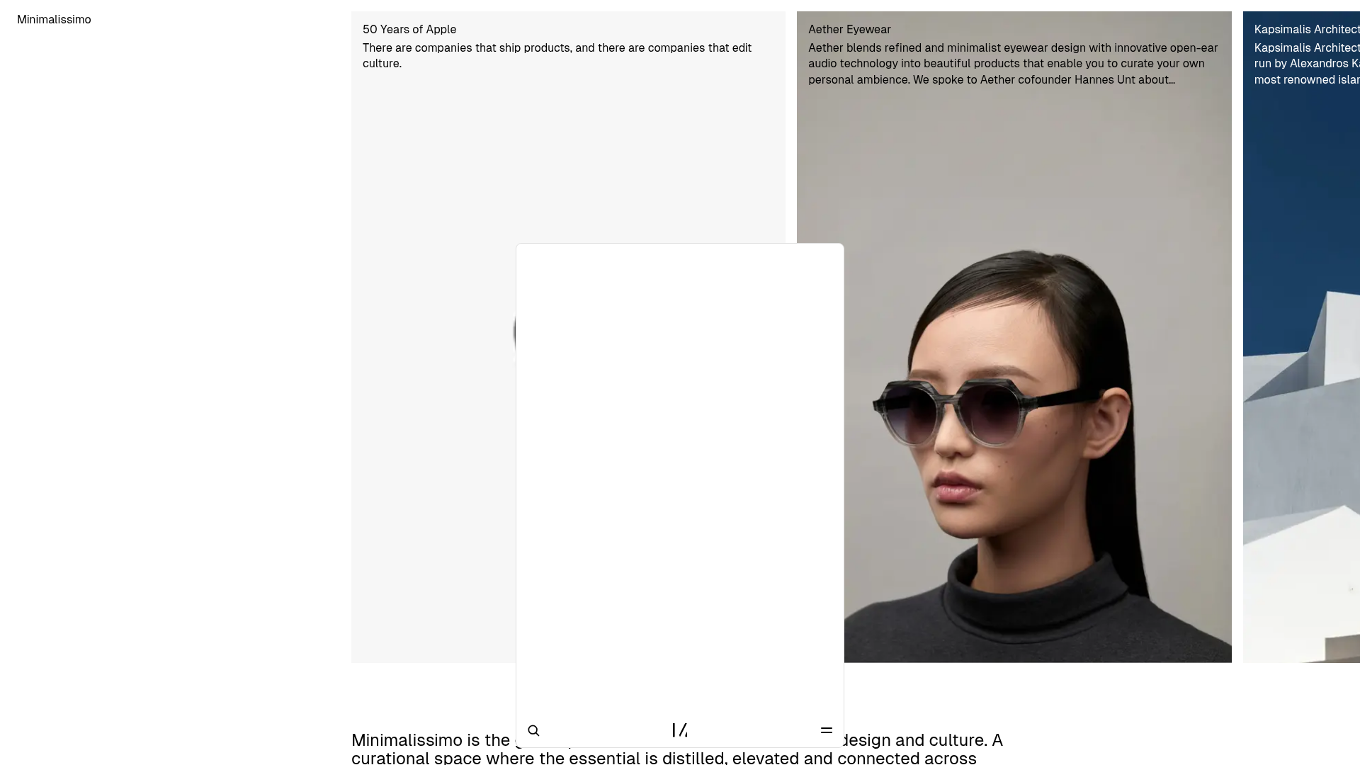
- Hero Carousel: Horizontal scroll section containing portrait-oriented cards (
aspect-[2/3]) with text overlays. - Mission Statement: A centered 6-column grid text block (on a 12-column scale) providing whitespace and context.
- Article Grid: A standard responsive grid (spanning 12, 6, or 4 columns) with landscape images (
aspect-[3/2]). - Topic Collections: Branded as "Spaces," these feature complex 4-image bento-style preview cards.
- Hero Carousel: Horizontal scroll section containing portrait-oriented cards (
- Reusable Components:
- The "Dock" Navigation: A fixed bottom-center bar (
fixed bottom-6) that houses search, an expandable menu, and a horizontal miniature post preview. - Content Cards: Uniform image-based cards with subtle
hover:opacity-80transitions. - Horizontal Scrollers: Container elements with
overflow-x-autoandscrollbar-hidefor a native-app feel on web.
- The "Dock" Navigation: A fixed bottom-center bar (
- Implementation Clues: Built with Tailwind CSS and Next.js, as evidenced by class patterns like
md:top-4anddata-nimg. It uses a 12-column grid system (grid-cols-12) and utilizesaspect-ratioutility classes for image consistency.
Use Cases
- Who should clone this: Creative agencies, architectural firms, and boutique e-commerce brands that want to prioritize image assets over text-heavy layouts.
- Effective Remixes:
- Style Swaps: Changing the font to a serif and background to charcoal/off-white for an ultra-premium editorial feel.
- Info Architecture: Adapting the "Spaces" collection grid for product categories or service buckets.
- Navigation: The floating bottom bar is a highly reusable component for mobile-first portfolios where top-of-screen reachability is an issue.
- Suggested Clone Scope: Start with the fixed bottom navigation and one horizontal portrait section. The mission statement block is an excellent template for landing page "About" sections that need breathing room.
Related Inspirations
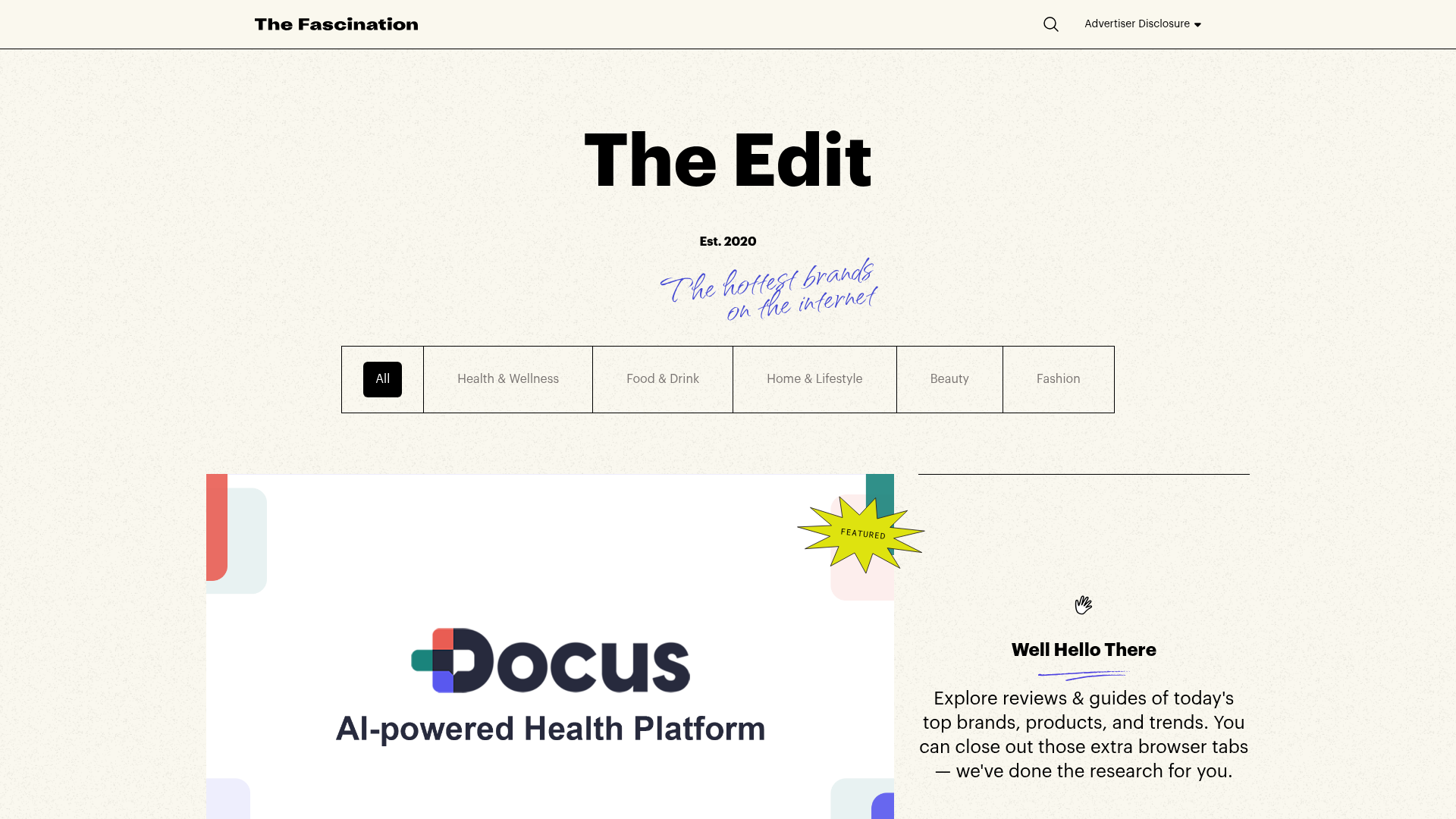
The Fascination Editorial Product Hub
A refined content marketplace layout featuring a minimalist bento-style grid, custom category filters, and modern hovering card interactions for brand reviews.

Baubauwerk Minimal Agency Portfolio Homepage
A clean studio site featuring a centered text hero, scatter-plot filterable project gallery, and full-bleed image sections for case studies.
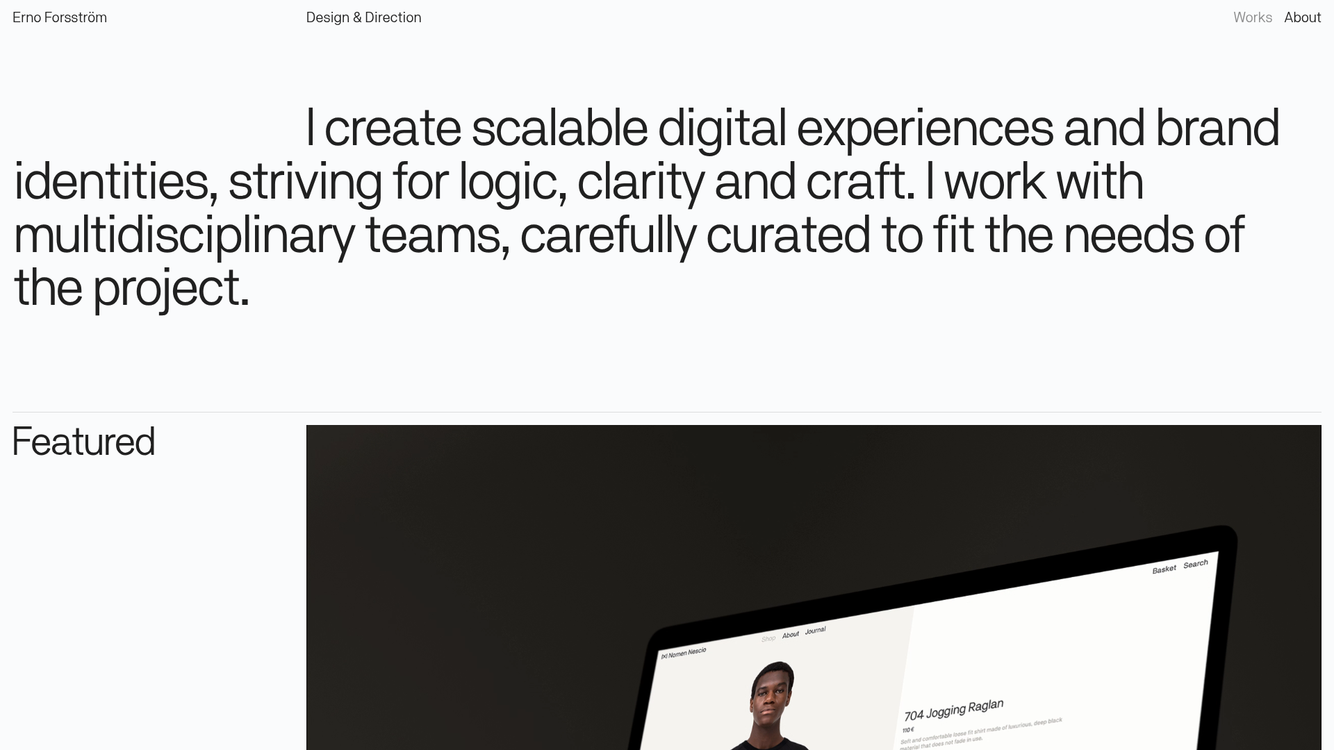
Erno Works Minimalist Design Portfolio
A clean, typography-focused portfolio featuring a sticky grid layout, large editorial headers, and integrated video project thumbnails for dynamic case study previews.
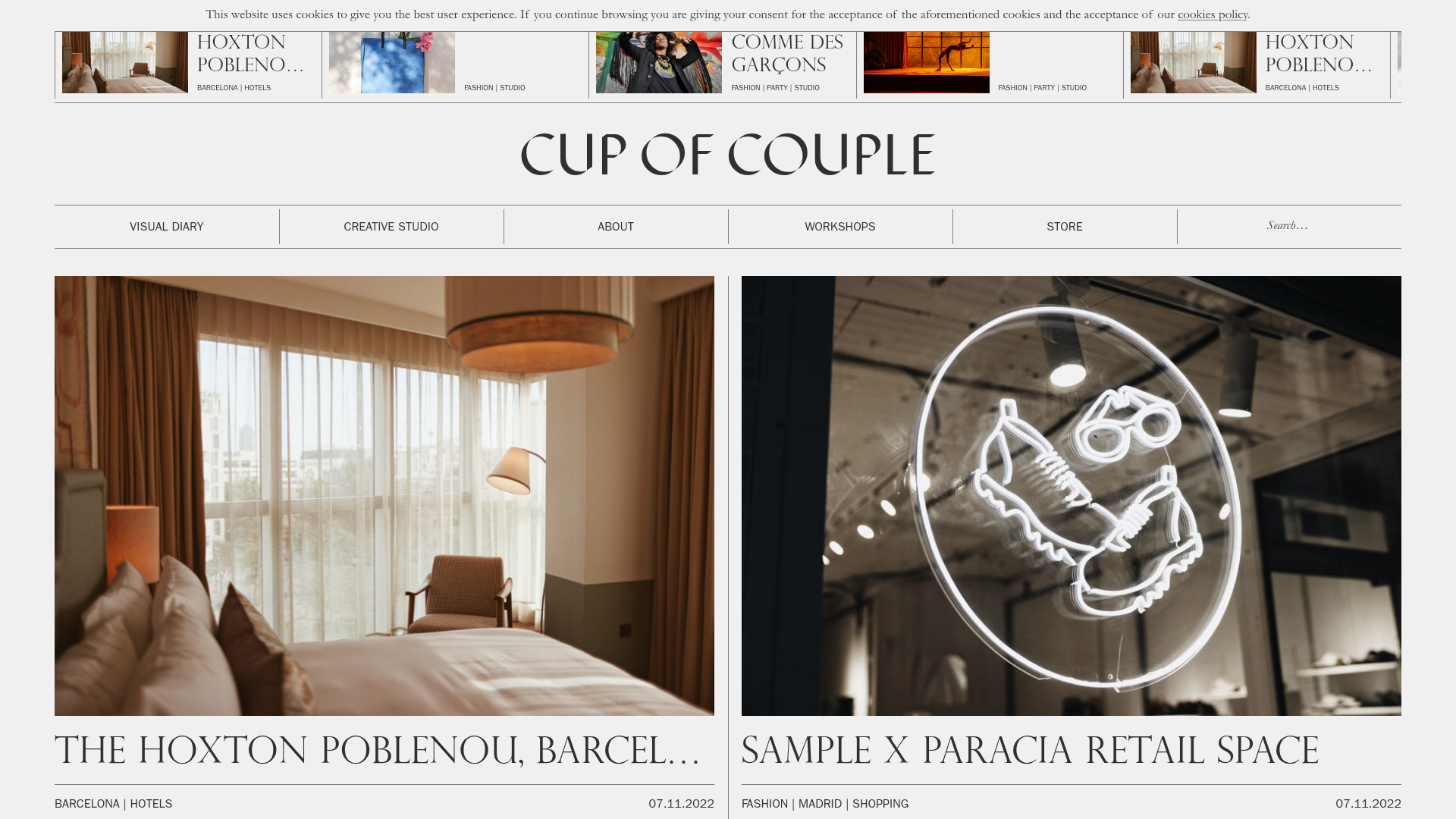
Cup of Couple Editorial Portfolio
A high-fashion editorial layout featuring a sticky compartmentalized header, a horizontal marquee carousel, and a mixed-width masonry grid with marquee typography effects.
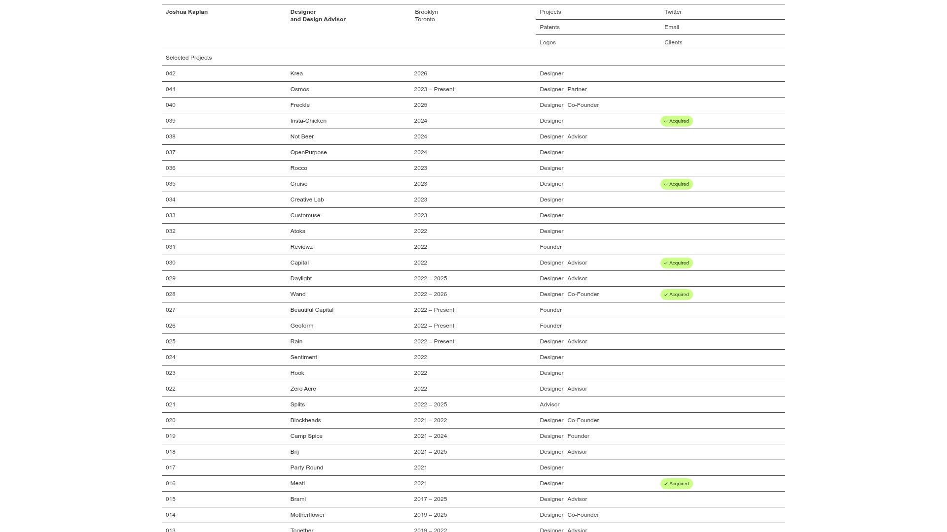
Joshua Kaplan Portfolio Index
A minimalist, text-only portfolio layout featuring an expansive tabular list of projects with horizontal rule separators and clean typography.
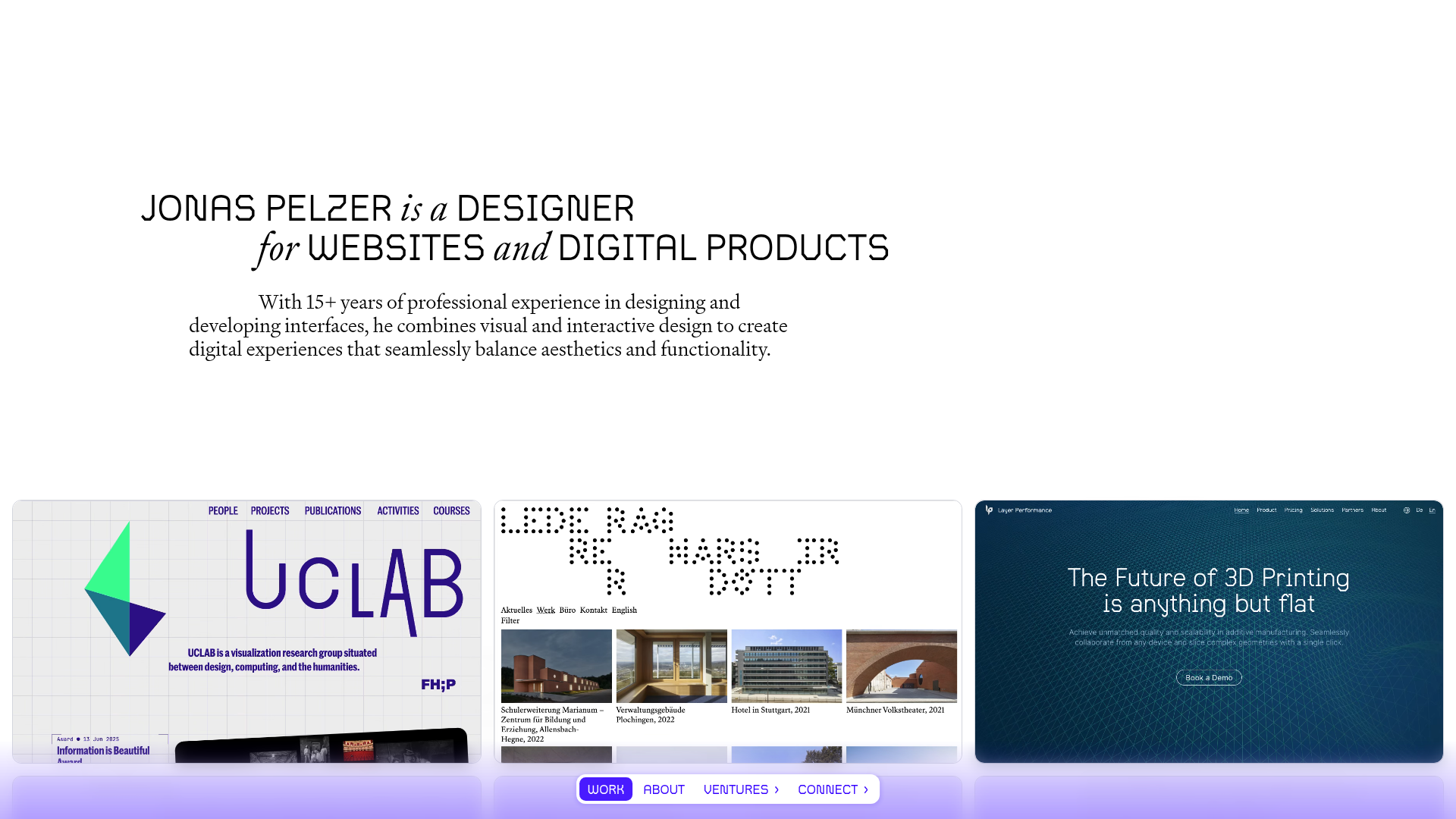
Jonas Pelzer Portfolio Showcase
A minimalist design portfolio featuring a large typography hero, a staggered video project grid, and a sticky tab-based navigation bar for content switching.
