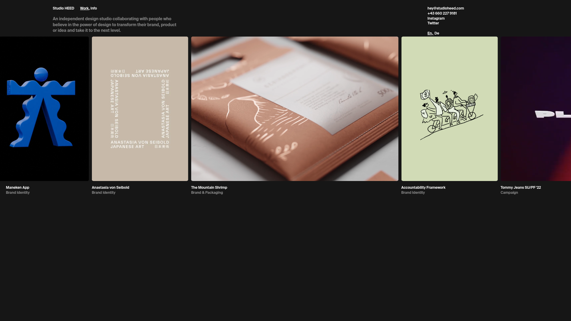
Studio HEED Horizontal Portfolio Carousel
A minimalist design studio site featuring a full-width horizontal scrolling project gallery with variable-sized cards, video thumbnails, and a clean dark-mode typography layout.
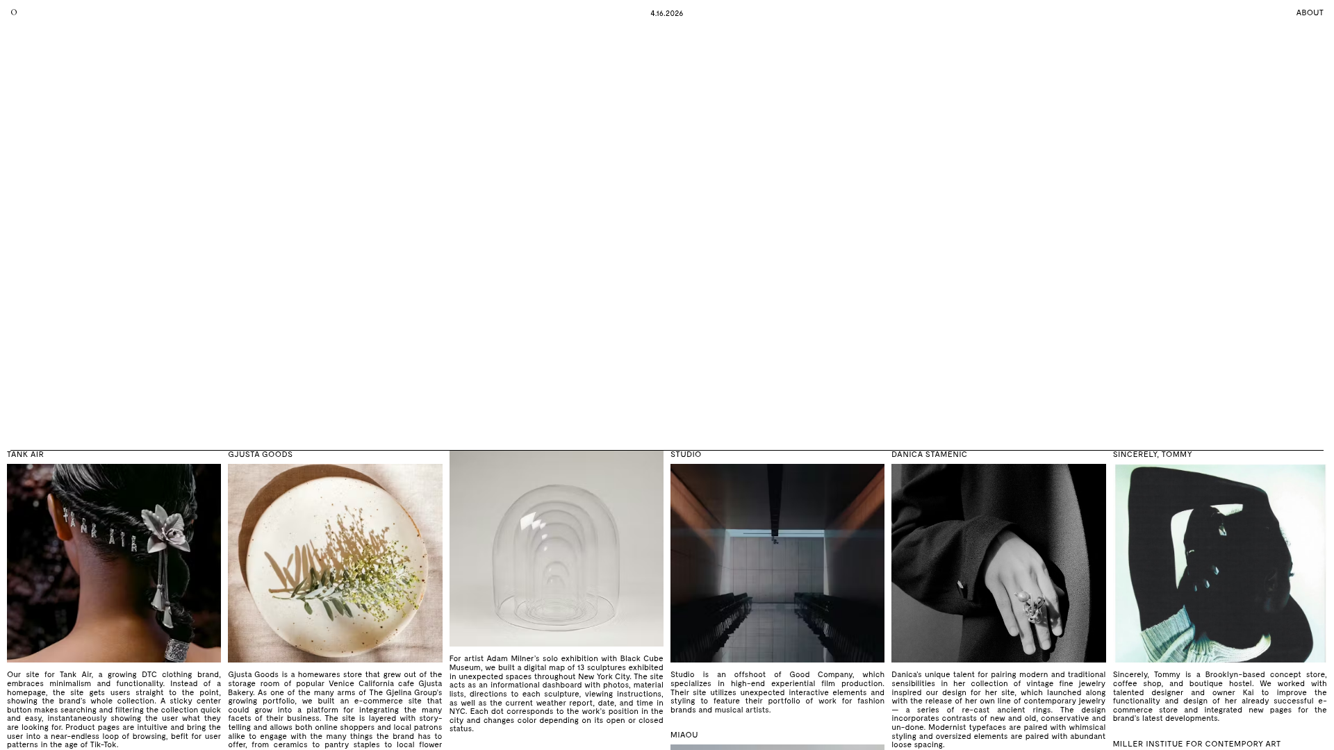
Overview
This website for Studio HEED is a sophisticated example of a horizontal-scroll portfolio layout that prioritizes high-impact visual content. It serves as an excellent reference for creatives needing a unique way to display fragmented or variable-aspect ratio media within a single-row carousel that remains anchored by an immersive dark-mode aesthetic.
Design System
- Color Palette & Visual Hierarchy: The site uses a deep matte black (#000000) background to make project colors pop. Text is primarily high-contrast white, creating a clear hierarchy where the project imagery is the primary focal point and metadata is secondary.
- Typography System: A clean, neutral sans-serif (resembling Inter or Roboto) is used throughout. Project titles and tags are small and uppercase or semi-bold to maintain a minimalist, utility-heavy appearance without distracting from the artwork.
- Structure & Flow: The layout is unconventional, featuring a static header with studio info and contact details at the top, followed by a full-width horizontal scrolling container. Project cards are arranged linearly with different widths based on content size attributes (
data-size="small"vsdata-size="large"). - Reusable Components:
- The Variable Card: A flexible container that supports static images,
.mp4video loops, and multi-layered picture elements. - The Info Header: A split-column header where the left side contains the studio description and the right side holds contact and social links.
- The Variable Card: A flexible container that supports static images,
- Interaction Design: The layout utilizes a
transform: translateXproperty for smooth horizontal movement. The HTML indicates custom--delayCSS variables for staggered entrance animations. One notable detail is the project metadata (Title/Tag) being positioned below the imagery but potentially moving independently of the images via individualtranslateXshifts. - Implementation Clues: The site is built with Nuxt.js, utilizing scoped v-data attributes (e.g.,
data-v-18bf355b) for component styling and a dedicated.carouselclass for the main work section.
Use Cases
- Who should clone this: Independent designers, architectural firms, and boutique creative agencies who want to move away from standard vertical grid galleries.
- Effective Remixes: This pattern works well for lookbooks, fashion campaigns, or digital art catalogs where high-resolution imagery and video loops are more important than long-form copy.
- Practical Directions:
- Swap Brand Style: Change the black background to a high-key white or a muted neutral for a softer, editorial feel.
- Information Architecture: Adapt the top header to include a more standard navigation menu if the site expands beyond a one-page portfolio.
- Selective Reuse: Clone the
cardandcarouselcomponents for a specific 'Featured Projects' section within a larger, vertically scrolling landing page.
- Clone Scope: A full-page clone is best for those seeking a 'digital business card' experience, while a quick section clone is ideal for adding a side-scrolling gallery to an existing site.
Related Inspirations

Niklas Rosén Designer Portfolio Index
A minimalist, responsive grid-based portfolio index featuring a clean 16-column layout, typographic list components, and a custom dark mode transition.
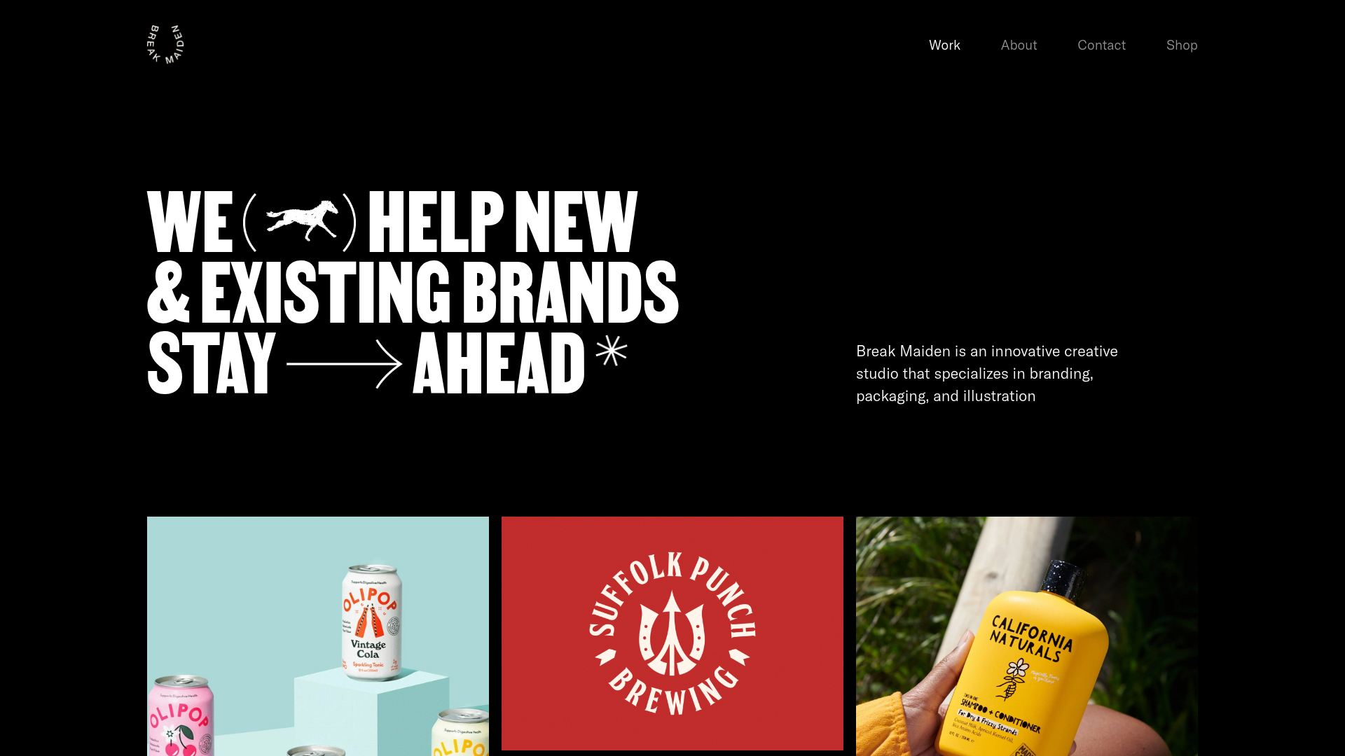
Break Maiden Agency Portfolio Hero
A high-impact dark mode hero section featuring oversized typography with inline GIF icons and a responsive grid for display-heavy case studies.
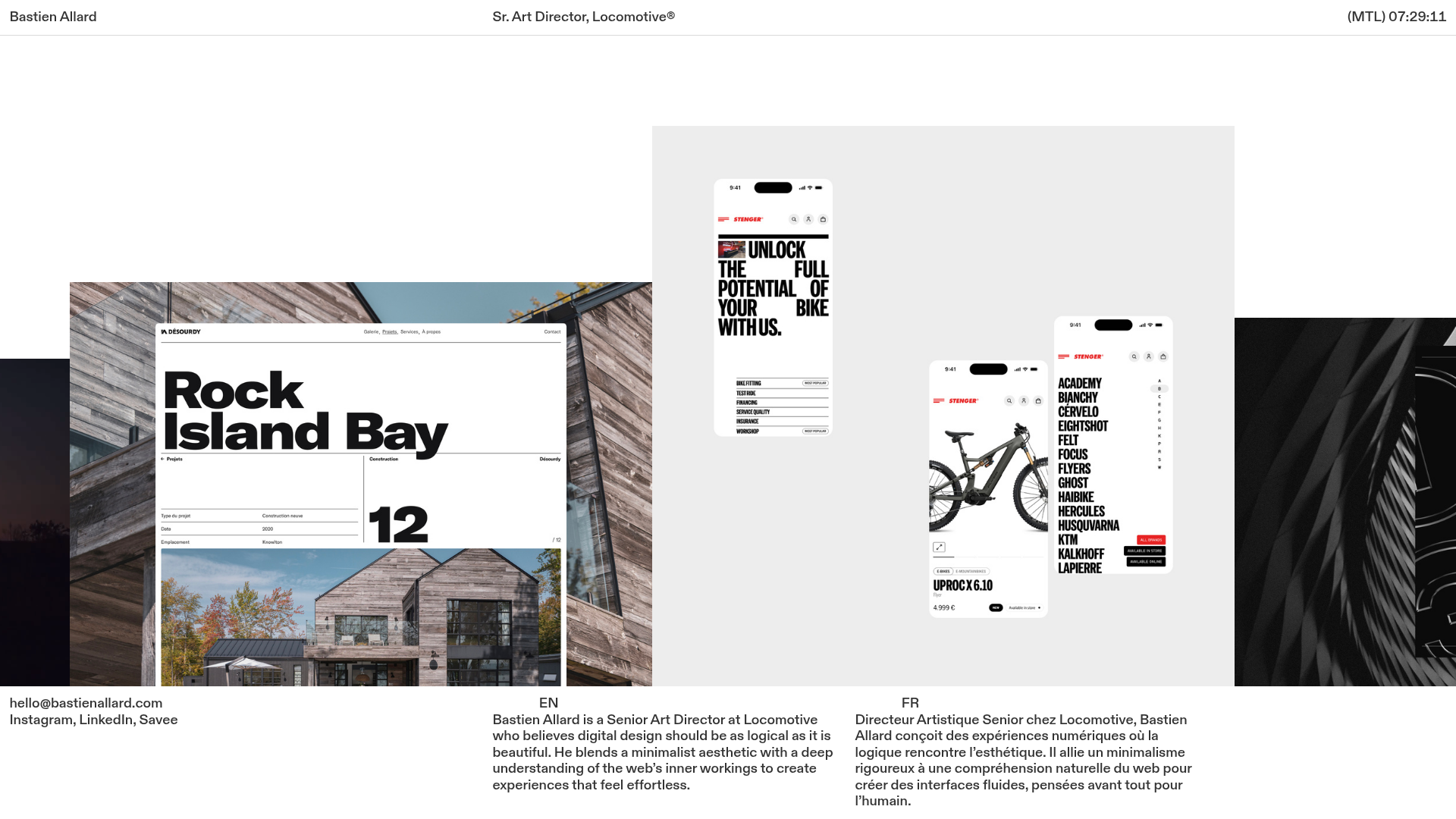
Bastien Allard Minimalist Portfolio Gallery
A clean, horizontal marquee-based portfolio featuring a sticky header/footer layout, digital clock integration, and responsive bilingual text columns for minimalist art director showcases.
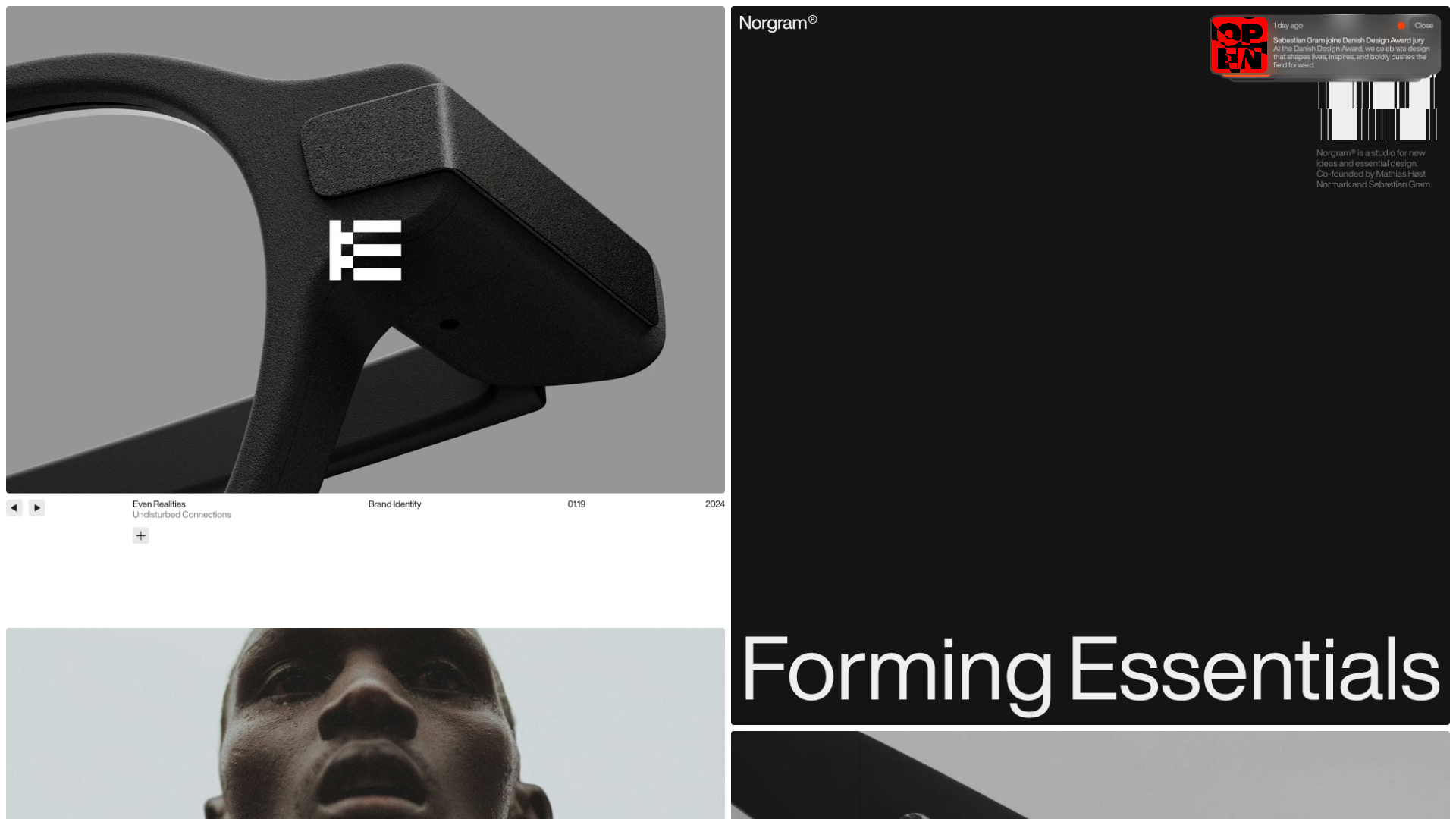
Norgram Minimalist Design Portfolio
A high-end, monochrome studio portfolio featuring a brutalist typography-led hero section, a clean asymmetrical masonry grid, and minimalist project navigation.
Studio Otto Multi-Column Portfolio Grid
A minimalist, five-column project showcase featuring infinite-scroll vertical columns, interactive image masks, and contextual description text blocks.

Marx Design Minimal Portfolio Grid
A high-end design portfolio featuring a synchronized image-hover grid layout, GSAP-powered transitions, and a hidden fullscreen menu with portrait image links.
