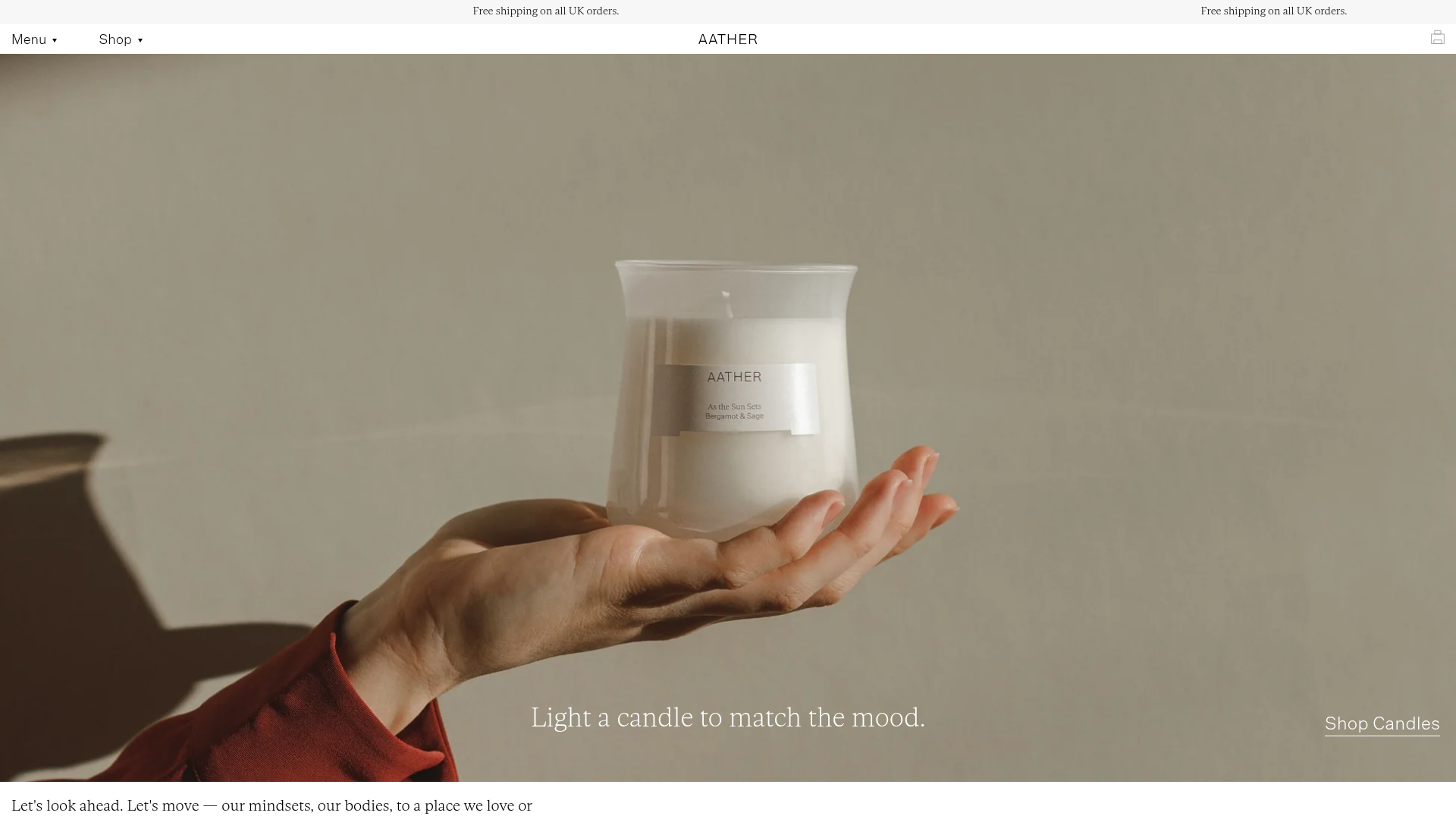
Aather Minimalist E-commerce Landing Page
A clean Shopify-based layout featuring high-resolution full-width hero imagery, a floating sticky header, an airy product grid with hover image transitions, and descriptive storytelling blocks.
Overview
Aather is a minimalist Shopify e-commerce landing page designed for luxury home goods. It serves as a superior reference for brand-forward retail because it balances high-resolution editorial photography with clean typography and ample white space to create a premium, lifestyle-focused shopping experience.
Design System
- Color Palette & Hierarchy: The layout uses a sophisticated neutral palette. A warm tan/beige (#dec39d) is used for narrative blocks to break up a primarily crisp white background. Text is rendered in deep charcoal or black for high legibility against muted tones.
- Typography: The system relies on a refined serif for headings and storytelling (e.g., "Light a candle...") and a clean, wide-spaced sans-serif for functional UI like navigation and metadata. Small caps (accent-uc class) are used for technical details like product weights, creating a clear typographic hierarchy.
- Page Structure: The flow prioritizes emotion before conversion:
- Full-width editorial Hero with a discrete call-to-action.
- Narrative text block paired with a product grid.
- Alternate full-width imagery without text to provide visual breathing room.
- Split-screen informational blocks (Image/Text).
- Social proof/Instagram feed and a minimalist footer.
- Reusable Components:
- Floating Sticky Header: A transparent-to-white header containing a simple "Menu" and "Shop" dropdown system.
- Product Cards: Minimalist tiles with dual-image hover transitions (showing the product vs. a lifestyle context) and simple metadata below.
- Drawer Cart: A clean slide-out AJAX cart with a gift message field.
- Announcement Bar: A thin, repeating-text ticker at the top for shipping information.
- Interaction Patterns: Elements use subtle fade-in and slide-up animations on scroll (
animate-text-element). Hovering over product cards triggers a seamless image swap, characteristic of premium Shopify themes. - Implementation Clues: The HTML reveals a Shopify-based structure using a block-based liquid architecture. It utilizes lazy loading (
lazyloaded) for high-res assets to maintain performance despite the heavy use of imagery.
Use Cases
- Who should clone this: Designers building luxury or artisanal brand sites (fragrances, skincare, home decor, boutique fashion) where the visual story is as important as the product list.
- Effective Remixes: This pattern can be effectively adapted for portfolio sites or digital agencies by replacing product grids with case study snippets, maintaining the editorial feel.
- Remix Directions: Swap the warm beige for a bold primary color to move from luxury to "Gen-Z" streetwear; adapt the split-sections to showcase service features rather than physical products.
- Clone Scope: For a fast win, clone the Product Card Grid with its hover transitions. For a site rebuild, the full-width hero and split-narrative blocks provide an excellent foundation for any image-heavy editorial homepage.
Related Inspirations
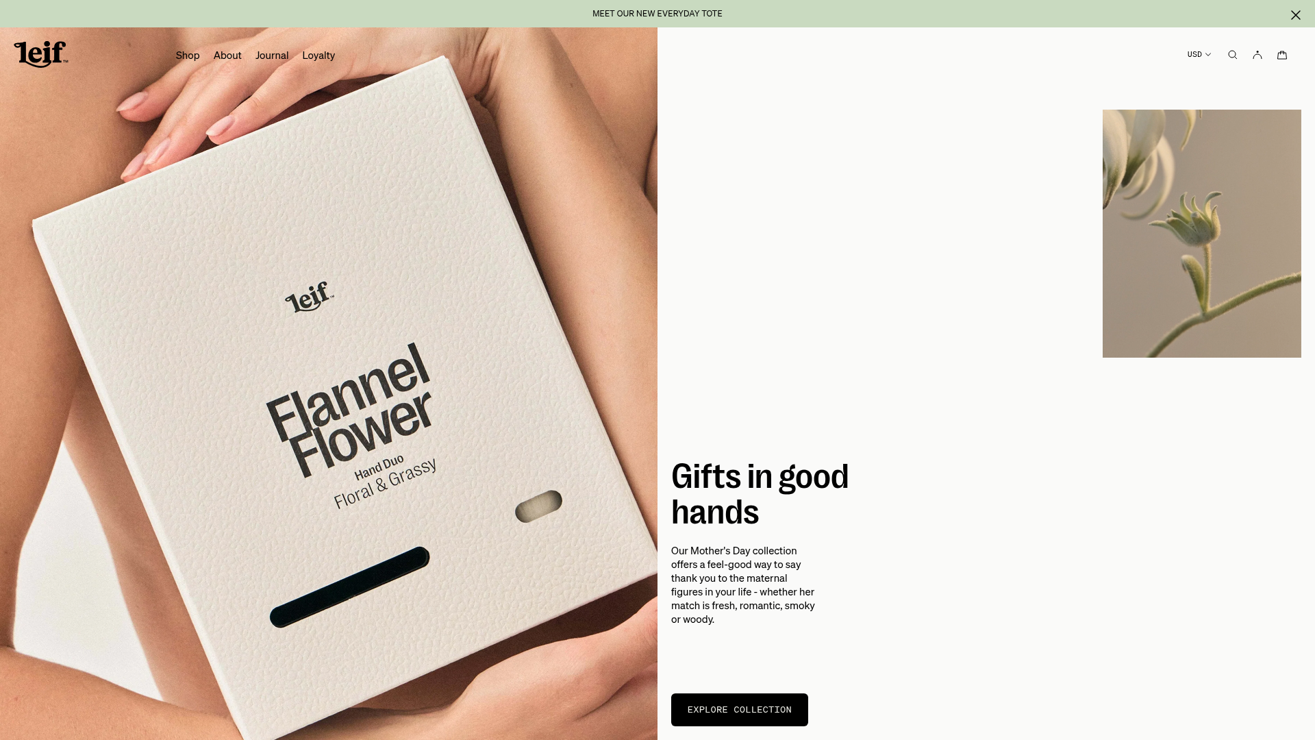
Leif Modern Botanical E-commerce Store
A minimalist e-commerce layout featuring an asymmetric hero section, vertical accordion-style scent menus with dynamic photo switching, and clean product grids with hover effects.

Context Gallery High-End Furniture Landing Page
A minimal editorial layout featuring a multi-column product carousel, designer biographies with image-text pairings, and a magazine-style content grid for curated design stories.

Glein Minimalistic Bento Grid eCommerce
A clean, modular layout using a bento-style responsive grid of text teasers and large-scale product imagery for lookbooks and collection browsing.

Isla Beauty Skincare E-commerce Store
A clean Shopify-based storefront featuring a split-hero landing page, a step-by-step product system carousel, and a split-screen testimonial section with localized product image sidebars.

Stojo Collapsible E-commerce Storefront
A Shopify layout featuring a prominent discount modal, mosaic grid hero sections, and clean product cards with integrated color swatches and quick-buy functionality.

Basic.Space E-commerce Gallery Clone
A minimalist product marketplace featuring a clean sticky navigation bar, nested flyout menus, and a horizontally scrollable product carousel with hover-state image switching.
