Todoist Landing Page with Sticky Features
A clean productivity app landing page featuring an animated hero section, a horizontal logo/quote marquee, a sticky side-by-side feature scroll, and a categorized project template gallery.
Overview
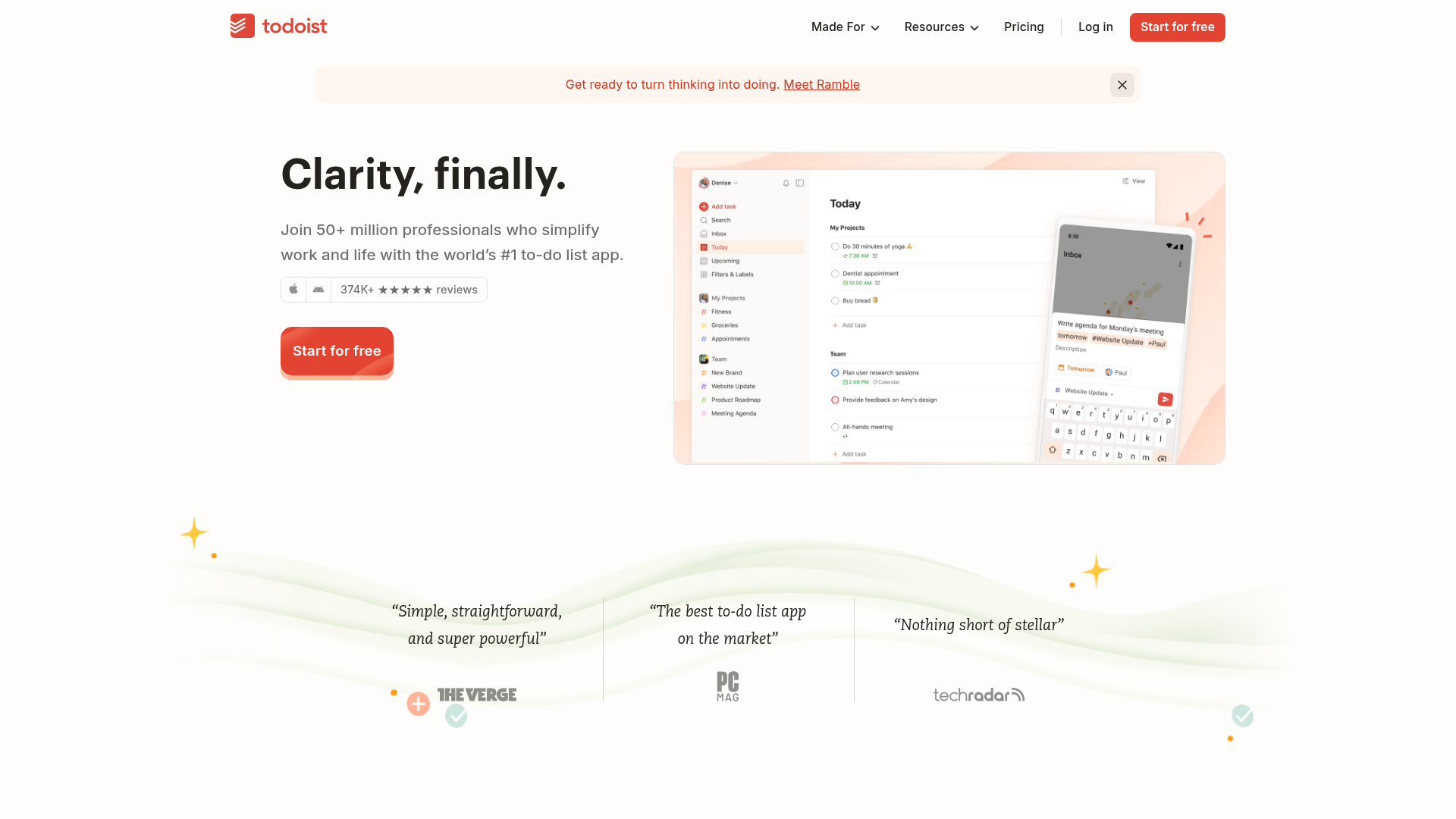
Todoist’s landing page is a masterclass in clean productivity aesthetics, utilizing whitespace and strategic color pops to communicate clarity and focus. It is an excellent clone reference for SaaS products needing to showcase software interfaces alongside high-trust social proof and structured informational sections.
Design System
- Color Palette & Visual Hierarchy: The primary brand color is a bold red (
#E44332), used for the main Call-to-Action (CTA) and key highlights. This is balanced against a neutral background and secondary 'theme' colors (sage green, soft red, sea salt blue) used to distinguish specific feature blocks. High contrast is maintained between dark text and light backgrounds to minimize visual noise. - Typography System: The system uses a clean sans-serif typeface. It features a clear scale: massive headings for hero impact (
_major-2xlclass), semi-bold weight for subheadings and buttons, and a mix of body sizes (_body-lgto_body-xs) for secondary information like reviews and compliance notes. - Page Structure:
- Banner & Header: Global navigation with nested dropdowns and a dismissible announcement banner.
- Hero Section: Split layout with a left-aligned value proposition and a right-aligned multi-device product illustration.
- Social Proof Marquee: A visually distinct, wavy-bordered section featuring high-authority testimonial quotes and publication logos.
- Sticky Feature Scroll: A side-by-side section where text content scrolls while product videos/animations remain pinned (sticky).
- Categorized Template Gallery: A tab-based filter system for displaying different project templates.
- Reusable Components:
- Shiny Shimmer Button: A primary CTA with a subtle animated light effect on hover.
- Radio Tile Groups: Sophisticated horizontal tabs for category switching in the template section.
- Sticky Video Container: A reusable pattern for keeping a visual reference fixed while the user reads supporting copy.
- Interaction & Implementation Details: The page is built with Astro, indicated by
data-astro-cidattributes. It uses CSS variables extensively for theming across different sections (e.g.,--productui-primary-theme-color). Motion is driven by scroll triggers, particularly in the side-by-side feature walkthrough.
Use Cases
- Who should clone this: Developers building SaaS landing pages, mobile application promotional sites, or any tool where "simplicity" and "clarity" are core product values.
- What products can remix it: Task trackers, CRM dashboards, educational platforms, or collaboration tools. The "Template Gallery" section is particularly useful for products that require user onboarding via predefined setups.
- Remix Directions:
- Brand Swap: Replace the signature Todoist Red with your brand's primary color; the neutral layout will adapt easily.
- Feature Reordering: If you lack 50m users, move the "Social Proof Marquee" further down and prioritize the "Sticky Feature Scroll" to explain your core value first.
- Sectional Remix: Use only the "Hero Section" and the "Wavy Logo Marquee" for a high-impact, short-form landing page.
- Clone Scope: A full-page clone is ideal for those wanting to replicate the enterprise-ready feel, but the "Sticky Feature" section is the most valuable standalone component for technical reuse.
Related Inspirations

Slite SaaS Knowledge Base Landing Page
A clean SaaS hero section with a conversational headline, secondary call-to-action buttons, and a structured software interface preview featuring user testimonials.
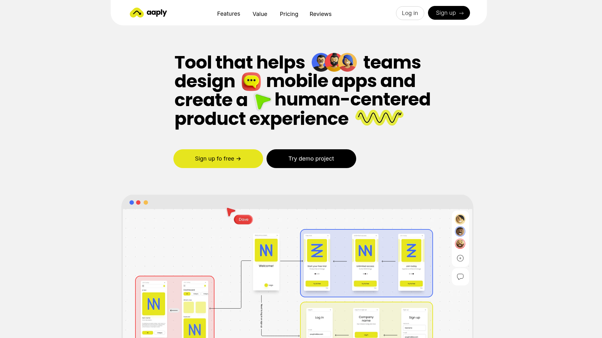
Aaply Mobile App Design Landing Page
A clean SaaS landing page featuring a bold typography-driven hero section, a sticky navigation bar, and integrated collaborative workspace UI mockups.

Notion AI Product Landing Page
A professional landing page layout featuring a clean hero section, distinctive bento-style feature cards, partner logo grid, and interactive product demo previews.
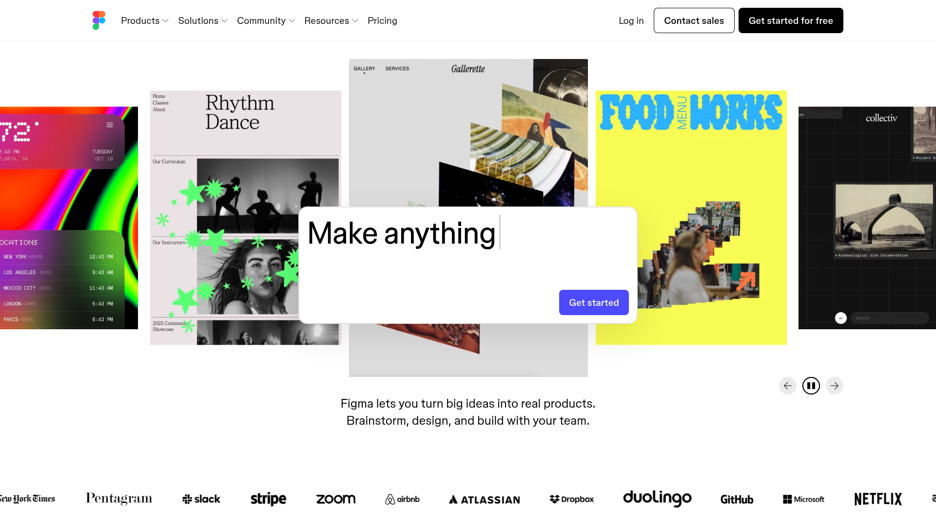
Figma Landing Page Gallery Hero
A dynamic landing page featuring a center-focused search bar hero, a horizontally-scrolling interactive video carousel, and a clean brand logo grid.

Good Glyphs Font Showcase Landing Page
A single-page layout featuring an interactive type tester, donation form with custom amount logic, and a contributor gallery using swiper-based glyph previews.
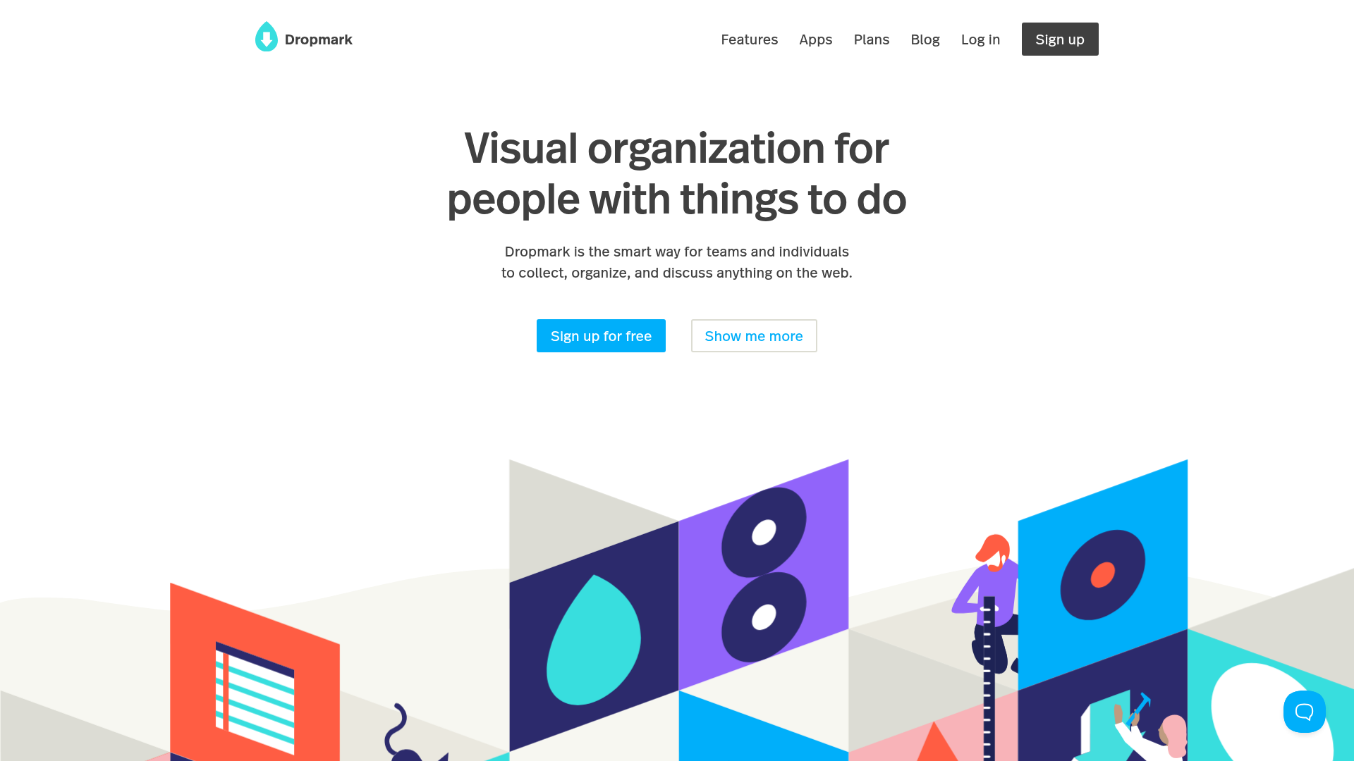
Dropmark Visual Organization Landing Page
Features a clean minimalist hero section with split-action buttons, a vibrant vector illustration footer, and an interactive horizontal flickity carousel for case studies.
