Notion AI Product Landing Page
A professional landing page layout featuring a clean hero section, distinctive bento-style feature cards, partner logo grid, and interactive product demo previews.
Overview
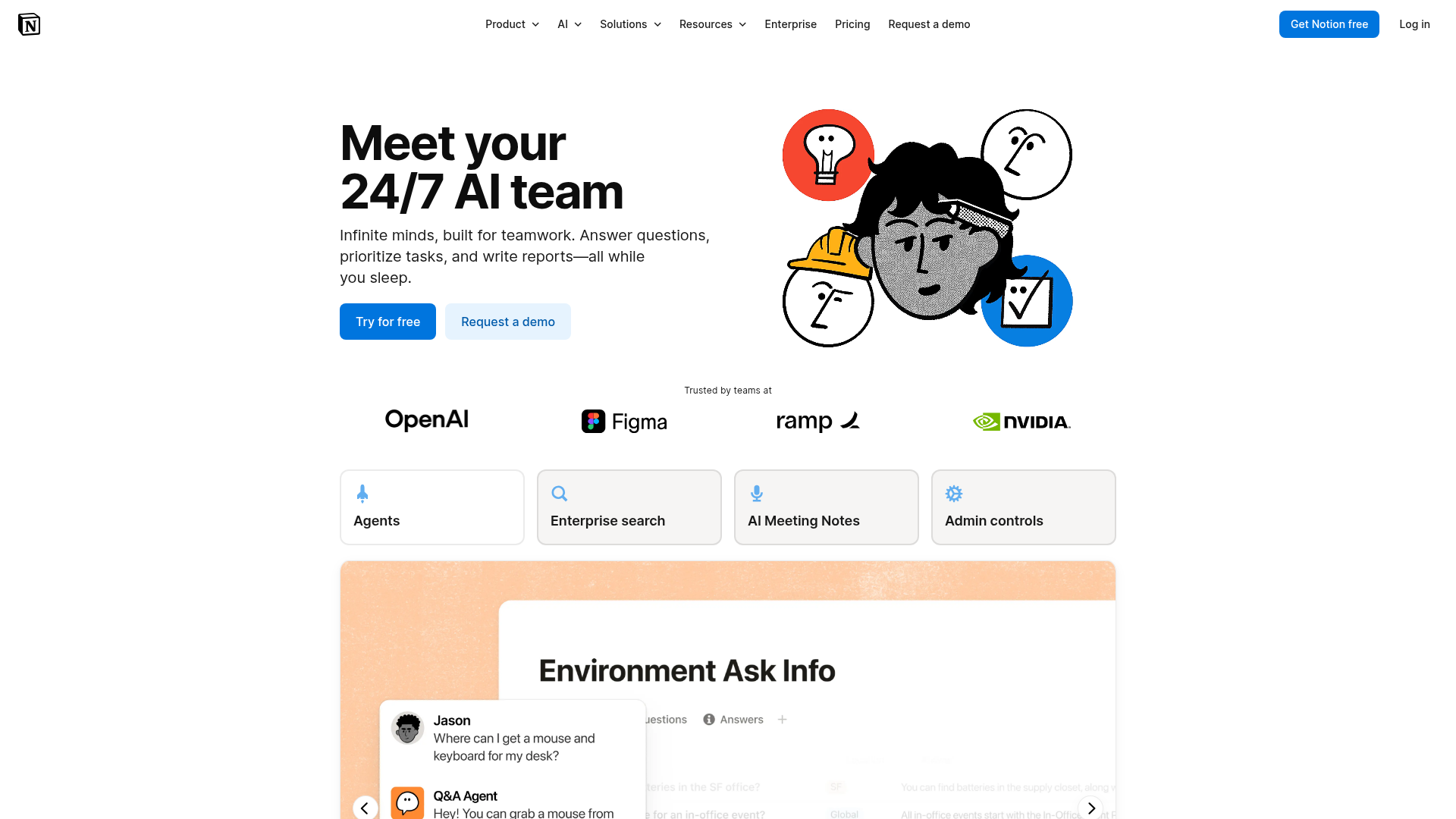
This landing page is a high-conversion SaaS product page for Notion AI, effectively balancing playful brand illustrations with a structured, data-rich layout. It serves as an excellent clone reference for building trust via social proof, detailing complex product tiers, and integrating high-fidelity video/GIF demonstrations within a clean, minimalist framework.
Design System
- Color Palette & Visual Hierarchy: The base is a strictly minimalist white and light gray (
#f6f6f7for card surfaces). Key actions use a vibrant brand blue (#0077d6) for primary buttons. Visual interest is driven by high-contrast black-and-white hand-drawn illustrations and colorful icons that guide the eye toward feature highlights. - Typography: The system relies on a clean sans-serif stack with a clear scale. Headlines use a heavy weight and large size (H1/H2) with tight leading, while body text uses a highly legible, medium-gray weight to maintain readability against the white background.
- Page Structure & Flow: The layout follows a classic conversion funnel: 1) Hero with core value prop and primary CTAs, 2) Logo cloud for immediate trust, 3) Bento-style feature selector, 4) Competitive pricing grid, 5) Alternating "Feature + Video/GIF" sections, 6) Governance/Security grid, and 7) Accordion-based FAQ at the footer.
- Reusable Components:
- Bento Grid Cards: Rounded-corner containers (
border-radius: var(--border-radius-200)) with subtle borders and icon headers. - Pricing Cards: Two-column layout with "Recommended" badges, clear pricing units, and tiered feature checklists.
- Compact Feature Links: Horizontal rows of small cards for use cases, featuring 20px icons and arrow indicators.
- Bento Grid Cards: Rounded-corner containers (
- Interaction & Motion: The HTML indicates a
KombiBlockCarousel, where clicking feature cards (like "Agents" or "Enterprise search") likely swaps the associated image or video below. Buttons useunderlineOnHoverand color shifts to indicate interactivity. - Implementation Clues: Built on Next.js, the site uses a CSS-in-JS or modular CSS approach (
section_section__ppkch). It heavily utilizes CSS variables for spacing (--spacing-28) and layout control (--row-item-count: 3).
Use Cases
- Who should clone this: B2B SaaS builders, Productivity tool startups, and AI-native applications needing to explain complex workflows simply.
- Effective Remixes:
- Brand Adaptation: Replace the hand-drawn illustrations with 3D renders or photography while keeping the "feature + demo" layout.
- Information Architecture: Adapt the Bento feature grid to serve as a navigation hub for different user personas (e.g., "For Devs", "For Managers").
- Practical Directions: Re-use the "Trusted by Enterprise" security grid section for any product requiring high data privacy standards. The pricing component is highly modular and can be expanded to 3 or 4 tiers easily.
- Clone Scope: A full-page clone is recommended for those needing a comprehensive product launch site. For existing sites, the FAQ accordion and security feature grid are the most portable and high-value sections to remix individually.
Related Inspirations

Slite SaaS Knowledge Base Landing Page
A clean SaaS hero section with a conversational headline, secondary call-to-action buttons, and a structured software interface preview featuring user testimonials.
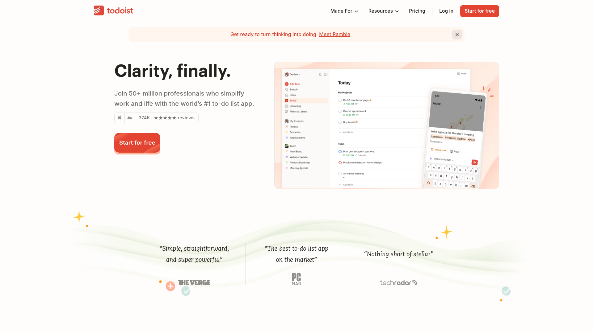
Todoist Landing Page with Sticky Features
A clean productivity app landing page featuring an animated hero section, a horizontal logo/quote marquee, a sticky side-by-side feature scroll, and a categorized project template gallery.
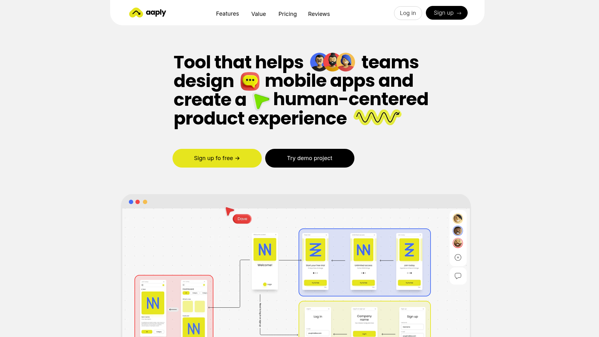
Aaply Mobile App Design Landing Page
A clean SaaS landing page featuring a bold typography-driven hero section, a sticky navigation bar, and integrated collaborative workspace UI mockups.
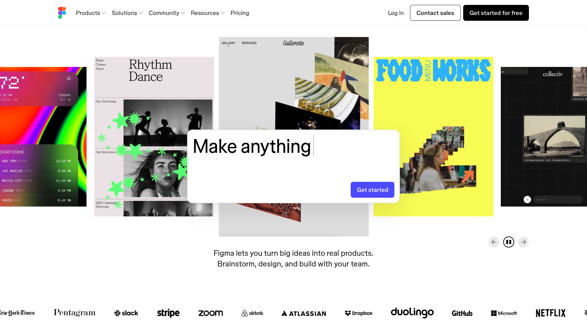
Figma Landing Page Gallery Hero
A dynamic landing page featuring a center-focused search bar hero, a horizontally-scrolling interactive video carousel, and a clean brand logo grid.
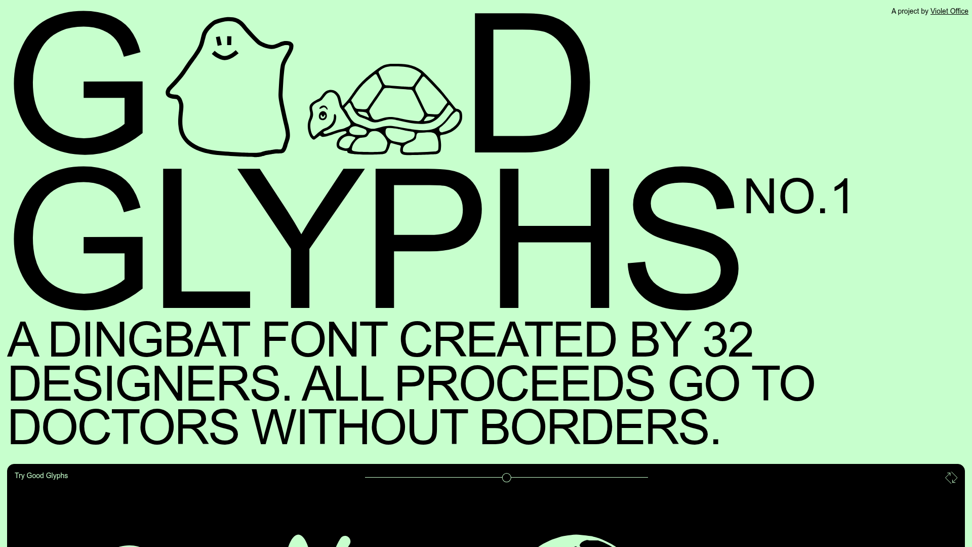
Good Glyphs Font Showcase Landing Page
A single-page layout featuring an interactive type tester, donation form with custom amount logic, and a contributor gallery using swiper-based glyph previews.
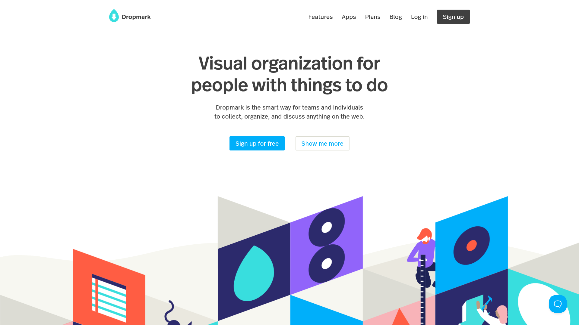
Dropmark Visual Organization Landing Page
Features a clean minimalist hero section with split-action buttons, a vibrant vector illustration footer, and an interactive horizontal flickity carousel for case studies.
