First+Foremost Agency Landing Page
A bold agency site featuring high-contrast typography, an animated botanical hero section, horizontal scroll product sliders, and accordion-style service explorers.
Overview
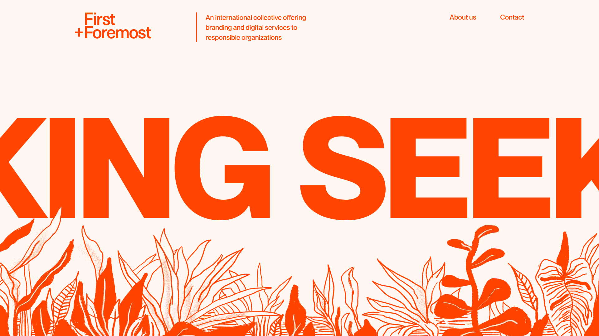
This agency landing page is a masterclass in high-impact, minimalist design, utilizing an aggressive "International Style" aesthetic balanced with organic botanical illustrations. It serves as an excellent reference for builders looking to implement bold typography and custom navigation patterns that break standard grid conventions without sacrificing readability.
Design System
- Color Palette & Visual Hierarchy: The site uses a high-contrast binary palette of vibrant orange (#FF4500) and off-white/cream. This simplified color story allows the bold, oversized typography and intricate hand-drawn botanical illustrations to dominate the visual hierarchy.
- Typography System: The design features a heavy, sans-serif Grotesk typeface. Use of massive, screen-filling font sizes for hero sections (e.g., "KING SEEKING") creates an immersive editorial feel. Information is organized through clear Heading 1 to Heading 3 scales, focusing on readability via generous line height in body text.
- Page Structure & Section Flow: The flow begins with a large-scale botanical Hero with marquee-style scrolling text, followed by centered mission statements, an "About" section with integrated video, a horizontal carousel for "What you won't get," an accordion-style "Services" explorer, and a final "Our Team" gallery.
- Reusable Components:
- Animated Hero Marquee: A continuous horizontal text scroll.
- Service Explorer Accordion: A vertical list that expands to reveal detailed text descriptions.
- Horizontal Slider: A swipeable/clickable card section used for value propositions.
- Floating Badges: Small secondary callouts (e.g., "We work in English et Français!") that add personality.
- Interaction & Motion: The site utilizes Gatsby-specific image transitions and lazy-loading. Key interactions include the horizontal transform on the
react-swipeable-view-containerand hover-state transitions on the team member avatars that swap grayscale/colored images. - Implementation Clues: Developed with Gatsby and Styled Components (
sc-prefixed classes). The layout relies heavily on a custom<Grid>system that manages vertical stacking and horizontal spacing consistently across the site.
Use Cases
- Who should clone this: Creative agencies, solo design portfolios, or specialized consultancy firms that want to project a "bold yet human" brand identity.
- Effective Remixes: This layout works well for high-end boutique brands. A developer could swap the orange for a deep emerald green and replace the botanicals with architectural wireframes for a real estate or design studio context.
- Practical Directions: Reuse the Service Explorer component for FAQ pages or detailed service lists. The Team Gallery (Rogue's Gallery) is perfect for smaller collectives or startup "About" pages where personality is a key selling point.
- Clone Scope: The Hero + Marquee section is perfect for a quick high-impact section clone, while the Full-Page structure is ideal for organizations with a medium amount of content and a strong visual POV.
Related Inspirations
Someone & Others Studio Landing Page
A minimalist studio portfolio featuring scroll-reveal typography, overlapping sticky case study cards, and a vibrant glassmorphism CTA with animated glow rings.
Atlantis Tech Engineering Services Landing Page
A dark-themed professional services layout featuring a custom SVG mountain hero, logo cloud, benefits grid, process timeline, and a dual-column 'fit' comparison section.
Dovetail Venture Portfolio Landing Page
A minimalist investment site featuring a warm pastel palette, distinctive hand-drawn illustrations, horizontal carousel for project cases, and a clean typography-focused grid layout.
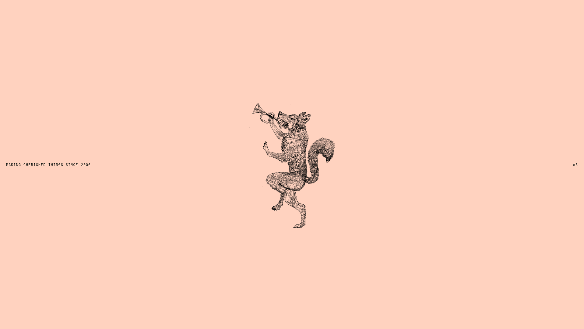
Smiling Wolf Minimalist Portfolio Landing
A refined, ultra-minimalist layout featuring a centered vintage illustration, subtle typography, and a spacious monochromatic aesthetic ideal for a high-end brand splash page.
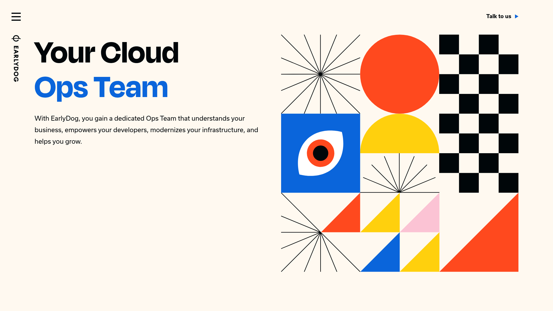
EarlyDog Managed Ops Landing Page
A minimalist landing page featuring a bold geometric hero illustration, asymmetrical grid layouts, and clean typography for service-based businesses.
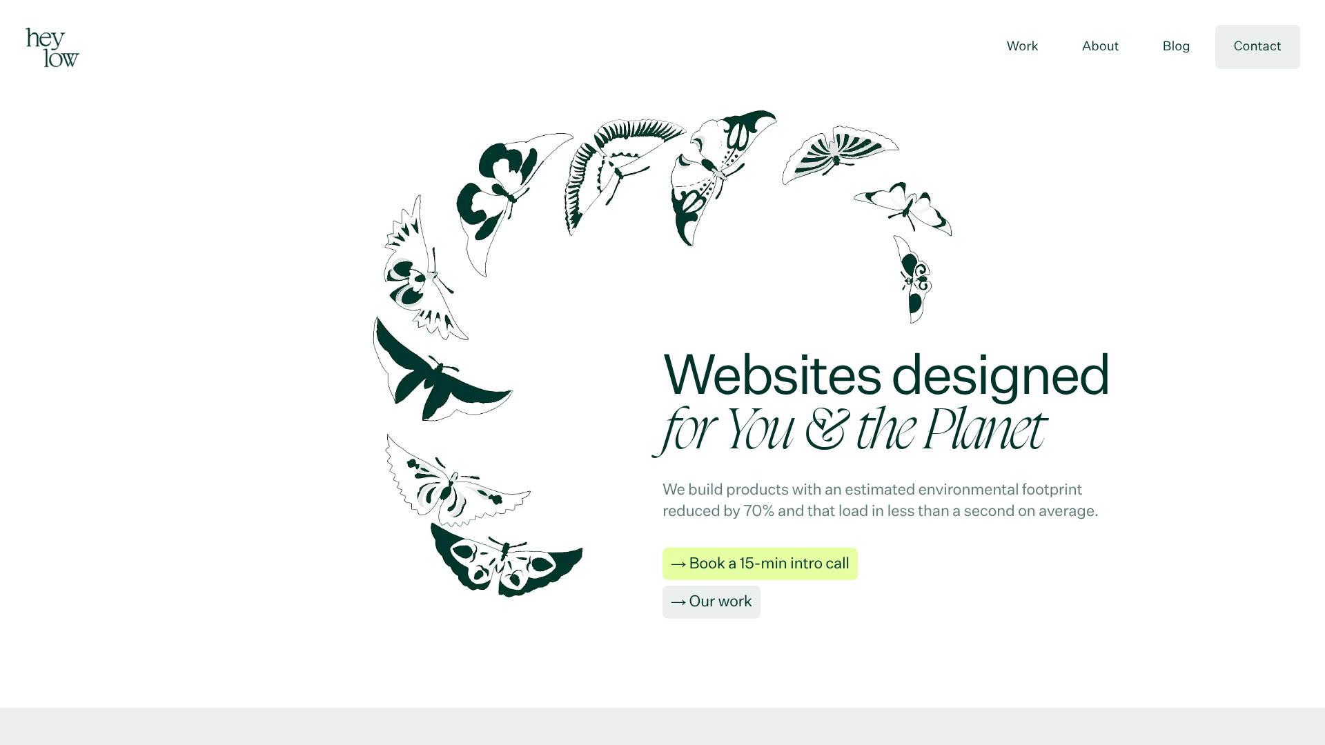
Heylow Portfolio Landing Page
A minimalist, eco-conscious portfolio featuring an animated butterfly hero section, Bento-style feature grid, and project cards with carbon rating and speed metrics.
