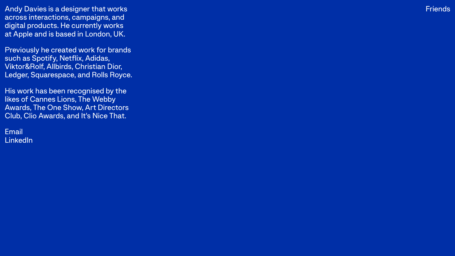
Andy Davies Minimalist Bio Landing Page
A stark, single-screen typographic layout featuring a high-contrast blue background, clean sans-serif text blocks, and simple text-based navigation.
Overview
This is a minimalist, text-first personal landing page for designer Andy Davies. It serves as a high-impact digital business card that prioritizes legibility and brand authority over visual clutter, making it an excellent reference for high-end professional portfolios or agency 'About' pages.
Design System
- Color Palette & Visual Hierarchy: The site uses a monochrome-on-color approach with a vibrant, high-saturation blue background (#0033CC) and stark white text. Hierarchy is established purely through text blocking and spatial positioning rather than font weight or size variation.
- Typography System: A clean, geometric sans-serif (reminiscent of Inter or San Francisco) is used throughout. The leading is generous, and the measure (line length) is constrained to approximately 50-60 characters to ensure optimal readability.
- Page Structure & Section Flow: The layout utilizes a simple split-plane structure. A main content block (the bio) is anchored to the top-left, while a single utility link ("Friends") is pinned to the top-right, creating a wide-open, airy center.
- Reusable Components: The primary reusable component is the
main.biotext container. It uses simple<p>tags for biography sections and<br>separated<a>tags for contact links, creating a repeatable vertical stack of information. - Interaction & Motion: Interactions are minimal. The HTML indicates standard
mailto:and external protocol links. There is no evidence of complex animations, emphasizing a static, "printed-matter" aesthetic. - Implementation Clues: The HTML is semantic and extremely lightweight, using a
<main>container for the primary copy and relative/absolute positioning to separate the main bio from the supplementary "Friends" link.
Use Cases
- Who should clone this: Creative directors, developers, and photographers who want a "low-maintenance, high-impact" web presence that emphasizes their pedigree over a visual gallery.
- Effective Remixes: This pattern works well for temporary "Coming Soon" pages, press kits, or minimalist project landing pages for individual product launches.
- Practical Remix Directions:
- Brand Swap: Replace the blue background with a signature brand color or a subtle paper-texture image.
- Information Architecture: Adapt the footer links to include a PDF portfolio download or a newsletter signup.
- Selected Reuse: Clone the top-right utility link positioning to create a persistent "Return to Home" or "Menu" button on otherwise dense pages.
- Suggested Clone Scope: This is ideal for a full-page clone due to its simplicity; the entire structure can be replicated in minutes to serve as a clean starting point for a personal brand.
Related Inspirations

Jacob Leech Portfolio Portfolio Site
A minimalist developer portfolio with custom cursor interactions, scroll-triggered text animations, a clean resume layout, and unique full-width graphic components.
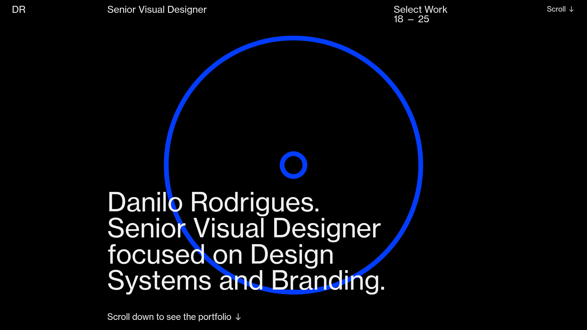
Danilo Rodrigues Designer Portfolio Landing
A minimalist, high-impact design portfolio featuring a full-screen image carousel hero, fluid typography, large scroll-triggered key visuals, and a clean grid-based case study layout.
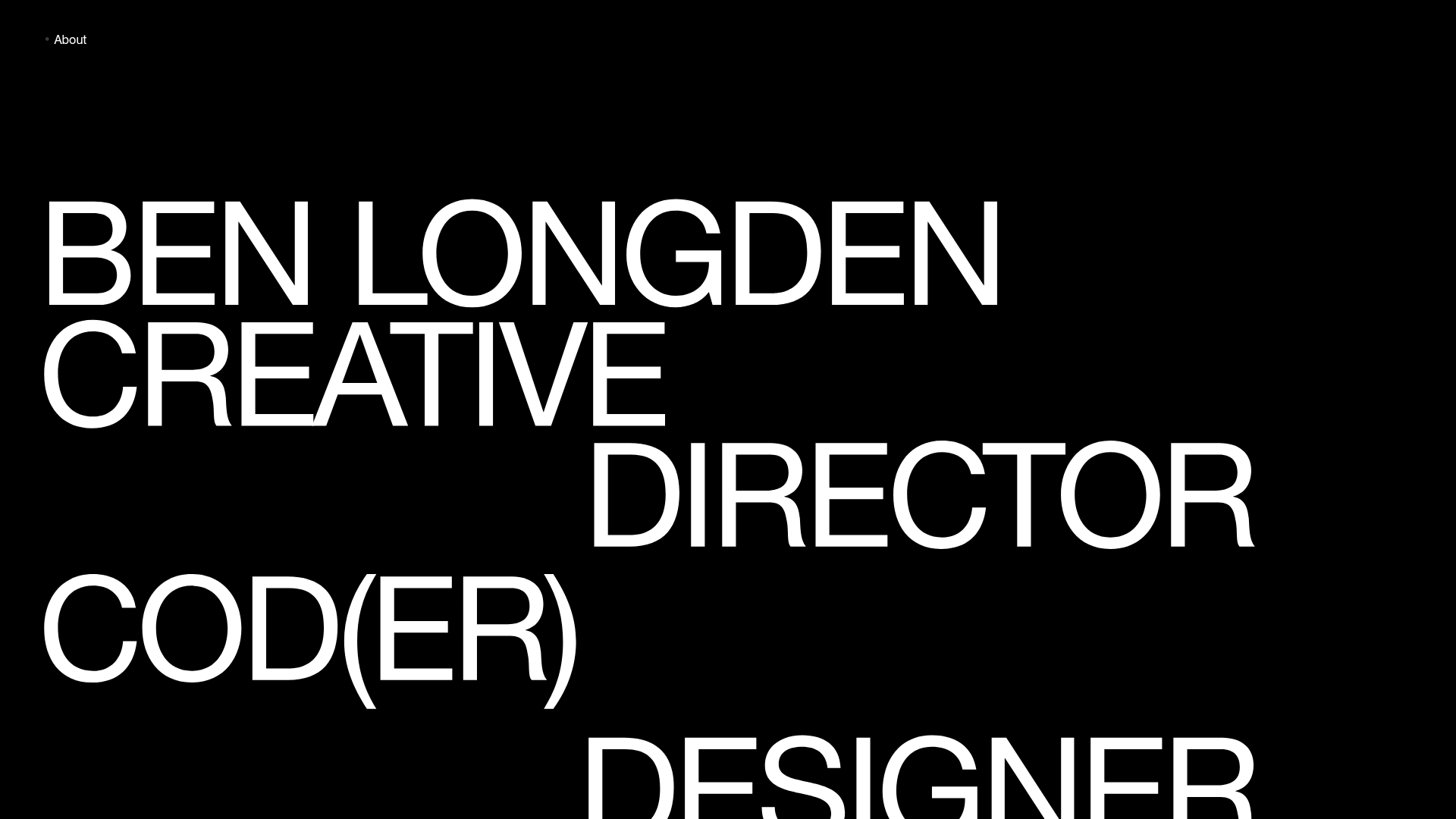
Ben Longden Minimalist Creative Portfolio
A bold typography-focused site featuring a large-scale overlapping hero section, horizontal image carousels for projects, and a scrolling text marquee footer.
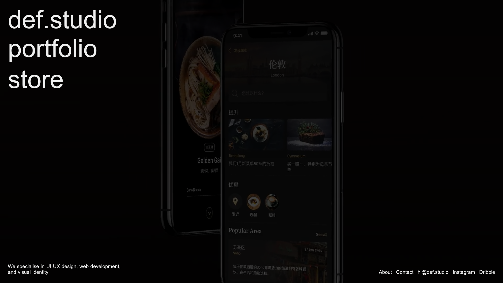
Def.studio Design Agency Portfolio
A dark-themed portfolio featuring a full-screen video background, smooth scroll transitions, and a vertical list of large-scale media-driven project cards with lazy-loaded video previews.
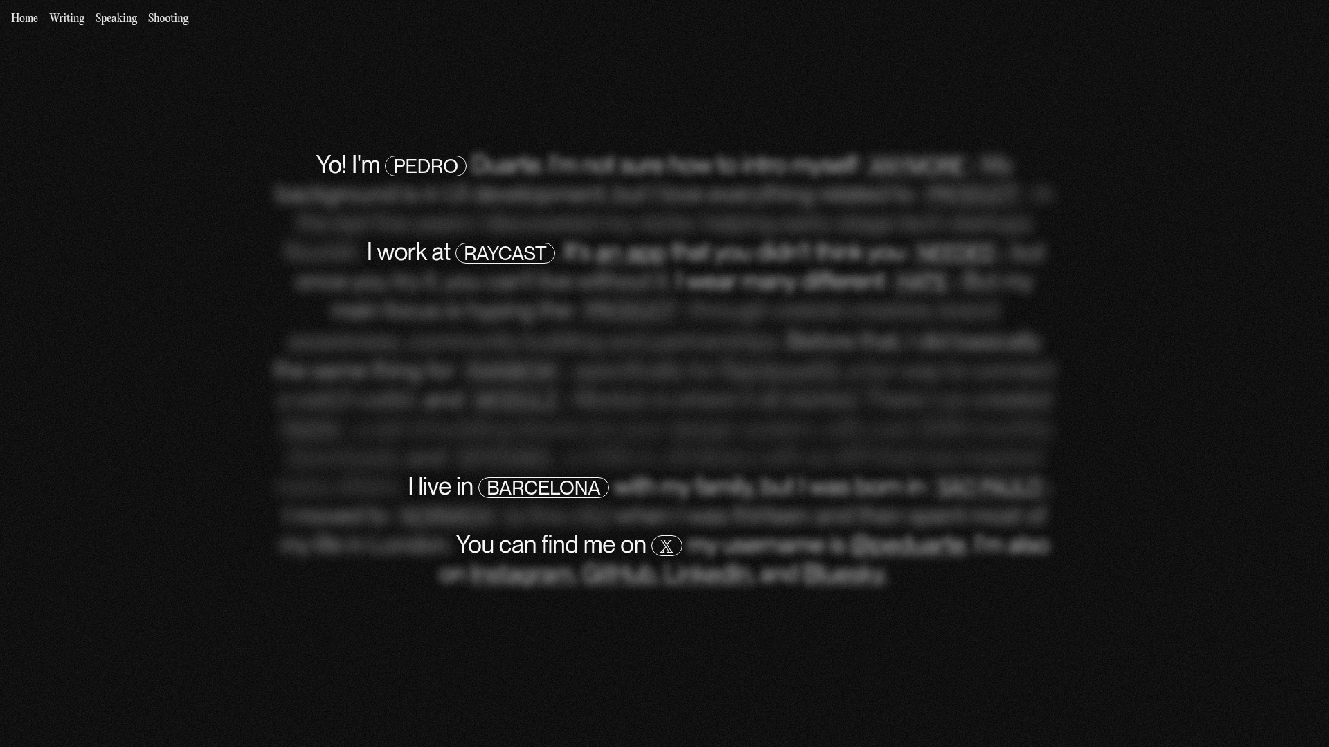
Pedro Duarte Personal Portfolio Site
A minimalist portfolio featuring an interactive text-reveal interface, a full-screen background video, and Radix UI components with a distinct dark aesthetic.

Niklas Rosén Designer Portfolio Index
A minimalist, responsive grid-based portfolio index featuring a clean 16-column layout, typographic list components, and a custom dark mode transition.
