Pedro Duarte Personal Portfolio Site
A minimalist portfolio featuring an interactive text-reveal interface, a full-screen background video, and Radix UI components with a distinct dark aesthetic.
Overview
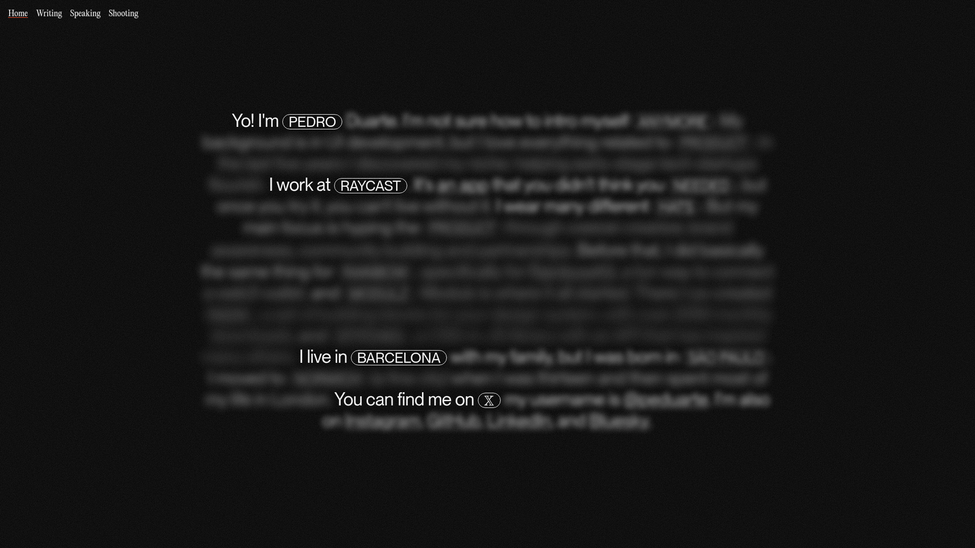
This minimalist personal portfolio serves as a masterclass in progressive disclosure, utilizing a "reveal" mechanic that expands blurred text into a detailed narrative upon interaction. It is a strong clone reference for developers who want to balance high-impact visual storytelling with a clean, low-clutter interface. The design successfully integrates full-screen video backgrounds with high-contrast typography and Radix UI components for an atmospheric, premium feel.
Design System
- Color Palette & Visual Hierarchy: The site uses a high-contrast dark aesthetic centered on a deep black background (
background:black) with white text. High-contrast white backgrounds are used specifically for the video layer, while the content overlay utilizesmix-blend-mode: multiplyand variable text opacity to create depth. Interactive elements are highlighted with pill-shaped borders and subtle gray accents. - Typography: The typography system utilizes large-scale headings (Radix
rt-r-size-7andrt-r-size-8). Essential keywords are enclosed in rounded capsules to denote interactivity. The HTML indicates specific usage of a serif italic font (variable(--font-editorial-new)) for stylized emphasis within the narrative text. - Page Structure: The layout follows a centered vertical flow within a
rt-Container. A fixed navigation bar resides at the top left, while a "counter" element (e.g., "R0/15") at the top right tracks the progression of interactions. The background is occupied by a full-screen, looped video element. - Reusable Components: Key components to clone first include the
reveal-trigger(the pill buttons that toggle hidden text blocks), thenav-blurnavigation strip, and thevideo-backgroundcontainer which handles responsive full-screen coverage. - Interaction & Motion: The primary interaction pattern is the use of
radix-collapsiblecomponents. Clicking pill-shaped triggers expands hiddenreveal-contentblocks with smooth transitions (transition: opacity 0.5s ease). The interface also features an opacity-based fade-in effect controlled by CSS variables (--delay) to sequence the appearance of text blocks. - Responsive Behavior: The HTML structure uses responsive size scaling (e.g.,
sm:rt-r-size-8) to maintain readability. The text-heavy, centered layout is inherently mobile-friendly, collapsing into a single-column narrative on smaller screens. - Implementation Clues: The site is built using Radix UI Themes (
radix-themes) and Next.js (indicated by thenext-route-announcer). It relies heavily on utility-first layout classes and Radix primitives for accessibility and state management.
Use Cases
- Who should clone this: Creatives, software engineers, and designers who want a non-traditional resume or profile that rewards user curiosity.
- Appropriate Products: Personal bios, agency "About" pages, interactive manifestos, or single-product launch pages where information needs to be digested in layers.
- Practical Remix Directions: Replace the full-screen video with a static high-grain image or a WebGL shader; swap the narrative text for technical documentation where clicking a term reveals its definition; or adapt the information architecture to showcase portfolio projects where the "reveal" reveals project thumbnails.
- Suggested Clone Scope: A quick section clone of the "interactive text-reveal" logic is highly recommended for adding flavor to standard landing pages without requiring a full-page architectural overhaul.
Related Inspirations

Jacob Leech Portfolio Portfolio Site
A minimalist developer portfolio with custom cursor interactions, scroll-triggered text animations, a clean resume layout, and unique full-width graphic components.
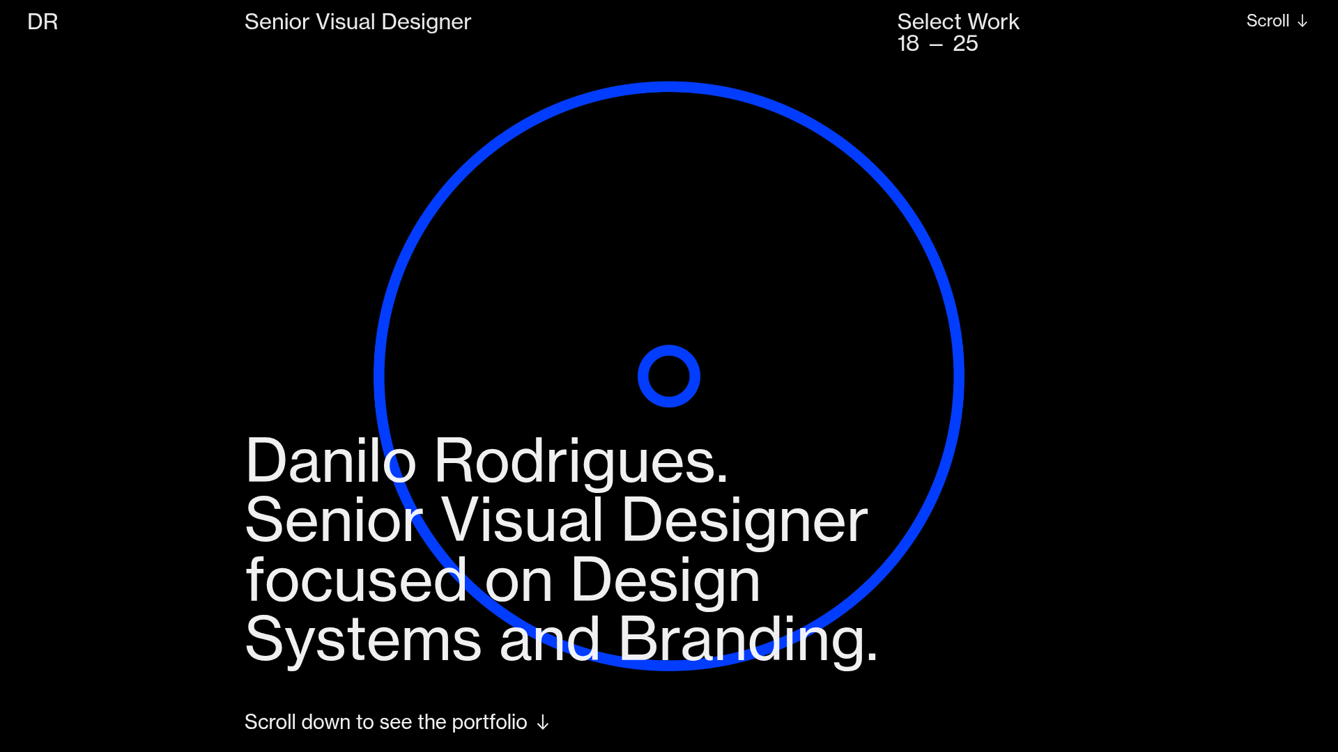
Danilo Rodrigues Designer Portfolio Landing
A minimalist, high-impact design portfolio featuring a full-screen image carousel hero, fluid typography, large scroll-triggered key visuals, and a clean grid-based case study layout.
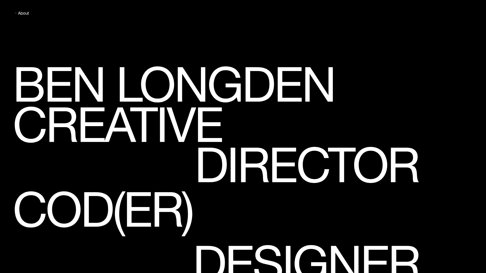
Ben Longden Minimalist Creative Portfolio
A bold typography-focused site featuring a large-scale overlapping hero section, horizontal image carousels for projects, and a scrolling text marquee footer.
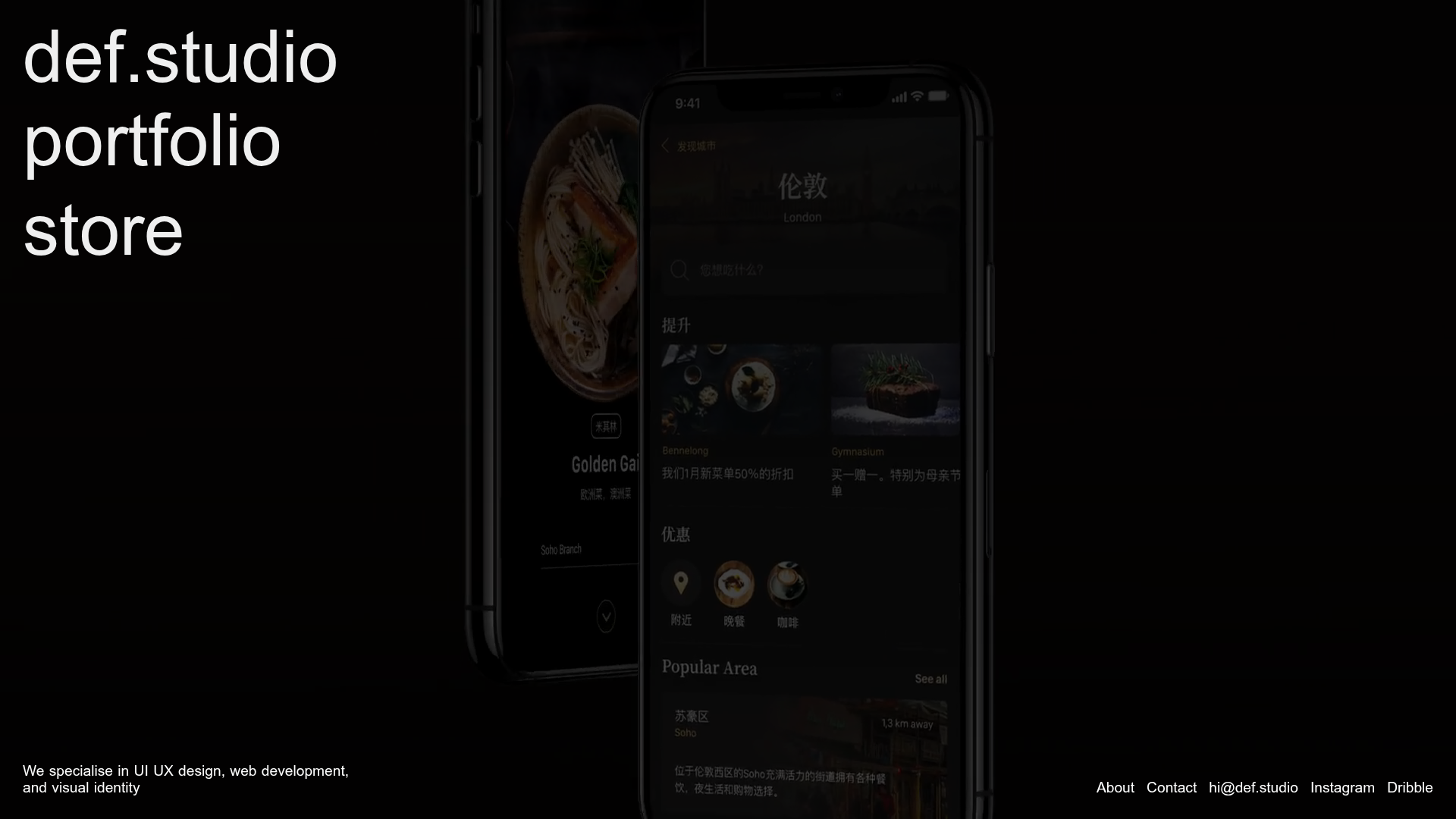
Def.studio Design Agency Portfolio
A dark-themed portfolio featuring a full-screen video background, smooth scroll transitions, and a vertical list of large-scale media-driven project cards with lazy-loaded video previews.
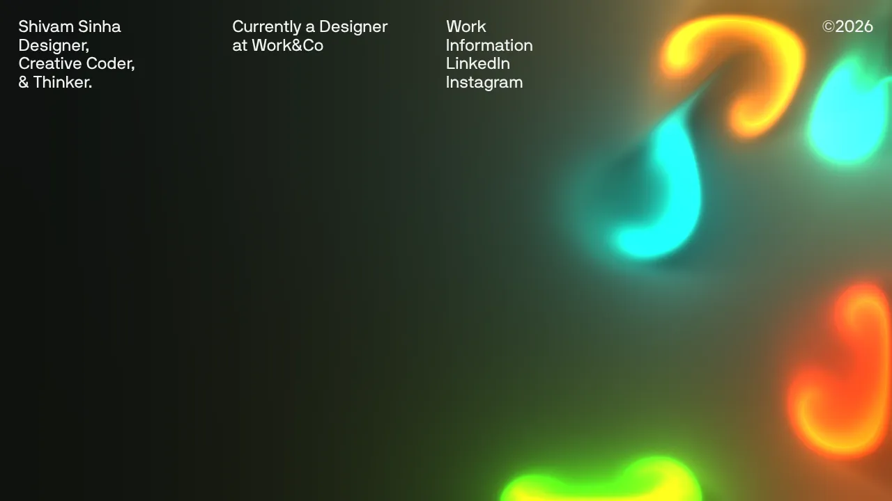
Shivam Sinha Portfolio Hero Landing
A minimalist portfolio layout featuring a full-screen interactive fluid-simulation canvas, clean typographic header, and a responsive navigation grid.
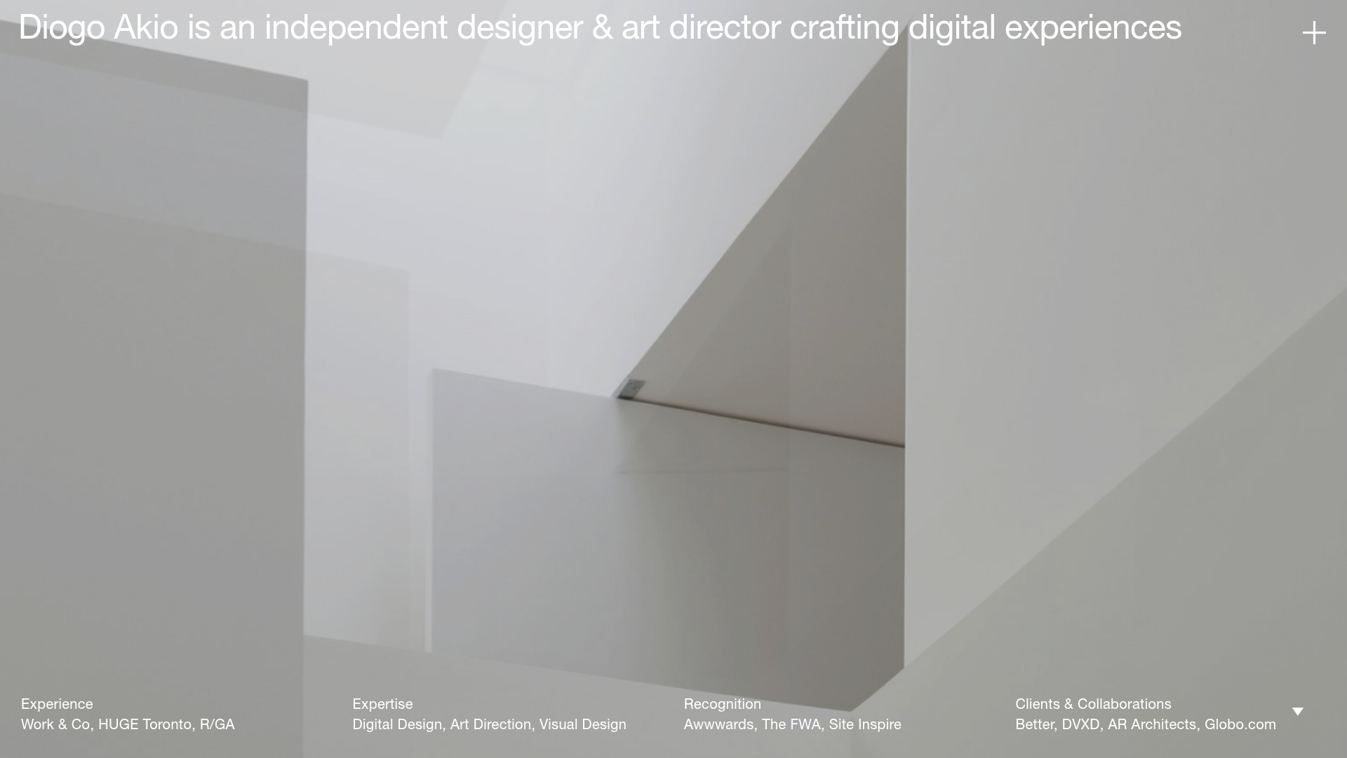
Diogo Akio Minimalist Portfolio Landing
A high-concept portfolio layout featuring a full-screen video hero, marquee footer components, and a smooth vertical-slide overlay for detailed bio and experience lists.
