Berner Kühl Minimalist Fashion E-commerce
A high-end retail layout featuring an infinite marquee product slider, split-screen content blocks with hand-applied numbering, and a dense product grid with image hover swaps.
Overview
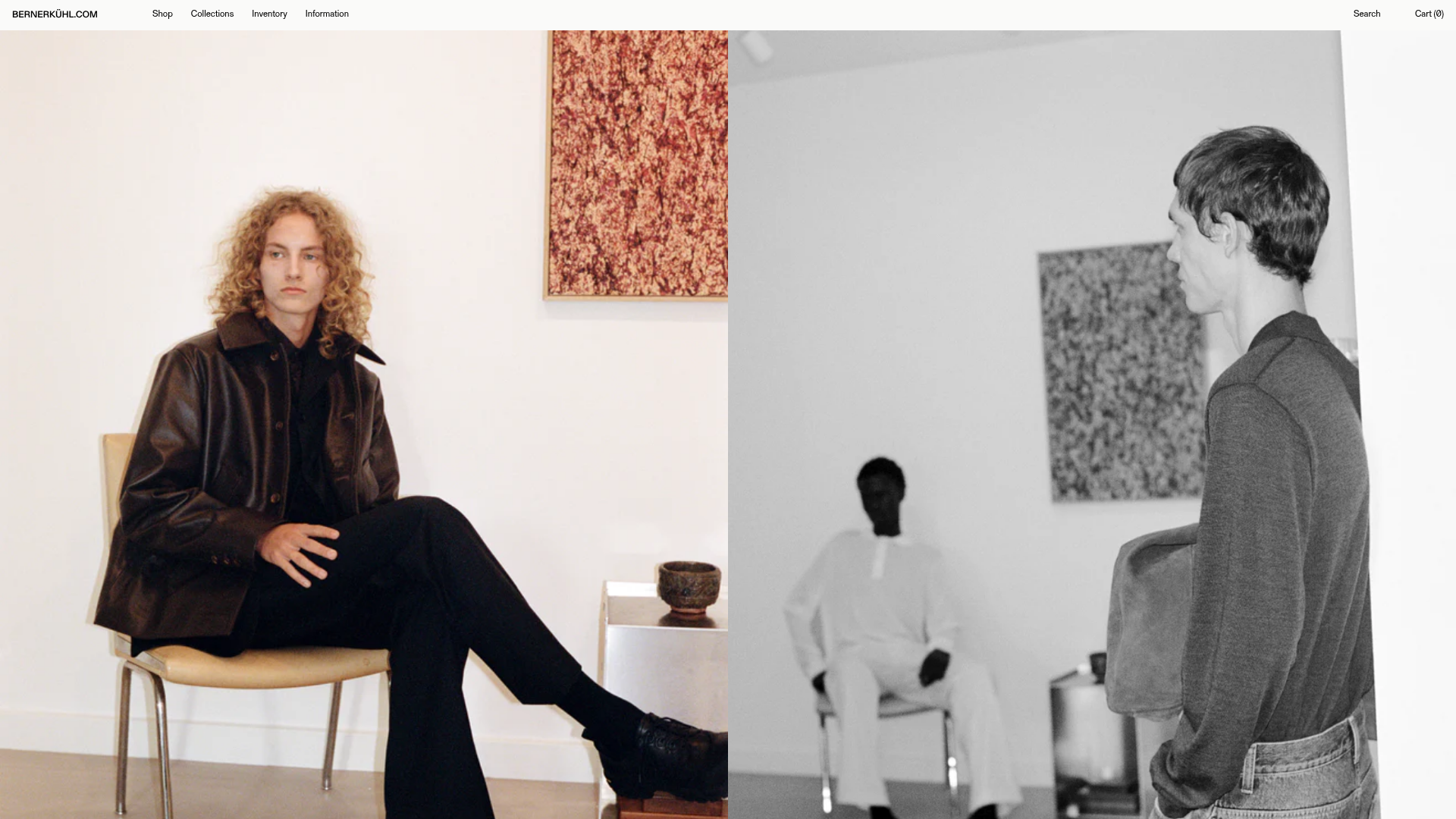
Berner Kühl is a high-end minimalist e-commerce storefront that emphasizes editorial-style presentation and structural symmetry. It is a premier reference for a clone-and-remix workflow due to its clean execution of the 'split-screen' layout and an unconventional infinite marquee navigation system that gives the store a rhythmic, high-fashion feel.
Design System
- Color Palette & Visual Hierarchy: The site uses a high-contrast monochromatic base (pure white
#FFFFFF, jet black, and muted greys). Visual hierarchy is driven by large-scale imagery rather than heavy typography, with content blocks separated by generous whitespace (mb5,mb6classes). - Typography: A strictly uppercase sans-serif system is used for navigation and headings (found in the
ttuandf4classes). Body text utilizes a classic Serif font for brand storytelling, creating a tension between modern utility and artisanal heritage. - Page Structure & Section Flow:
- Fixed Header: Minimal top-aligned navbar with split utility links.
- Hero Hero Grid: 50/50 split-screen images with floating white labels (
.label.absolute). - Marquee Slider: An auto-scrolling horizontal product reel (
.marquee3k) displaying featured items with sequential numbering. - Editorial Content: Right-aligned text blocks paired with multi-image product mosaics.
- Product Grid: A dense collection view using 4-5 columns on desktop with immediate image swaps on hover.
- Reusable Components:
- Floating Label Item: A relative container with an absolute-positioned white badge for titles.
- Split Content Block: A responsive flex container (
.flex-row-l) that stacks text on mobile but mirrors content and imagery on desktop. - Numbering System: Hand-applied digital counters (01, 02, etc.) used consistently across all sections to provide a clinical, catalog-like feeling.
- Interaction Patterns: Hover states on the product grid trigger a swap between different image source files (
.swap.relative), and themarquee3kcomponent provides a continuous, low-speed motion that encourages eye scanning. - Implementation Clues: The site is built on Shopify using Tachyons-like functional CSS utilities (e.g.,
w-100,flex-column,ph3,dn). This makes it highly modular and easy to extract specific grid patterns into other utility-first frameworks like Tailwind.
Use Cases
- Who should clone this: Designers building archival fashion stores, boutique furniture showrooms, or digital lookbooks for premium lifestyle brands.
- Effective Remixes: Swap the stark white background for a textured paper grain to achieve a 'print magazine' aesthetic, or replace the auto-marquee with a manual drag-scroll for a more tactile mobile experience.
- Practical Remix Directions: The dense product 'arrivals' grid can be cloned in isolation to showcase a large inventory without excessive page scrolling. Alternatively, the split-screen editorial section is excellent for 'About Us' or 'Process' pages.
- Clone Scope: A full-page clone is recommended for a high-impact landing page, but the marquee slider component and the numbered image labels are the most valuable individual units for smaller-scale remixes.
Related Inspirations
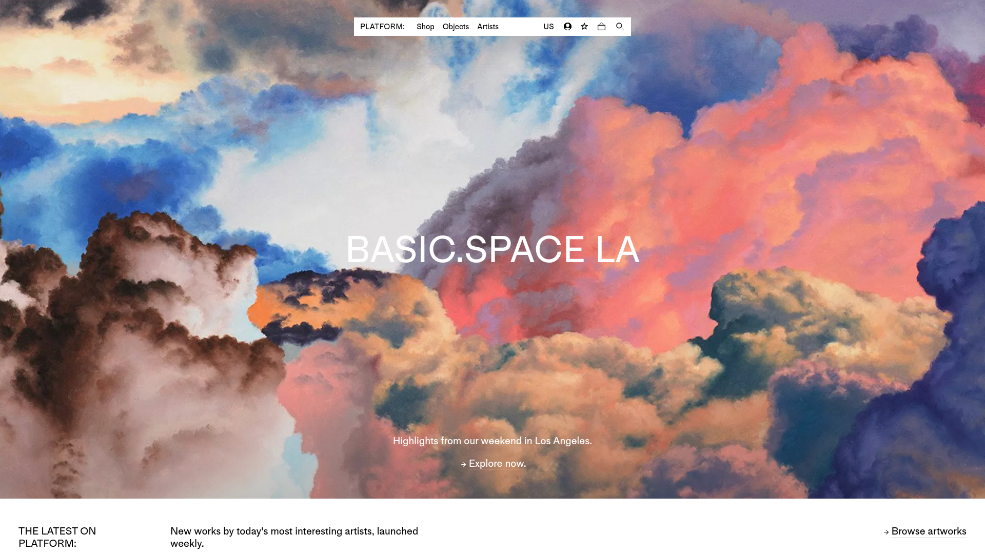
Platform Art E-commerce Gallery Page
A minimalist art marketplace featuring a full-bleed image hero, horizontal scroll product carousels with countdown timers, and hover-triggered image swaps.
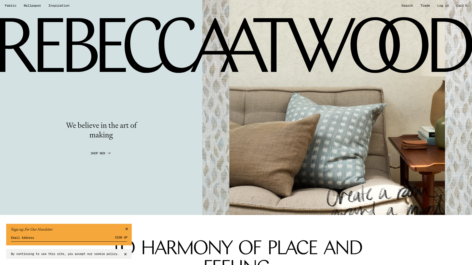
Rebecca Atwood E-commerce Homepage
Features a high-impact typography-driven hero, split-image diptychs with hover effects, a product carousel, and interactive 'wordstack' links that reveal images on hover.
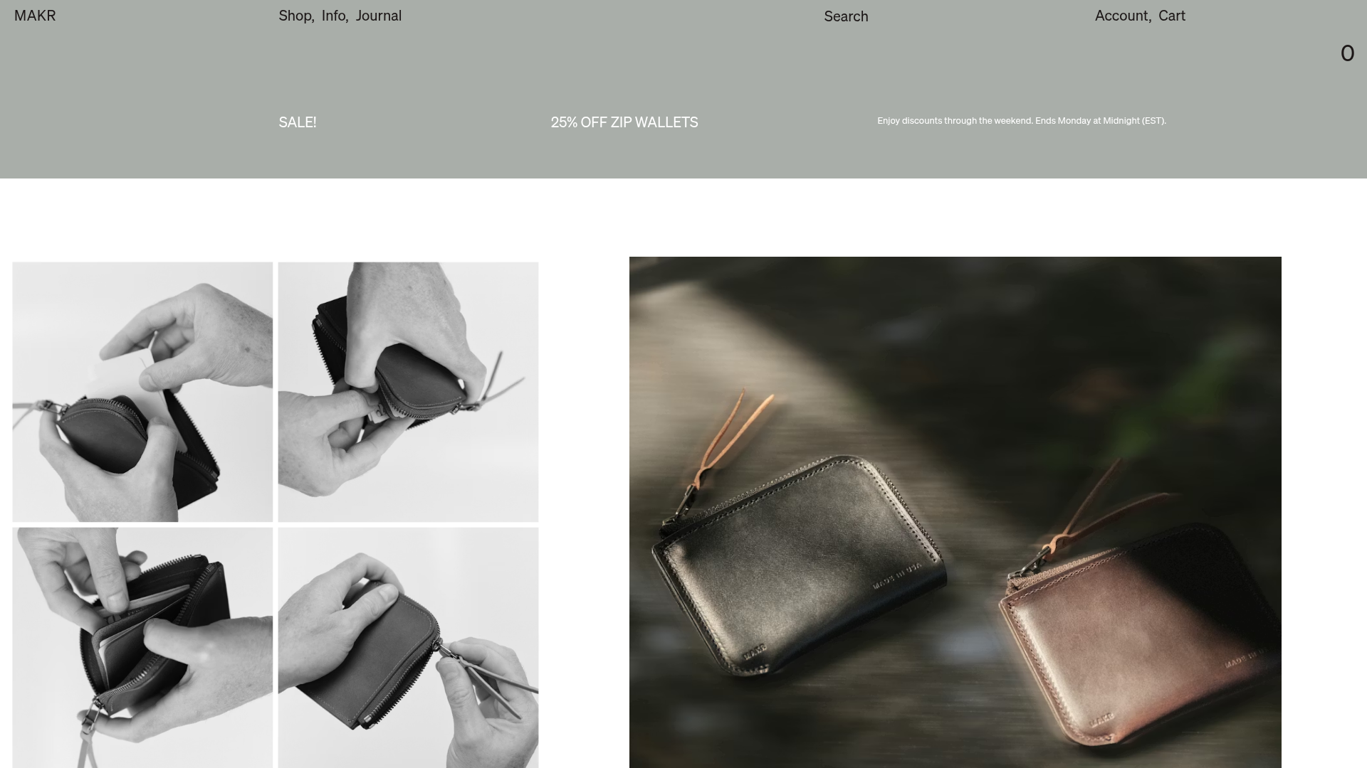
Makr Minimalist Design Goods Store
A clean e-commerce layout featuring an asymmetric image grid, drawer-based navigation categories with hover previews, and a sophisticated minimalist aesthetic.
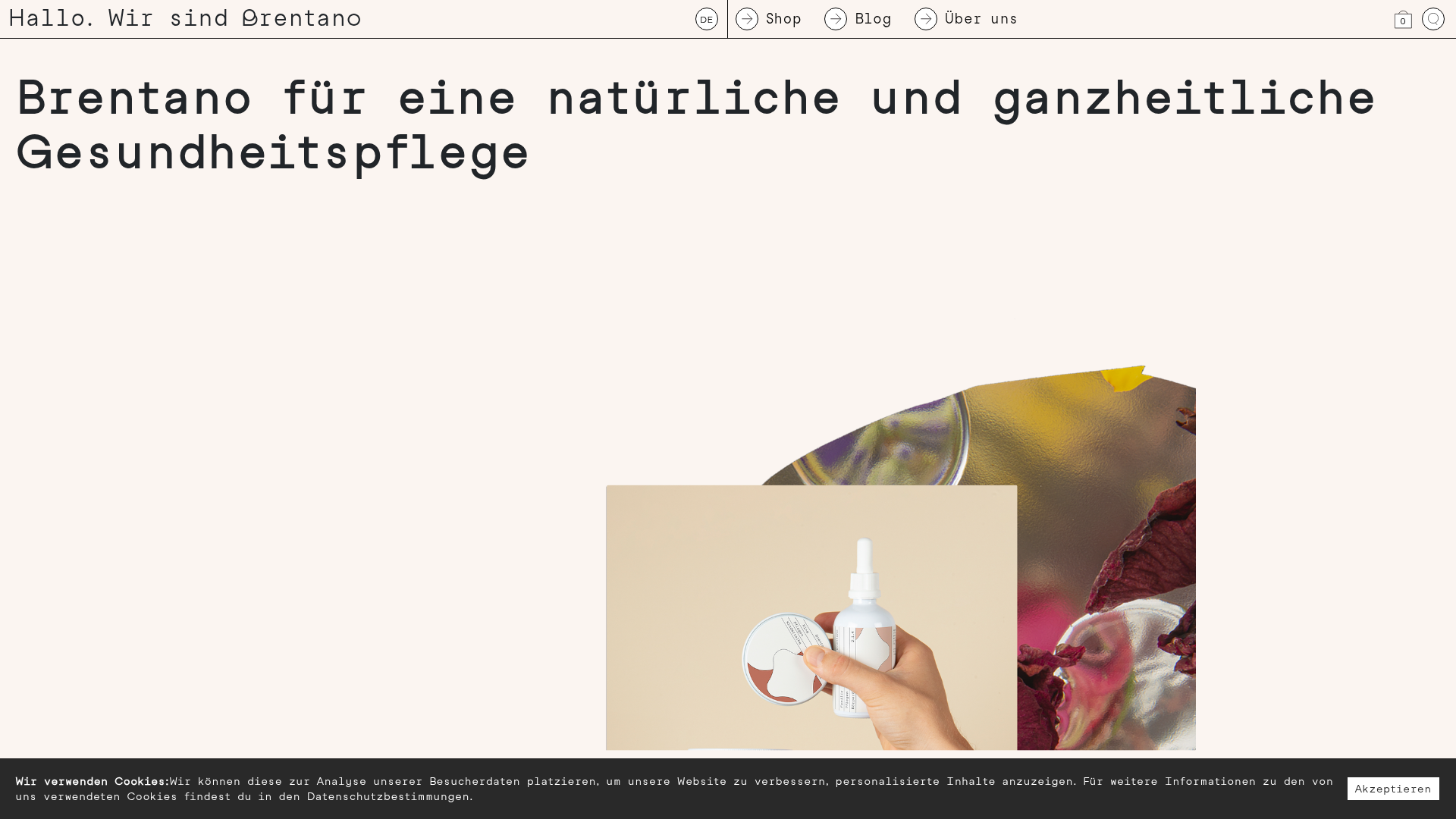
Brentano Natural Healthcare E-commerce Store
A minimalist e-commerce layout featuring a clean typewriter-style aesthetic, unique asymmetrical product imagery, and a grid-based shop component for handmade organic goods.
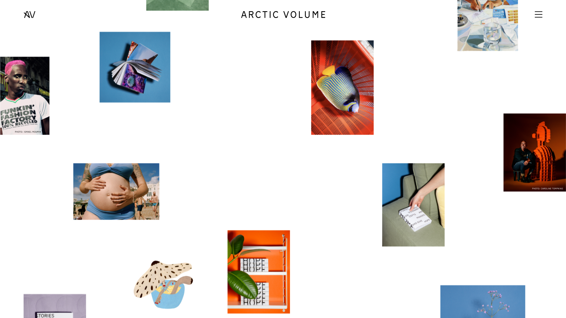
Arctic Volume Creative Portfolio Showcase
A minimalist gallery layout featuring a dynamic floating image canvas hero, smooth transitions, and a clean typography-focused editorial blog footer.

Context Gallery High-End Furniture Landing Page
A minimal editorial layout featuring a multi-column product carousel, designer biographies with image-text pairings, and a magazine-style content grid for curated design stories.
