Rebecca Atwood E-commerce Homepage
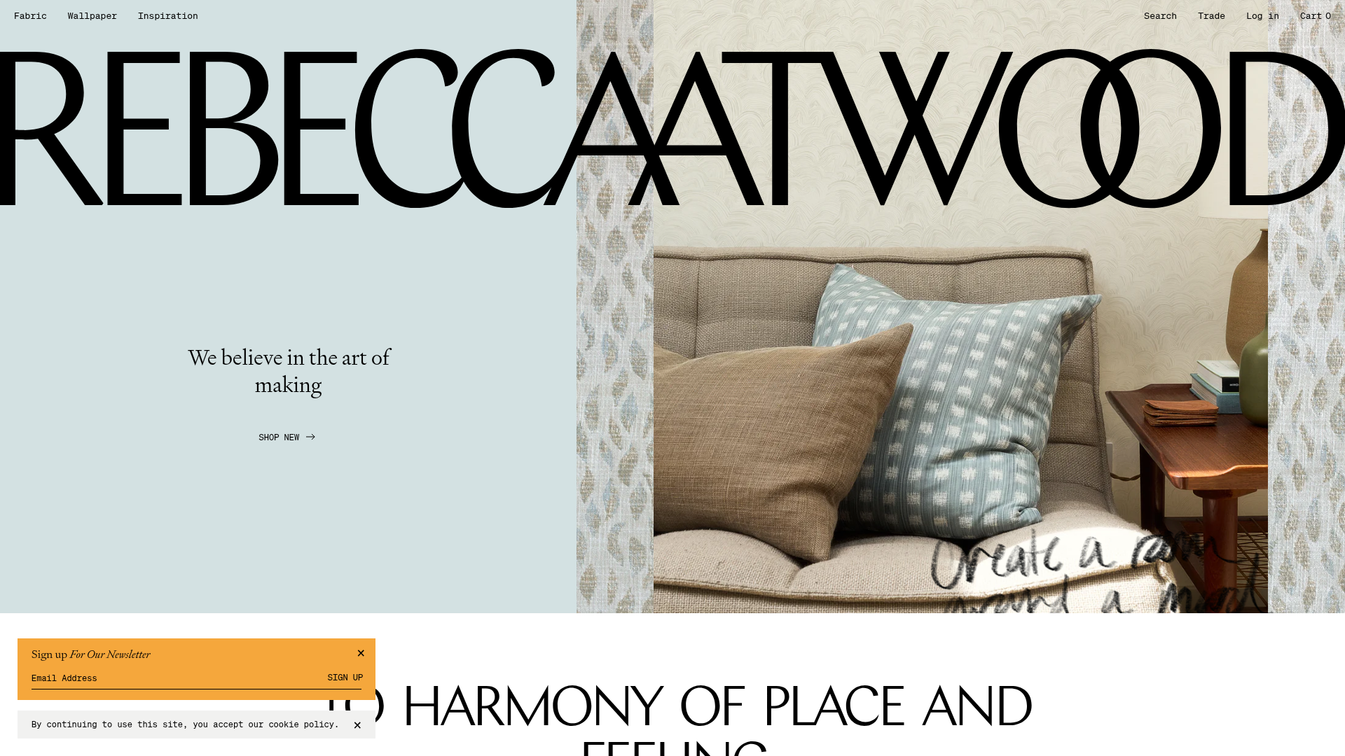
Features a high-impact typography-driven hero, split-image diptychs with hover effects, a product carousel, and interactive 'wordstack' links that reveal images on hover.
Overview
This website for Rebecca Atwood is a sophisticated e-commerce showcase for luxury textiles and wallpapers. It stands as a premium reference for builders because of its 'editorial-first' approach, blending high-impact typography with fluid, interactive visual storytelling that elevates standard product listings into an immersive brand experience.
Design System
- Color Palette & Visual Hierarchy: The palette is a soft, muted mix of pastels (e.g.,
#d3e1e2light blue-grey,#bf8c9edusty rose, and#f0d8c3tan). Large-scale photographic diptychs provide the primary visual anchors, while black high-contrast typography maintains a clean hierarchy against the soft backgrounds. - Typography System: The brand uses a mix of classical and modern styles. A massive, oversized serif logo dominates the header. Body and UI text leverage a mix of elegant serifs for headings (e.g.,
text--serif) and monospaced fonts (text--mono) for technical product specs like fiber content and price, creating a 'studio-blueprint' aesthetic. - Page Structure & Section Flow:
- Super-Hero: Typography-driven split screen with a floating foreground image and 'handwritten' text overlays.
- Image Diptych: A two-column grid showcasing category entry points (Wallpapers vs. Textiles) with descriptive serif captions.
- Product Carousel: A horizontal scroll of product cards featuring 'hover-to-reveal' secondary lifestyle images.
- Text-Image Block: A colorful high-contrast promotional section for a book launch.
- Wordstack Section: Minimalist vertical list of text links that trigger image reveals.
- Reusable Components:
- The 'Wordstack': A vertically stacked navigation component where
mouseenterevents reveal a centered floating image (x-show="imageVisible"). - Interactive Product Cards: Cards that transition between a studio product shot and a lifestyle application photo on hover.
- Diptych Blocks: Clean, responsive 2-up grids with consistent
ctabutton styles.
- The 'Wordstack': A vertically stacked navigation component where
- Interaction & Motion Patterns: Features extensive use of
revealclasses that manage opacity and matrix3d transforms for smooth scroll-driven entries. The product carousel uses Flickity for touch-responsive sliding. Most interactions emphasize a 'slow-burn' luxury feel through easing cubic-beziers. - Implementation Clues: Built with Shopify, utilizing Alpine.js (
x-data,@mouseenter) for lightweight reactivity in the 'Wordstack' section and standard utility classes for spacing (e.g.,margin--b-50,padding--tb-100).
Use Cases
- Who should clone this: Brands in the interior design, boutique fashion, or high-end craft space that rely on visual texture and storytelling rather than volume-based sales.
- Effective Product Remixes: Ideal for artisanal products where 'The Process' is a selling point—think custom furniture, handmade ceramics, or architectural services.
- Practical Remix Directions:
- Information Architecture: Use the 'Wordstack' for a creative FAQ or Portfolio index rather than just internal links.
- Visual Style: Swap the muted pastels for high-contrast 'Brutalist' colors to transform the site from 'cozy luxury' to 'modern tech/studio'.
- Sectional Reuse: Clone the Hero section exclusively for a landing page where a product needs to feel 'layered' within a space.
- Suggested Clone Scope: A full-page clone is best for those wanting to replicate the editorial flow, but the 'Wordstack' and 'Hero Image Layering' are the most valuable individual sections to extract for existing sites.
Related Inspirations
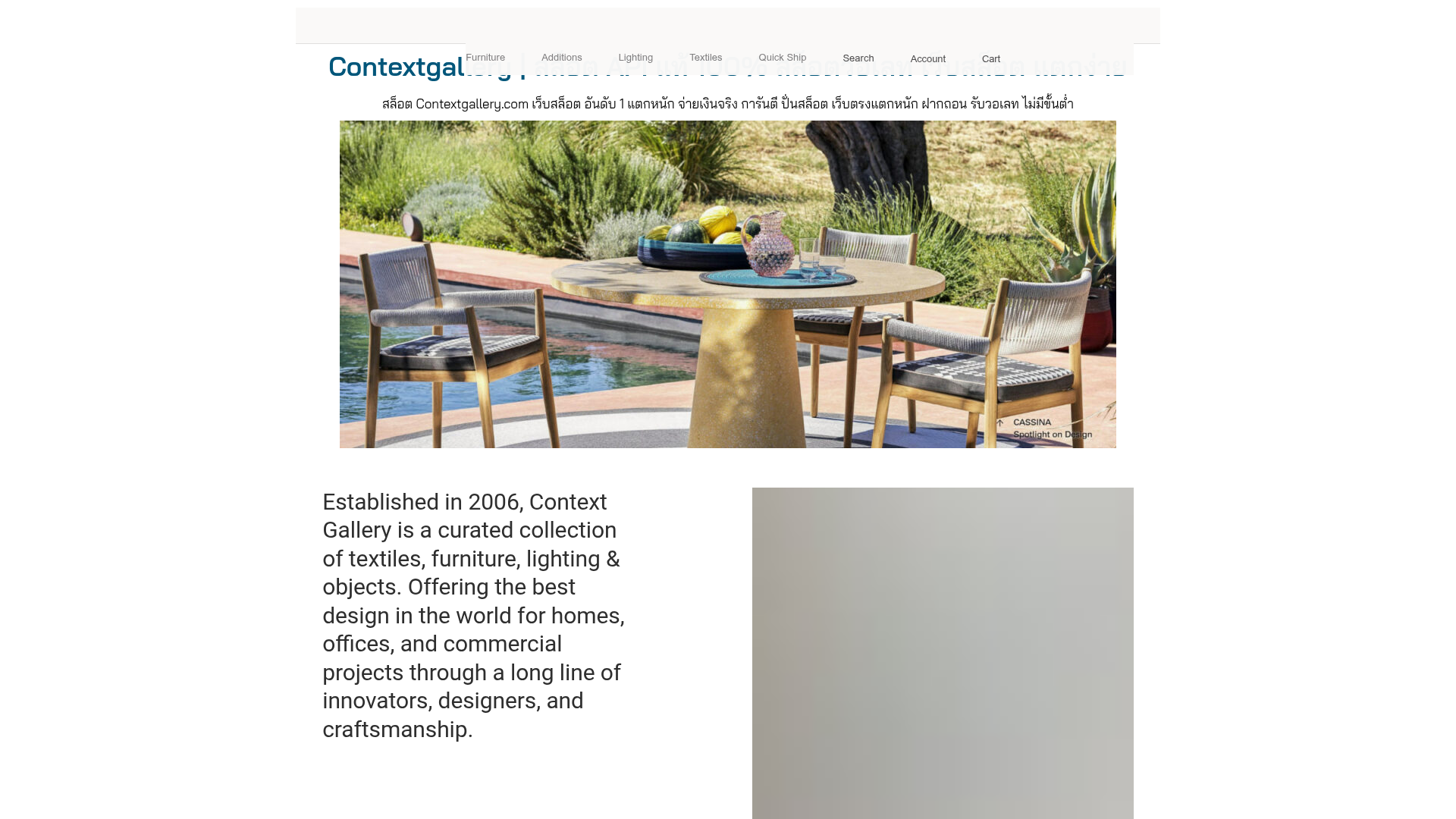
Context Gallery High-End Furniture Landing Page
A minimal editorial layout featuring a multi-column product carousel, designer biographies with image-text pairings, and a magazine-style content grid for curated design stories.
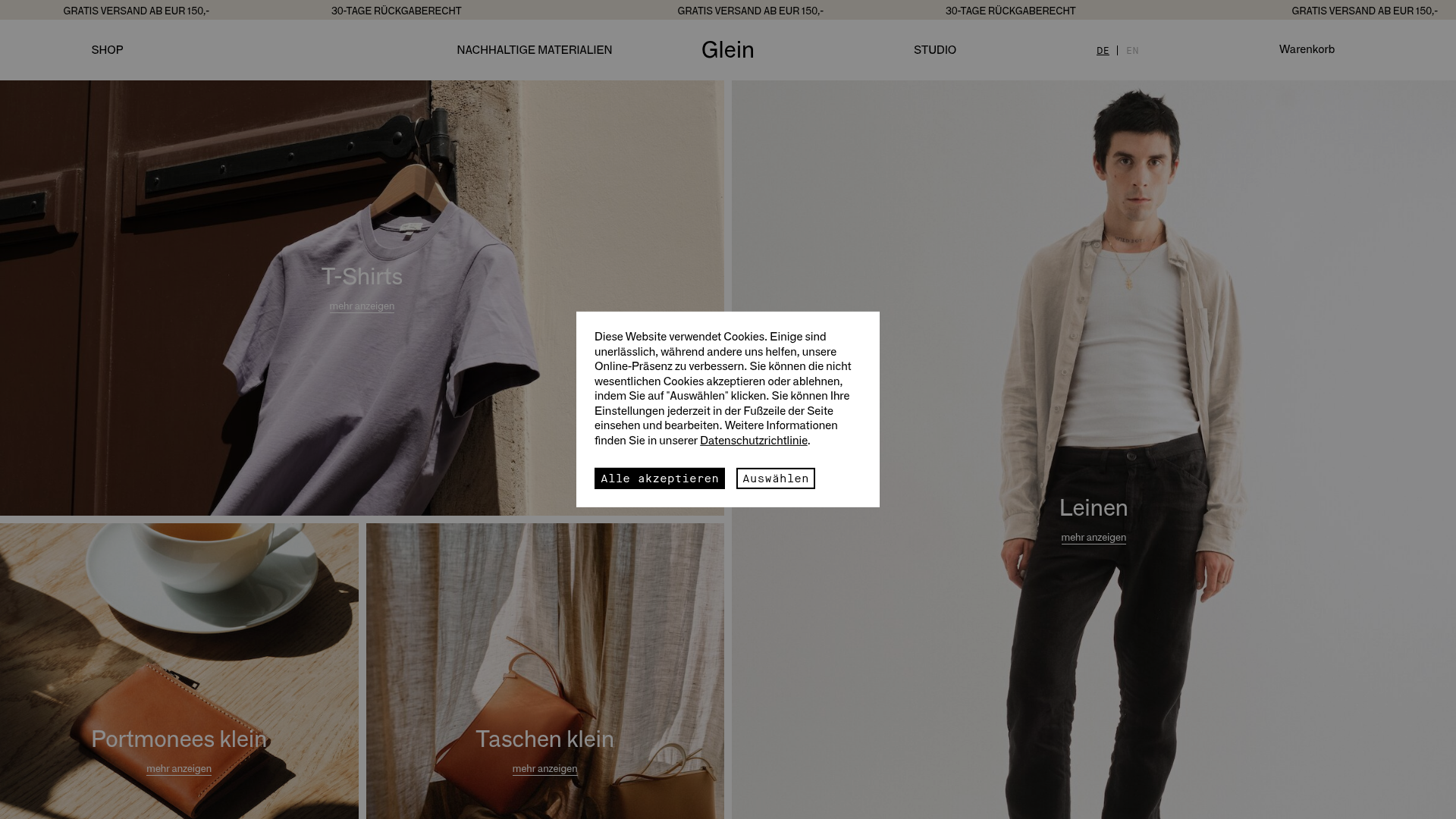
Glein Minimalistic Bento Grid eCommerce
A clean, modular layout using a bento-style responsive grid of text teasers and large-scale product imagery for lookbooks and collection browsing.
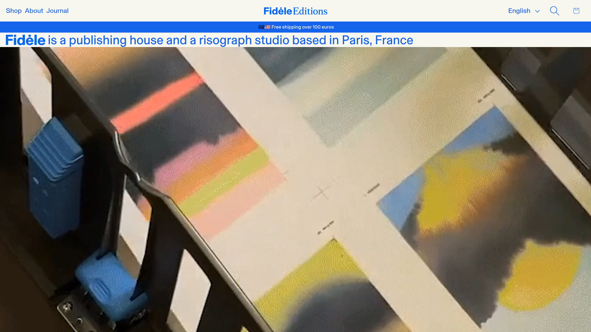
Fidèle Editions Art Studio Store
A minimalist e-commerce layout featuring a high-impact video hero, horizontal product carousels with hover-triggered image swaps, and a clean editorial-style blog section.
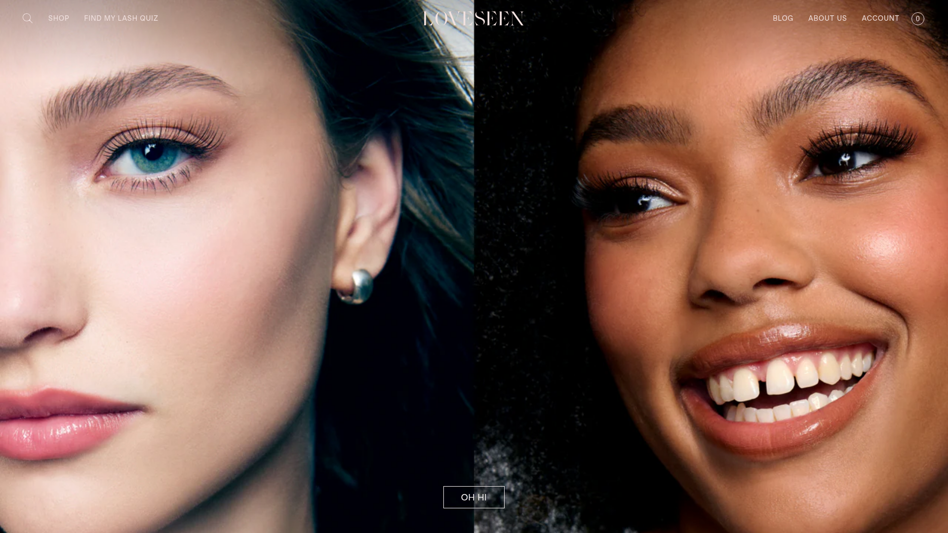
LoveSeen Beauty E-commerce Landing Page
A high-impact beauty retail site featuring a split-screen full-bleed hero image, minimalist navigation, and a horizontally scrolling user-generated content (UGC) Instagram slider.
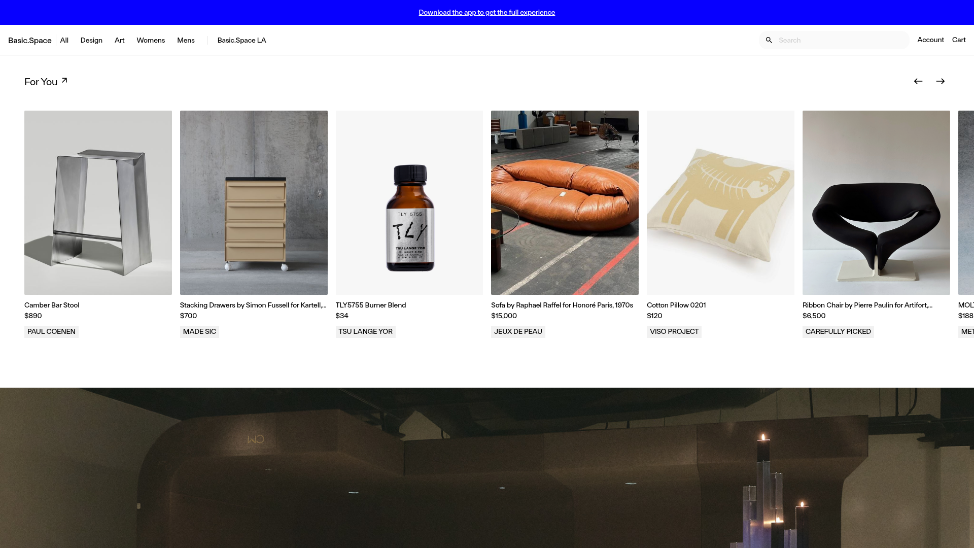
Basic.Space E-commerce Gallery Clone
A minimalist product marketplace featuring a clean sticky navigation bar, nested flyout menus, and a horizontally scrollable product carousel with hover-state image switching.
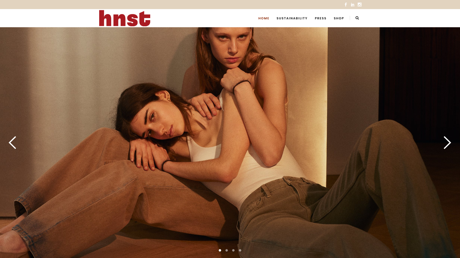
HNST Circular Fashion eCommerce Gallery
A minimalist apparel site featuring a full-screen image slider with parallax effects, grid-based product sections, and a clean typography-focused header for sustainable brand storytelling.
