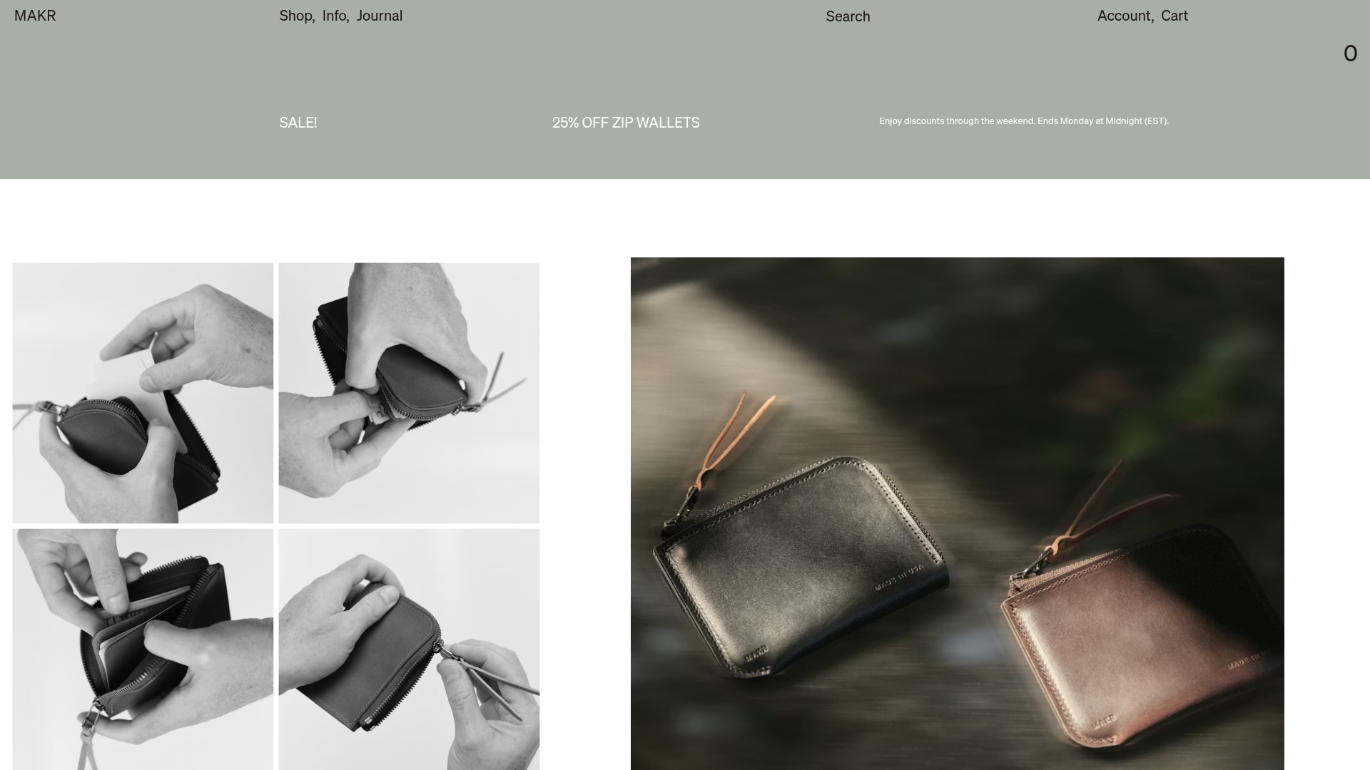
Makr Minimalist Design Goods Store
A clean e-commerce layout featuring an asymmetric image grid, drawer-based navigation categories with hover previews, and a sophisticated minimalist aesthetic.
Overview
Makr is a sophisticated e-commerce site for minimalist leather and canvas goods, focusing on high-end craft and understated aesthetics. It serves as an excellent clone reference for its masterclass in whitespace, innovative navigation drawer system, and a flexible, asymmetrical image-led layout that prioritizes high-quality photography over marketing copy.
Design System
- Color Palette & Visual Hierarchy: The site uses a muted, natural palette. The primary header and notification bar use an earthy sage/grey (
#a6aca4approximately), while the main body is stark white. Hierarchy is established through image scale and generous padding rather than bold colors or large typography. - Typography: Features a clean, utilitarian sans-serif font (similar to Helvetica or Arial) used in all-caps for navigation and headers. The scale is intentionally small relative to the layout, emphasizing the 'minimalist' brand identity.
- Page Structure: The layout follows a modular "content block" approach. It begins with a text-heavy promotional bar, followed by alternating sections: side-by-side asymmetric images (
side-by-side float-right), full-width centered feature images (centered-single), and three-column product carousels (three_images). - Reusable Components:
- Navigation Drawer: A highly reusable pattern where clicking "Shop" or "Info" opens a full-width drawer with a list of categories on the left and a dynamic image hover preview on the right (
desktop-navigation-hover-item). - Image Blocks: Versatile grid containers (
twocol,twopane,onecol) that handle different aspect ratios and offsets. - Subtle Captions: Caption blocks (
caption_offset) that use small text at the bottom or sides of images to maintain a clean look.
- Navigation Drawer: A highly reusable pattern where clicking "Shop" or "Info" opens a full-width drawer with a list of categories on the left and a dynamic image hover preview on the right (
- Interactions: The core interaction is the navigation hover effect, where hovering over category links updates a large preview image in real-time. The site also utilizes the Splide.js library for smooth, touch-responsive carousels on mobile and desktop.
- Responsive Behavior: On mobile, the multi-column grids collapse into a single-column stack. The navigation shifts to a simplified hamburger-style drawer (
mobile-drawer) with full-width link rows.
Use Cases
- Who should clone this: Brands selling premium physical goods (architectural hardware, luxury fashion, artisan furniture) where the visual detail of the product is the primary selling point.
- Effective Remixes: Portfolio sites for photographers or designers can swap product links for case studies while keeping the sophisticated grid. The navigation drawer can be adapted for service-based businesses with many sub-offerings.
- Remix Directions: Swap the muted header color for high-contrast black or vibrant brand colors to drastically change the mood while keeping the layout logic. The "asymmetric" image grid can be regularized into a standard square grid for a more traditional retail feel.
- Clone Scope: The navigation drawer and the
side-by-sideimage block are high-value individual components to clone. For a full-page clone, it is best suited for stores with a small, curated inventory that can support large-scale photography.
Related Inspirations

Context Gallery High-End Furniture Landing Page
A minimal editorial layout featuring a multi-column product carousel, designer biographies with image-text pairings, and a magazine-style content grid for curated design stories.

Glein Minimalistic Bento Grid eCommerce
A clean, modular layout using a bento-style responsive grid of text teasers and large-scale product imagery for lookbooks and collection browsing.

Isla Beauty Skincare E-commerce Store
A clean Shopify-based storefront featuring a split-hero landing page, a step-by-step product system carousel, and a split-screen testimonial section with localized product image sidebars.

Basic.Space E-commerce Gallery Clone
A minimalist product marketplace featuring a clean sticky navigation bar, nested flyout menus, and a horizontally scrollable product carousel with hover-state image switching.

Ashley & Co Lifestyle E-commerce
An elegant Shopify-based storefront featuring a split-screen animated hero, horizontal ticker-tape collection carousel, and dynamic mega-menus with scent-specific color switching and image previews.
Relieve Furniture Sustainable Marketplace Landing Page
A clean sustainability-focused landing page featuring a hero with environmental impact stats, two-column visual category grid, horizontal logo slider, and a testimonial carousel.
