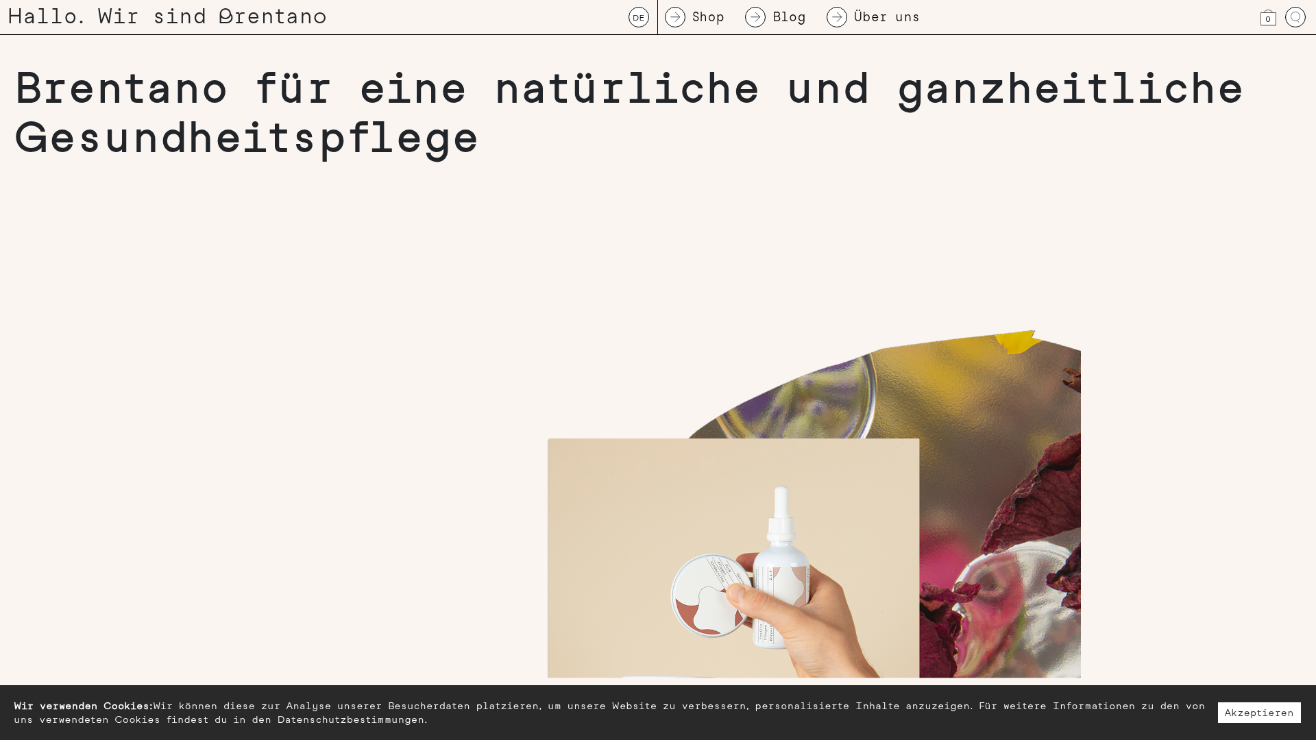
Brentano Natural Healthcare E-commerce Store
A minimalist e-commerce layout featuring a clean typewriter-style aesthetic, unique asymmetrical product imagery, and a grid-based shop component for handmade organic goods.
Overview
Brentano is a sophisticated e-commerce site for natural healthcare products, blending a brutalist aesthetic with high-end editorial layouts. It is a standout clone reference for its bold use of monospaced typography, unconventional image framing, and a minimal color palette that allows organic products to remain the focal point.
Design System
- Color Palette & Visual Hierarchy: The site uses a soft cream/off-white background (#fbf7f2) which softens the starkness of the black text. Contrast is achieved through high-quality photography and a dark gray footer/cookie notice for grounding. Visual hierarchy is driven by massive headline scale rather than color.
- Typography System: A heavy reliance on monospaced, typewriter-style fonts (likely Space Mono or similar) for everything from navigation to headers. Headlines use a large scale (text-xl class) with significant letter-spacing, providing a boutique, handcrafted feel.
- Page Structure & Section Flow: The navigation is a persistent thin header with circle-icon text links. This is followed by a massive H1 hero, an asymmetrical image offset (using Bootstrap-style offset utilities), and a grid-based "Product Related" section showcasing items in a minimal card format.
- Reusable Components:
- Product Cards: A clean container containing a header with a reference number (e.g., 1.1.5), the product name, a square image, and a footer with weight, price, and a simple "Kaufen" button.
- Circular Navigation: Text links paired with SVG arrow-icons inside circles for a geometric look.
- Cookie Consent: A full-width bottom bar that maintains the minimal aesthetic with a high-contrast white button.
- Interaction & Motion: Hover states on product images and the 'Kaufen' (Buy) button provide subtle feedback. The search function is hidden behind an icon and triggers a full-width overlay input.
- Implementation Clues: The HTML reveals a Bootstrap-based grid system (
container-fluid,row,col-12,offset-sm-4) used to create modern, off-center layouts that don't feel like standard templates. The frontend is built using Vue.js (noted bydata-v-appand the#appmount point).
Use Cases
- Who should clone this: Small-batch artisans, organic skincare brands, independent publishers, or boutique design studios wanting a high-end, "anti-design" aesthetic.
- Effective Remixes: Ideal for products that benefit from an "apothecary" or scientific vibe. The numbering system (e.g., "1.1.5 Arnika+ Salbe") is perfect for categorized catalogs or limited editions.
- Practical Directions: Builders should clone the layout grid to learn how to use offsets for asymmetrical editorial looks. Remix the typography by swapping the mono font for a high-contrast serif for a more luxury fashion look, or keep the mono and swap to a vibrant neon color palette for a technical streetwear brand.
- Suggested Clone Scope: A full-page clone is highly recommended to capture the spatial relationship between the oversized typography and the whitespace, which is essential to this design's success.
Related Inspirations

Isla Beauty Skincare E-commerce Store
A clean Shopify-based storefront featuring a split-hero landing page, a step-by-step product system carousel, and a split-screen testimonial section with localized product image sidebars.

Finn Pet Supplements Landing Page
An e-commerce landing page featuring high-contrast typography, a sticky brand logo banner, parallax scroll effects on product headers, and a clean product grid.
Vita Architecture Portfolio Landing Page
A minimalist, high-end architecture portfolio featuring a custom canvas-based image gallery, split-text animations, and a project slider with dynamic image masks.
Graf Lantz Minimalist E-commerce 404
A clean Shopify-based error page featuring a full-width video hero with a CTA button, a detailed multi-column footer, and a sophisticated slide-out cart drawer.
Platform Art E-commerce Gallery Page
A minimalist art marketplace featuring a full-bleed image hero, horizontal scroll product carousels with countdown timers, and hover-triggered image swaps.
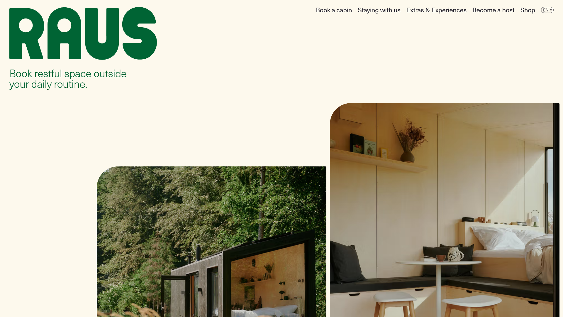
Raus Booking Site with Asymmetric Layout
A nature-focused landing page featuring a floating booking widget, stylized image masks, and an asymmetric animated gallery for showcasing cabin experiences.
