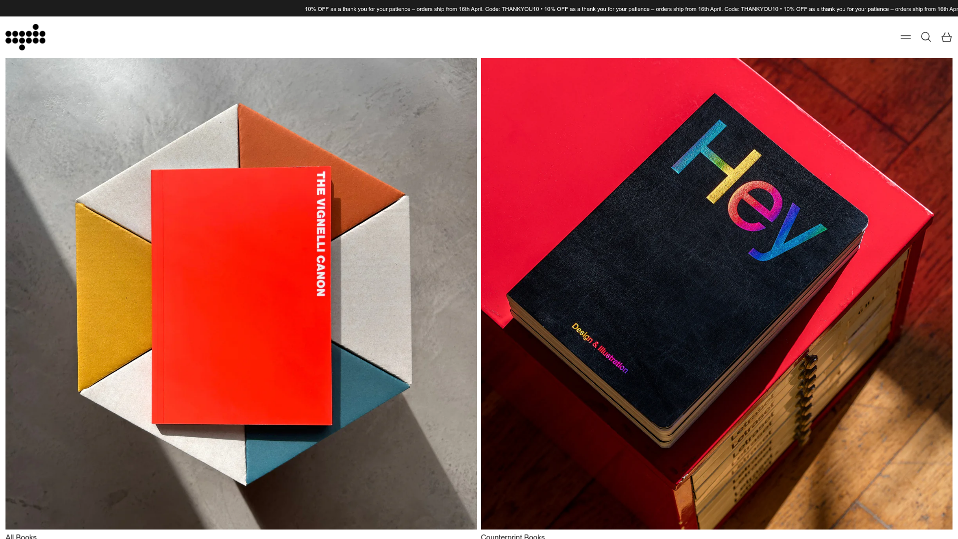
Counter-Print Minimalist Design Storefront
A high-impact typography and grid-driven layout featuring a masonry collection list, animated marquee announcement bar, and clean product tiles for a content-focused aesthetic.
Overview
This storefront is a premier example of a minimalist, content-first e-commerce layout that prioritizes high-quality imagery and a rigid grid architecture. It effectively balances large-scale masonry discovery with dense, product-focused utility, making it a powerful reference for brands that want to position products as collectible objects or curated art.
Design System
- Color Palette & Visual Hierarchy: The site uses a high-contrast 'Monochrome Plus' scheme. The background is a clean off-white/grey (
scheme2), while the typography and borders utilize a deep black for maximum legibility. Color is reserved entirely for product photography, allowing the vibrant book covers to pop against the neutral container. - Typography System: The brand uses a sophisticated Serif/Sans-Serif pairing. Bold, high-weight headings define section boundaries (e.g., "All Books"), while a utilitarian mono-spaced or clean sans-serif is used for secondary data like pricing (£20.00 GBP) and dates in the news feed.
- Page Structure & Flow: The layout starts with an animated marquee announcement bar, followed by a large-scale Masonry collection list (
ThemeModule_MasonryLayout) for visual impact. This flows into high-density 6-column product grids for browsing, interspersed with full-width typographic feature text and 4-column blog galleries. - Reusable Components:
- Animated Marquee: A CSS/JS-driven infinite loop for site-wide alerts.
- Product Tiles (
ThemeTile): Clean, border-less cards with a subtle hover-scale effect (scale-100 group-hover:scale-103) and distinct "Sold Out" badges. - Masonry List: Irregular grid blocks that break the standard row pattern to create visual interest.
- Inline Newsletter: A simple, high-contrast horizontal form with a standard label-less input and action button.
- Interactions & Implementation: The site is built on Shopify, utilizing Tailwind CSS for utility-first styling and Alpine.js (
x-data) for state management (modals, search drawers, and tiles). Hover states are functional rather than decorative, focusing on image scaling and text clarity.
Use Cases
- Who should clone this: Independent publishers, boutique furniture designers, fashion ateliers, or digital asset creators who rely on strong visual presentation.
- Effective Remixes: Swap the monochrome background for a brand-specific muted tone (e.g., sage or clay) to soften the aesthetic while keeping the grid. The product tiles are highly adaptable for anything from physical goods to portfolio case studies.
- Practical Directions:
- Quick Clone: Reuse the Animated Marquee and the 6-column Product Grid for a high-density homepage.
- Full Clone: Replicate the transition from masonry hero sections to dense catalog grids to create a storytelling-to-shopping user journey.
- Scope: The product card component (
ThemeTile) is the most valuable individual asset for its clean handling of status badges, pricing, and responsive image scaling.
Related Inspirations

Context Gallery High-End Furniture Landing Page
A minimal editorial layout featuring a multi-column product carousel, designer biographies with image-text pairings, and a magazine-style content grid for curated design stories.

Glein Minimalistic Bento Grid eCommerce
A clean, modular layout using a bento-style responsive grid of text teasers and large-scale product imagery for lookbooks and collection browsing.

Basic.Space E-commerce Gallery Clone
A minimalist product marketplace featuring a clean sticky navigation bar, nested flyout menus, and a horizontally scrollable product carousel with hover-state image switching.

Ashley & Co Lifestyle E-commerce
An elegant Shopify-based storefront featuring a split-screen animated hero, horizontal ticker-tape collection carousel, and dynamic mega-menus with scent-specific color switching and image previews.
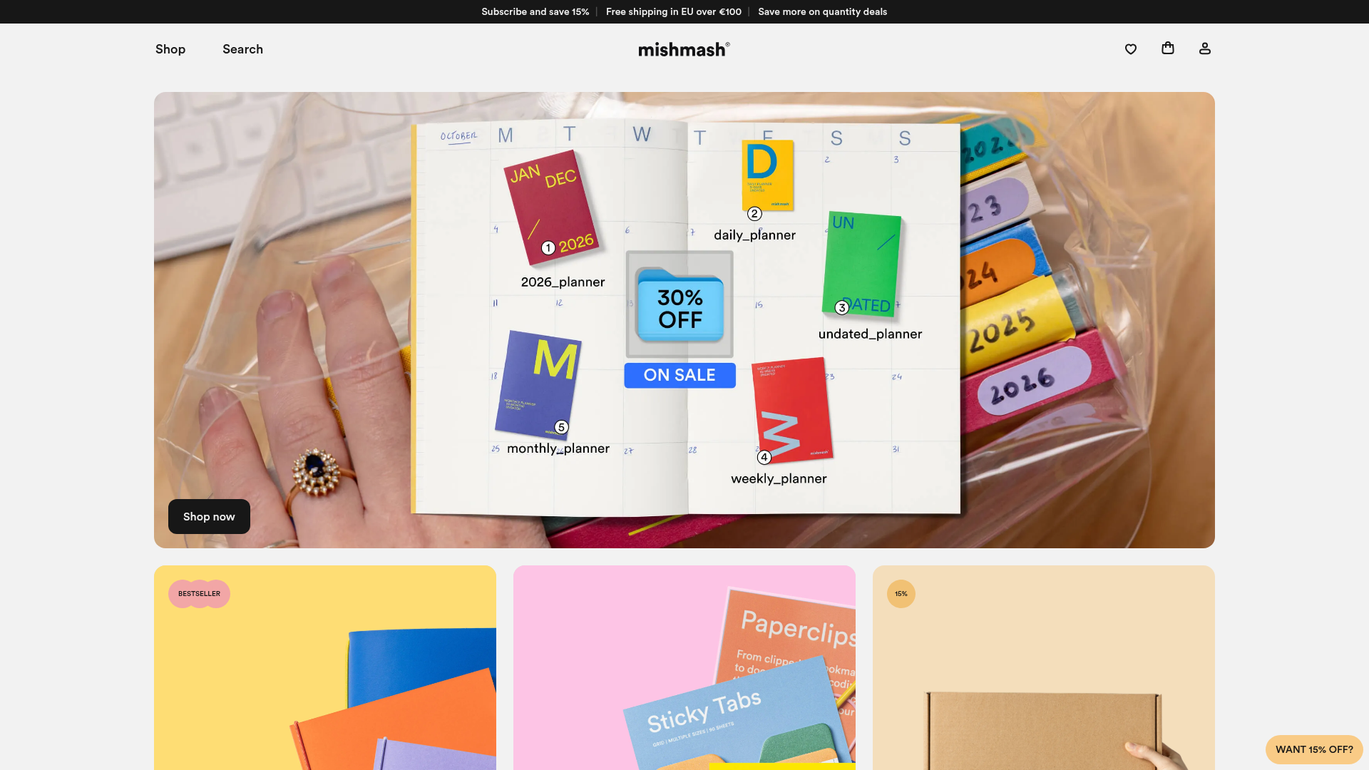
Mishmash Stationery E-commerce Layout
A clean retail template featuring rounded image grids, a multi-column comparison section with custom iconography, and a responsive products carousel.
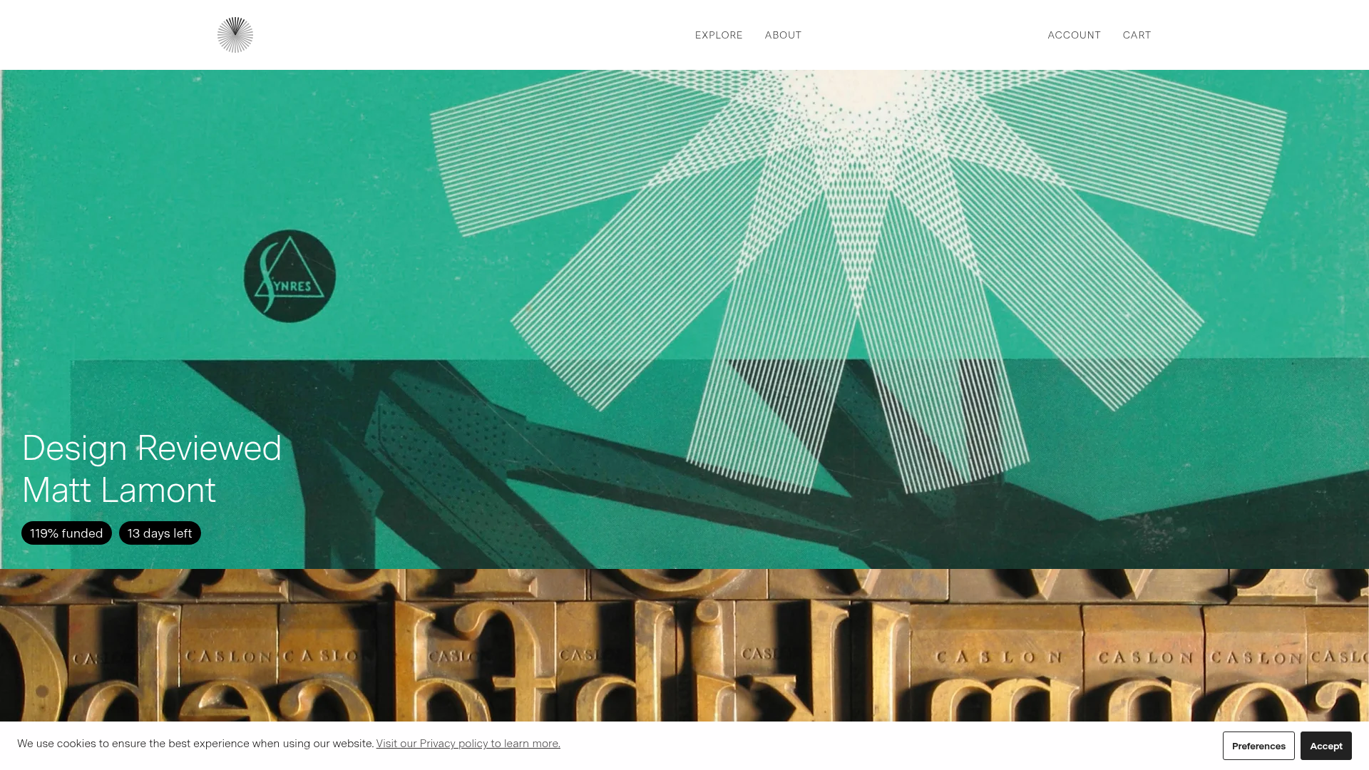
Volume Crowdfunding Book Gallery
A minimalist editorial storefront featuring full-width high-resolution image cards, status pills for campaign progress, and a clean typography-focused navigation layout.
