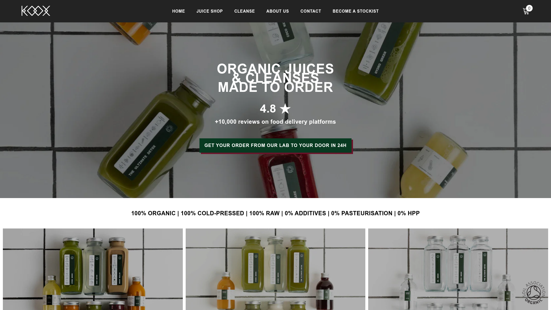
Koox Juice E-commerce Store
A clean Shopify-based health food storefront featuring a full-width video/image hero, organized product grids for cleanses, and high-contrast typography for brand clarity.
Overview
Koox Juice is a sophisticated Shopify e-commerce storefront for a health-focused brand, emphasizing high-fidelity product imagery and minimalist UI. It serves as an excellent clone reference for direct-to-consumer (DTC) brands that need to balance luxury product presentation with clear, trust-building certifications and data.
Design System
- Color Palette & Visual Hierarchy: The site uses a high-contrast dark green (
#083a21) and black (#000000) primary palette against a clean white background. Hierarchy is established through dense, large-scale white text overlays on photography and thick call-to-action buttons to ensure clarity against busy backgrounds. - Typography system: The system relies on a bold, geometric sans-serif (900 weight for logos, 700 for headings). It uses all-caps styling for prominent headings and sub-headings to create an authoritative, premium feel. Values like "4.8 ★" are emphasized with increased font weight to anchor trust sections.
- Page Structure & Section Flow:
- Hero: Full-width lifestyle image with centralized text and a high-contrast button.
- Trust/Value Bar: Horizontal list of product attributes (100% Organic, etc.) separating the hero from products.
- Visual Nav: Large, image-heavy spotlight boxes for main categories (Cleanses, Juice Box).
- Product Grids: Standard 4-column product layout with consistent shadow-less cards.
- Social Proof Blocks: Simple centered sections for ratings and review quotes.
- Reusable Components:
- Sticky Header: A transparent-to-solid transition header with an integrated cart bubble.
- Primary Button: A large, green rectangular button with sharp corners and subtle hover effects.
- Product Cards: Minimalist card design focusing on title and price without excess clutter.
- Iconography Blocks: Simplified SVG-style icons paired with bold labels (Why Koox section).
- Interaction & Motion: The site utilizes Shopify's "scroll-trigger" animations (classes like
animate--slide-inandanimate--fade-in) to reveal content as the user scrolls, creating a smooth, premium feel. - Mobile Behavior: The navigation collapses into a dedicated mobile hamburger menu with specific icon weights. The product grid switches from 4 columns to a stacked or fluid layout to maintain readability of titles.
- Implementation Clues: Built on Shopify (Liquid), using CSS variables for theme-wide consistency (
--logo_font_weight,--button_bg). The presence ofhalo-blockclasses suggests the use of a high-end pre-built theme framework designed for customization.
Use Cases
- Who should clone this pattern: Developers building storefronts for premium health, wellness, beauty, или luxury food products that rely on glass-bottled aesthetics or "made-to-order" services.
- Effective Remixes: This pattern effectively handles high-SKU inventories that need a "boutique" feel. It can be adapted for artisanal coffee roasters, skincare lines, or farm-to-table delivery services.
- Practical Remix Directions:
- Brand Swap: Replace the dark green with a bright pastel for a softer beauty look while keeping the high-contrast bold text.
- Information Architecture: Adapt the horizontal trust bar (100% Organic...) to highlight shipping speeds or regional sourcing data.
- Section Splice: Use only the "Why KOOX" icon grid and the centered rating block for an existing landing page that needs better social proof presentation.
- Suggested Clone Scope: High value in cloning the full-page layout to understand the pacing between lifestyle imagery and product data. A quick section clone of the visual category navigation (Spotlight blocks) is recommended for brands with 3-5 distinct product tracks.
Related Inspirations
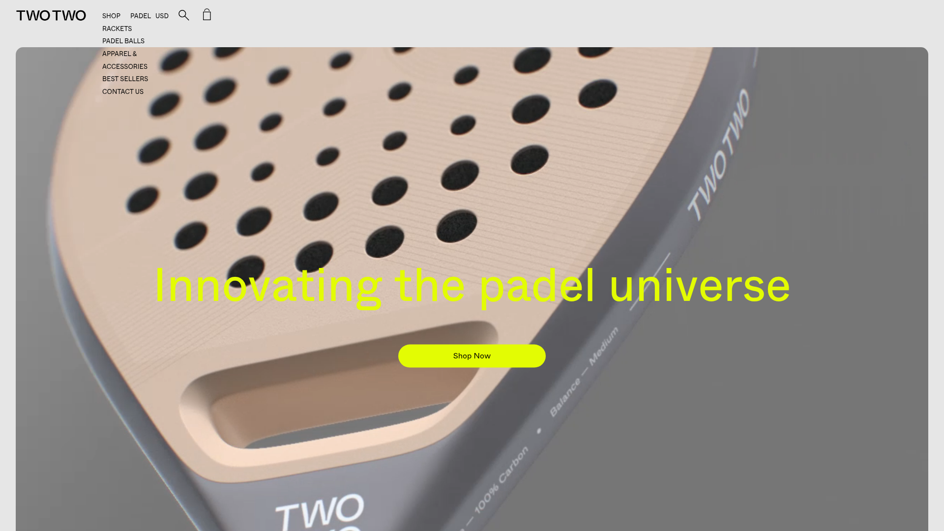
TWOTWO Padel Equipment Storefront
An e-commerce landing page featuring a full-bleed video hero, rounded product grid cards with hover states, an auto-scrolling logo ticker, and a bespoke social media image marquee.
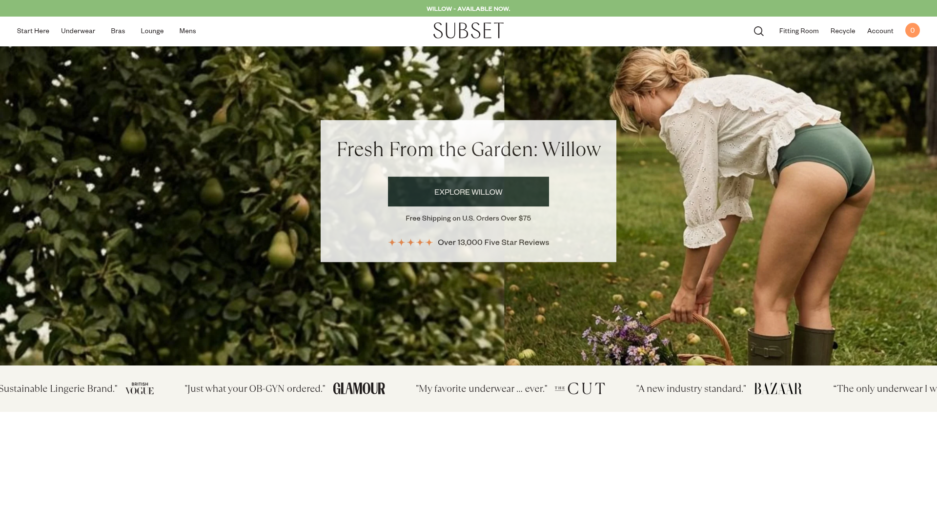
Subset Organic Apparel E-commerce Store
A clean Shopify layout featuring a full-width image hero, a brand ticker for social proof, and product grids with hover-activated alternate images and color swatches.

Context Gallery High-End Furniture Landing Page
A minimal editorial layout featuring a multi-column product carousel, designer biographies with image-text pairings, and a magazine-style content grid for curated design stories.

Glein Minimalistic Bento Grid eCommerce
A clean, modular layout using a bento-style responsive grid of text teasers and large-scale product imagery for lookbooks and collection browsing.

Isla Beauty Skincare E-commerce Store
A clean Shopify-based storefront featuring a split-hero landing page, a step-by-step product system carousel, and a split-screen testimonial section with localized product image sidebars.

Stojo Collapsible E-commerce Storefront
A Shopify layout featuring a prominent discount modal, mosaic grid hero sections, and clean product cards with integrated color swatches and quick-buy functionality.
