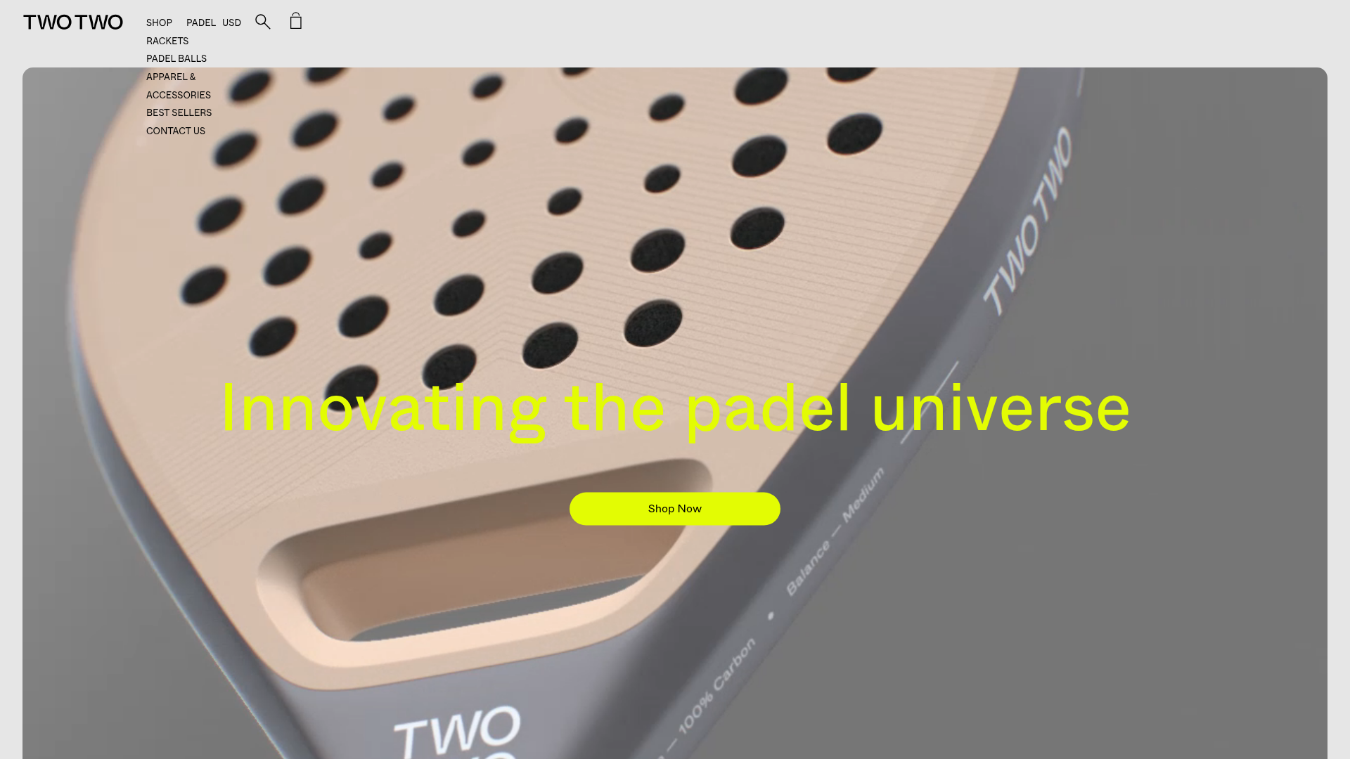
TWOTWO Padel Equipment Storefront
An e-commerce landing page featuring a full-bleed video hero, rounded product grid cards with hover states, an auto-scrolling logo ticker, and a bespoke social media image marquee.
Overview
This storefront is a high-end e-commerce landing page for the padel brand TWOTWO, characterized by a minimalist, "sport-fashion" aesthetic. It successfully combines high-performance product photography with a bold typography-driven layout, making it an excellent reference for brands seeking a premium, lifestyle-oriented digital atmosphere.
Design System
- Color Palette & Visual Hierarchy: The site uses a high-contrast Foundation of deep greys (e.g.,
#333) and off-whites, punctuated by a signature high-visibility neon yellow (#E1FF20) for primary calls to action and focal text. This creates a "sporty yet luxury" vibe. - Typography System: The system relies on a clean, wide sans-serif. Large-scale headings (e.g., "Innovating the padel universe") are used for impact, while secondary tactical information and product titles use a smaller, highly legible weight in sentence case.
- Page Structure & Flow: The layout follows a classic high-conversion flow: a full-bleed video hero section, followed by a product category title, a focused product grid, a scrolling third-party validation (press) ticker, further product grids, and a social proof marquee before the newsletter capture.
- Reusable Components:
- Hero Video Player: A 100% width/height container with
border-radius: 15pxandobject-fit: coverto house atmospheric looping video. - Product Cards: Rounded image containers with a 150% aspect ratio (
padding-top: 150%) that feature a distinct image-swap hover state. - Interactive Marquee: A bespoke social media image ticker (
.marquee-content) designed for rapid visual browsing of lifestyle content. - Sticky Header: A minimal top nav that pushes secondary links (like currency and search) into a hidden drawer/sidebar architecture.
- Hero Video Player: A 100% width/height container with
- Interaction & Motion: The site uses the
Slickslider for press testimonials and Glider.js for mobile scrolling grids. Hover states on product cards reveal secondary "lifestyle" shots or functional SVG icons. - Implementation Clues: The HTML identifies this as a Shopify-based site (
shopify-sectiontags), utilizinglazyloadfor responsive imagery and a side-drawer navigation pattern (NavDrawer) for a cleaner desktop view.
Use Cases
- Who should clone this: Boutique athletic brands, premium hardware manufacturers, or fashion labels that want a video-first immersive experience without heavy UI clutter.
- Effective Remixes: High-end skincare or tech gadget brands could easily swap the neon accents for softer or more clinical palettes while maintaining the rounded card structure.
- Remix Directions: Adapt the "Press Slider" for customer testimonials or replace the "Social Athletics" marquee with a "User Generated Content" section for different industries.
- Clone Scope: A quick section clone of the "Press Ticker" or the "Social Marquee" is highly valuable for adding social proof to any landing page, while a full-page clone is best for those launching a limited 3-10 product inventory.
Related Inspirations
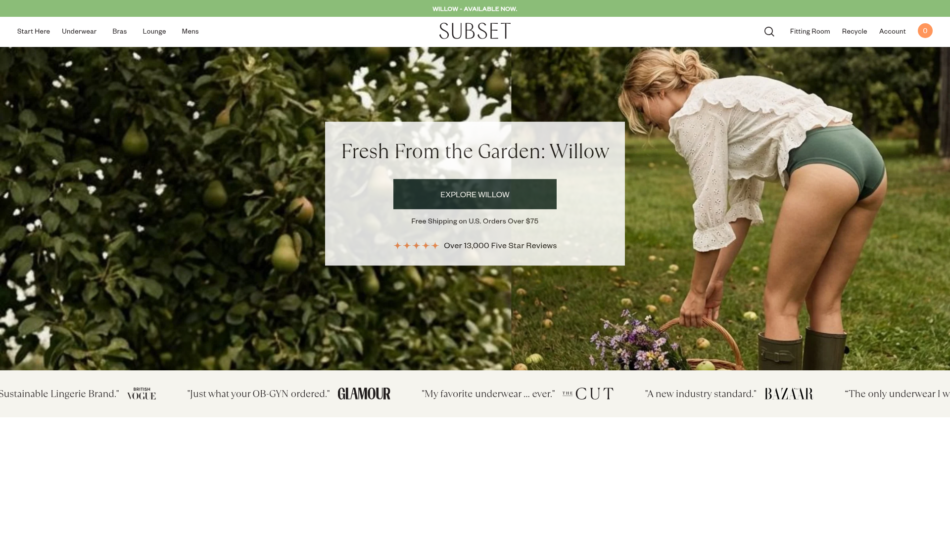
Subset Organic Apparel E-commerce Store
A clean Shopify layout featuring a full-width image hero, a brand ticker for social proof, and product grids with hover-activated alternate images and color swatches.
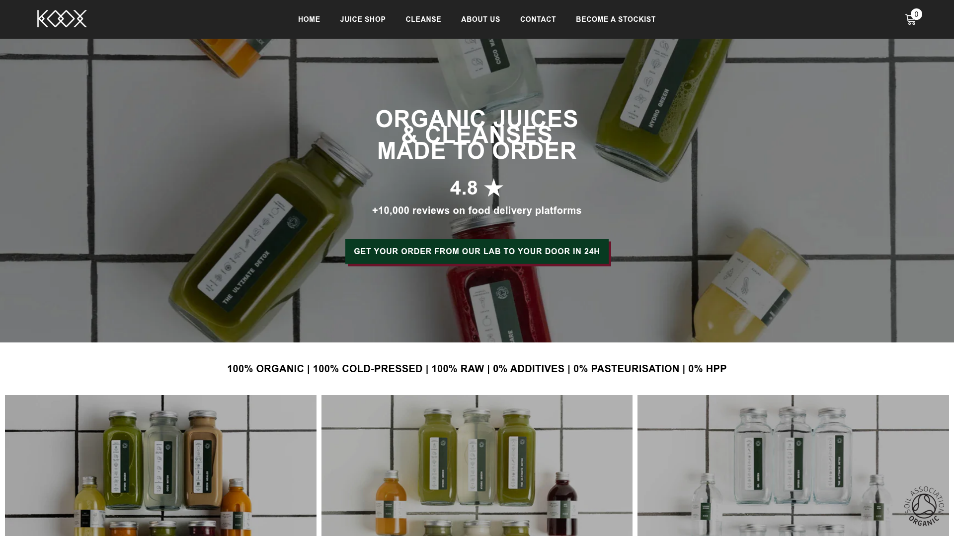
Koox Juice E-commerce Store
A clean Shopify-based health food storefront featuring a full-width video/image hero, organized product grids for cleanses, and high-contrast typography for brand clarity.

Context Gallery High-End Furniture Landing Page
A minimal editorial layout featuring a multi-column product carousel, designer biographies with image-text pairings, and a magazine-style content grid for curated design stories.

Glein Minimalistic Bento Grid eCommerce
A clean, modular layout using a bento-style responsive grid of text teasers and large-scale product imagery for lookbooks and collection browsing.

Isla Beauty Skincare E-commerce Store
A clean Shopify-based storefront featuring a split-hero landing page, a step-by-step product system carousel, and a split-screen testimonial section with localized product image sidebars.

Stojo Collapsible E-commerce Storefront
A Shopify layout featuring a prominent discount modal, mosaic grid hero sections, and clean product cards with integrated color swatches and quick-buy functionality.
