Joséphine Löchen Minimal Portfolio Gallery
A minimalist photography portfolio featuring a full-screen image slider, synchronized thumbnail navigation, and a structured multi-column about/contact section using Swiss-inspired typography.

Overview
This minimalist photography portfolio is a masterclass in high-end, Swiss-style editorial design. It utilizes a dual-slider system where a full-screen image gallery is synchronized with a bottom-docked thumbnail navigation bar, allowing for seamless visual exploration. It serves as an excellent reference for builders looking to create image-centric portfolios where content takes precedence over complex navigation.
Design System
- Color Palette & Visual Hierarchy: The site uses a monochrome aesthetic, primarily pure white backgrounds with black text and subtle gray accents (
class="gray") for metadata. The visual hierarchy is extremely flat, relying on scale and the images themselves to guide the eye. - Typography: The system uses SwissRail (a custom neo-grotesque like Helvetica), prioritizing legibility and a mid-century modern feel. Headers like
[ Contact ]and[ Print ]are wrapped in square brackets, a common editorial trope to denote categories. - Page Structure:
- Fixed Header: Minimal project title and "Information" link.
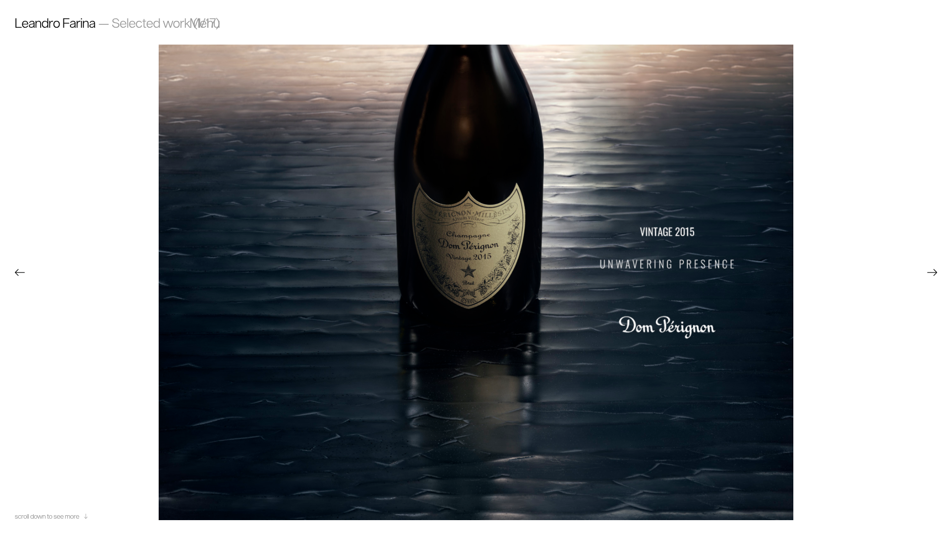
- Main Canvas: A prominent, responsive image slider occupying the majority of the viewport.
- Thumbnail Navigation: A horizontal micro-gallery at the bottom featuring project titles and index numbers (e.g., "01/08").
- Hidden/Overlay Sections: An "About" section structured into a four-column grid (Description, Contact, Infos, Credits).
- Reusable Components: The
flickity-sliderimplementation for both the main view and the thumbnails is highly reusable for any media gallery. The multi-column.about--wrapperdemonstrates a clean way to organize professional credits and client lists. - Interaction & Motion: The site uses the Flickity library for smooth, touch-responsive sliding. Images use lazy loading (
class="lazyloaded") with SVG placeholders to ensure fast initial page weight. A unique "placeholder" div maintains aspect ratios during load. - Implementation Clues: The HTML reveals a custom-built environment (HTTB.EU) using
g-componentattributes, suggesting a modular JavaScript architecture. It usesdata-ratioanddata-orientationattributes to dynamically adjust image containers to portrait or landscape orientations.
Use Cases
- Who should clone this: Photographers, fashion designers, and architects needing a high-impact, low-friction showcase.
- Remix directions:
- E-commerce: Adapt the main slider for product hero sections and the thumbnail bar for variant selection.
- Brand Agency: Swap the white background for a dark mode or brand-specific color while maintaining the strict 4-column info footer.
- Minimalist Blog: Reuse the slider logic for featured stories, turning the thumbnails into post previews.
- Suggested Scope: A full-page clone is best to capture the synchronized slider behavior, which is the site's most distinctive UX feature.
Related Inspirations
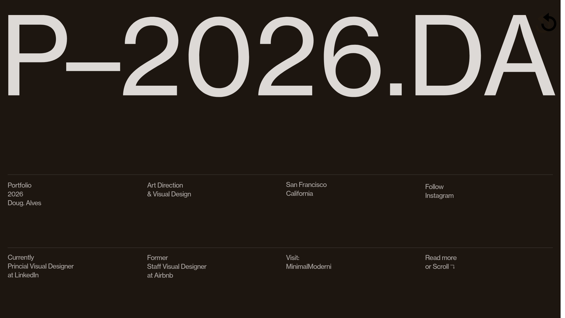
Doug Alves Visual Design Portfolio
A minimalist, high-contrast design portfolio featuring oversized typography, a sticky four-column grid footer, and a vertical scroll-triggered slide-show for project showcases.
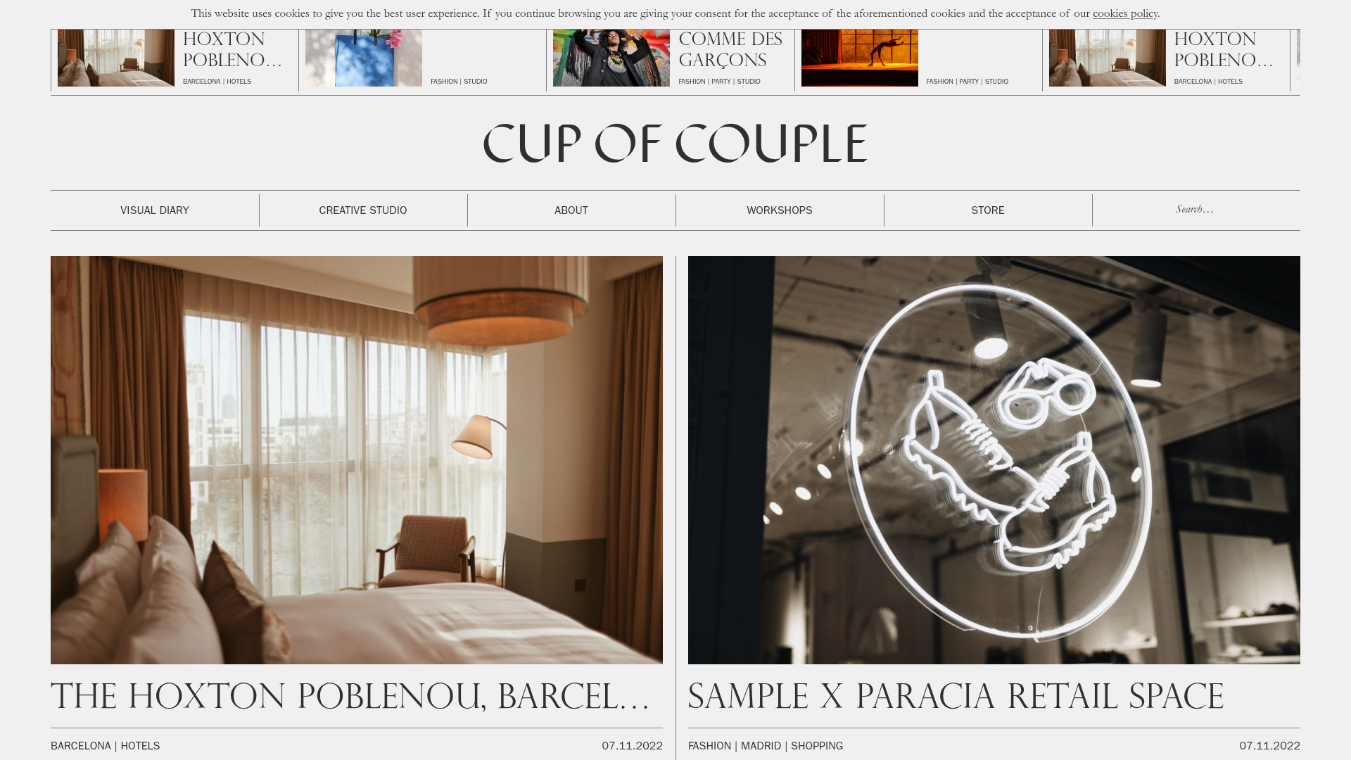
Cup of Couple Editorial Portfolio
A high-fashion editorial layout featuring a sticky compartmentalized header, a horizontal marquee carousel, and a mixed-width masonry grid with marquee typography effects.
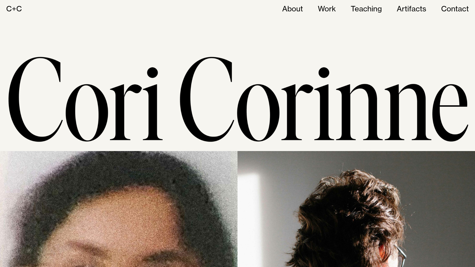
Cori Corinne Minimalist Portfolio Home
A clean, typography-focused layout featuring a massive serif hero header, two-column image grid, and text-based navigation for a high-end editorial feel.
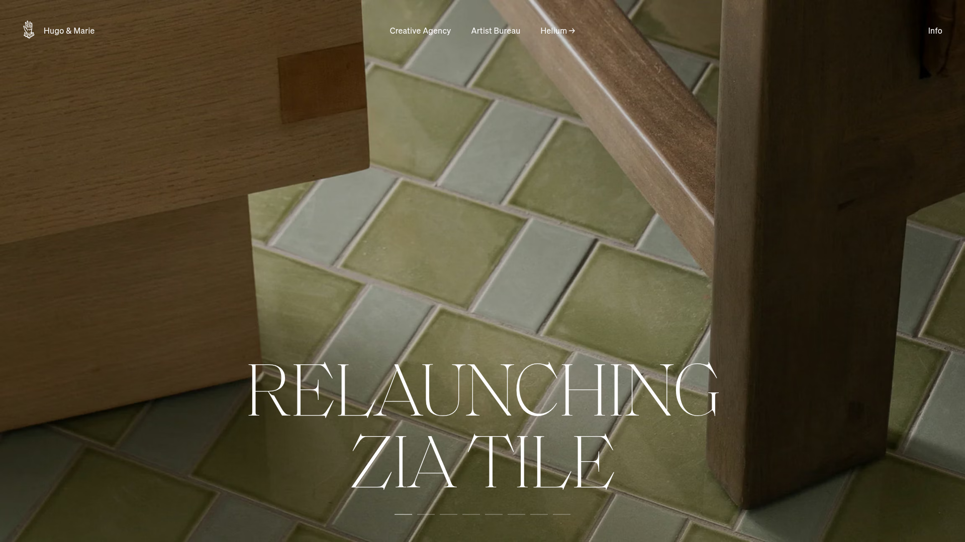
Hugo & Marie Agency Landing Page
Features a full-screen auto-playing media carousel with elegant serif typography overlays and a cleanly structured three-column services layout.
Leandro Farina Portfolio Gallery
A minimalist photography portfolio featuring a full-width Slick slider hero and a responsive image grid with hover-triggered captions and category tags.

Xandra Alvarez Allende Photography Portfolio
A minimalist photography site featuring a marquee-style title bar, a staggered vertical image flow, and a full-screen light-box gallery for individual works.
