Marylou Faure Illustration Portfolio
A minimalist Shopify-based portfolio featuring a grid-based project layout, sticky navigation, a client logo marquee, and image-rich project carousels.
Overview
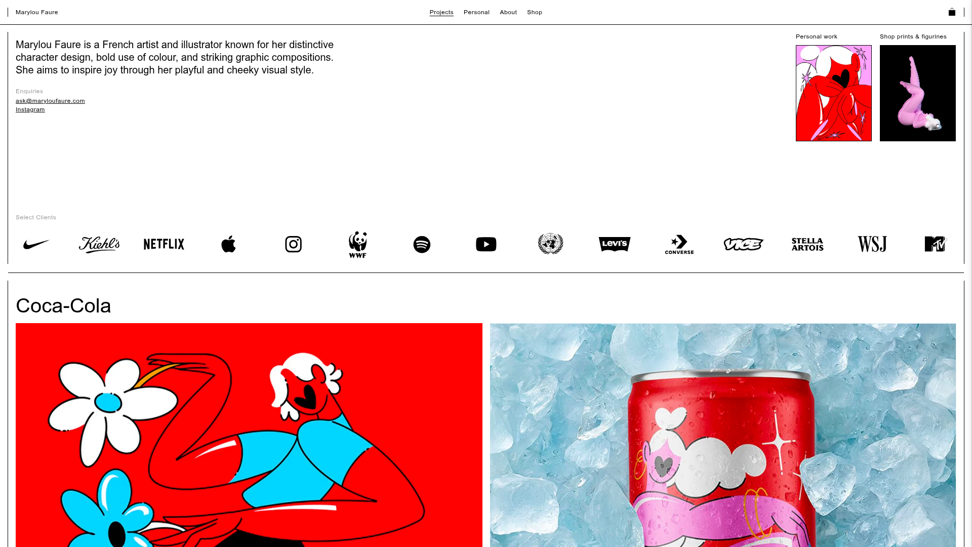
This website is the professional portfolio and shop for illustrator Marylou Faure, utilizing a minimalist Shopify-based architecture. It serves as an excellent reference for creatives because it balances high-density visual content with a clean, low-chroma interface that allows the artwork to remain the focal point. Builders should look to this for its seamless integration of brand storytelling, a client social-proof marquee, and a high-performance image grid.
Design System
- Color Palette & Visual Hierarchy: The UI uses a strict monochrome foundation (black text on white backgrounds) with thin black borders (
layout-borders). Color is introduced dynamically via individual project backgrounds (e.g.,rgb(255, 0, 0)for Coca-Cola orrgb(114, 194, 242)for Kiehl's), which are defined as inline styles on image containers to match the artwork. - Typography System: A clean, grotesque sans-serif is used throughout. Hierarchy is established through size and bold weights: H1 for the intro bio (approx. 24-32px), H2 for project titles, and lowercase labels for sub-navigation and metadata (e.g., "Enquiries").
- Page Structure: The flow begins with a two-column introductory hero (text left, featured work right), followed by a horizontal "Select Clients" logo marquee. The remainder of the page is a vertical stack of project sections, each containing a title and a multi-column grid of visuals.
- Reusable Components:
- Project Grid: A flexible
span-6grid system that adjusts based on image aspect ratio. - Sticky Header: A minimal top nav that remains fixed while the user scrolls.
- Client Marquee: A simple horizontal flex container for SVG logos.
- Modal Carousel: The HTML reveals
all-carousel-slidesandwork-carousel-wrapdivs, indicating that thumbnails trigger a full-screen detailed view with "Prev/Next" controls.
- Project Grid: A flexible
- Interaction Patterns: The site uses lazy-loading for images and videos. Image containers feature a
work-image-heightclass that applies a background color while assets load, preventing layout shift and maintaining the color-blocked aesthetic. - Implementation Clues: Built on Shopify with custom liquid sections (
shopify-section). It utilizes standard layout utilities (likespan-6for grid columns) and a custom carousel script for project deep-dives.
Use Cases
- Who should clone this: Independent artists, illustrators, and graphic designers who want a site that functions both as a portfolio and an e-commerce storefront without the "clunky" look of standard Shopify themes.
- Remix Directions:
- Architecture: Swap the artist bio for a studio mission statement.
- E-commerce: Repurpose the "Shop prints" sidebar block as a "Book a Consultation" or "Current Availability" status indicator.
- Logo Marquee: Replace client logos with industry awards or press mentions.
- Suggested Clone Scope: For a quick win, clone the Intro Hero and Client Marquee to add immediate professional credibility to a landing page. For a full build, the project grid system (with its dynamic background colors) is the most valuable architectural element to replicate.
Related Inspirations
Dovetail Venture Portfolio Landing Page
A minimalist investment site featuring a warm pastel palette, distinctive hand-drawn illustrations, horizontal carousel for project cases, and a clean typography-focused grid layout.
Visionnaire E-commerce Streetwear Layout
A clean Shopify-based fashion storefront featuring high-impact image/video split hero sections, a horizontal product carousel with size indicators, and a minimalist full-screen navigation bar.
Santi Jaramillo Design Portfolio Page
A minimalist portfolio layout featuring a large typography-driven hero section with hover-triggered GIFs and an asymmetrical justified grid for project thumbnails.
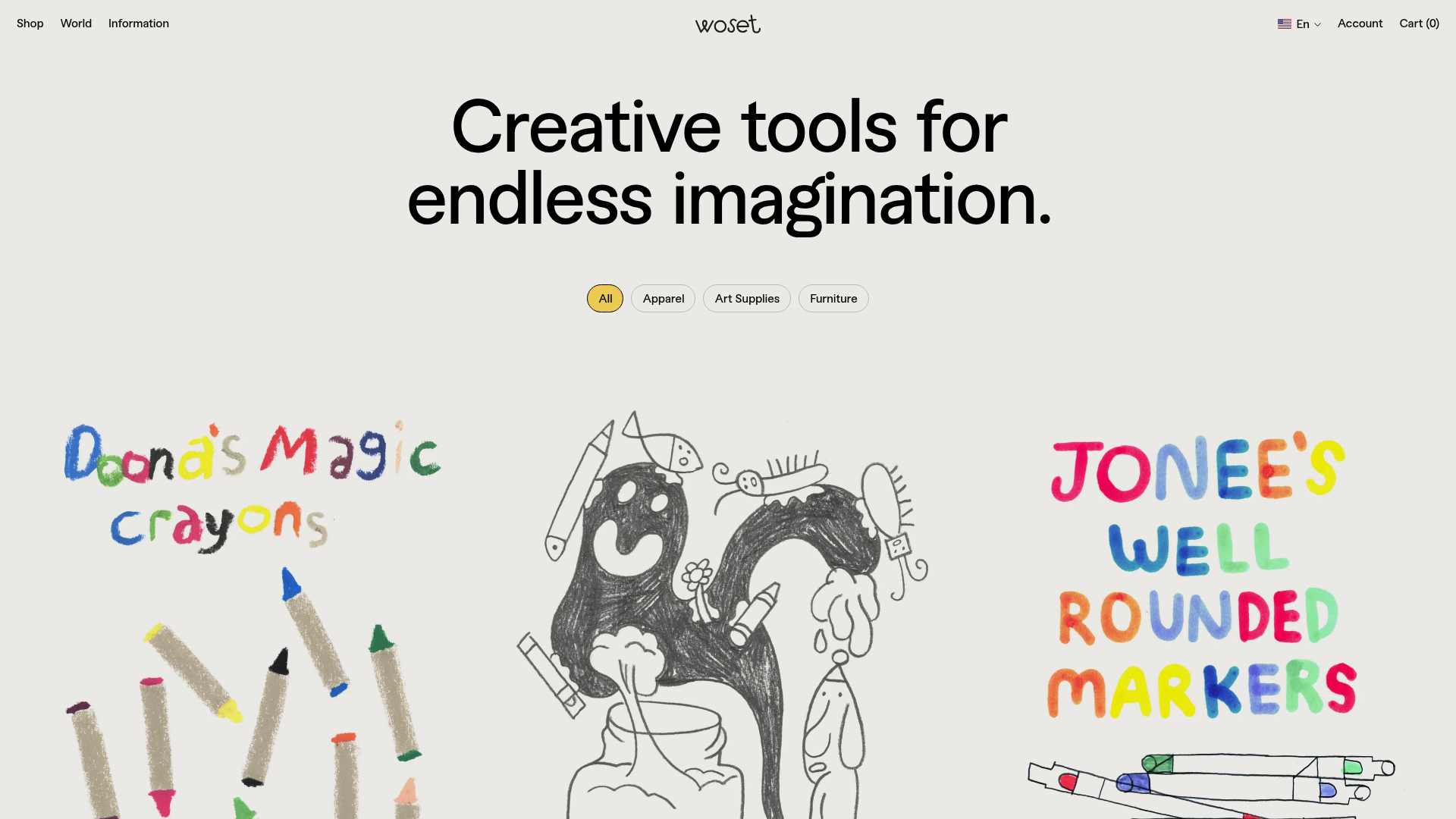
Woset Illustrative E-commerce Product Grid
A whimsical retail layout featuring a hand-drawn aesthetic, high-contrast typography, and a unique animated product filtering system for creative brands.
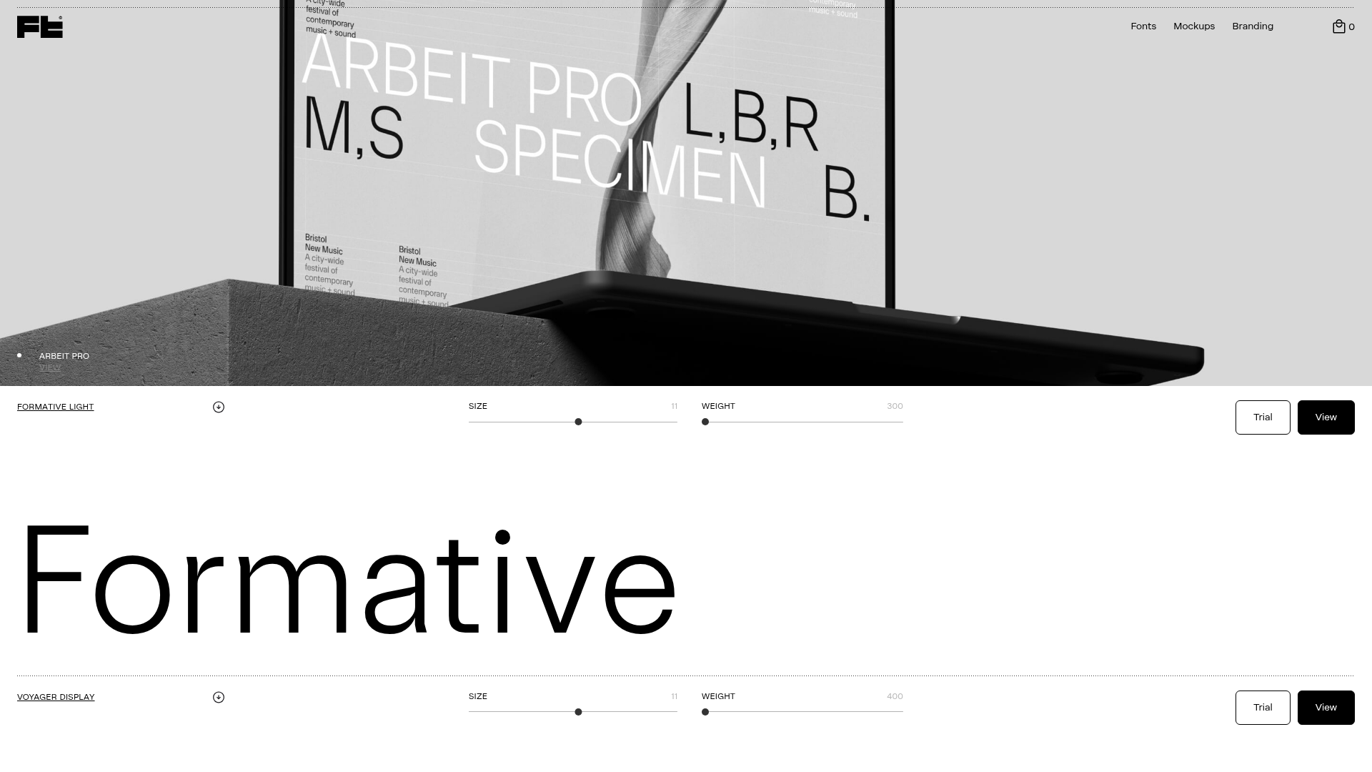
Studio Few Typography Portfolio Gallery
A minimalist font foundry layout featuring interactive type testing sliders, clean grid structures, and variable font customization components.
Studio Lathe Minimalist Portfolio List
A high-contrast, minimalist portfolio layout featuring a dense list-based project index with flexible category labeling and a full-screen yellow background.
