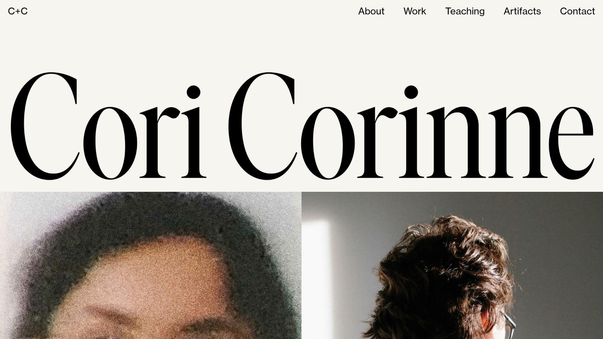
Cori Corinne Minimalist Portfolio Home
A clean, typography-focused layout featuring a massive serif hero header, two-column image grid, and text-based navigation for a high-end editorial feel.
Overview
This minimalist portfolio home by Cori Corinne is an excellent example of high-end editorial web design that prioritizes typography over decorative elements. It utilizes a bold serif hero header and a strict, grid-based image layout to create an atmospheric, professional presence. It is a strong reference for builders who want to communicate a sense of luxury, expertise, and visual elegance through white space and scale.
Design System
- Color Palette & Visual Hierarchy: A muted, off-white background (#f7f7f5 or similar) provides a warmer, more sophisticated feel than pure white. Visual hierarchy is established through extreme scale contrast—the hero text dominates the initial view, followed by large-format photography and finally a small, functional footer.
- Typography System: The site uses a high-contrast serif font (reminiscent of modern variations on Bodoni or Didot) for the main branding and hero header. The navigation and footer utilize a clean sans-serif (e.g., Helvetica or Inter) at a smaller scale to ensure legibility without competing with the display type.
- Page Structure: The layout follows a linear vertical flow: a top navigation bar, followed by a full-width hero image containing the name, a two-column image grid for portfolio highlights, and a four-column footer for social links and copyright.
- Reusable Components: The primary components to clone are the top navigation bar with distributed text links and the fluid two-column image block (data-xl-width="6") which uses a "no-gutter" configuration for seamless edge-to-edge photography.
- Interaction & Motion: The HTML reveals a
revealclass on content blocks and CSS transitions (0.7s ease-out), suggesting subtle fade-in and scale-up animations as the user scrolls into new sections. - Responsive Behavior: The HTML includes
data-column-mode-sm="single", indicating that the two-column image grid collapses into a stacked vertical layout on mobile devices to maintain image impact. - Implementation Clues: Built using the Semplice portfolio framework, the site uses a structured grid system with explicit column widths (e.g.,
data-xl-width="12"anddata-xl-width="3") andfluidlayout attributes for responsive scaling.
Use Cases
- Who should clone this: Creative directors, editorial photographers, high-end fashion brands, and typographers looking for a "gallery-style" digital presence.
- Effective Remixes: This pattern can be remixed for boutique architectural firms or luxury real estate by swapping the hero type with high-resolution site photography and using the grid for project walkthroughs.
- Remix Directions: Replace the off-white background with a dark charcoal and white text for a "dark mode" luxury feel; adapt the four-column footer into a minimalist service list; or use the massive hero header style for a bold blog title.
- Suggested Scope: A full-page clone is most effective to capture the specific spatial relationships between the massive header and the grid, though the two-column fluid image section can be easily extracted for use in existing landing pages.
Related Inspirations
Cup of Couple Editorial Portfolio
A high-fashion editorial layout featuring a sticky compartmentalized header, a horizontal marquee carousel, and a mixed-width masonry grid with marquee typography effects.

Context Gallery High-End Furniture Landing Page
A minimal editorial layout featuring a multi-column product carousel, designer biographies with image-text pairings, and a magazine-style content grid for curated design stories.

Glein Minimalistic Bento Grid eCommerce
A clean, modular layout using a bento-style responsive grid of text teasers and large-scale product imagery for lookbooks and collection browsing.

Basic.Space E-commerce Gallery Clone
A minimalist product marketplace featuring a clean sticky navigation bar, nested flyout menus, and a horizontally scrollable product carousel with hover-state image switching.

Clase Agency Branding Portfolio
A minimalist design agency portfolio featuring a typographic hero section, full-width image articles, sticky title bars, and integrated scrolling text marquees for a clean editorial layout.

Ayaka B. Ito Creative Portfolio
A minimalist design portfolio featuring an immersive full-screen hero image, clean typographic navigation, and a structured layout for showcasing branding and editorial projects.
